|
|
|
|
|
| 1981 - 1991: The First Decade | © Copyright 2005 Pritam & Eames |
|||||||||||||||||||||||||||||||
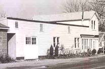 |
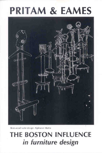
The New York Times called PRITAM & EAMES the "Gallery of Original Furniture" when it opened on May 21, 1981, in a converted 19th-century steam laundry building in East Hampton, NY. In its opening show, the gallery exhibited work by makers who would become instrumental in shaping the course of the American studio furniture movement. The following selection of announcements and work from the gallery's first decade records its commitment to studio furniture and chronicles the strength and originality that establishes this field as a vital 20th century decorative art.
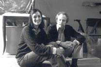
Founders, Bebe Pritam Johnson and Warren Eames Johnson, 1981. |
|||||||||||||||||||||||||||||||
 |
||||||||||||||||||||||||||||||||
|
||||||||||||||||||||||||||||||||
Note from the editors: This document was created as a single scrolling page. It is long. If printed, the document could run from 140 to 160 pages. The editors have made every effort to align the images with their mention in the text. Words underlined in the text indicate work pictured. |
||||||||||||||||||||||||||||||||
 |
Introduction |
|||||||||||||||||||||||||||||||
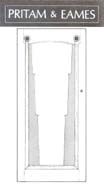
Gallery entrance door design by James Schriber |
||||||||||||||||||||||||||||||||
About Pritam & Eames |
||||||||||||||||||||||||||||||||
 |
There were two early encounters that encouraged the Johnsons: in l979 they visited the Richard Kagan gallery in Philadelphia, and in 1980 they attended a furniture show hosted at the Roitman showroom in Providence. Kagan's sliver of a shop on South Street in Philadelphia was virtually the only place where an interested observer could get a sense of the maker energy percolating in the East. Kagan, a furniture maker himself, was an inspiration to the partners because of his knowledgeable selection of work. The Design Book series by Taunton Press offered another important source of information for the Johnsons, as were catalogues from museum shows such as the 1972 Woodenworks exhibit at the Renwick Gallery, Smithsonian Institution, in Washington, DC, and the 1979 New Handmade Furniture exhibition organized by the American Craft Museum in New York. |
|||||||||||||||||||||||||||||||
The partners' task for the opening exhibition was to choose work from a multifacted, multi-centered field. By 1980, they had met Jere Osgood in Boston. His steering would be invaluable to the gallery since the studio furniture landscape was largely unlit at the time of the partners' research in the late 1970s. One of their most important discoveries, however, was closer to home. It was their future landlord, Leif Hope, without whose support and encouragement the partners acknowledge they surely would have had a more difficult road and possibly have failed. Tucked away on a back street in East Hampton, the 19th-century steam laundry building owned by Hope has been the gallery address for nearly 25 years. This location was perfect for the Johnsons because the stabilized rent not only made their expenses manageable, but also allowed an unhurried pace for them to develop an audience for studio furniture. One of their first acts as Pritam & Eames was to commission James Schriber to make an entrance door for the gallery. They reasoned that his padauk and aniline-dyed ash door would provide a clue from the outside as to what was inside. Good friends and owners of New York's Soho Charcuterie catered the gallery's opening on May 21, 1981. Many of the furniture makers came, providing enduring insight into their love of a good party. One of them said to a Fine Woodworking editor, "If any gallery is going to make it, it'll be this one." |
||||||||||||||||||||||||||||||||
| 1 9 8 1 | ||||||||||||||||||||||||||||||||
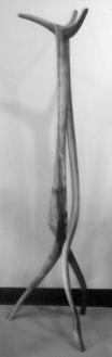
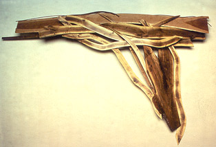
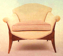
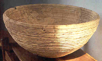
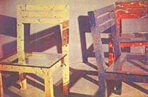
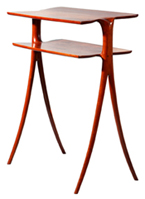
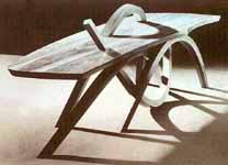
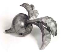
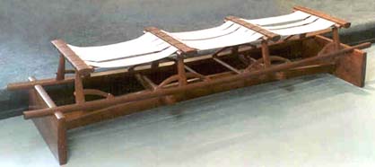
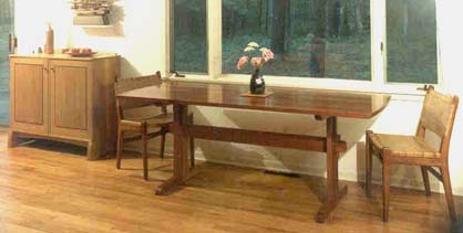
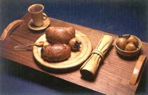
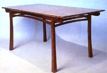
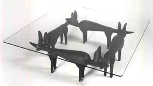
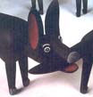
| Selections from the Opening Exhibition - 1981 | Opening Exhibition Judy Kensley McKie's work has much in common with the spirit-imbued carving of primitive cultures. Her images suggest energies beyond what you see. (See Notes, McKie l987 show). She was represented in the opening exhibit with a console table in the form of a pair of carved mahogany dogs supporting a glass top. She also showed a walnut blanket chest with carved bird and floral motifs in the facades, patterns that continue in her work today. Bill Keyser, on faculty at the School for American Craftsmen at the Rochester Institute of Technology (RIT), took his command of technique and applied it first to form and then to function. He was exceptional in the opening show in that he contributed a nonfunctional piece that was a wall sculpture made from long sections of walnut and cherry branches. He also showed a branched-formed clothes tree, that could stand alone as sculpture. |
|||||||||||||||||||||||||||||||
 |
 |
|||||||||||||||||||||||||||||||
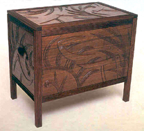
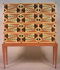
Judy
Kensley McKie - carved Walnut Bird and Fern Chest |
Wendell
Castle - Walnut and Elm Game Table, Chairs + |
|||||||||||||||||||||||||||||||
 |
 |
|||||||||||||||||||||||||||||||
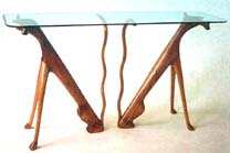
Judy Kensley McKie - Mahogany Table with Dogs |
Alphonse Mattia - Red Lacquer Mirror Detail |
|||||||||||||||||||||||||||||||
 |
 |
|||||||||||||||||||||||||||||||
William Keyser - Walnut Clothes Tree |
William Keyser - Maple and Walnut Split Branch Wall Sculpture |
|||||||||||||||||||||||||||||||
 |
 |
|||||||||||||||||||||||||||||||
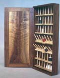
Rob Sperber - Walnut Thread Cabinet |
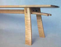
Hank Gilpin - Maple Bench Detail |
|||||||||||||||||||||||||||||||
 |
 |
|||||||||||||||||||||||||||||||
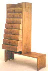
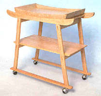
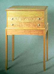
Hank Gilpin - Oak Chest on Stand |
Hank Gilpin - Curly Maple Tea Cart |
|||||||||||||||||||||||||||||||
 |
 |
|||||||||||||||||||||||||||||||
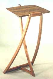
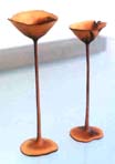
Peter Korn - Cherry Dictionary Stand |
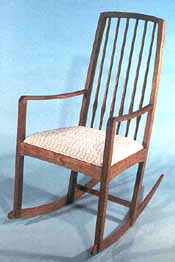
Peter Korn - Rocker |
|||||||||||||||||||||||||||||||
 |
 |
|||||||||||||||||||||||||||||||
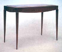
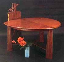
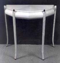
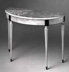
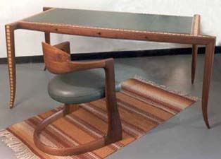
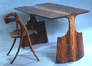
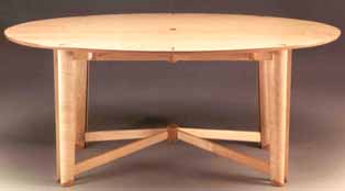
Timothy Philbrick - Rosewood Pier Table |
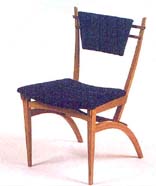
John Dunnigan- Walnut and Velvet Chair |
|||||||||||||||||||||||||||||||
 |
 |
|||||||||||||||||||||||||||||||
John Dunnigan - Mahogany Table and Mirror |
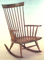
David Ebner - Wishbone Oak Rocker |
|||||||||||||||||||||||||||||||
 |
 |
|||||||||||||||||||||||||||||||
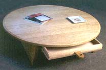
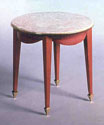
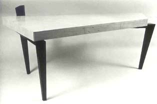
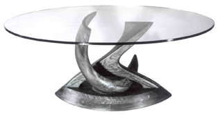
Richard Newman - Mahogany Blanket Chest + |
Richard Newman - Black Limba Coffee Table Base |
|||||||||||||||||||||||||||||||
 |
 |
|||||||||||||||||||||||||||||||
Bruce
Beeken - Bubinga Low Table |
Wendy Maruyama - Padauk Bench |
|||||||||||||||||||||||||||||||
 |
 |
|||||||||||||||||||||||||||||||
 |
||||||||||||||||||||||||||||||||
Thomas Hucker - Sitka Spruce Box |
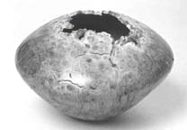
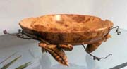
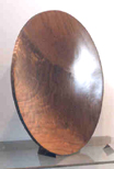
Mark Lindquist - Maple Burl Bowl |
|||||||||||||||||||||||||||||||
 |
||||||||||||||||||||||||||||||||
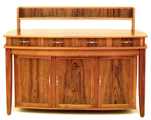
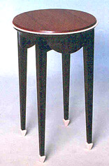
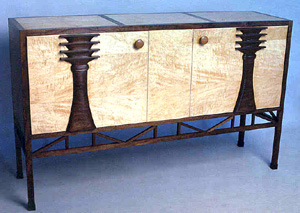
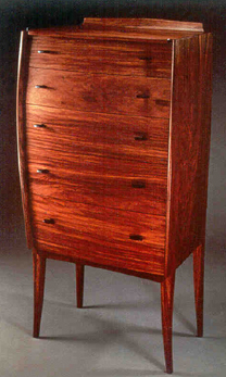
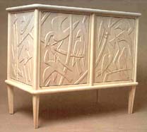
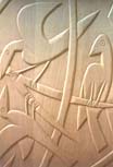
George Gordon -Teak and Mahogany Sideboard
|
||||||||||||||||||||||||||||||||
|
||||||||||||||||||||||||||||||||
| 1 9 8 2 | ||||||||||||||||||||||||||||||||
| Announcement
of 1982 Show Schedule |
1982: New work from America's top designer-craftsmen Neal Barkon, Larry Bickford, Michael Coffey, Ron Curtis, David Ebner, David Ellsworth, Hank Gilpin, Michael Hurwitz, Hunter Kariher, William Keyser, Silas Kopf, Alan Lorn, Judy McKie, Charles Mark, Alan Marks, Richard Newman, Timothy Philbrick, Robert Sperber, Leslie Wells, Newell White, Jonathan Wright. NOTES: This show opened the gallery's second season. Seminal work from John Dunnigan and Richard Newman arrived this year. Newman's stunning dining table opened the 1982 season and Dunnigan's Versailles Table arrived for the Masters show later in the summer. These pieces established both makers as individual stylists from whom much could be expected. Richard Newman's dining room extension table in cherry, ebony, and ormolu broke radically with his past. A commission requested by his mother-in-law forced him to abandon his RIT Modernist style of work in favor of Louis XVI. Prior to working in the Modernist vein that he says was encouraged at RIT, Newman had made banjos. And it was the musical instrument making that prepared him for the fine decorative work that characterizes his furniture from here on. The dining room table combines cherry and ebony on the legs and apron, which also features cast gold-plated ormolu of androgynous faces set in relief. The table has a resawn, hand-planed top of figured cherry veneer. The effect of this combination is stunning, like nothing else in studio furniture at the time. Although the use of gold was anathema to some and considered elitist by others, Newman was mostly undisturbed. He said, "Gold is noble, it's a perfect material." When a piece sets a mark, it usually provokes some discussion. Work from others in the exhibit shows how well they, too, struck the vein of a successful personal furniture style. Such a piece is Tim Philbrick's pearwood and leather chair. The leather seat and back are tailored into an elegant pearwood frame, and outlined with red leather piping. Judy McKie's carved and painted plant stand shows her inimitable blend of animal and invented form. The skyward seeking thrust of the bird's head, wings, and legs is a gesture that communicates to everyone. With its fan-like form, the stylish padauk and purpleheart chest of drawers by Michael Hurwitz inverts the cabinetmaker's usual approach. In this case the largest drawer is on the top with the size of the drawers diminishing as they descend. David Ebner's English brown oak sofa table and chair demonstrate the strong impression that Wharton Esherick's style of work had on him. In the sofa table, he made use of a "poured leg" design for the first time: the top appears to continue and flow down into the leg form. You could dance on Gilpin's sassafras low table, affectionately dubbed a "foot stomper." It shows his fresh treatment of familiar form, as well as his preference for under-utilized domestic hardwoods. Some makers become associated with a single piece. Such was the case of Jonathan Wright's bubinga/maple dining room extension table. Without its leaves, the top is a deltoid or inflated triangle; with the addition of its three leaves, the top of the three-legged table becomes round. Wright would continue to make versions of this popular design into the 1990s. |
|||||||||||||||||||||||||||||||
 |
||||||||||||||||||||||||||||||||
| Signature Pieces - Summer 1982 | ||||||||||||||||||||||||||||||||
 |
 |
|||||||||||||||||||||||||||||||
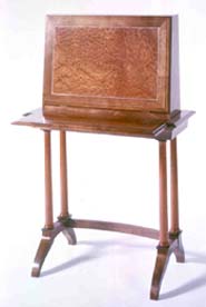
Alan
Lorn - Cherry Fallfront Desk |
||||||||||||||||||||||||||||||||
 |
||||||||||||||||||||||||||||||||
Richard
Scott Newman - Cherry, Ebony and Gold Extension Dining Table + |
||||||||||||||||||||||||||||||||
 |
 |
|||||||||||||||||||||||||||||||
 |
||||||||||||||||||||||||||||||||
Richard
Newman - Cherry, Ebony, Gold and Silk Chair |
Richard
Newman - Details of Dining Table |
|||||||||||||||||||||||||||||||
 |
 |
|||||||||||||||||||||||||||||||
Michael
Hurwitz - Purpleheart and Padauk Chest of Drawers |
Judy
Kensley McKie - Bird Table + |
|||||||||||||||||||||||||||||||
 |
 |
|||||||||||||||||||||||||||||||
David
Ebner - English Brown Oak Sofa Table and Chair |
Tim
Philbrick - Pearwood and Leather Chair + |
|||||||||||||||||||||||||||||||
 |
 |
|||||||||||||||||||||||||||||||
Hank
Gilpin - Oak Foot Stomper Table |
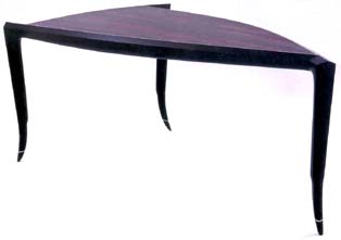
Jonathan
Wright - Bubinga and Maple Extension Table |
|||||||||||||||||||||||||||||||
 |
||||||||||||||||||||||||||||||||
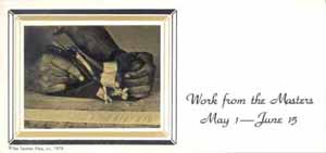
| Work
from the Masters - 1982 |
Work
from the Masters Wendell Castle, Michael Coffey, John Dunnigan, Wharton Esherick, Tage Frid, William Keyser, Sam Maloof, Alphonse Mattia, George Nakashima, Jere Osgood. Lecture by Wendell Castle, introduction by Jack Lenor Larsen. NOTES: This show paid tribute to those who helped shape the course of the studio furniture movement by their work and through their teaching. With the seven-year apprenticeship system a tradition of the past, the academic training centers on American campuses that developed in the 1960s and 1970s proved crucial to the development of the studio furniture movement. In addition to providing basic furniture making skills, these structured academic programs took place in an environment that ultimately fostered a freer, more dynamic approach to design. The schools also provided the opportunity for friendships and a spirit of camaraderie to develop between students and teachers which, in many cases, lasted long after graduation. At this point it might be helpful to give a sketch of some of the personalities in place at the time of the gallery's opening and to note the diversity of their background disciplines. Wharton Esherick's singular visionary authorship is generally acknowledged as the source of the American studio furniture movement. Trained in the fine arts in the early twentieth century, Esherick went from painting to woodcut printing, and then to sculpture and furniture in the 1920s. He received public notice when he collaborated with Philadelphia architect George Howe on a room setting for the 1939 World's Fair. Esherick's legacy was that he showed the possibility of using wood to create sculptural furniture forms. He was also instrumental in showing the way to use found objects, such as materials from the woods or even from one's backyard, in furniture. Self-taught, he was not bound to the use of a particular set of tools or techniques and advocated the use of anything that would get the job done. Esherick's 1965 cherry and red oak library ladder in this show was borrowed from the collection of Jack Lenor Larsen, an early avid Esherick collector. |
|||||||||||||||||||||||||||||||
 |
||||||||||||||||||||||||||||||||
 |
||||||||||||||||||||||||||||||||
Wharton Esherick - Cherry Library Ladder |
George Nakashima - Walnut Conoid Chair |
|||||||||||||||||||||||||||||||
 |
 |
|||||||||||||||||||||||||||||||
Sam
Maloof - Walnut Rocker |
Jere
Osgood - Maple Side Chair |
|||||||||||||||||||||||||||||||
 |
 |
|||||||||||||||||||||||||||||||
Tage Frid - Mahogany Flip-Top Game Table + |
Wendell Castle - Curly English Sycamore |
|||||||||||||||||||||||||||||||
 |
 |
|||||||||||||||||||||||||||||||
William
Keyser - Maple and Padauk Shelf Cabinet |
John Dunnigan - Wenge, Purpleheart, and Epoxy Resin Table |
|||||||||||||||||||||||||||||||
| Another important figure in the early stages of the studio furniture movement was George Nakashima. Trained as an architect, Nakashima turned to furniture as a form of building in which he could involve himself "from beginning to end." He was among the Japanese-Americans interred during World War II in a detainment center in Idaho. It was there that he learned how to use traditional Japanese hand tools. Upon his release, Nakashima moved to New Hope, PA, where he produced furniture emphasizing simple lines and a respect for wood. With his shrewd business sense, as well as his background in design and architecture, Nakashima's one-man shop soon expanded to include a dozen skilled craftsmen. By the time the partners met Nakashima in 1979, his philosophy and practice to preserve the splendor of wood by making objects of use had evolved to such an extent that he had a much larger public audience than most studio furniture makers would ever enjoy. As Edward Cooke observed in New American Furniture:The Second Generation of Studio Funituremakers (Museum of Fine Arts, Boston, catalogue, 1989), "Esherick and Nakashima gained a foothold in the high-end furniture market after World War II primarily through their architectural connections, but their subsequent success was also closely linked to the emergence of the studio craft movement of the 1950s. In furniture, different aspects of this movement arose among the self-taught and within the educational system." George Nakashima did not work with galleries as he did not like middlemen, but he agreed to support the fledgling Pritam & Eames with one of his Conoid chairs, this one in Persian walnut. The 1950s also saw other self-taught woodworkers like Art Carpenter and Sam Maloof develop their interest in furniture design and construction into new careers. Sam Maloof's 1955 walnut rocker in the P&E show was borrowed from the American Craft Museum collection. Interestingly, it fell to Tage Frid, a Danish cabinetmaker trained in the traditional European apprenticeship system, to establish the first college-level programs in this country with a furniture major, first at Dartmouth College in l948 and then at RIT when the program moved there in 1950. His traditional approach to design and his exhortation to students "to design around construction" exerted a profound influence, as well as reaction, on those who studied with him. Frid's students included Jere Osgood, Dan Jackson, and Bill Keyser. Frid left RIT to establish the furniture program at the Rhode Island School of Design (RISD) in 1962, where his emeritus influence continues today with former students Rosanne Somerson, John Dunnigan, and Alphonse Mattia on faculty. In the Masters show, Frid's contemporary take on the game table was based on a simple flip-and-twist mechanism. As with most of his work, the detailing itself was kept to a minimum. The solid stance of the table, its clean functionality, and its handsome material show how Frid continued to be influenced by a modernist approach. When Frid left RIT for RISD, he was replaced by Wendell Castle, with Bill Keyser as Castle's teaching assistant. If Frid represented traditional cabinetmaking skills as practiced abroad in a journeyman's life, then Castle was his antithesis. He was inspired more by what was going on in contemporary sculpture than by furniture. Trained as an industrial designer and sculptor, Castle created wood furniture during the sixties and seventies utilizing the same stack-laminated techniques favored by other contemporary sculptors. As a teacher, his approach was radically different from Frid's. Instead of "design around construction," it was "'bring out the sketchbooks." Castle began his own studio school in the early eighties in Scottsville, NY. He was represented in this show by his sycamore and ebony demilune, part of his "fine furniture" series first shown at the Alexander Milliken Gallery in New York the previous year. He would later eschew this body of work, which had been inspired by the French ébéniste Emile-Jacques Ruhlmann, as overly reliant on skill. Much of Castle's work came to P&E in the 1980s as a result of the partners' friendship with Castle's New York dealer, Alexander (Sandy) Milliken. Bill Keyser came from a family where technical know-how was second nature. When Castle left RIT in 1969, Keyser took over as head of the furniture program, where he remained until his retirement in 1997. Keyser's padauk and maple shelf and wall-hung cabinet is a piece defined in linear terms. By using laminations of woods in contrasting colors, the linear form gains rhythm. As with most of Keyser's work, this piece combines innovative process with a sculptor's sense of form. When Krenov left PIA abruptly in 1976, it fell to Jere Osgood, and Dan Jackson, to lead the program in Boston. Alphonse Mattia would succeed Jackson at PIA as Jackson's health deteriorated. Osgood and Mattia provided a decade of inspirational teaching at PIA from l976-l986. The wide crest rail of Osgood's 1978 curly maple chair in this show evokes the outstanding chair designs by Hans Wegner of Denmark. And, in fact, as a student, Osgood worked for a year in Denmark, although he did not train with Wegner. Osgood's body of work comes from a consideration of the lines found in nature's forms. This chair takes ergonomics as a starting point and arrives at a form that is strikingly organic and inviting. The comfortable seat, made of belt leather, avoids the visual bulk and technical fussiness of upholstery. This side chair is one of Osgood's three classic chair forms, the other two being his dining chair (see 10 x 16, 1991) and his easy chair (see P&E Editions, 1994). Alphonse Mattia studied with Dan Jackson at the Philadelphia College of Art (PCA) and then with Tage Frid at RISD in the seventies. He said that he wanted to make a series of objects that were related to function, but not ruled by it. He was represented in the Masters show by his red lacquer mirror from the year before, which would not sell until it was reintroduced at the gallery's tenth anniversary show. The business end of studio furniture depends on a relatively small group of buyers. Although these buyers represent considerable connoisseurship, few among them are willing to purchase pieces simply because of their excellence. In the world of fine arts, the case may be different -- it is not uncommon to keep prized paintings in storage. Studio furniture is collected primarily as a means towards an end -- a piece usually represents a fulfillment of a specific need. Time and again, pieces of exceptional quality remain unsold. These cases are often heartbreaking for the maker, as well as for the gallery. At the time of this show, John Dunnigan was RISD's principal instructor in furniture making. For the Masters show, he made a side table that referenced the same 18th-century French furniture period as Richard Newman's dining table seen earlier, but with more of an attitude. Both tables perch on versions of the spade foot, though Newman used gold-plated bronze, while Dunnigan used cast epoxy resin. The rose color of the epoxy, seen on the feet and the rim of the tabletop, stands boldly against, yet remains sympathetic to, the wenge legs and the purpleheart top. [This Dunnigan side table would be included in the 2003-04 Museum of Fine Arts, Boston exhibit, The Maker's Hand, American Studio Furniture, 1940-1990.] At the time, Michael Coffey had his own studio school in Poultney, VT, and was represented in the Masters show by a dressing table suite including a mirror and stool in mozambique. Although not represented in this show, the gallery would exhibit the work of David Powell, director of the Leeds Design Workshop, Easthampton, MA, the following year. After his brief stay at both RIT and PIA, James Krenov went west to northern California and formed the wood program at the College of the Redwoods in 1981. He was not represented in the Masters show, but would send his first work to the gallery the following year. His work, and that of his students, became an important source of furniture making talent for the gallery that continues today. The Masters show was meant to acquaint people who walked through the door with some of the seminal figures whose work originated the field of studio furniture. In actuality, it was the well priced work of the masters' students, the coming generation of furniture makers, that allowed the gallery to survive its critical first years. |
||||||||||||||||||||||||||||||||
| The Design Approach: Wendy Maruyama & Ed Zucca - 1982 | Furniture
Making: The Design Approach NOTES: The work of Wendy Maruyama and Ed Zucca was the subject of P&E's first featured show, and it provided an opportunity for the young gallery to showcase furniture as original artistic expression. However, the confidence of the collecting public had yet to match the experimentalism and exuberance of the work. Later, Maruyama said that she was embarrassed that none of her pieces sold from this, her first featured exhibit. A supportive marketplace had not yet been created by galleries for art-driven furniture. The expressive nature of Zucca's and Maruyama's furniture styles can be traced to their background influences as well as their circumstances. Maruyama graduated from San Diego State University in 1975 where she studied with woodworker/sculptor Larry Hunter, whose work would appear in the gallery in 1984. While still in San Diego, Maruyama saw the catalogue for Fantasy Furniture, a 1966 show that included work by Tommy Simpson and Wendell Castle at the Museum of Contemporary Crafts in New York. This was furniture to which she could aspire. Having read about the work being done by Alphonse Mattia on the east coast, she enrolled at Virginia Commonwealth University (VCU) and spent a semester studying with him. She followed Mattia to PIA in 1976 when he began teaching there with Jere Osgood. After two years at PIA, Maruyama went on to earn an MFA from RIT. At the time of the P&E show, Maruyama was teaching along with Tom Hucker at the Appalachian Center for Crafts in Smithville, TN. |
|||||||||||||||||||||||||||||||
 |
 |
|||||||||||||||||||||||||||||||
Wendy
Maruyama - Primary Chairs |
||||||||||||||||||||||||||||||||
 |
||||||||||||||||||||||||||||||||
Wendy
Maruyama- Mickey Mackintosh Chair |
Wendy
Maruyama - I-15 to Vegas |
|||||||||||||||||||||||||||||||
 |
 |
|||||||||||||||||||||||||||||||
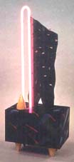
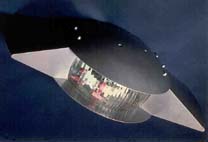
Ed
Zucca - Captain Video Table of Painted Basswood and Raku Ceramic Tiles by Kathy Yokum |
Ed
Zucca - UFO Light |
|||||||||||||||||||||||||||||||
 |
 |
|||||||||||||||||||||||||||||||
Ed
Zucca - Flourescent Electric Table |
Ed
Zucca - Floor Standing Light with Red Fan |
|||||||||||||||||||||||||||||||
| Ed Zucca maintained his studio in Putnam, CT. He had studied with Dan Jackson in the late 1960s at PCA, a period when Philadelphia was a dynamic center of innovative craft work. Zucca's interests in tinkering and building were already well established, and his work referenced a variety of influences from Art Deco, Egyptian, and pre-Columbian architecture, Shaker furniture, to American cars and gadgets of the 1950s, to space-age fantasy-fueled objects. Zucca's wall-mounted light took the form of a Twilight Zone flying saucer, and his sound-emitting sideboard whined when someone would pass by. His space-crafted work, was an adventurous and humorous take on studio furniture. However, it is always a question, when embedding a high degree of novelty in a substantial piece, whether the longevity of comment is at variance with the investment. Maruyama's puckish Mickey MacIntosh chair was paired with her three painted Primary Chairs, with plate-glass seats. Her work was, in part, influenced by what was going on in contemporary Italian design at the time, a colorful style that came to be known as Memphis. Maruyama's first work in neon, I-15 to Vegas, appeared in her P&E show, a lamp that also included colored marquetry. Her infamous Scribble Desk arrived at the gallery in 1983. Its appearance, together with Garry Bennett's Nail Cabinet, on the back cover of a 1980 Fine Woodworking magazine, fueled the gathering discussion as to whether work like this was furniture or something else. |
||||||||||||||||||||||||||||||||
| The
Bowl, the Vase, and the Box - 1982 |
Turned
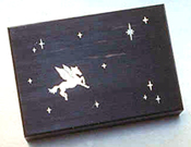
Work: The Bowl, the Vase, and the Box David Ellsworth, Silas Kopf, Ed Moulthrop, Philip Moulthrop, Richard Scott Newman, Del Stubbs. NOTES: This exhibit included the work of four turners and two furniture makers who contributed boxes. Of the turners, Ed Moulthrop enjoyed a national reputation, and David Ellsworth was steadily building one of his own. The highlight of the exhibition, though, was the small, almost paper-thin, manzanita vessels of Del Stubbs. Silas Kopf contributed boxes with floral marquetry patterns, and Richard Scott Newman again demonstrated his mastery with ebony and gold. One shallow lidded box of ebony has a contemporary feel to it, utilizing platinum as well as gold wire in its diagonally dashed pattern. The other ebony box has an inlaid mother-of-pearl image of Pegasus against an ebony night sky. |
|||||||||||||||||||||||||||||||
 |
||||||||||||||||||||||||||||||||
 |
||||||||||||||||||||||||||||||||
| Ed
Moulthrop - Turned Tulipwood Bowls |
||||||||||||||||||||||||||||||||
 |
 |
|||||||||||||||||||||||||||||||
Del
Stubbs - Manzanita Goblets |
David
Ellsworth - Turned Bowl |
|||||||||||||||||||||||||||||||
 |
 |
|||||||||||||||||||||||||||||||
 |
||||||||||||||||||||||||||||||||
Silas
Kopf - Boxes with Marquetry |
Richard
Newman - Ebony Lidded Boxes |
|||||||||||||||||||||||||||||||
| The
Desk and the Reading Chair - 1982 |
Reading
and Writing: The Desk and the Chair Lawrence Bickford, John Dodd, Tom Duffy, David Ebner, George Gordon, Peter Korn, Thomas Loeser, Ben Mack, Bruce McQuilken, Robert March, Alan Marks, Craig Marks, Michael Rosen, David Steckler. NOTES: Group shows are, by their nature, diverse in spirit. Nevertheless the serious observer will always come up with a few unprompted favorites, which gives these shows the excitement of the hunt. Thematically, of course, there can be some unifying concept such as, in this show, the desk. The gallery partners had received advice from design professionals that people would only be inclined to invest in pieces for the public areas of the home. The partners found, however, that a favorite piece for the collecting public was the desk, which normally would go into the private area of the home. Both the rosewood writing table with drawer by Craig Marks, and the padauk roll-top desk of Robert March, have unusually graceful lines that allow them to sit confidently in almost any interior. The line of March's tambour roll-top flows down from the carcase through the legs. There is also a great deal of flowing line in Marks' writing table, which was featured of the gallery's show announcement. Notice the similarity of the line in the legs of these two pieces, though the makers worked a continent apart. In Marks' table, however, the lines become the personality, set aggressively at 45 degrees into the apron. The carved pull is a signature of his teacher, James Krenov. Proving again the strengths of diverse training centers, Marks came from the College of the Redwoods, and March from RIT. |
|||||||||||||||||||||||||||||||
 |
 |
|||||||||||||||||||||||||||||||
Craig
Marks - Rosewood, Kingwood and Ebony Writing Table |
||||||||||||||||||||||||||||||||
 |
 |
|||||||||||||||||||||||||||||||
Robert
March - Padauk Roll-Top Desk |
David
Ebner - Cherry Stand-Up Desk |
|||||||||||||||||||||||||||||||
 |
 |
|||||||||||||||||||||||||||||||
Ben
Mack - Maple Desk |
Alan
Marks - Oak and Leather Easy Chair |
|||||||||||||||||||||||||||||||
 |
||||||||||||||||||||||||||||||||
John
Dodd - Cherry Desk |
||||||||||||||||||||||||||||||||
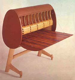
| Stand-up or reference desks are not unique to studio furniture, but David Ebner's piece gave him a perfect format for showing off his poured leg design. The piece has a delicate but sculptural presence. John Dodd's desk in cherry focuses on pure line and is completely without ornamentation. Its design does not stem from any furniture tradition per se but is more in line with what one would expect from a contemporary architect. The curve on the front of the top contains pencil drawers and replies to the outward flare of the pedestal sides. It has a clean and inviting look. |
||||||||||||||||||||||||||||||||
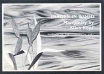
| Images
in Wood: Marquetry by Silas Kopf - 1982 |
Marquetry:
Images in Wood Silas Kopf Also new work from John Dunnigan, David Ellsworth, Richard Scott Newman, James Schriber, Del Stubbs. NOTES: Silas Kopf was established by 1982 as an expert in creative marquetry. He had apprenticed with Wendell Castle in the mid-70s, and continued occasionally to collaborate with him. Kopf employed craftsmen to build his pieces, which he would then use as a canvas for marquetry designs. In 1989, he studied with Pierre Ramond at the Ecole Boulle in Paris, further perfecting his mastery of marquetry. |
|||||||||||||||||||||||||||||||
 |
||||||||||||||||||||||||||||||||
Silas
Kopf - Cherry Blanket Chest with Marquetryof Padauk, Bubinga,
Rosewood, Jacaranda and Holly |
||||||||||||||||||||||||||||||||
Commissions
& Installations - 1982 |
Commissions
|
|||||||||||||||||||||||||||||||
 |
||||||||||||||||||||||||||||||||
George Gordon - Set of Walnut Arbitration Tables for Manhattan Maritime Law Firm |
||||||||||||||||||||||||||||||||
 |
||||||||||||||||||||||||||||||||
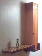
Home Office: David Ebner Chair; Hank Gilpin Walnut and Cherry Desk; Jim Fawcett Storage Cabinet in Pecan, Oak, Beech, and Tulipwood |
||||||||||||||||||||||||||||||||
| Two notable exceptions were the pioneering efforts of Patricia Conway, principal in the New York architectural design firm of Kohn, Pedersen, Fox and Conway, and David Schwarz, a Washington, DC, architect who worked with studio furniture makers on corporate as well as residential projects. Later, the partners surmised that there may have been a perception in the trade that studio furniture cost more, took longer, and did not offer customary trade discounts. From the furniture maker's side, working with an architect or designer in a commission situation often left the maker out of the design process. Makers ended up executing designs of others rather than their own. Some makers made a practical adjustment and built to specification as part of their production routine. Beyond that, the results of the commission process can be far from a surefire thing. It is fair to say that some furniture makers and clients ought not be placed together in a commission situation. | ||||||||||||||||||||||||||||||||
| Summing Up:
The First Year's Lessons In the gallery's experience, clients generally make their own decisions and do not require professional vetting. They act as their own arbiters of taste, and for this a quotient of confidence is necessary. This fact does tend to limit the circle of collectors of studio furniture because it takes some strength to make such decisions. Whether a sales or commission situation, the client has to be convinced that the piece will work for them in an evironment that they know better than anyone else -- their own home. Jack Lenor Larsen has said you're not a collector unless you pay storage. But collectors of studio furniture are not generally of this nature. Their objective is to envision an acquisition that they will live with and use. You could argue that the challenge in placing studio furniture is more difficult than that of painting, not only because of the space furniture requires, but also because our tolerance of what is acceptable on someone's wall is greater than what we will accept to sit upon or eat from. The partners' mission was to show people that studio furniture was a real residential option, one that could heighten the quality of their lives in their most intimate surrounding. They didn't rely on pedestals to display work in the gallery. Rather, they assembled work in groupings that made synergistic sense, arranging pieces in familiar ways that suggested how they might look in a home. The natural eclecticism of studio furniture lent itself to some imaginative pairings. Group shows were the gallery's common exhibition format at the time, because the format served their mission very well. Many collections of studio furniture that began in the 1980s remain unequaled today. In Patricia Conway's book, Art for Everyday: The New Craft Movement, (New York. Clarkson Potter, 1990), she guides readers through the homes and offices of collectors and demonstrates how studio furniture works in living rooms, bedrooms, boardrooms, lobbies, offices, patios, and gardens. "These craft artists," Conway wrote, "are concerned not primarily with the expression of material and natural form as were their predecessors, these craft artists are direct descendants of the Arts and Crafts movement that shaped the early part of the 20th century. Their ethos is the unifying moral and aesthetic force of craft and the reconnection of that force with the everyday." The partners, who assisted Patricia Conway by introducing her to many of the collectors featured in her book, felt that Art for Everyday validated their approach. |
||||||||||||||||||||||||||||||||
| 1 9 8 3 | ||||||||||||||||||||||||||||||||
| Spring 1983 | Spring
1983 |
|||||||||||||||||||||||||||||||
 |
 |
|||||||||||||||||||||||||||||||
James
Krenov - Maple and Red Oak Cabinet |
||||||||||||||||||||||||||||||||
 |
||||||||||||||||||||||||||||||||
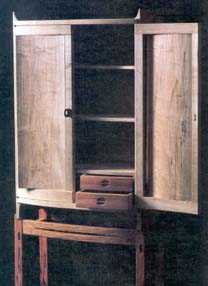
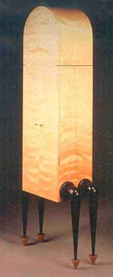
James Krenov - Mahogany and Yaca-wood Cabinet + |
||||||||||||||||||||||||||||||||
| The
Fine Art of Craftsmanship: Design and Process - 1983 |
The
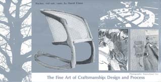
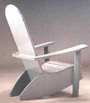
Fine Art of Craftsmanship - Design and Process Glenn Gordon's sturdy bench in lacewood is a compact composition of line and material. Although he would turn to writing in the future for creative outlet, this early small bench remains a strong piece. Bruce Beeken's cedar Adirondack Chair was the earliest piece shown at the gallery
to have been designed to be made in limited groups and marketed at a reasonable
price. It took a discerning eye, nonetheless, to appreciate the differences
between this chair and what was readily available in catalogues. The gallery
itself would begin its effort to market an edition series in 1995; and by
2001, Beeken himself would be ready to launch his own line of
Vermont furniture. |
|||||||||||||||||||||||||||||||
 |
||||||||||||||||||||||||||||||||
 |
 |
|||||||||||||||||||||||||||||||
|
||||||||||||||||||||||||||||||||
John
Dunnigan - Pupleheart and Lacquer Table + |
Wendell
Castle - Purpleheart and Maple Music Stand + |
|||||||||||||||||||||||||||||||
 |
 |
|||||||||||||||||||||||||||||||
Michael Hurwitz - Cherry and Lacquer Coffee Table |
Michael Hurwitz - Child's Chair |
|||||||||||||||||||||||||||||||
 |
 |
|||||||||||||||||||||||||||||||
Tage
Frid - Walnut Stools |
William
Keyser - Pecan Low Table |
|||||||||||||||||||||||||||||||
 |
 |
|||||||||||||||||||||||||||||||
David Ebner - Purpleheart Renwick Stool |
Glen Gordon - Ronchamps Bench |
|||||||||||||||||||||||||||||||
 |
 |
|||||||||||||||||||||||||||||||
Bruce Beeken - Cedar Adirondack Chair |
James Schriber - Padauk and Ebony Game Table |
|||||||||||||||||||||||||||||||
 |
 |
|||||||||||||||||||||||||||||||
James
Schriber - Ebonized Maple Table |
James Schriber - Ash Bed |
|||||||||||||||||||||||||||||||
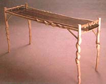
| Included in this show were three pieces by James Schriber. The stylistic differences between the black table and the queen-size ash bed are such that one would not assume that the same person designed both pieces. This versatility and design fluency has distinguished Schriber's work throughout his career, and also makes him among the most commissionable of furniture makers. Schriber played an exceptional role in studio furniture as he gave the wider public more faith in the field. The black table, has a slick contemporary elegance, while the ash bed harks back to Carl Malmsten and Schriber's time with Osgood at PIA. "Country" is the word that comes to mind to describe the bed, and "urban" the table. | ||||||||||||||||||||||||||||||||
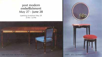
| Post-Modern Embellishment - 1983 |
Post-Modern Embellishment - 1983 Dale Broholm, John Dunnigan, Alphonse Mattia, Judy Kensley McKie, Richard Scott Newman, James Schriber. NOTES: This show focused on the decorated surface, and the use of paint, epoxy resin, gold, ebony, and carving. Patricia Conway observed that Post-Modernism was regarded as a reaction against the austerity of Modern design, and its exclusion of ornament. Since the early 1970s, a number of furniture makers, architects, and designers renewed their interest in pattern and decoration and the application of pure ornament to furniture, rooms, and buildings. "The universal appeal of ornament is precisely its 'uselessness'," Conway writes in Ornamentalism: The New Decorativeness in Architecture and Design, co-authored with Robert Jensen (Clarkson Potter Inc., 1982). "Because ornament does not hold things up or make things work, it is essentially free: free to move the eye, to intrigue the mind, to rest the soul; free simply to delight." The epoxy resin in John Dunnigan's Vanity Suite (shown on the announcement) and the ebony detailing in Richard Scott Newman's demilunes exemplify the theme of this show. Newman exhibited a pair of demilunes, one in cherry and ebony, the other in maple and ebony. These original demilunes presaged the slightly larger versions of the table that would become his signature piece over the next ten years. Later, a commission allowed Newman to design a ten-foot wide version of the table (pictured under Commissions, 1989). In studio furniture at this point, two pieces came to symbolize a movement in the field that took decorative detailing into the realm of art ideologies. One such piece was Garry Knox Bennett's padauk cabinet with a 16-penny nail pounded into one beautifully crafted door. This act on Bennett's part certainly would have been in keeping with the Dada movement. Many assumed that Wendy Maruyama's Scribble Desk that appeared in this exhibition derived from the same spirit. But, according to Maruyama, this is not true. Her intention was to embellish the top surface of the desk with a calligraphic gesture rendered in as free a manner as possible. She used a crayon, then lacquered the surface. Both Bennett and Maruyama's pieces appeared on the back cover of Fine Woodworking in 1980, to the consternation of some who thought they were desecrating the wood. Ed Zucca's Egyptian Dynasty Cabinet is an apt example of ornamentation. The nature of its façade is entirely determined by two bold, but strange, tower-like bas-relief figures on the front. This piece was made before his space furniture series. The Egyptian-style work, although distinctive and appealing, was not a style to which he would return. |
|||||||||||||||||||||||||||||||
 |
||||||||||||||||||||||||||||||||
| + rsn table | + reverse slide | |||||||||||||||||||||||||||||||
 |
 |
|||||||||||||||||||||||||||||||
John
Dunnigan - Purpleheart and Marble Table |
Richard
Newman - Maple and Ebony, First Demilune |
|||||||||||||||||||||||||||||||
 |
 |
|||||||||||||||||||||||||||||||
Wendy
Maruyama - Scribble Desk |
||||||||||||||||||||||||||||||||
 |
||||||||||||||||||||||||||||||||
Ed
Zucca - Egyptian Dynasty Cabinet |
||||||||||||||||||||||||||||||||
 |
 |
|||||||||||||||||||||||||||||||
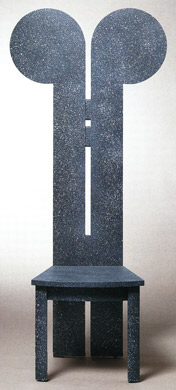
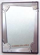
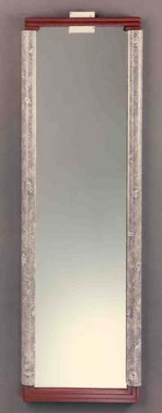
Alphonse Mattia - "Fragile" Mirror |
Alphonse Mattia - "Unbreakable" Mirror |
|||||||||||||||||||||||||||||||
 |
||||||||||||||||||||||||||||||||
Judy
Kensley McKie - Carved Birch Table |
||||||||||||||||||||||||||||||||
 |
 |
|||||||||||||||||||||||||||||||
Dale Broholm - Lacewood, Pearlized-Paint Upholstered Chair |
Dale Broholm - Cabinet |
|||||||||||||||||||||||||||||||
| Both Fragile and Unbreakable are part of a signature series of mirrors by Alphonse Mattia that would represent him well in the gallery world until the appearance of his valet series in 1984. Remarkable work from Judy McKie surfaced again in this show. Her table exhibits the first use of the lizard-like form, to which she would return in the future. The creature is carved into the leg material and its upward motion takes the eye in a continuous sweep up to the braided pattern of the apron. This table is a precursor to her Grinning Beast Table that she made for a 1986 P&E show. |
||||||||||||||||||||||||||||||||
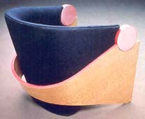
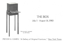
| The
Box - 1983 |
||||||||||||||||||||||||||||||||
 |
 |
|||||||||||||||||||||||||||||||
 |
 |
|||||||||||||||||||||||||||||||
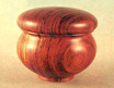
Del
Stubbs - Cocobolo Lidded Containers |
||||||||||||||||||||||||||||||||
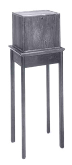
Jeff
Kellar - Rosewood Box-on-Stand |
||||||||||||||||||||||||||||||||
| Signature Pieces: The Desk for Home & Office - 1983 |
Signature
Pieces: The Desk for Home & Office Wendell Castle, Michael Coffey, John Dodd, John Dunnigan, David Ebner, Hank Gilpin, George Gordon, David Hannah, Creighton Hoke, Silas Kopf, Peter Korn, Alan Lorn, Benjamin Mack, Robert March, Wendy Maruyama, Jere Osgood, David Powell, Wendy Stayman, John Tierney, Stewart Wurtz, Robert Whitley. NOTES: Listed in this show are desks by Wendell Castle, Jere Osgood, and David Powell. The Castle desk uses his by-now familiar pinwheel leg-to-apron design with maple parquetry running up the legs and along the apron top to frame a green leather writing surface. One of Castle's simplest decorative treatments, and the desk is strong because of it. David Powell, like Castle, was responsible at that time for a studio school, Leeds Design Workshop in Easthampton, MA. Powell had been trained by Edward Barnsley of the English studio furniture movement, but his desk owes more to the experimental forms of the 1960s than to Arts and Crafts influence. The carcase of Powell's desk is egg-shaped in profile and upholstered in leather. The Barnsley-Powell connection was an important trans-Atlantic association; another was that of the British furniture maker John Makepeace and Wendell Castle. Jere Osgood made only a few pieces in the early 1980s. He has acknowledged that it was very difficult to do his own work while running the PIA program, especially during the first years of its existence. It would take until 1985 before he was able to create enough work for a two-person show with his former student, Tom Hucker. In this show, the surface of Osgood's simple walnut and ash writing table is supported by a curved leg structure built using his tapered-laminate technique. The asymmetrical design of the forward and rear legs allows the top to cantilever from a central pedestal. Freed from the traditional "leg at the corners" design, the top takes on an aerodynamic quality. Basic to Osgood's thinking is the idea that forms expressing a natural flow of energy will never simply be linear. Of note is a fall-front desk by Wendy Stayman, whose name was appearing on a gallery listing for the first time. Trained at Wendell Castle's studio school, her fall-front desk in pearwood and maple exhibits both the architectural crispness associated with her work as well as her knowledgeable eye for decorative detail. The pear and maple combination is a visual feast. |
|||||||||||||||||||||||||||||||
 |
||||||||||||||||||||||||||||||||
 |
 |
|||||||||||||||||||||||||||||||
Wendy
Stayman - Pearwood, Holly, Maple and Leather Fall-front Desk |
||||||||||||||||||||||||||||||||
 |
||||||||||||||||||||||||||||||||
Wendell
Castle - Walnut, Curly Maple and Leather Writing Desk and Chair |
||||||||||||||||||||||||||||||||
 |
||||||||||||||||||||||||||||||||
David Powell - Personal Desk |
||||||||||||||||||||||||||||||||
 |
 |
|||||||||||||||||||||||||||||||
Jere Osgood - Walnut and Ash Desk |
John Dunnigan - Maple, 24K Gold over Bronze Writing Table |
|||||||||||||||||||||||||||||||
| Commissions - 1983 | ||||||||||||||||||||||||||||||||
 |
 |
|||||||||||||||||||||||||||||||
Peter
Resnick - Art Nouveau Silver Chest |
Ed
Zucca - Space Suite |
|||||||||||||||||||||||||||||||
 |
 |
|||||||||||||||||||||||||||||||
George
Gordon - Walnut Dining Table |
Jonathan
Wright -One of several small Bubinga conference tables for a Philadelphia
law firm |
|||||||||||||||||||||||||||||||
| The
Discreet Object of Desire - 1983 - 1984 |
The
Discreet Object of Desire Wendell Castle, John Dodd, John Dunnigan, David Ellsworth, Hank Gilpin, George Gordon, Reg Herndon, Michelle Holzapfel, Thomas Hucker, Michael Hurwitz, Silas Kopf, Ben Mack, Charles Mark, Richard Scott Newman, Zivko Radenkov, Del Stubbs. NOTES: The appearance of work by Reg Herndon and Zivko Radenkov signified the onset of influence that graduates from Krenov's program at The College of the Redwoods would have on P&E exhibitions. The impact of Zivko Radenkov's spare and reverential Winter Cabinet is even more pronounced when set against the strong decorative styles that were prevalent on the east coast at the time. Here, it is the reserve of the decorative element that makes its mark. The slender bare branches tell us the season and the remaining leaf completes the composition. Radenkov says of this cabinet that he "wanted a wintry sort of feeling with still a few leaves hanging around before a breeze carries them to the cold ground. In the lower corner of the right panel, there is a falling leaf being carried off by a small swirl of wind. I used the western curly maple for background to convey the sense of a cold winter day. So, all in all, the cabinet is a fantasy of looking out some window and you see what you see." Radenkov would continue into the 1990s to produce cabinets decorated with marquetry patterns of floral motifs. This exhibit also marked the arrival of work by Michelle Holzapfel. She would continue to exhibit her turned and carved pieces at P&E until the early 1990s. |
|||||||||||||||||||||||||||||||
 |
 |
|||||||||||||||||||||||||||||||
Zivko
Radenkov - Winter Cabinet + |
||||||||||||||||||||||||||||||||
 |
 |
|||||||||||||||||||||||||||||||
Reg Herndon - Maple Display Cabinet |
||||||||||||||||||||||||||||||||
 |
 |
|||||||||||||||||||||||||||||||
Michelle Holzapfel - Cherry Burl Beet |
Michelle Holzapfel - Turned and Carved Pumpkin |
|||||||||||||||||||||||||||||||
 |
||||||||||||||||||||||||||||||||
Silas Kopf - Mahogany and Narra Coffee Table |
||||||||||||||||||||||||||||||||
| 1 9 8 4 | ||||||||||||||||||||||||||||||||
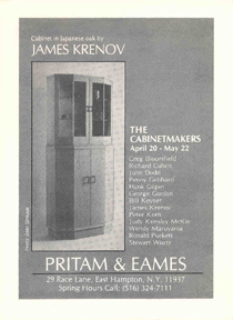
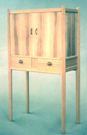
| The
Cabinetmakers - 1984 |
The
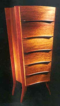
Cabinetmakers Greg Bloomfield, Richard Cohen, John Dodd, John Dunnigan, David Ebner, Penny Gebhard, Hank Gilpin, George Gordon, Bill Keyser, Silas Kopf, Peter Korn, James Krenov, Tom Loeser, Ben Mack, Charles Mark, Alan Marks, Wendy Maruyama, Judy Kensley McKie, Richard Newman, Ronald Puckett, Stewart Wurtz. NOTES: The Krenov cabinet pictured on the announcement is only 57 inches high and 26 inches wide. At the time, it marked a still-rare appearance of his work in the United States. This cabinet, in Japanese white oak, is related to one that he made in Sweden 15 years earlier. The 1984 piece is composed of a small showcase attached to a larger base cabinet, which is raised by a plinth. Krenov previously had used a functional base cabinet to support a hip-high section, but he would not return to a closed base form for 10 years. Perhaps he felt that he said it perfectly with this cabinet. Everyone, especially his students at the time, remembers this piece. The small black/white image on the show announcement sold the cabinet over the phone to someone who knew nothing about Krenov or studio furniture. It remains one of his purest pieces and one, regrettably, that he does not repeat. The Cabinetmakers show included the Fish Cabinet by Judy McKie, her largest case piece to date. The cabinet form, a perfect horizontal rectangle, provided her with an ample canvas for starkly angular fish imagery, which are repeated across the front in a geometric pattern. The table base lifts the case much like an aquarium. McKie would return periodically to the large case piece as a means to explore pattern and two-dimensional designs. She returns to large surface-pattern exploration in her 1995 Pattern Table, this time on a horizontal surface. Gilpin's minimalist fumed white oak cabinet has a certain monumentality for its size -- chest height. The illusion is enhanced by its unusual plinth base. The minimalist sense of the piece is reinforced by its single front door. The cabinet's warm tone was achieved by fuming the oak with ammonia, a 19th-century French technique. David Ebner's Lingerie Chest marks the first appearance of this piece at the gallery, but not the last. It follows the French formula of seven drawers, one for each day of the week. Its anthropomorphic form a robed figure, giving this piece its signature. |
|||||||||||||||||||||||||||||||
 |
 |
|||||||||||||||||||||||||||||||
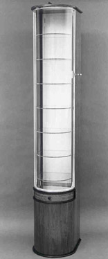
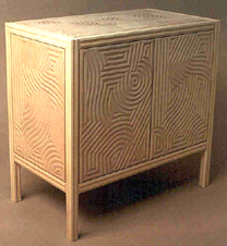
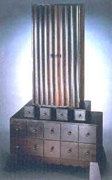
James
Krenov - Japanese Oak and Glass Cabinet |
||||||||||||||||||||||||||||||||
 |
||||||||||||||||||||||||||||||||
Judy
Kensley McKie - Fish Cabinet |
||||||||||||||||||||||||||||||||
 |
 |
|||||||||||||||||||||||||||||||
Hank Gilpin- Fumed Oak Cabinet |
David
Ebner - Mahogany Lingerie Chest |
|||||||||||||||||||||||||||||||
 |
 |
|||||||||||||||||||||||||||||||
Greg Bloomfield - Bubinga, Ebony, Glass and Silver Showcase Cabinet |
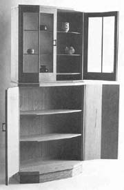
George
Gordon - Corner Cabinet |
|||||||||||||||||||||||||||||||
 |
 |
|||||||||||||||||||||||||||||||
Peter
Korn - Cherry Breakfront |
Silas
Kopf - Walnut and Marquetry Breakfront |
|||||||||||||||||||||||||||||||
| The
Boston Influence - 1984 |
The Boston
Influence The appearance of Jere Osgood’s padauk and ebony Chest of Drawers in this show was a precursor to a regular contribution of major pieces from this outstanding maker. Although Osgood had developed his thinking about chests in the 1970s, the investment of time in a piece such as this five drawer chest makes their appearance rare amongst Osgood’s speculative pieces. The next chest of drawers, his three drawer low chest, would not show at the gallery until ’95. And his tall or lingerie chest would not appear until 2003. Visually, the striking feature of these chests is their curved torso-like shaping. The width of the chest is narrower at the bottom with deeper drawers. The drawers get shallower as they widen towards the top. The curve of the front also becomes more accentuated as the piece progresses upward. This chest literally swells as in the tension of skin over muscle or the viscosity of a drop. This is accomplished by curving both horizontally and vertically. Although you see compound curving in other Osgood pieces, it is most effective in these chests. To accomplish this visual simplicity, the drawer fronts are all different bent laminate constructions. The sides of the chest which also swell vertically are coopered from shaped solid staves. The stems of the pulls are through tenons and pinned with wedges on the inside. The solid top is dovetailed into the sides. For a look at an earlier Osgood chest, see the one included on page 58 in the catalogue for the 2003 exhibit at the Boston MFA, The Maker’s Hand – American Studio Furniture, 1940-1990. Although Judy Kensley McKie and Rosanne Somerson attended RISD and not PIA, their inclusion in this show reflects their influence and proximity to the Boston makers. PIA graduates not represented in this show but whose work also is associated with P&E include Bruce Beeken, Tim Philbrick, and James Schriber. |
|||||||||||||||||||||||||||||||
 |
||||||||||||||||||||||||||||||||
 |
||||||||||||||||||||||||||||||||
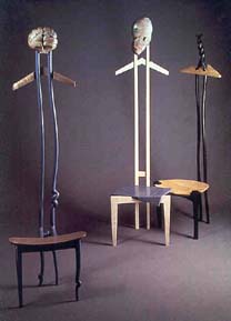
Alphonse
Mattia - Valets |
||||||||||||||||||||||||||||||||
 |
 |
|||||||||||||||||||||||||||||||
Side Tables - Dale Broholm |
Wendy Maruyama - Drawers with Pointy Legs |
|||||||||||||||||||||||||||||||
 |
||||||||||||||||||||||||||||||||
Thomas Hucker - Beefwood and Linen Bench |
||||||||||||||||||||||||||||||||
 |
 |
|||||||||||||||||||||||||||||||
Tom Loeser - Oak Side Chair |
Tom Loeser - Painted Maple "Mouse Hole" Table |
|||||||||||||||||||||||||||||||
 |
 |
|||||||||||||||||||||||||||||||
Michael Hurwitz - Tall Cherry Table |
Mitch Ryerson - Beefwood, Ebony, Walnut, Maple "People" Chair |
|||||||||||||||||||||||||||||||
 |
 |
|||||||||||||||||||||||||||||||
Michael Hurwitz - Brandy Vault |
Michael Pierschalla - English Brown Oak, Black Lacquer, Leather Writing Desk |
|||||||||||||||||||||||||||||||
 |
||||||||||||||||||||||||||||||||
Judy Kensley McKie - Butternut Jungle Chairs with Oak Table commissioned from John Dunnigan |
||||||||||||||||||||||||||||||||
 |
||||||||||||||||||||||||||||||||
 |
||||||||||||||||||||||||||||||||
Rosanne Somerson - Painted Mirror |
Jere
Osgood - Andaman Paduak Chest of Drawers |
|||||||||||||||||||||||||||||||
 |
||||||||||||||||||||||||||||||||
Stewart
Wurtz - Swiss Pearwood and Purpleheart Writing Table and Chair |
||||||||||||||||||||||||||||||||
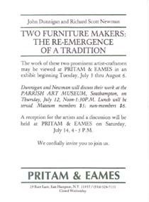
| Two Furniture Makers: The Re-Emergence of a Tradition - 1984 | Two
Furniture Makers: The Re-Emergence of a Tradition John Dunnigan, Richard Scott Newman. NOTES: This was the second exhibit that featured individual makers. Here the notion that a furniture maker can create a signature body of work as original as any painter takes on weight. Richard Newman was trained at RIT and had worked for Wendell Castle; John Dunnigan, trained at RISD, studied with the legendary Tage Frid. As part of the exhibit, both lectured at the Parrish Art Museum, Southampton, NY and at PRITAM & EAMES. John Dunnigan's high-style vanity is sumptuous in its use of material and color. The curly maple top was set up by a base painted in a red as definite as that used in Chinese furniture. The neoclassical leg refers to Egyptian bundled papyrus, a metaphor that Dunnigan would use again. The design of Richard Newman's umbrella stand also used the bound bundle metaphor. This time the structure is actually made by joining of curved staves. These elements were not staves in the usual sense, they were complex laminations that allow the compounding of the curve. The elements that joined the staves were surfaced in ebony, adding a heightened sense of depth, structure, and material richness. Although the form itself was attractive and unusual, on close inspection it was the beaded bronze banding that made you catch your breath. The braided beads were individually cast and gold plated, and set into an ebony bracelet. A perfectly fitted, interior-blackened copper canister fulfilled the piece's functional promise. |
|||||||||||||||||||||||||||||||
 |
 |
|||||||||||||||||||||||||||||||
John Dunnigan - Ebonized Mahogany Boudoir Chair |
||||||||||||||||||||||||||||||||
 |
 |
|||||||||||||||||||||||||||||||
Richard
Newman - Umbrella Stand |
John
Dunnigan - Maple, Red Lacquer Vanity Suite |
|||||||||||||||||||||||||||||||
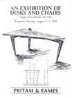
| An
Exhibition of Desks and Chairs - 1984 |
An Exhibition
of Desks and Chairs |
|||||||||||||||||||||||||||||||
 |
 |
|||||||||||||||||||||||||||||||
Stewart
Wurtz - Pearwood, Ebony and Lacquer Desk |
||||||||||||||||||||||||||||||||
 |
||||||||||||||||||||||||||||||||
Wendell
Castle - Lady's Writing Desk with Silver Inlay |
||||||||||||||||||||||||||||||||
 |
||||||||||||||||||||||||||||||||
 |
||||||||||||||||||||||||||||||||
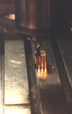
Richard Newman - Carving fluted feet for Pearwood Chairs on a Bridgeport mill |
Richard Scott Newman - Pearwood Chairs |
|||||||||||||||||||||||||||||||
 |
||||||||||||||||||||||||||||||||
Robert
March - Hickory Desk |
||||||||||||||||||||||||||||||||
 |
||||||||||||||||||||||||||||||||
William Walker - European Cherry Writing Desk and Two Chairs |
||||||||||||||||||||||||||||||||
 |
 |
|||||||||||||||||||||||||||||||
Creighton
Hoke - Pearwood Fall-Front Desk |
Ben
Mack - Maple Desk and Chair |
|||||||||||||||||||||||||||||||
 |
||||||||||||||||||||||||||||||||
David
Ebner - English Brown Oak Desk Suite |
||||||||||||||||||||||||||||||||
 |
 |
|||||||||||||||||||||||||||||||
John
Tierney - Maple and Lacquer Chair |
West
Lowe - Pudding Mahogany Leisure Desk |
|||||||||||||||||||||||||||||||
| Commissions
- 1984 |
||||||||||||||||||||||||||||||||
 |
||||||||||||||||||||||||||||||||
Michael
Coffey Walnut Pedestal Table and Charles Marks Chairs |
||||||||||||||||||||||||||||||||
 |
||||||||||||||||||||||||||||||||
Hank
Gilpin - Cherry Trestle Table, Fumed Oak Cabinet; Hans Wegner - Chairs |
||||||||||||||||||||||||||||||||
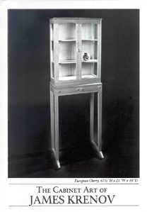
| James
Krenov & New Works - 1984-85 |
The
Cabinet Art of James Krenov & New Works Judy McKie's Dog Eat Dog table was a forerunner of many tables she would do over the years in which she would use paired animal forms.
|
|||||||||||||||||||||||||||||||
 |
 |
|||||||||||||||||||||||||||||||
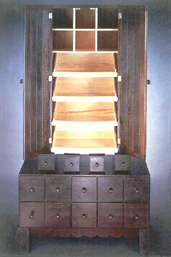
James
Krenov - European Cherry and Maple Cabinet, and European Chestnut Cabinet |
||||||||||||||||||||||||||||||||
Michelle Holzapfel - Yellow Birch Burl Ram's Horn Vase |
 |
 |
||||||||||||||||||||||||||||||
 |
||||||||||||||||||||||||||||||||
Michelle Holzapfel - Ash MFK Fisher Bowl |
Michelle Holzapfel - Breakfast in Bed |
|||||||||||||||||||||||||||||||
 |
||||||||||||||||||||||||||||||||
William Walker - White Oak Chest |
||||||||||||||||||||||||||||||||
 |
 |
|||||||||||||||||||||||||||||||
Hank Gilpin - Maple and Walnut Chairs |
Bob March - Rosewood Dining Table |
|||||||||||||||||||||||||||||||
 |
||||||||||||||||||||||||||||||||
Hank Gilpin - Ash and Fumed Oak Keyhole Chairs |
||||||||||||||||||||||||||||||||
 |
||||||||||||||||||||||||||||||||
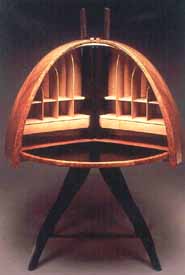
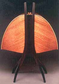
Timothy
Philbrick - Curly Maple and Silk Chaise Longue
|
||||||||||||||||||||||||||||||||
 |
 |
|||||||||||||||||||||||||||||||
James Schriber - Purpleheart Table |
John Dunnigan - Exclamation Point Chair |
|||||||||||||||||||||||||||||||
 |
 |
|||||||||||||||||||||||||||||||
James Schriber - bleached Maple, Pink Ivory and Satinwood Bed |
||||||||||||||||||||||||||||||||
 |
||||||||||||||||||||||||||||||||
Lawrence Hunter - Walnut and Birch Clock V-2 |
David Ebner - Red Oak Scallion Coat Rack |
|||||||||||||||||||||||||||||||
 |
 |
|||||||||||||||||||||||||||||||
Judy
McKie - Dog Eat Dog Coffee Table- Carved Limewood, Milk Paint and Glass |
||||||||||||||||||||||||||||||||
| 1 9 8 5 | ||||||||||||||||||||||||||||||||
| Original
Furniture for the Dining Room - 1985 |
Original
Furniture for the Dining Room |
|||||||||||||||||||||||||||||||
 |
||||||||||||||||||||||||||||||||
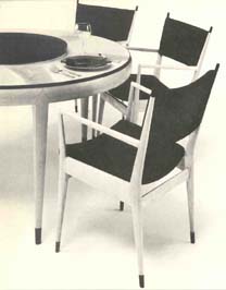 |
David
Powell - Maple, Ebony and Granite Dining Table & Chairs
|
|||||||||||||||||||||||||||||||
 |
||||||||||||||||||||||||||||||||
 |
||||||||||||||||||||||||||||||||
Wendy Stayman - Satinwood and Maple Silver Chest |
||||||||||||||||||||||||||||||||
Ron Puckett - Paduak and Copper China Cabinet |
||||||||||||||||||||||||||||||||
 |
 |
|||||||||||||||||||||||||||||||
Judy
Kensley McKie - Carved Limewood Abstract Chest |
||||||||||||||||||||||||||||||||
 |
||||||||||||||||||||||||||||||||
Bill
Keyser - White Oak Dining Table |
||||||||||||||||||||||||||||||||
 |
 |
|||||||||||||||||||||||||||||||
David
Ebner - Rosewood and Maple Stick Table |
Peter
Superti - Wenge, Satinwood, Africa Bean Pods and Fiber Tropical Rain
Cabinet |
|||||||||||||||||||||||||||||||
 |
 |
|||||||||||||||||||||||||||||||
Joe Tracy - Maple and Plexiglass Tea Cart |
Robert
March - Rosewood Harvest Table |
|||||||||||||||||||||||||||||||
 |
||||||||||||||||||||||||||||||||
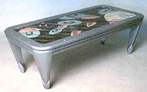
Michael Coffey - Mozambique and Glass Dining Table |
||||||||||||||||||||||||||||||||
 |
||||||||||||||||||||||||||||||||
John Dunnigan - Dining Chair |
||||||||||||||||||||||||||||||||
 |
||||||||||||||||||||||||||||||||
Jonathan
Wright - Maple and Pearwood Dining Table |
||||||||||||||||||||||||||||||||
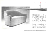
| Original
Furniture for the Living Room - 1985 |
Original
Furniture for the Living Room Dale Broholm, Michael Coffey, Peter Dean, John Dodd, John Dunnigan, David Ebner, Hank Gilpin, Thomas Hucker, James Krenov, Silas Kopf, Ben Mack, Robert March, John Marcoux, Richard Scott Newman, Tim Philbrick, Ron Puckett, Stephen Rieger, James Sagui, James Schriber, Rosanne Somerson, Lee Trench, William Walker, Robert Whitley. NOTES: The participants in this show demonstrated the strength of four centers of studio furniture study in the mid-1980s: RIT, PIA, RISD, and the College of the Redwoods as represented by James Krenov himself. This exhibit reflected a group of makers in full stride. The upholstered form is one species of studio furniture which brings the best work from some makers, and which others never touch. Upholstered chairs, settees, and sofas benefit most from a relationship with a talented upholsterer. This takes trust, patience, and serious out-of-pocket expense. Nevertheless, the successful pieces are rewarding for both maker and client since so little refined work is available commercially. Early shows exhibited the upholstered work by John Dunnigan and Tim Philbrick, and both would continue to excel at this form. Upholstered work from James Schriber would appear in future shows. In this show, Stephen Reiger introduced his upholstered Easy Chair. It was remarkable for the degree to which he utilized the chair's exposed wood to give the upholstered form a crisp and stylish appearance. The chair is very comfortable. David Ebner's settee and easy chair have the presence of smoothly sculpted volumes. Where Reiger's exposed wood makes you aware of the formal properties of his chairs, Ebner's work exposes less wood and uses it as embellishment. Its roundedness suggests ultra comfort, though both chair and settee are actually compact, space-conservative forms. Also of note from Reiger was his oak floor lamp styled as a neo-classical column. |
|||||||||||||||||||||||||||||||
 |
 |
|||||||||||||||||||||||||||||||
David
Ebner - Lounge Chair |
||||||||||||||||||||||||||||||||
 |
 |
|||||||||||||||||||||||||||||||
Spadone-Rieger
- Upholstered Chair and Oak Lamp; David Ebner - Upholstered Settee Richard Newman - Maple and Ebony Demilune |
Joe
Tracy - Teak, Silk, Granite Rock Lamp |
|||||||||||||||||||||||||||||||
 |
 |
 |
||||||||||||||||||||||||||||||
Judy
McKie - Carved Limewood Bird Cabinet with Marble Top |
||||||||||||||||||||||||||||||||
 |
||||||||||||||||||||||||||||||||
Stephen
Rieger - White Oak Column Lamp |
John
Dunnigan - Maple, Ebony and Leather Desk, Handpainted Silk Chair |
|||||||||||||||||||||||||||||||
 |
||||||||||||||||||||||||||||||||
James
Schriber - Padauk and Leather Game Table
|
||||||||||||||||||||||||||||||||
 |
 |
|||||||||||||||||||||||||||||||
Robert
Whitley - Walnut Rocker |
||||||||||||||||||||||||||||||||
 |
||||||||||||||||||||||||||||||||
Bruce
Volz - Ebonized Walnut and Holly Side Table |
Dale
Broholm - Curly Birch, Ebony, Leather-wrapped Legs Highboy |
|||||||||||||||||||||||||||||||
 |
 |
|||||||||||||||||||||||||||||||
Silas
Kopf - Maple Marquetry Wine Cabinet |
James
Sagui - East Indian Rosewood Powder Cabinet |
|||||||||||||||||||||||||||||||
| Subtractive Work - 1985 | Subtractive
Work Jon Brooks, David Holzapfel, Howard Werner. NOTES: This exhibit focused on work made by reducing a large chunk of wood to reveal form, rather than achieving form by joining smaller pieces of wood. At the time of this show, Wendell Castle, one of the pioneers of carved forms made from stacked solids, had abandoned this method of construction. He would return to the subtractive process in the 1990s with his Angel Chairs series exhibited at the Peter Joseph Gallery in New York. Both Jon Brooks and Howard Werner work with monolithic blocks of wood and continue to produce vital bodies of work that demonstrate this enduring dimension of studio furniture. Howard Werner met Jon Brooks in the 1970s at RIT and was influenced by his approach of carving solid wood with the chain saw. Refined form and chain sawing would seem to be mutually exclusive concepts; however, sculptors had long been drawn to this technique for rapid removal of material. In this show, Werner's work demonstrated a sculptural sophistication. His five-pointed star dining table shows how far he had stretched chain-saw technique in order to render a complex form. Other pieces in this show were only nominally furniture-related and his vessel or dish-forms essentially cross the line into non-functional work. From its beginning, the gallery was decidedly in the functional corner of the studio furniture movement, but the partners certainly recognized that a good piece of furniture might have some things in common with sculpture. Both Howard Werner and Jon Brooks move freely between pieces that may or may not function as furniture. In Werner's case, he acknowledges that he was heavily influenced by such sculptors as Isamu Noguchi and Constantin Brancusi, as well as by the primitive carving techniques of Africa and Oceania. The underlying point here is that although Werner moves freely between functional and sculptural pieces, his work springs from the discipline of studio furniture, not from sculpture. |
|||||||||||||||||||||||||||||||
 |
 |
|||||||||||||||||||||||||||||||
Howard
Werner - Elm Sphere |
||||||||||||||||||||||||||||||||
 |
||||||||||||||||||||||||||||||||
Howard
Werner - Standing Maple Dish |
||||||||||||||||||||||||||||||||
 |
 |
|||||||||||||||||||||||||||||||
Howard Werner
- Walnut Dish |
Howard Werner
- Curly Maple Star Dining Table |
|||||||||||||||||||||||||||||||
 |
 |
|||||||||||||||||||||||||||||||
Jon
Brooks - Walnut, Red Oak, Brass Palenque and Night Lighting |
Jon
Brooks - Tasmanian Blackwood and Myrtle Music Stand |
|||||||||||||||||||||||||||||||
 |
||||||||||||||||||||||||||||||||
David
Holzapfel - Butternut Hollow Table Base |
Like Werner, Jon Brooks' low table treads the line between sculpture and function. Early in his career, he focused on found organic form as a primary element in his work. Brooks credits his artist-in-residency at the University of Tasmania in 1983-84 as a turning point in his work because he moved from single carved timbers to constructed sticks and color. Work from Brooks will often include colored pencil, acrylic, and pastels on wood. In this show, his combination of branch forms and saw-tooth cut-outs created a witty, animated form for a music stand. |
|||||||||||||||||||||||||||||||
| Furniture
of Thomas Hucker & Jere Osgood - 1985 |
The
Furniture of Jere Osgood & Thomas Hucker NOTES: This show attests to former student/teacher influences that are still discernible in technique and form. This early featured show introduced pieces by both Tom Hucker and Jere Osgood that will be considered classic in their life's body of work, notably Hucker's low table on bronze pedestals, his slatted and cantilevered low table, and Osgood's rosewood and ash desk with legs that spread like a strong root structure and an aerodynamic spread-winged carcase suspended from its trunk. Osgood's sweeping cantilevered pedestal desk with its open upper cabinet took center space in this exhibit. Made of Brazilian rosewood and ash, this desk assumes visual command. What remains singular it is the horizontal stretch of its open cabinet. Osgood basically takes his flying wing tabletop and its cantilevered pedestal base and builds the cabinet as a shell structure shaped by the rear curve of the writing surface. The shell itself curves upward with the line of the pedestal posts. But the plane of the shell acts as a visual multiplier of the energy of that rear curve. The user, facing the interior of the shell, can select from a balcony of shallow drawers that stretch the entire width. Osgood's second shell desk for the show was the first of his dome-shaped shells: shells constructed from curved, wedge-shaped segments, tapering to a central axis at the top. These desks open from side-to-side, the doors revolving back around the stand. Here is a true interior space that the user can close entirely for privacy. As a result, the interior takes on a special character. Osgood sets up the interior space by his choice of pearwood and the suspended curved drawer and partition structure that is not built up from the table's surface. In this shell desk, as with later versions, Osgood's construction of the interior shelves and drawers have evolved to articulate miniature architectural spaces with their own architectural integrity. See, for example, his 2001 Shell Desk. The interior of this Dome Desk reflects the architecture of the whole. As in the rosewood desk, the suspended drawer structure allows the writing surface to extend to the rear of the piece without interruption. What chair to use with a desk like the Brazilian rosewood Shell? Osgood offers a solution with his curly maple chair. Its signature wide crest rail, reminiscent of Carl Malmsten, gives the kind of horizontal sweep that is comfortable with this desk. If there could be a piece as distinctive as the Brazilian rosewood desk but still hold its own, it would be Tom Hucker's slatted low table. Designed for a sofa or easy chair, it suggests a tatami-sized room and a community of rice bowls as Hucker's love of Japanese culture bubbles through. His focus was foremost to create a large table surface with transparency that avoids glass. The cantilever structure of the slatted table shows Hucker's emulation of his teacher, Osgood. Somewhat overshadowed by the slatted table, Hucker's other low table springs from earlier bench forms: it is narrow, stretched long, and structurally evokes a palanquin. The ends in this case are cast bronze stands. From end view, they could be Brancusi torsos. Here, however, they relate strongly to the Shield Chairs included in this show. This low table, a signature Hucker piece in the coming years, will be seen later with bronze stands and a verdigris patina, as well as in stone. The use of linen cord as a decorative element is a tactile contrast to the hard bronze. |
|||||||||||||||||||||||||||||||
 |
 |
|||||||||||||||||||||||||||||||
 |
||||||||||||||||||||||||||||||||
Jere
Osgood - Rosewood and Ash Desk |
||||||||||||||||||||||||||||||||
 |
 |
|||||||||||||||||||||||||||||||
Jere Osgood
- Bubinga and Wenge Dome Desk |
||||||||||||||||||||||||||||||||
 |
||||||||||||||||||||||||||||||||
Thomas Hucker - Walnut, Ash and Linen Slatted Table |
||||||||||||||||||||||||||||||||
 |
||||||||||||||||||||||||||||||||
Thomas Hucker
- Beefwood and Bronze Low Table |
||||||||||||||||||||||||||||||||
 |
 |
|||||||||||||||||||||||||||||||
Profile
of Hucker Low Table |
Thomas Hucker
- Lacewood and Partridgewood Sofa Table |
|||||||||||||||||||||||||||||||
 |
||||||||||||||||||||||||||||||||
Thomas Hucker
- Lacquer and Wenge Side Board |
||||||||||||||||||||||||||||||||
 |
||||||||||||||||||||||||||||||||
Thomas Hucker - Lacquer and Wenge Shield Chairs |
||||||||||||||||||||||||||||||||
| The Shield Chair redefines how a chair can be. It trades familiarity for conceptual challenge. Structurally it accomplishes the engineering required by any chair -- countering the racking forces created by being seated. It is architecturally interesting as well, especially in the way its shape defines an interior space. | ||||||||||||||||||||||||||||||||
| Commissions
- 1985 |
||||||||||||||||||||||||||||||||
 |
||||||||||||||||||||||||||||||||
Richard
Scott Newman - Cherry, Ebony and Vermeil Lady's Writing Table and
Chair |
||||||||||||||||||||||||||||||||
 |
||||||||||||||||||||||||||||||||
Richard
Scott Newman - Curly Maple, Ebony and Vermeil Bench |
||||||||||||||||||||||||||||||||
 |
 |
|||||||||||||||||||||||||||||||
James
Schriber - Padauk Bedroom Suite |
||||||||||||||||||||||||||||||||
 |
 |
|||||||||||||||||||||||||||||||
James
Schriber - Wenge Armoire of Bedroom Suite |
||||||||||||||||||||||||||||||||
| Objects
on a Smaller Scale - 1986 |
Objects on a Smaller Scale |
|||||||||||||||||||||||||||||||
 |
 |
|||||||||||||||||||||||||||||||
Hap
Sakwa - "Before Dawn" |
Hap
Sakwa |
|||||||||||||||||||||||||||||||
 |
 |
|||||||||||||||||||||||||||||||
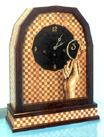
Silas
Kopf - Clock |
Michelle
Holzapfel - "Continental Breakfast" |
|||||||||||||||||||||||||||||||
| 1 9 8 6 | ||||||||||||||||||||||||||||||||
| 27
Race Lane Opening - 1986 |
Gallery
Opening: 27 Race Lane (The work in this section of PRITAM & EAMES featured functional pieces in glass, clay, wood, fiber, and metal, and represented another dimension of the gallery's focus on living with craft.) Susan Andrews, Bennett Bean, Jonathan Graham Bonner, Chunghi Choo, Diana Crain, Robert Davis, Addie Draper & Bud Latven, Jamie Fine, Beth Forer, Glenn Gilmore, Susan Goldin, Sam Stang, David Levi, Dimitri Michaelides (IBEX), Peter Handler, Carrie Harper, Cedric Hartman, Nancy Jurs, Karen Karnes, Michael Lambert, Jack Lenor Larsen, Sung Lee, Daniel Levy, Dona Look, Kari Lonning, Daniel Mack, Steven Maslach, James Makins, Robin Mix, Joyce Nagata, Hiroshi Nakayama & Judy Glasser, Joyce Nagata, Thomas O'Donnell, Liam O'Neill, John Page & David Thorbeck, Joe Panzarella, Deborah Papathanasiou, Jim & Shirley Parmentier, Stephen Prettyman, Rais-Wittus, Derek Richards, Hap Sakwa, Joanne Schiavone, John C. Sollinger, Alan Stirt, Tom Stoenner & Mark Sonzogni, Lucy Tracy, Joe Tracy, Jesse Walden, Geoffrey Warner. NOTES: In 1985, the Johnsons were encouraged by friends and supporters including Leif Hope and Jack Lenor Larsen, to open an additional section to the gallery that would showcase smaller functional work in the traditional craft mediums of glass, clay, metal, fiber, and wood. The designation "27" refers to the address of this section that opened in May, 1986. The partners had always taken seriously the motto of "beautiful objects for everyday use," so their goal in "27" was to maintain a focus on functional work at smaller scales. Also, the point had been made that as museums have gift shops, it would do well for P&E to have a section of their gallery devoted to smaller items, some of which could fall into a "gift" category. The numbers of makers represented in this group was markedly greater than the studio furniture makers. The juried American Craft Council (ACC) shows at Rhinebeck and Baltimore, and museum shows such as the 1987 hollow-ware exhibition curated by Rosanne Rabb at the Castle Gallery, College of New Rochelle, provided ample opportunity to meet artisans. These venues offered more concentrated sourcing than the partners had experienced in scouting out furniture makers. The selection of work for "'27" was guided by the belief that one can live with and use beautiful handmade objects on a daily basis. The partners looked for work that did not camouflage its construction and evidenced, in some way, the mark of the maker. They sought out artisans who were doing original and substantive work, and who were considered masters of their disciplines. The goal of "27" was to establish a showcase for objects that celebrated the honor of use. Eleni Prieston, a jeweler who lived nearby and whose own high-karat gold granulated work was shown at the gallery, managed "27" for four years. With the partners, she helped bring about a showcase for contemporary functional work in different media that was well received by a mostly separate audience from that of studio furniture. The opening collection included established makers like ceramicists Karen Karnes and James Makins, metalsmiths Chungi Choo, Jonathan Bonner, and Janet Prip, and basket weaver Kari Lonning, as well as work by emerging craftsmen. The work of Karen Karnes and James Makins was emblematic of everything the partners hoped to represent in the new gallery section. James Makin's porcelain Chromaline and white dinnerware, with its hint of celadon, carries the impression of his fingers. The grooves in the porcelain, a feature he chooses to emphasize rather than hide, are so distinctive that they have become his signature. |
|||||||||||||||||||||||||||||||
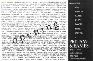 |
||||||||||||||||||||||||||||||||
 |
||||||||||||||||||||||||||||||||
James
Makins - "Chromaline" Porcelain |
||||||||||||||||||||||||||||||||
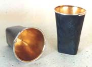 |
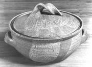 |
|||||||||||||||||||||||||||||||
Pat
Flynn - Pewter, Silver and Gold Beakers |
Karen
Karnes - Earthenware Casserole |
|||||||||||||||||||||||||||||||
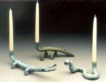 |
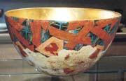 |
|||||||||||||||||||||||||||||||
Jonathan
Bonner - Copper Candlesticks |
Bennett
Bean - Gold-Leafed Ceramic Bowl |
|||||||||||||||||||||||||||||||
 |
 |
|||||||||||||||||||||||||||||||
Ibex
- Glass Tumblers |
Page
& Thorbeck - Ceramic Tea Service |
|||||||||||||||||||||||||||||||
 |
 |
|||||||||||||||||||||||||||||||
Chunghi
Choo - Silver Napkin Rings |
Michael
& Maureen Banner - Silver Teapot |
|||||||||||||||||||||||||||||||
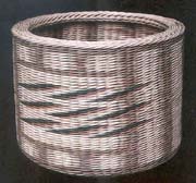 |
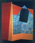 |
|||||||||||||||||||||||||||||||
Kari
Lonning - Dyed Rattan Basket |
Joanne
Schiavone - Paper Tabletop Screen |
|||||||||||||||||||||||||||||||
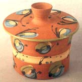 |
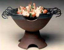 |
|||||||||||||||||||||||||||||||
Joyce
Nagata - Majolica Cookie Jar | |
Ron
Bower - Ceramic and Iron Hibachi |
|||||||||||||||||||||||||||||||
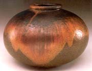 |
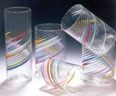 |
|||||||||||||||||||||||||||||||
Judith
Glasser & Hiroshi Nakayama - High-fire Stoneware Vase, Wood Ash Glaze |
Tom
Stoenner (Tundra) - Drinking Glasses |
|||||||||||||||||||||||||||||||
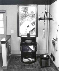 |
||||||||||||||||||||||||||||||||
Rais - Steel Woodburning Stove |
||||||||||||||||||||||||||||||||
| Perhaps the ultimate useful ceramic object is the ovenproof casserole by Karen Karnes. She is credited with resurrecting ovenproof stoneware, and these pieces carry her trademark twisted handle. The selection of objects in "27" focused on work that expressed the imprint of the maker, whether manifest in the glaze on the collaborative efforts of Glasser-Nakayama stoneware; the rainbow swirls in Tom Stoenner's handblown glass tumblers, or the joyful, painterly style of Joyce Nagata's functional Majolica pottery. It wasn't long before the gallery represented other functional work that included wearables and gold-smithing. The 19th-century laundry building in which the gallery was located did not have heat because the warmth of the old steam presses obviated the need. Fortunately, Jack Larsen introduced the Johnsons to Rais/Wittus, a company that handled the U.S. distribution of the handsome, virtually hand-built Danish stove. The Rais stove remains their principal source of heat and the gallery became a Long Island dealer for the stove line in the process. |
||||||||||||||||||||||||||||||||
| Art
at Home - 1986 |
||||||||||||||||||||||||||||||||
 |
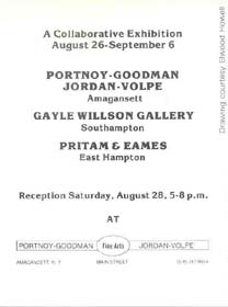 |
Art
at Home - 1986 NOTES: P&E collaborated with the dealers Theo Portnoy (ceramics and glass) and Gayle Wilson (fiber) for this exhibition. They used a large store space in Amagansett on the East End, illustrating how fluid the notions of exhibition were at the time. |
||||||||||||||||||||||||||||||
| Art
at Home - 1986 |
Art
at Home - 1986 Dale Broholm, Wendell Castle, Hank Gilpin, George Gordon, Thomas Hucker, Jeff Kellar, Garrett Klugherz, James Krenov, West Lowe, Judy Kensley McKie, Kristina Madsen, Richard Scott Newman, Jere Osgood, Hap Sakwa, Rosanne Somerson, Wendy Stayman, Lee Trench, Bruce Volz, Geoffrey Warner, Howard Werner, Stewart Wurtz. NOTES: Concurrent to the show with dealers Portnoy/Goodman and Wilson, P&E mounted its own Art at Home exhibit. The announcement piece, a four-poster bed by Richard Newman, challenged early advice given to the gallery: clients will invest in the public, but not the private, areas of the home. The only other maker contributing beds for gallery exhibition at the time was James Schriber, once in early 1983, and again in 1984. It might seem that Newman took his neoclassical style to an unlikely subject. However, a bed composed with four posts was a natural for him because the posts are a perfect stand-in for his fluted and ebony-edged leg-work. Ormolu that would have adorned the apron of a table works beautifully on the square sections of the posts where the foot, headboard, and side rails join. Cresting the posts themselves are twisted acanthus finials. The head and footboard themselves become the tableaux for his beautiful re-sawn, hand-planed decorative veneers. Judy McKie contributed a spectacular, but modestly sized, circular dining table. It is called the Grinning Beast table because of the four beast heads that adorn the top of the legs. Examining the carved apron and following down the post of the legs, one can make out wings and feet, small in relation to the size of the grinning beast's head. The carving is dramatic and strong rather than finely detailed. Rather than diminish the drama by introducing color, McKie bleaches the maple to a bone white. The top of the table with its rounded edge seems to float on the energy of its animated base. Krenov was present in the show with the first of his walk-about cabinets. The walk-about cabinet has a central display area closed off by glass doors that could be reached from either front or back. This walk-about included his signature horn-like extension of the stiles and legs joined into the cabinet at a 45-degree angle. Kristina Madsen's work appeared in the gallery for the first time. The inspiration for her vellum writing table and chair came in part from a 12th-century source. Its intriguing top center panel is covered in transparent vellum and contains a quote from a 12th-century abbess, someone whose life Madsen admires. Its eight slender legs provide an expansive, but stable, writing surface. The ensemble is an expression of restraint and delicacy that would seem to be in sympathy with the abbess's view of life. Occasionally a piece makes the kind of impact that becomes an identity for the maker. This was the case with George Gordon's capacious liquor cabinet. Its ample door panels were the perfect canvas for exhibiting intensely figured walnut crotch veneer. The quiet style of the cabinet was a counterbalance to this strength. The curly amaranth interior gave the illusion of illumination. Gordon would go on to make this cabinet a number of times, which is exceptional for a piece so complex. Overlapping with Kristina Madsen at the Leeds Design Workshop in the late 1970s, Bruce Volz remained active in the studio furniture movement through the 1980s. His American Flyer cabinet is one of his best-known pieces. At its core, it is a Lionel locomotive memorabilia, and its spirited use of materials and puckish form give the American Flyer an arresting stand-alone presence. Similarly, his Grandmother Clock springs from memories: in this case, of his grandmother's spoon collection. Modern clock movements do not require a pendulum case, so this piece can more aptly be called a clock with a case piece. The different attitude expressed in the Grandfather Clock comes not only from the imposing cove molding at the top, but also in the more somber tonality of the blue analine-dyed face veneer and the dark wenge framework. Its body is similarly composed of drawers below a cabinet. Rosanne Somerson contributed a reading couch to the show. This piece doesn't display her usual finely painted and textured detail but depends on a statement of form that is both simple and strong. There is an almost rustic appearance to the wood, which comes from bleaching the wenge. The four legs of the couch are the same, but on one end, they extend further above the frame to provide a stretcher support for the new moon backrest. This reading couch is one of her simplest and best designs and would evolve to other seating pieces over the years. |
|||||||||||||||||||||||||||||||
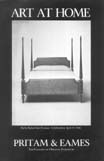 |
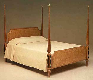 |
|||||||||||||||||||||||||||||||
Richard
Scott Newman - Cherry, Ebony, and Vermeil Bed |
||||||||||||||||||||||||||||||||
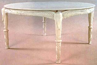 |
||||||||||||||||||||||||||||||||
Judy Kensley McKie - Carved bleached Maple "Grinning Beast" Table |
||||||||||||||||||||||||||||||||
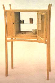 |
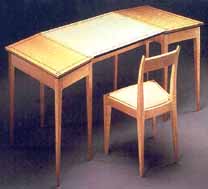 |
|||||||||||||||||||||||||||||||
James Krenov - Pearwood Walkabout Cabinet |
Kristina Madsen - Curly Maple, Ebony, Vellum Writing Table with Silk Upholstered Chair |
|||||||||||||||||||||||||||||||
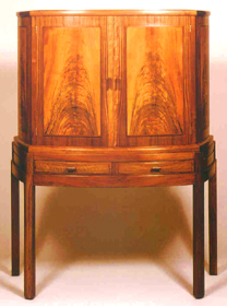 |
||||||||||||||||||||||||||||||||
George Gordon - Walnut, Curly Amaranth Liquor Cabinet |
||||||||||||||||||||||||||||||||
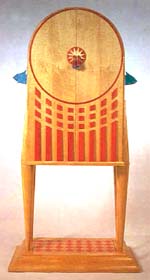 |
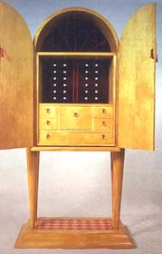 |
|||||||||||||||||||||||||||||||
Bruce
Volz - Pau Amarillo, Walnut, Glass, Silk, Ceramic Beads "American Flyer
I" |
||||||||||||||||||||||||||||||||
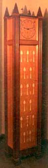 |
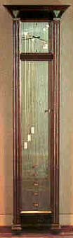 |
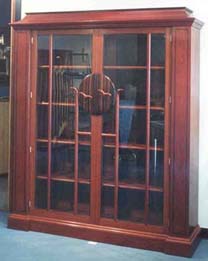 |
||||||||||||||||||||||||||||||
Bruce
Volz - Purpleheart, Pearwood, Holly, Glass, Paint "Grandmother Clock" |
Bruce
Volz - Wenge, analine dye, Abalone "Grandfather Clock" |
Bruce
Volz - Jatoba, Macassar Ebony, East Indian Laurel, Cherry Library |
||||||||||||||||||||||||||||||
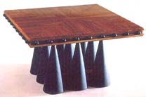 |
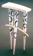 |
|||||||||||||||||||||||||||||||
Wendell Castle - Tulipwood, Leather "Sub-Nine" Coffee Table |
Wendell Castle - Australian Lacewood, painted Poplar "Summer" |
|||||||||||||||||||||||||||||||
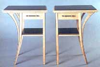 |
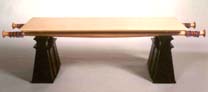 |
|||||||||||||||||||||||||||||||
Wendy
Stayman - Curly Maple, Ebony, Lacquer, Brass End Tables |
John
Dunnigan - Pylon Bench |
|||||||||||||||||||||||||||||||
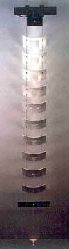 |
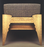 |
|||||||||||||||||||||||||||||||
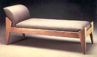 |
||||||||||||||||||||||||||||||||
Thomas Hucker - Aluminum Cascade Light |
Rosanne Somerson - Wenge Reading Couch |
|||||||||||||||||||||||||||||||
| One expects unusual work from Tom Hucker and his hanging light did not disappoint. It was called Cascade light and was based on the idea of a number of aluminum forms, hung one below the other, connected by descending wires. The light introduced from the top shines through apertures in these aluminum plates, creating a striking display. | ||||||||||||||||||||||||||||||||
| The
Furniture Art of John Dunnigan - 1986 |
The
Furniture Art of John Dunnigan - 1986 NOTES: That P&E featured work by John Dunnigan and Richard Newman early on is no surprise. From the beginning, the gallery partners recognized work by these two distinctive furniture makers as exemplars of the highest standards of design and craftsmanship. Dunnigan's furniture has as strong a signature as work by any fine artist. In this exhibit, he unveiled a floor lamp that continued his metaphor of the wrapped bundle. The upward focused shade is itself a fine example of hand-blown glass. The shade was the product of a collaboration with Keer Montague, a company formed by two RISD graduates which reflected once again the abundant talent around that school. The swollen base of the lamp is functionally astute for stability and continues Dunnigan's use of exaggeration as a source of dramatic tension in his designs. His pale green occasional boudoir chair in lacquered mahogany and velvet took another look at the basic chair design he developed in the late 1970s. This chair was a more completely upholstered version than its predecessors, with less emphasis on wood than the chair in the gallery's opening exhibition. The padauk and wenge floor-standing clock also made use of decorative glass. Here, the glass door of the case features sandblasted chevrons that decrease in scale and opacity from bottom to top. The shape of the door itself emphasizes the swing of the pendulum. Its less-than-imposing height gives this case piece an elegant, but approachable, air. The maple and ebony bench alongside the chair features hand painted silk by Wendy Wahl, Dunnigan's collaborator on fabric designs. The upholstered bench can also be seen in conjunction with the 1984 Exclamation Point Chair since both use the exploding form as a primary design focus. The Exclamation Point Chair appears reminiscent of the early 20th-century club chair, although Dunnigan's interest here has more to do with the effect of the birds'-eye maple front and rear arm panels and their exclamation point shapes. With this feature he dramatizes the chair's perspective. Rounding out the show was another of his upholstered chairs, this time scaled for use at the dining or writing table. The legs terminate with his by-now familiar spade foot and the crown of the chair rolls back into a neat scroll design. The raised maple metropes and routed triglyphs establish a decorative rhythm on the purpleheart apron of the writing table. |
|||||||||||||||||||||||||||||||
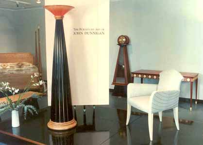 |
||||||||||||||||||||||||||||||||
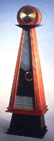 |
||||||||||||||||||||||||||||||||
John Dunnigan - Padauk,
Wenge, Gold plated Brass and Sandblasted Glass
"Grandmother Clock" 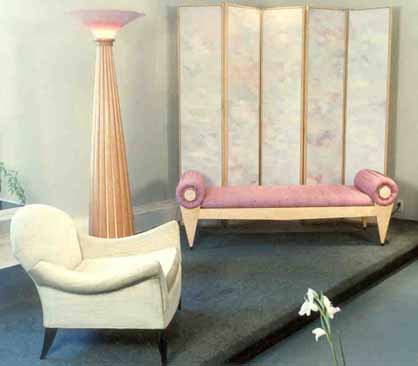 |
||||||||||||||||||||||||||||||||
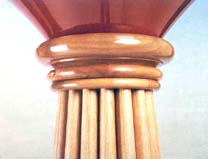 |
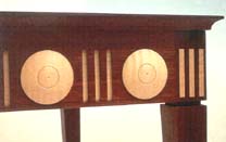 |
|||||||||||||||||||||||||||||||
John Dunnigan - Lamp
Detail |
John Dunnigan - Writing
Table Detail |
|||||||||||||||||||||||||||||||
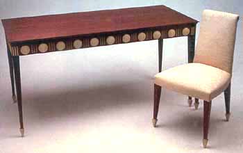 |
||||||||||||||||||||||||||||||||
John Dunnigan - Purpleheart
and Maple Writing Table and Handpainted Silk Chair |
||||||||||||||||||||||||||||||||
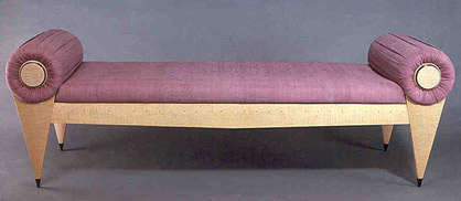 |
||||||||||||||||||||||||||||||||
John Dunnigan - Maple
and Handpainted Silk Daybed |
||||||||||||||||||||||||||||||||
| The
Room by David Ebner - 1986 |
The Room
by David Ebner, with Paintings by Joseph Roboli - 1986 |
|||||||||||||||||||||||||||||||
 |
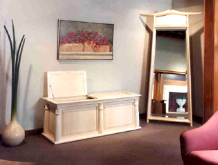 |
|||||||||||||||||||||||||||||||
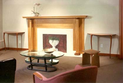 |
||||||||||||||||||||||||||||||||
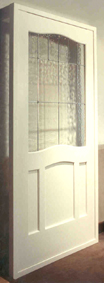 |
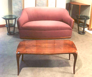 |
|||||||||||||||||||||||||||||||
| The
Furniture of James Schriber and Ron Puckett - 1986 |
The
Furniture of James Schriber and Ron Puckett - 1986 Earlier Ron Puckett work reflected a decided Arts and Crafts influence (see his paduak/copper cabinet in the 1985 Dining Room show). Here he shows a post-modernist influence, but rather than the rich Graves colors that Schriber employs, Puckett used the starker contrasts of the French ébénistes: ebonized or purpleheart decorative detailing combined with fruitwood and maple. The most successful piece in the show for him was the mirror, which he went on to repeat a number of times. Note that the detailing on the mirror is both bolder as well as simpler than in his other pieces. |
|||||||||||||||||||||||||||||||
 |
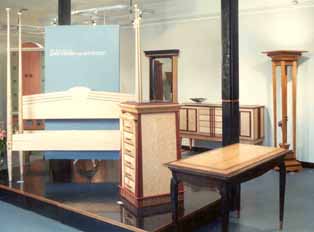 |
|||||||||||||||||||||||||||||||
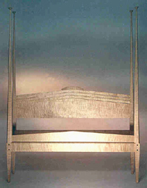 |
 |
|||||||||||||||||||||||||||||||
James Schriber
- Curly Maple Pencil Post Bed |
James Schriber
- Poplar, Fiberglass, Perforated Metal China Cabinet |
|||||||||||||||||||||||||||||||
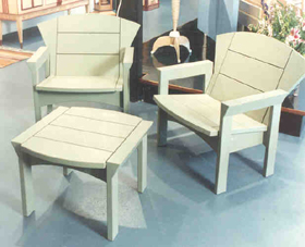 |
||||||||||||||||||||||||||||||||
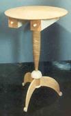 |
||||||||||||||||||||||||||||||||
|
James Schriber
- Maple and Metal Candlestick Table |
||||||||||||||||||||||||||||||||
James Schriber
- Mahogany Garden Furniture |
||||||||||||||||||||||||||||||||
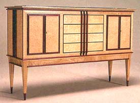 |
||||||||||||||||||||||||||||||||
Ron Puckett
- Purpleheart, Maple and Marble Sideboard |
||||||||||||||||||||||||||||||||
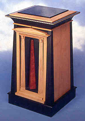 |
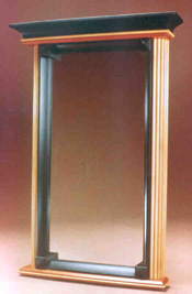 |
|||||||||||||||||||||||||||||||
Ron Puckett - Purpleheart, Maple and Marble Chest of Drawers |
Ron Puckett - Pearwood, Ebonized Cherry Mirror |
|||||||||||||||||||||||||||||||
| New
Work - 1986 |
New
Work - 1986 Wendell Castle, John Dunnigan, David Ebner, Hank Gilpin, Michelle Holzapfel, Bill Keyser, West Lowe, Ben Mack, Kristina Madsen, Richard Scott Newman, Zivko Radenkov, Peter Superti, William Turner. NOTES: Comparing the work of two makers from this group could not more dramatically highlight the different directions within studio furniture being taken at this time. The pieces by Wendell Castle passed beyond functionality into the realm of wry commentary on table-ness. Here, he was thinking as a sculptor, but his decorative arts background in furniture making gave him a formidable technical vocabulary. Although these were not simple forms, they were not overly complicated for a master like Castle. The asymmetrically bent, beautifully veneered tabletop forms demonstrate the special advantage he has as a sculptor. Contrast these pieces with Zivko Radenkov's oval cabinet. It, too, relied on a master maker's arsenal of technical skills. In this case, creating marquetry figure on a curved surface required that all of the cutting was done at an angle so that the slightly broader edge to the rear of the delicate floral figure would underlay the opposing bevel cut of the background veneer. Radenkov created a cabinet of such austere and fragile loveliness that is breathtaking. Like his Winter Cabinet, the criss-crossing of the marquetry branches by lines of lattice creates the metaphor of peering through a window onto a scene of natural beauty. |
|||||||||||||||||||||||||||||||
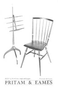 |
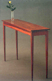 |
|||||||||||||||||||||||||||||||
West
Lowe - Maple "Duet" Music Stand and Chair |
Kristina
Madsen - Padauk Hall Table |
|||||||||||||||||||||||||||||||
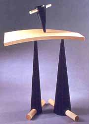 |
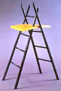 |
|||||||||||||||||||||||||||||||
Wendell
Castle - Curly Maple, Ebonized Walnut "Stand Apart" |
Wendell
Castle - Ebonized Cherry, Stained Maple "Ladder of Trust" |
|||||||||||||||||||||||||||||||
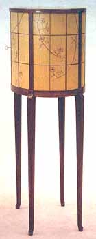 |
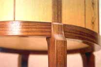 |
|||||||||||||||||||||||||||||||
Zivko
Radenkov - Padauk, Marquetry in field of Douglas Fir, Pink Ivory, Gabon
Ebony, Yaca-wood, White Oak Cabinet |
||||||||||||||||||||||||||||||||
| Commissions
- 1986 |
||||||||||||||||||||||||||||||||
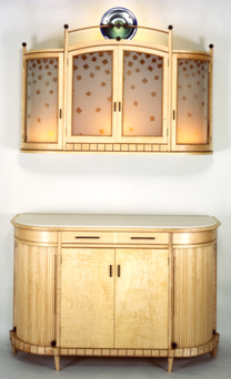 |
||||||||||||||||||||||||||||||||
Geoffrey
Warner - Maple, Cherry, Wenge, Glass, Corian Two-Piece Bar |
||||||||||||||||||||||||||||||||
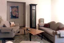 |
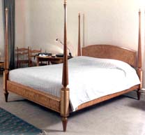 |
|||||||||||||||||||||||||||||||
John
Dunnigan Seating, Stewart Wurtz Coffee Table, Bruce Volz Clock, Richard
Newman Chair |
Richard
Scott Newman - Cherry, Maple Bed |
|||||||||||||||||||||||||||||||
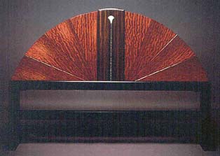 |
||||||||||||||||||||||||||||||||
Bruce
Volz - Headboard |
||||||||||||||||||||||||||||||||
| 1 9 8 7 | ||||||||||||||||||||||||||||||||
| Works
of Distinction - 1987 |
Works
of Distinction - "27" NOTES: In its second year, "27" introduced the outdoor furniture of ceramicist Bennett Bean, as well as his familiar colorful pots lined with gold. The combination of terra cotta, slate, and serviceablity made the tables a gallery favorite. Also featured in "27" was the work of two RIT-trained furniture makers, Brad Smith and Peter Handler. Smith made a series of functional pieces like step ladders and his popular axe-handled stools in various American hardwoods. Peter Handler created his own niche with furniture of anodized aluminum, another reminder that furniture is not defined by its material. St. Louis was home to IBEX, a glass studio where Sam Stang, David Levi, and Dimitri Michaelides collaborated on functional handblown glass work that was a great find for the gallery. The glasswork that came out of their studio embodied everything the gallery sought: distinctively personal, functional, and beautiful. By the time the group disbanded in the early 1990s, the IBEX partners had produced thousands of colorful, functional glass pieces such as tumblers (see 27 Race Lane Opening - 1986), vases, and bowls. The gallery continues to show the work of Sam Stang, whose own classically referenced vases, bowls, and platters carry on the standard established by IBEX. Later, the furniture part of the gallery would feature the iron and steel work of David Secrest, along with work by metalsmith Tom Joyce, in a 1994 show. It was Secrest's twisted iron and steel door pulls that first caught the partners' attention for inclusion in the "work of distinction" section of the gallery. |
|||||||||||||||||||||||||||||||
 |
||||||||||||||||||||||||||||||||
 |
|
|||||||||||||||||||||||||||||||
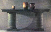 |
||||||||||||||||||||||||||||||||
Bennett Bean - Terra Cotta and Slate Dining Table; Ceramic Pots |
||||||||||||||||||||||||||||||||
Jonathan
Bonner - Copper Weather Vane and
Umbrella Stands |
||||||||||||||||||||||||||||||||
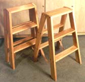 |
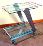 |
|||||||||||||||||||||||||||||||
Brad
Smith - Elm and Ash Ladders |
Peter
Handler - Anodized Aluminum, Glass Tea Cart |
|||||||||||||||||||||||||||||||
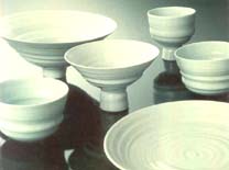 |
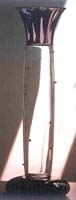 |
 |
||||||||||||||||||||||||||||||
James
Makins - Porcelain Whiteware |
Ibex
- Glass Vase |
David
Secrest - Pattern Welded Iron and Steel Door Pulls |
||||||||||||||||||||||||||||||
| Early
Spring Show - 1987 |
Early
Spring Show - 1987 Also present in the exhibition was a trio of pieces from three makers who had studied with Jim Krenov. The lovely country-styled hutch in fir and pearwood by Marie Hoepfl was fresh and unpretentious. Jim Budlong's simple cherry bowed wall-hung display cabinet was a sensitively rendered statement in minimalist form. Ted Hawke came from England to study with Krenov and produced a few pieces during his stay. His maple side table has unusual legs that are carved and not constructed. |
|||||||||||||||||||||||||||||||
 |
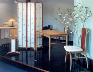 |
|||||||||||||||||||||||||||||||
Geoffrey
Warner - Screen, Writing Table, Chair |
||||||||||||||||||||||||||||||||
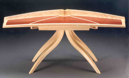 |
||||||||||||||||||||||||||||||||
Jere
Osgood - Ash and Leather Desk |
||||||||||||||||||||||||||||||||
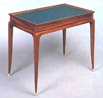 |
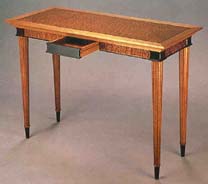 |
|||||||||||||||||||||||||||||||
Timothy Philbrick - Kosipo and Slate Tea Table |
Rick Wrigley - Hall Table |
|||||||||||||||||||||||||||||||
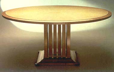 |
||||||||||||||||||||||||||||||||
James Schriber - Maple, Pearwood and Ebony Dining Table |
||||||||||||||||||||||||||||||||
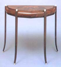 |
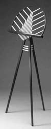 |
|||||||||||||||||||||||||||||||
Wendell Castle - Ziricote, Brazilian Rosewood and Ivory inlay Demilune |
Bill Keyser - Rosewood and Ash Music Stand |
|||||||||||||||||||||||||||||||
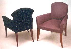 |
||||||||||||||||||||||||||||||||
John
Dunnigan - Side Chairs |
||||||||||||||||||||||||||||||||
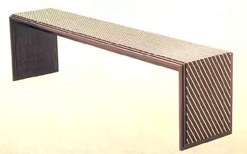 |
||||||||||||||||||||||||||||||||
Kristina Madsen - Wenge and Holly Bench |
||||||||||||||||||||||||||||||||
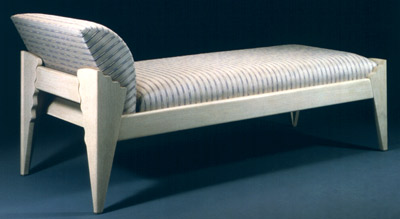 |
||||||||||||||||||||||||||||||||
Rosanne Somerson - White Oak Reading Couch |
||||||||||||||||||||||||||||||||
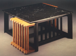 |
||||||||||||||||||||||||||||||||
Rosanne Somerson - Radiator Coffee Table |
||||||||||||||||||||||||||||||||
 |
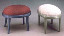 |
|||||||||||||||||||||||||||||||
Don Krawczyk - Milk-painted Maple Writing Table and Chairs |
Lee Trench - Painted Basswood Stools |
|||||||||||||||||||||||||||||||
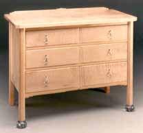 |
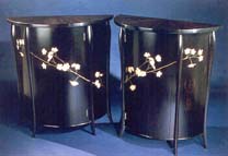 |
|||||||||||||||||||||||||||||||
Lee Trench - Curly Maple, Sterling, Glass Chest |
Jamie Robertson - Ebony Lunettes |
|||||||||||||||||||||||||||||||
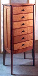 |
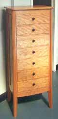 |
|||||||||||||||||||||||||||||||
Hank Gilpin - Australian Lacewood and Makore Chest of Drawers |
Hank Gilpin - Cherry Chest of Drawers |
|||||||||||||||||||||||||||||||
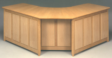 |
||||||||||||||||||||||||||||||||
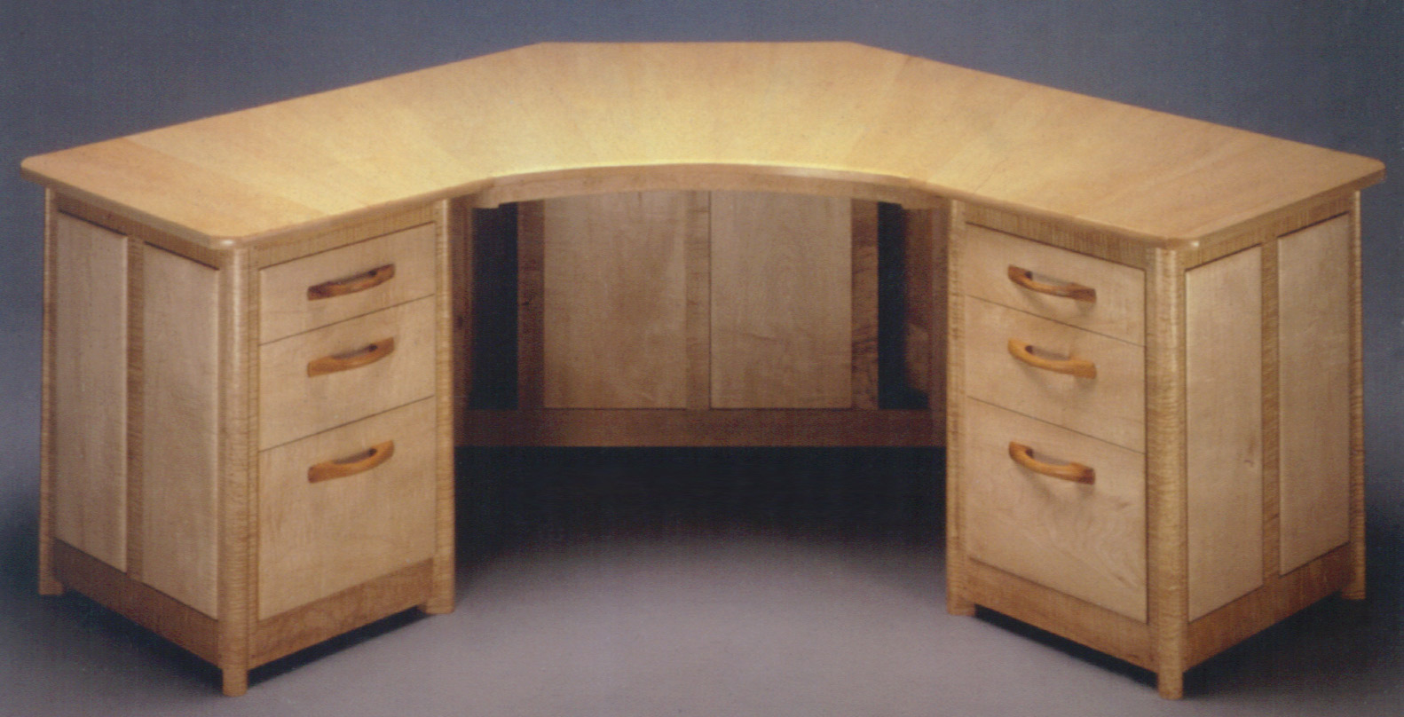 |
||||||||||||||||||||||||||||||||
Hank Gilpin - Rock Maple Corner Desk |
||||||||||||||||||||||||||||||||
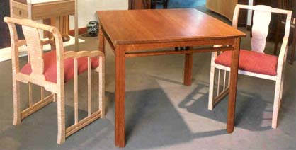 |
||||||||||||||||||||||||||||||||
Hank
Gilpin - Curly Maple Chairs and Cherry Table |
||||||||||||||||||||||||||||||||
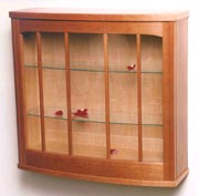 |
 |
|||||||||||||||||||||||||||||||
Jim Budlong - Cherry Display Cabinet |
||||||||||||||||||||||||||||||||
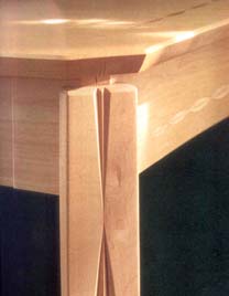 |
||||||||||||||||||||||||||||||||
Ted
Hawke - Maple Side Table detail |
Marie
Hoepfl - Douglas Fir and Pearwood Hutch |
|||||||||||||||||||||||||||||||
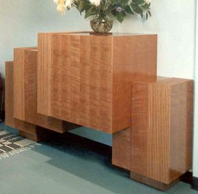 |
||||||||||||||||||||||||||||||||
Ben Mack - Cherry Entertainment Center |
||||||||||||||||||||||||||||||||
|
James
Krenov and William Walker - 1987 |
James
Krenov and William Walker - 1987 Completing this body of work was the Swedish ash long cabinet that is 62 inches wide and stands 49 inches high. The front is composed of four doors and four drawers that carefully use the beautiful ash figure of the thick-sawn veneer in a vertical and horizontal composition. The pulls are relieved from solid lipping sections. The long horizontal cabinet would continue to be a major focus of Walker's work. The gallery would show three other such cabinets in the coming years, the most recent being Walker's entry in the 20th anniversary show in 2001. It's instructive to see Walker's leg-to-carcase transition go through its subtle evolution over the years in these four chests, since it is not uncommon for makers to consider design elements over a long period of time. |
|||||||||||||||||||||||||||||||
 |
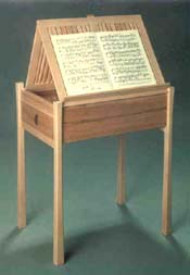 |
|||||||||||||||||||||||||||||||
James
Krenov - Maple Music Stand |
||||||||||||||||||||||||||||||||
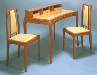 |
||||||||||||||||||||||||||||||||
William
Walker - Bubinga, Pearwood Desk and Chairs |
||||||||||||||||||||||||||||||||
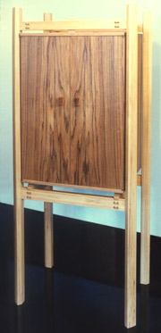 |
||||||||||||||||||||||||||||||||
James Krenov - Red Oak and Pecan Cabinet |
||||||||||||||||||||||||||||||||
 |
||||||||||||||||||||||||||||||||
William
Walker - Doussie and Pecan Breakfast Table and Chairs
|
||||||||||||||||||||||||||||||||
 |
||||||||||||||||||||||||||||||||
William
Walker - Swedish Ash Cabinet |
||||||||||||||||||||||||||||||||
| The
Furniture of Wendy Stayman - 1987 |
The
Furniture of Wendy Stayman - 1987 NOTES: The shift in 1987 from theme shows to exclusive shows was prompted not only by the maturation of the work, but also by the fact that a group of collectors had finally evolved. Wendy Stayman was one of the makers who had developed a mature design style and who had the ability to produce a number of pieces for a featured show. Carcase building is time-intensive work. It's interesting that five of the seven pieces in Stayman's show included case pieces. The announcement piece is actually a precursor to the High Chest or Chiffonier shown in the exhibit. Both have a reserve reminiscent of the Federal period's reaction to European court furniture. The allure of Stayman's chest comes from her careful use of a contrasting wood color for edge-beading and her distinct personal direction in creating jewelry-like pulls. The strength of the Chiffonier is its careful balance between restrained form and delightful detailing. Also reminiscent of neoclassical work, the pair of Henson end tables combines subtle and elegant form with just enough detailing. The second large case piece has a more Deco-like appearance and is a tour-de-force of router-created pattern work. Stayman laminated two distinctly different maple veneer patterns onto a stable board, and then routed through the top veneer at intervals to reveal the second pattern underneath. The effect is like a moiré or double-weave. The doors open from the ebony pull that runs top to bottom and adds an architectural force to the piece. These were two of the most exciting case pieces shown at Pritam & Eames to date. Stayman's Tineo sideboard was also quite architectural in nature, but relied more on defining the tension of space and volume than on finesse of detailing. The oak, holly, and marble bedside cabinets were satisfying pieces because of their spare but, once again, "just right" detailing. Like the Chiffonier, they utilized a tassel pull. The marble tops are a fitting capital for the tables, which otherwise might seem severe. The last case piece was the Kimono Cabinet. It relied again upon exquisite decorative detailing. The two central macassar ebony doors provide a background for a tapered column of falling snow accumulating, as it were, at the bottom. This last illusion was created by the use of an eggshell lacquer technique that Stayman knew from her training in museum conservation. In this technique, tiny pieces of eggshell are pieced together to create a pattern which is then lacquered over to create a stable surface. The title Kimono Cabinet derived from the form given to the piece by the two smaller appended side cabinets. Rounding out the show was a table and stool, and two-seater bench. The maple and holly table, with its small single drawer and stool (not shown), could function as a small vanity. Stayman once again defined her style through subtle detailing. The drawer front with its round silver pull created an image of the moon in a cloudy streaked sky. The slightly canted legs give the table an architectural presence and here again, she has created tension between strong form and elegant trimming. Lastly, the two-seater bench, which works well in a foyer or bedroom, is perhaps her best known and most often sold furniture piece. |
|||||||||||||||||||||||||||||||
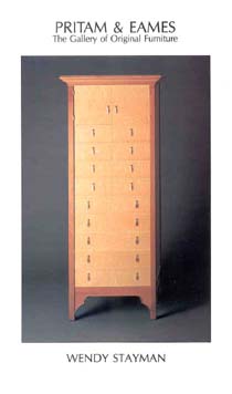 |
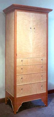 |
|||||||||||||||||||||||||||||||
Wendy Stayman - Maple
and Pearwood Chiffonier |
||||||||||||||||||||||||||||||||
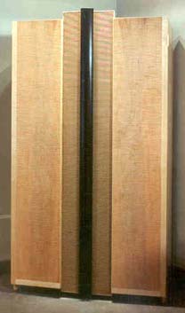 |
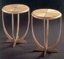 |
|||||||||||||||||||||||||||||||
Wendy Stayman - Maple
and Ebony Henson End Tables |
||||||||||||||||||||||||||||||||
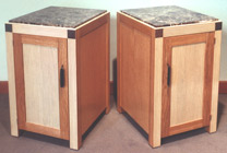 |
||||||||||||||||||||||||||||||||
Wendy Stayman - Maple and Ebony Armoire |
Wendy Stayman - Oak,
Holly and Marble Bedside Cabinets |
|||||||||||||||||||||||||||||||
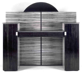 |
||||||||||||||||||||||||||||||||
Wendy Stayman - Tineo Sideboard |
||||||||||||||||||||||||||||||||
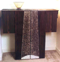 |
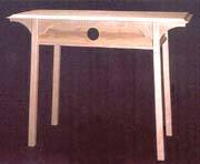 |
|||||||||||||||||||||||||||||||
Wendy Stayman - Bleached Maple and Holly Table |
||||||||||||||||||||||||||||||||
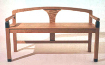 |
||||||||||||||||||||||||||||||||
Wendy Stayman - Ebony
and Egg Shell Lacquer Kimono Cabinet |
Wendy Stayman - Cherry Bench |
|||||||||||||||||||||||||||||||
| The
Furniture Art of Judy Kensley McKie - 1987 |
The
Furniture Art of Judy Kensley McKie - 1987
|
|||||||||||||||||||||||||||||||
 |
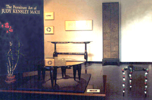 |
|||||||||||||||||||||||||||||||
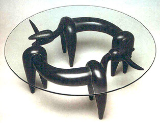 |
||||||||||||||||||||||||||||||||
Judy McKie - Bronze and Glass
"Chase Table" |
||||||||||||||||||||||||||||||||
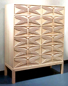 |
||||||||||||||||||||||||||||||||
Judy McKie - Limewood "Dragonfly Cabinet" |
||||||||||||||||||||||||||||||||
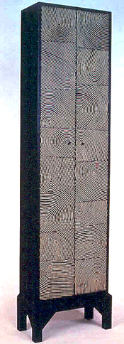 |
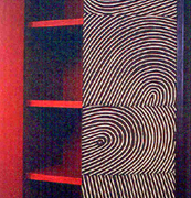 |
|||||||||||||||||||||||||||||||
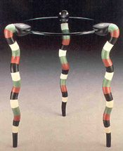 |
||||||||||||||||||||||||||||||||
Judy McKie - Limewood
"Thumbprint Cabinet" |
Judy McKie - Painted
Maple "Snake Table" |
|||||||||||||||||||||||||||||||
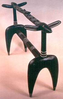 |
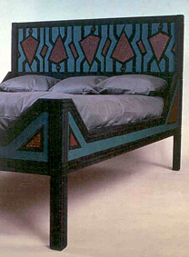 |
|||||||||||||||||||||||||||||||
Judy McKie - Ebonized Mahogany "Gazelle Table" (without Glass Top) |
Judy McKie - Pine
Turtle Bed |
|||||||||||||||||||||||||||||||
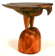 |
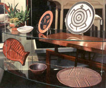 |
|||||||||||||||||||||||||||||||
Judy McKie - Mahogany Bird Table |
Judy McKie - Ceramics |
|||||||||||||||||||||||||||||||
| It has been said that McKie is a modernist, working within a long tradition of animal imagery usage in furniture, such as the ball and claw foot. However, her work has more in common with the spirit-imbued carving of African and Eskimo cultures and other animist traditions. McKie says this is the work that inspires her. She describes her first experience of working with animal form as coming from a state akin to daydreaming, where the mind is drifting and freely associating. She also says that at the time, she was reacting against the strict rectilangularity of '60s furniture. The painted maple Snake Table was one of the most poplar pieces in the show. Despite its simple dancer-like appearance, it was deceptively difficult to make in wood. In this show, as in most of her one-person shows at P&E, McKie liked to stretch her thinking by including work in media other than wood and bronze: in this case, it was ceramics. Her bowls and plates had the double benefit of allowing her to percolate creatively and also to produce objects that could reach a wider audience. |
||||||||||||||||||||||||||||||||
| Colette
- 1987 |
Colette
- 1987 |
|||||||||||||||||||||||||||||||
 |
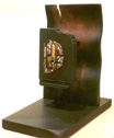 |
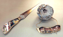 |
||||||||||||||||||||||||||||||
Colette - Pin
on Stand |
Colette - Letter
Opener and Necklace |
|||||||||||||||||||||||||||||||
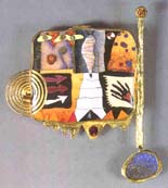 |
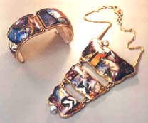 |
|||||||||||||||||||||||||||||||
Colette - "Pictogram#17,
Elegy Series" 22K and 24K Gold, Cloisonne |
Cuff
and Pendant Necklace |
|||||||||||||||||||||||||||||||
| The
Furniture of Bruce Volz - 1987 |
The
Furniture of Bruce Volz - 1987 NOTES: The bed, table, and boudoir chair reflected a direction in Bruce Volz's work toward an elegant Egyptian-inspired decorative style. The use of a white field with dyed veneer gave this group of pieces its distinctive feel. The dresser's swelled front got added tension from its pink spikes of dyed veneer. The rose-colored Italian marble top took the piece in its own exuberant direction. This body of work set the second high water mark of Volz's work in studio furniture. |
|||||||||||||||||||||||||||||||
 |
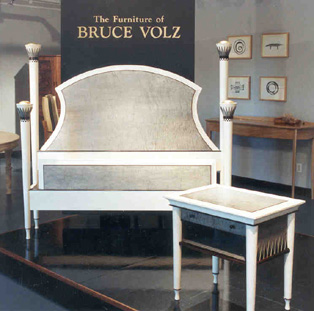 |
|||||||||||||||||||||||||||||||
Bruce Volz - Bed and Table in Maple, Ebony, Analine Dye, Gold Leaf |
||||||||||||||||||||||||||||||||
 |
 |
|||||||||||||||||||||||||||||||
Bruce Volz - Arm
Chair and Handmade Paper, Marble,
Italian Marble, Gold Leaf, Japanese Paper Torchere |
Bruce Volz - Dyed
Maple and Italian Marble Sideboard/Dresser
|
|||||||||||||||||||||||||||||||
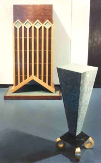 |
||||||||||||||||||||||||||||||||
Bruce Volz - Walnut
Burl, Satinwood, Pearwood, Handmade Paper Tall Cabinet and Marble, Japanese Paper, Gold Leaf Torchere |
||||||||||||||||||||||||||||||||
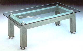 |
||||||||||||||||||||||||||||||||
Bruce Volz - Dyed
Bird's-Eye Maple, Ebony, Anodized Aluminum and U-joints Coffee Table |
||||||||||||||||||||||||||||||||
| Early
Winter/New Work - 1987 |
Early
Winter/New Work - 1987 Dale Broholm, John Dunnigan, Hank Gilpin, Thomas Hucker, Ben Mack, Kristina Madsen, Richard Scott Newman, Jamie Robertson, James Schriber, Peter Superti, Lee Trench, Geoff Warner, Rick Wrigley. NOTES: This show had an unfortunate burden to carry in that its opening coincided with the stock market crash of 1987. The partners thought the exhibit might be doomed: "Will anyone want to think about studio furniture?" But they did. In fact, the announcement piece, James Schriber's Sleigh Bed, sold the day after the crash. Schriber's piece itself reflects the classic sleigh bed form for a single bed, though it does impart a contemporary feel. This delightful update concentrated on the beautiful curves inherent in the form, with a Deco-style molding in ebonized wood for dramatic contrast against the cherry. The strength of Hank Gilpin's refined curly maple chest came from its beautifully figured, sequentially cut, solid-wood drawer fronts and side panels. The high stance of the legs, plus the low overall height of this five drawer chest, made this an unusual piece. It was reminiscent of a dresser, but too high to be called one. |
|||||||||||||||||||||||||||||||
 |
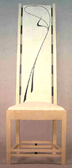 |
|||||||||||||||||||||||||||||||
 |
||||||||||||||||||||||||||||||||
James
Schriber - Cherry and Ebony Sleigh Bed |
Jamie
Robertson - Maple and Linen Chair |
|||||||||||||||||||||||||||||||
 |
 |
|||||||||||||||||||||||||||||||
Hank
Gilpin - Curly Maple and Rosewood Chest of Drawers |
Kristina
Madsen - Wenge, Ebony and Obsidian Cabinet on Stand |
In Kristina Madsen's Chest on Stand, the deep resonant colors of the wenge dramatized the patterned texture that she explored in the cabinet's front and side panels. This was her most complex piece to date, in which she created patterns by resawing. After this piece, Madsen turned her attention to South Pacific carving techniques, gradually bringing them into her pattern work. This chest, therefore, marks an important transition in her work, and was included in the 2003-4 MFA Boston show, The Maker's Hand - American Studio Furniture, 1940-1990. | ||||||||||||||||||||||||||||||
| Commissions - 1987 | ||||||||||||||||||||||||||||||||
 |
||||||||||||||||||||||||||||||||
Richard
Scott Newman - Maple and Ebony Table with Drawer |
||||||||||||||||||||||||||||||||
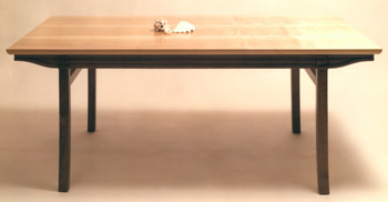 |
||||||||||||||||||||||||||||||||
George Gordon - Pearwood and Maple Desk |
||||||||||||||||||||||||||||||||
| 1 9 8 8 | ||||||||||||||||||||||||||||||||
| Early
Spring Show - 1988 |
Early
Spring Show - 1988 David Ebner, Therese Edson, George Gordon, Robert Hannan, Thomas Hucker, Judy Kensley McKie, Richard Scott Newman, Alan Olson, Rosanne Somerson, Lee Trench, William Walker, Geoffrey Warner, Stephen Whitney. Also, work from Alphonse Mattia, James Krenov, Wendy Maruyama NOTES: Therese Edson and Alan Olson, a Colorado couple, entered the furniture movement by painting and repainting found furniture. Their attitude toward furniture was casual and although their decorative painting was accomplished, the integrity of the underlying furniture was potluck. David Ebner's king-size bed featured white oak and oak veneer cut into a sunburst pattern on the foot and headboards. Its allusion to Japanese architectural style gave it strength and you could even say serenity, while the sunburst pattern offered a nice greeting to the beginning of each day. From George Gordon came a walnut bench with woven leather upholstery. Although Gordon's body of work was not extensive, this piece related well to his ample cabinets and rocking chair. In all of these pieces, Gordon developed a language of simple curves that defined the forms as his own. Garry Bennett's Judy table marked a rare appearance of his work at Pritam & Eames. Its title and use of bronze referred to McKie's involvement in bronze casting, which he had mentored, the year before. Bob Hannan took up Colorcore to render the stylized folksy graphics of his pieces. He combined simple whimsy with a Calagari distortion of perspective to create his own niche in studio furniture. |
|||||||||||||||||||||||||||||||
 |
 |
 |
||||||||||||||||||||||||||||||
Therese
Edson and Alan Olson - Wood, Acrylic, Gold Leaf, Neon, Brass "Temple" |
Therese
Edson and Alan Olson - Styrene, Acrylic, Gold Leaf, Neon "Unexploded
Box" |
|||||||||||||||||||||||||||||||
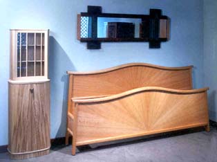 |
||||||||||||||||||||||||||||||||
David
Finck - Ash Cabinet, David Ebner - Oak Bed, Peter Superti - Aframosia, Anigre and Steel Mirror |
||||||||||||||||||||||||||||||||
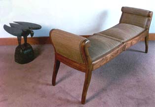 |
 |
|||||||||||||||||||||||||||||||
Judy
McKie - Ebonized Mahogany Bird Table; George Gordon - Walnut Upholstered Bench |
Garry
Knox Bennett - Bronze and Corian "Judy" Table |
|||||||||||||||||||||||||||||||
Bob
Hannan - Colorcore and Walnut Blanket Chest |
||||||||||||||||||||||||||||||||
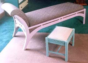 |
||||||||||||||||||||||||||||||||
Lee
Trench - Painted Maple Day Bed and Basswood Stool |
||||||||||||||||||||||||||||||||
| Other
New Work - Spring, 1988 |
Other
New Work - Spring, 1988 NOTES: Other makers contributing work that spring included Alphonse Mattia, Wendy Maruyama, and James Krenov. Mattia's piece was called Chair O'Drawers and could be considered an extension of his valet series. It was also a witty allusion to Jere Osgood's l972 Chest of Chair (see Michael Stone, Contemporary Woodworkers, Peregrine Press, p. 155), illustrating that the history of studio furniture was already sufficiently established so as to provide its own internal references. Wendy Maruyama's Urban Amazon hat rack is nominally functional, while providing the opportunity for her to design a piece around the painted sculptural forms that interested her at the time. James Krenov's piece, a departure for him, could best be called a cabinet on table as opposed to a cabinet on stand. This piece is relatively large within the Krenov body of work: 61"H x 34"W x 21"D. The spectacular western maple panels are distinguished by the subtlety of the Japanese oak. This is one of his cabinets where the convex door panels fly free of the outside framing. |
|||||||||||||||||||||||||||||||
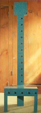 |
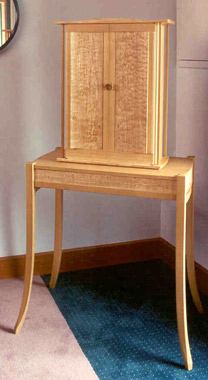 |
|||||||||||||||||||||||||||||||
Alphonse
Mattia - Chair O' Drawers |
James
Krenov - Western Maple and Japanese Oak |
|||||||||||||||||||||||||||||||
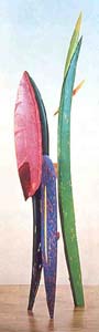 |
||||||||||||||||||||||||||||||||
Wendy
Maruyama - Jelutong "Urban Amazon" Hat Rack
|
||||||||||||||||||||||||||||||||
| The Furniture of John Dodd and Ben Mack - 1988 | 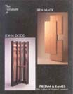 |
The Furniture
of John Dodd and Ben Mack - 1988 |
||||||||||||||||||||||||||||||
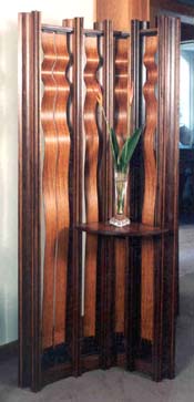 |
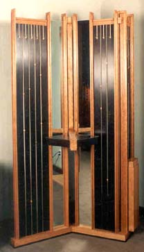 |
|||||||||||||||||||||||||||||||
John
Dodd - Beeswing Nara, Walnut Room Divider |
John
Dodd - Cherry, Ebony, Maple Room Divider |
|||||||||||||||||||||||||||||||
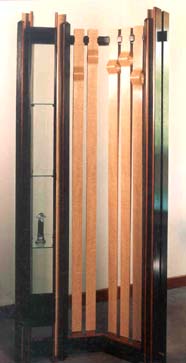 |
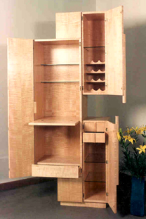 |
|||||||||||||||||||||||||||||||
John
Dodd - Ash, Machich, Anigre Room Divider |
Ben
Mack - Maple Entertainment Center |
|||||||||||||||||||||||||||||||
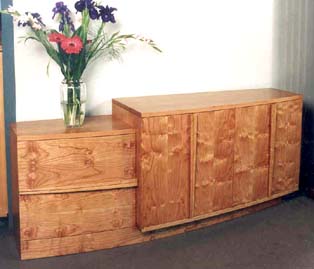 |
||||||||||||||||||||||||||||||||
Ben Mack - Cherry, Cherry Cluster Burl Credenza/Dresser |
||||||||||||||||||||||||||||||||
| Mack's second large case piece, a cherry dresser, was similarly structured, but as with the media cabinet, across a horizontal plane. Rather than the tension of suspended blocks as captured in the media cabinet, this cabinet's tension comes from two sections of a bowed front curve that combined a two-drawer section on the left and a series of storage shelves on the right. | ||||||||||||||||||||||||||||||||
| Functional
& Decorative Holloware - 1988 |
Functional
& Decorative Holloware - 1988 Michael Banner, Ken Carlson, Chunghi Choo, Mardi-Jo Cohen, Charles Crowley, Robert Davis, Pat Flynn, Skip Gaynard, Robly Glover Jr., John Horn, Marvin Jensen, Jim Kelso, Thomas Markusen, Kurt Matzdorf, Thomas Muir, Robyn Nichols, Tom Odell, Janet Prip, John Michael Route, Michel Royston, Claire Sanford, Nancy Slagle, Randy Stromsoe, Leonard Urso. NOTES: This seminal show planted the seeds for future metal exhibitions, whether holloware, jewelry, or flatware. Eleni Prieston's knowledge of metalsmithing techniques, as well as her connections through the studio jewelry field, provided the qualifications to select work. She was aware of an undercurrent of American artisans, mostly associated with universities, who were pushing boundaries in metalwork. This was the first of six exhibits over a nine-year period in which the gallery focused on holloware with the hope of creating a small, but durable, audience for this discipline. In sterling silver, Tom Muir accomplished the seemingly impossible feat of creating a double-walled hollow bowl by raising and soldering two forged bowls, the exterior wall of which is animated by a series of repousse protrubences. Other notable work in the show included silver goblets with an Art Noveau flavor by Len Urso; cast bronze vases by Janet Prip, woven verdigris copper baskets by Ken Carlson, turned copper platters by Tom Markusen, lyrical silver serving pieces by Robyn Nichols, Marvin Jensen's mokume-gane (wood grain) vessels, Robley Glover's light-hearted fabricated copper tea pots, the highly stylized silver holloware of Kurt Matzdorf, and Charles Crowley's architectonic statements in precious and non-precious metals that incorporated vessel and stand. |
|||||||||||||||||||||||||||||||
 |
 |
|||||||||||||||||||||||||||||||
Robyn Nichols |
Tom
Muir - Silver and Nickel Double-wall Bowl |
|||||||||||||||||||||||||||||||
 |
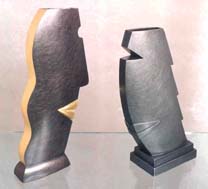 |
|||||||||||||||||||||||||||||||
Leonard
Urso - Silver Flower Goblets |
Janet
Prip - Pewter and Gold Face Vases |
|||||||||||||||||||||||||||||||
 |
 |
|||||||||||||||||||||||||||||||
Jim
Kelso - Silver, Gold, Wood Netsuki |
Tom
Odell - Raised Patinated Copper Vessels |
|||||||||||||||||||||||||||||||
 |
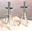 |
|||||||||||||||||||||||||||||||
Kurt
Matzdorf - Silver, Gold Vessels and Candleholders |
||||||||||||||||||||||||||||||||
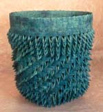 |
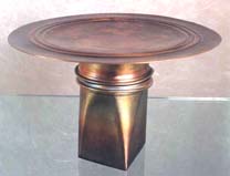 |
|||||||||||||||||||||||||||||||
Ken
Carlson - Woven Copper Porcupine Basket |
Thomas
Markusen - Copper Cake Plate |
|||||||||||||||||||||||||||||||
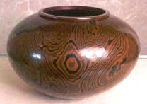 |
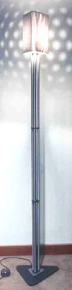 |
|||||||||||||||||||||||||||||||
Marvin
Jensen - Mokume Gane Vessel |
||||||||||||||||||||||||||||||||
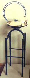 |
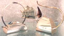 |
|||||||||||||||||||||||||||||||
Michael
and Maureen Banner - Silver Teapots |
||||||||||||||||||||||||||||||||
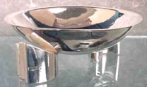 |
||||||||||||||||||||||||||||||||
Charles
Crowley - Silver Teapot and Painted Metal Stand |
Randy
Stromsoe - Silver Bowl on Stand |
Marvin
Jensen - Anodized Aluminum Floor Lamp |
||||||||||||||||||||||||||||||
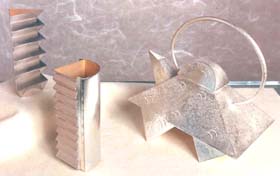 |
 |
|||||||||||||||||||||||||||||||
Nancy
Slagle - Silver Teapot and Vases
|
Robly
Glover - Patinated Brass Teapot |
|||||||||||||||||||||||||||||||
| Twelve
American Jewelers - 1988 |
Twelve
American Jewelers - 1988 Jamie Bennett, Colette, Robert Ebendorf, Vicki Eisenfeld, Lilly Fitzgerald, Mary Lee Hu, Jung-Hoo Kim, Tom Odell, Eugene & Hiroko Pijanowski, Vernon Reed, Alan Burton Thompson, Leonard Urso. NOTES: This first exhibit devoted to jewelry brought together an eclectic mix of studio goldsmiths whose work represented a range of jewelry techniques and styles. The show featured wearable work in metal by jewelers who had limited exposure but were prolific and well respected by their peers, whether through their university associations or their individually cultivated audiences. In addition to the California-based Colette's cloisonné enamel jewelry with its signature mystical references, the show also introduced the pioneering cybernetic, interactive work of Texas jeweler Vernon Reed. There is a feeling of a woven component to the jewelry of Eugene and Hiroko Pijanowski. Cranbrook-trained, the Pijanowskis also included mokume-gane or metal inlay techniques in their work. This show introduced their largely ceremonial neckpieces and cuffs that would turn the heads of all but the wearer. |
|||||||||||||||||||||||||||||||
 |
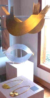 |
|||||||||||||||||||||||||||||||
Eugene
and Hiroko Pijanowski |
||||||||||||||||||||||||||||||||
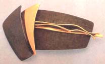 |
 |
|||||||||||||||||||||||||||||||
Tom
Odell - Gold and Textured Patinated Japanese Alloys Brooch |
Leonard
Urso - 18K Gold and Pearl "Figure" Brooch |
|||||||||||||||||||||||||||||||
 |
||||||||||||||||||||||||||||||||
Vicki
Eisenfeld - Woven Gold, Silver and Married Metals Neckpiece and Earrings |
||||||||||||||||||||||||||||||||
 |
 |
|||||||||||||||||||||||||||||||
Mary
Lee Hu - Woven Silver Neckpiece and Bracelet |
Robert
Ebendorf - Linoleum Bracelets |
|||||||||||||||||||||||||||||||
 |
 |
|||||||||||||||||||||||||||||||
Jamie
Bennett - Enamel, Silver, Gold Brooches |
||||||||||||||||||||||||||||||||
 |
||||||||||||||||||||||||||||||||
Vernon
Reed - Computerized Neck Piece |
Lilly
Fitzgerald - Brooch and Earrings |
|||||||||||||||||||||||||||||||
| The
Furniture Art of John Dunnigan - 1988 |
The Furniture
Art of John Dunnigan - 1988 Another striking seating piece was the Emerald or Cleavage Settee. This settee, like the pair of chairs just described, combined the simple curved form with surprising conclusions. The curved line from the arm to the foot is an unbroken one: on the inside, it has but a single transition. This form allowed Dunnigan to dramatize the piece with a tiny foot and tiny scrolled finials at the top of the arm. By giving himself this single transition, he created tension with the bloated junction at the point of the apron. By sacrificing a right-angle junction at the apron, he created much of the drama of the piece. In the upholstered volume of the settee, the most striking feature is the obvious cleavage in the middle of the back. Again, the curves here continue the curves of the front. The detail of a double canister on both sides of the couch gives the piece another moment of excess. Dunnigan's upholstered work is so voluptuous that his teacher, Tage Frid, would tease him about making furniture for bordellos. If you see Dunnigan's style as the enjoyment of slight decadence, then you understand his choice of French Deco linoleum for the top of the writing table, the rightness of the pink-ness of his vanity, and the splendid luxury of the upholstered tops under glass in the two side cabinets of his vanity suite. |
|||||||||||||||||||||||||||||||
 |
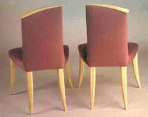 |
|||||||||||||||||||||||||||||||
John Dunnigan - Asymmetrical
Side Chairs |
||||||||||||||||||||||||||||||||
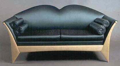 |
||||||||||||||||||||||||||||||||
John Dunnigan - Curly
Maple and Silk "Cleavage" Settee |
||||||||||||||||||||||||||||||||
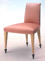 |
 |
|||||||||||||||||||||||||||||||
John Dunnigan - Maple,
Rosewood and Silk Chair |
||||||||||||||||||||||||||||||||
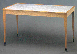 |
 |
|||||||||||||||||||||||||||||||
John Dunnigan - Bird's-eye
Maple, Rosewood, French Deco Linoleum Escritoire with Detail of Top |
||||||||||||||||||||||||||||||||
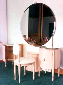 |
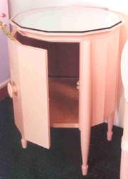 |
|||||||||||||||||||||||||||||||
John Dunnigan - Vanity |
||||||||||||||||||||||||||||||||
| Richard
Scott Newman: Masterwork - 1988 |
Richard
Scott Newman: Masterwork - 1988 Newman's mirror, combined with his hall or demilune tables, is a statement of reserved elegance. In contrast to the over-the-top quality of the cabinet, the leg treatments of his tables include vertical fluting edged with ebony and flat-faceted ebony faces separated by narrow flutes. Because of their exceptional length, the vertical thrust of these legs is as dramatic as their impossible slenderness. As supports they are rigid structure; the slimness is accomplished through a complicated internal structure including steel parts that Newman engineered. The legs end in a turned transition crowned by apron corner blocks embellished with starburst ormolu. |
|||||||||||||||||||||||||||||||
 |
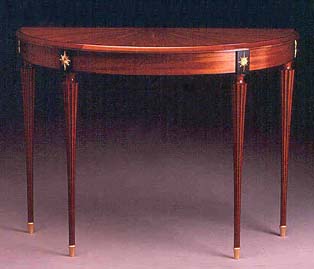 |
|||||||||||||||||||||||||||||||
Richard Newman - Mahogany,
Ebony and Vermeil Demilune |
||||||||||||||||||||||||||||||||
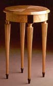 |
||||||||||||||||||||||||||||||||
Richard Newman - Curly
Maple and Ebony Side Table |
||||||||||||||||||||||||||||||||
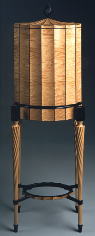 |
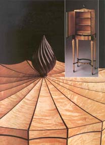 |
|||||||||||||||||||||||||||||||
Richard Newman - Figured
Maple and Gabon Ebony Fluted Cabinet |
||||||||||||||||||||||||||||||||
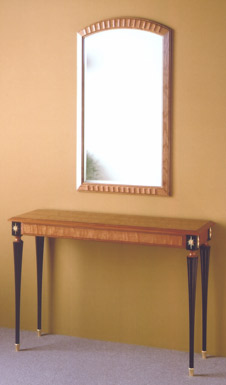 |
||||||||||||||||||||||||||||||||
 |
||||||||||||||||||||||||||||||||
Richard Newman - Walnut, Ebony and Gold-over-Bronze Umbrella Stand |
||||||||||||||||||||||||||||||||
Richard Newman - Cherry,
Ebony and Vermeil Hall Table and Cherry Mirror |
||||||||||||||||||||||||||||||||
| The mirror maintains the elegant simplicity of the tables. Newman's problem was finding glass fabricators willing to work to his standard of tolerances. Note how the diagonal corner in the glass, created by the beveled border, has to intersect exactly with the mitered corner of the frame. Absent from this show were other furniture forms Newman had done splendidly in the past, such as chairs, dining tables and writing tables. However, you must appreciate the total commitment of human resources by one of the field's finest makers that this fluted cabinet represents. |
||||||||||||||||||||||||||||||||
Two
Furnituremaker's Art: Kristina Madsen and Rosanne Somerson - 1988 |
Two
Furnituremakers' Art: Kristina Madsen and Rosanne Somerson - 1988 NOTES: Though Kristina Madsen trained at Leeds Design School and Rosanne Somerson at RISD, they had come to know each other and respect one another's work from past shows. The desire to exhibit together was mutual. Again, the two-maker show format reflected respect and consideration for the enormous financial burden that preparation for a one-person show demands, as well as consideration of how much original work a single maker can produce for one show. While it is one thing for a painter to come up with a series of original canvases, it is another matter altogether for a furniture maker to create a series of original pieces. The learning curve for a single piece can be daunting. Somerson's Tortoise Buffet, her announcement piece, included a number of design details that were current in her work at the time: the wavy shaped edge, the hanging medallion on the drawer, and the distressed or bleached treatment of hardwood. The buffet's faintly theatrical air is countered by Somerson's choice of neutral colors. Her largest piece in the show was a bloodwood trestle table with tulipwood details. Its straightforward function and quiet detailing make it more historically reflective than many of her other pieces. More in line with the direction of her work at the time was the cherry and ebony High Heeled Coffee Table, which had debuted earlier in a Workbench show in New York. This table had something to say and it was part of a developing trend of narrative in studio furniture. The show also contained pieces from Madsen's recent past, as well as those leading in new directions. You can visualize her pau amarello and ebony extension dining table in the context of a Deco-inspired boardroom: when you look at the chair, you can almost see the Chrysler building. The Tasmanian myrtle bench, which she completed during an artist's residency in Tasmania, is another piece in which she explored patterns derived from router-cutting, re-sawing, and realignment. The flared and canted ends of the bench ground it and impart a graceful attitude. This bench is a precursor to her South Pacific-inspired shallow relief carved work. Madsen's pau amarello dressing screen has a delicacy and warmth that is further enhanced by her fine linen crochet, a detail made possible by the needlework skills she learned in childhood. The crochet demonstrates her fascination with pattern. The carved stepped footing detail on the dressing screen reappears in her wenge daybed with re-sawn and realigned patterns in its detail work. Note the tassels on the silk canister cushions, and the use of feathers plucked from chickens on her mother's farm. Madsen's maple and huon pine side table also draws on re-sawn and realigned work to create patterns, this time highlighted with blue acrylic. |
|||||||||||||||||||||||||||||||
 |
||||||||||||||||||||||||||||||||
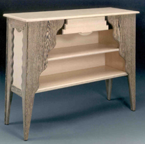 |
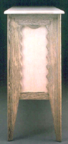 |
|||||||||||||||||||||||||||||||
Rosanne Somerson
- Granadillo, Wenge and Blistered Maple "Tortoise Buffet" |
||||||||||||||||||||||||||||||||
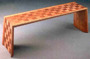 |
||||||||||||||||||||||||||||||||
Kristina Madsen
- Tasmanian Myrtle Bench |
||||||||||||||||||||||||||||||||
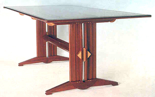 |
||||||||||||||||||||||||||||||||
Rosanne Somerson
- Bloodwood and Tulipwood Trestle Table |
||||||||||||||||||||||||||||||||
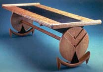 |
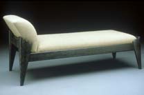 |
|||||||||||||||||||||||||||||||
Rosanne Somerson
- Cherry and Ebony "High-Heeled Coffee Table" |
Rosanne Somerson
- Black and White Reading Couch |
|||||||||||||||||||||||||||||||
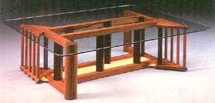 |
||||||||||||||||||||||||||||||||
Rosanne Somerson - Grenadillo, Wenge, Blistered Bird's-Eye Maple, Glass ZigZag Coffee Table |
||||||||||||||||||||||||||||||||
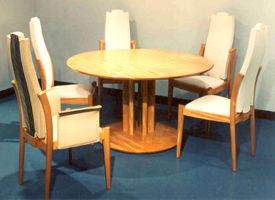 |
||||||||||||||||||||||||||||||||
Kristina Madsen
- Pau Amarello and Ebony Dining Table |
||||||||||||||||||||||||||||||||
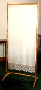 |
|
|||||||||||||||||||||||||||||||
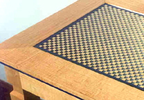 |
||||||||||||||||||||||||||||||||
Kristina Madsen - Detail of Huon Pine and Acrylic Side Table |
||||||||||||||||||||||||||||||||
Kristina Madsen
- Pau Amarello and Linen Dressing Screen |
||||||||||||||||||||||||||||||||
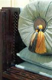 |
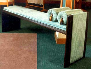 |
|||||||||||||||||||||||||||||||
Kristina Madsen
- Wenge and Silk Moire Bench |
||||||||||||||||||||||||||||||||
| New
Work - November 1988 |
1988
- New Work David Ebner, Therese Edson, Hank Gilpin, George Gordon, Thomas Hucker, Alan Olson, Joe Tracy, Bruce Volz, Geoff Warner, Rick Wrigley. NOTES: The inclusion of work in this show by David Ebner and Hank Gilpin should be noted. Anyone perusing the Archives could not help but notice the impact that work by these two makers had for the gallery. Particularly in the growth period of the 1980s, the accessibility of Ebner and Gilpin's work, as well as the price level, allowed for broad client participation in studio furniture. They had true importance in sustaining the gallery as it evolved a long-term, serious market. David Ebner's work in this show included his tradition-referenced gateleg table and ladderback chairs,which he had been making throughout the 1980s, as well as a new chair design that he called his Biedermeier chair. This dining chair has its rear leg and back formed from a single sweeping saber curve. The back itself is fashioned from three posts resembling columns topped by capitals, a design feature of the Biedermeier movement. The strength of the apron joinery and the heft of the legs allow for a clean and contemporary chair constructed without the use of stretchers. Hank Gilpin's side tables were a design he had introduced two years earlier and had re-made numerous times with various woods. Here he used figured maple with spalting that gives them a calligraphic character. The signature of these tables is the four-sided, double stretcher bottom. Tom Hucker's circular library table in Carpathian elm burl and beefwood was another high-concept piece. Its circular top flows out of the apron into a tri-structured base. Not only are there three supports for the top, but each support is a small stand with three posts. The combination of the circle with the triangle is one of the oldest graphic tensions and one that recurs in Hucker's thinking. Hucker often begins a piece by considering the energy of combining opposites. We have already seen the combinations of transparency versus solid in his furniture. In 1989, he would combine mass and weightlessness in his Boston MFA piece for the New American Furniture show. |
|||||||||||||||||||||||||||||||
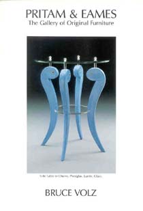 |
 |
|||||||||||||||||||||||||||||||
Thomas
Hucker - Carpathian Elm Burl and Beefwood Library Table |
||||||||||||||||||||||||||||||||
 |
||||||||||||||||||||||||||||||||
David
Ebner - Cherry Gateleg Table and Ladderback Chairs |
||||||||||||||||||||||||||||||||
 |
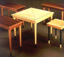 |
|||||||||||||||||||||||||||||||
Hank
Gilpin - Figured Maple Side Tables |
Rick
Wrigley - Gatehouse Production Tables |
|||||||||||||||||||||||||||||||
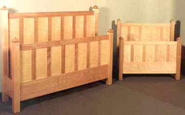 |
||||||||||||||||||||||||||||||||
Rick
Wrigley - Maple and Pearwood Queen and Twin Beds |
||||||||||||||||||||||||||||||||
| Commissions - 1988 | ||||||||||||||||||||||||||||||||
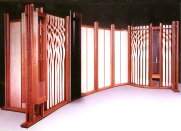 |
||||||||||||||||||||||||||||||||
John
Dodd - Room Divider and Display Cases in Curly Moave, Cherry and Oak |
||||||||||||||||||||||||||||||||
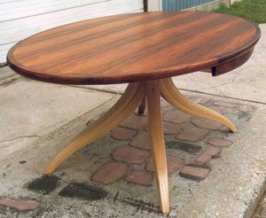 |
||||||||||||||||||||||||||||||||
Jere
Osgood - Brazilian Rosewood and Ash Conference Table |
||||||||||||||||||||||||||||||||
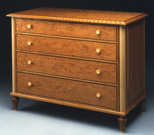 |
||||||||||||||||||||||||||||||||
Richard Scott Newman - Cherry, Maple and Ebony Chest of Drawers |
||||||||||||||||||||||||||||||||
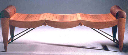 |
||||||||||||||||||||||||||||||||
James
Schriber - Lacewood and Leather Bench |
||||||||||||||||||||||||||||||||
| 1 9 8 9 | ||||||||||||||||||||||||||||||||
| Early
Spring Show - 1989 |
Early
Spring Show - 1989 Garry Knox Bennett, Timothy Coleman, David Ebner, Kenton Hall, Michelle Holzapfel, Todd Hoyer, Thomas Hucker, Silas Kopf, James Krenov, Don Krawczyk, Richard Scott Newman, Stephen Pemberton, Ron Puckett, James Schriber, Peter Spadone, Lee Trench, William Walker, Geoff Warner, Dick Wickman, Jonathan Wright, Rick Wrigley, Stewart Wurtz. NOTES: The is the first announcement designed by Diana Zadarla, a graphic designer trained at the Pratt Institute who joined P&E in 1989. She established a signature style for the gallery's printed materials that fit like a glove with the owners' approach. Previously she was senior art director of licensed products for Henson Associates (Muppets) in New York. Coincidentally, the late Jim Henson had a collection of studio furniture that included work by Judy McKie and Wendy Stayman. The mirror by Steve Pemberton used on the announcement seemed to sum up the surface decoration and use of neoclassical references of the period. James Schriber's dining table was also classically referenced in its form, but instead of complex veneer-decorated surfaces, he gave this solid wood extension table a contemporary simplicity that emphasized its elegant form as well as the beauty of the bubinga. David Ebner's green painted version of his Biedermeier chair took his by now popular chair form toward surface decoration with its paint and silver leaf. In contrast, his walnut and elm burl tea table was more connected to the central themes in his work over the years. James Krenov's two pieces continued his exploration of the small cabinet, with wood as his muse. The oak and teak cabinet, is a case on stand with the legs continuing up the sides like an armature. He said later that he initially continued those lines into a crest over the top but finally dismissed this resolution. What remains is an embrasure of the cabinet that is a metaphor for the opening seed jacket revealing the substance within. It is a true expression of Krenov's philosophy to see the piece through the material and follow that inspiration wherever it leads during the making. The beautifully figured oak doors are handsomely set off by the contrasting teak frame. The second cabinet, in yaca-wood and mahogany, combines two themes established in his earlier cabinets: the first is the flow of the leg into the vertical stile ending in a protruding horn-like finial (this goes back to his 1983 yaca-wood cabinet); the second is the walk-about that was introduced in the gallery in 1986. Bill Walker's square low table, like James Schriber's dining table, was made entirely of solid sections in a design form where one would expect the use of veneer: a top framed on four sides is normally a veneered construction. Walker's design solution for the expansion of a solid top within a frame was to leave the top split diagonally down the middle and to join these two halves with patinated steel tenons, thereby giving the piece an interesting material dimension as well as an unusual design feature. It was a fresh take on a low table, unfortunately one not repeated. Don Krawczyk's contribution of a side table, two chairs, and a cupboard, continued his contemporary folk vernacular. Tom Hucker's walnut low table is a study in volumes. It is not a particularly large table, but its form suggests a massive weight suspended above a platform base. The massive top, however, is a veneered hollow form. The volume of the base supports the illusion of weight. With the energy of the two volumes and the effect of their proximity, Hucker again provokes the intellect. Rick Wrigley's bed was part of a series based on simple rectilinear parquetry patterns. Because of their clean lines and contemporary feel, these beds were successful designs. The Azalea Cabinet from Silas Kopf was another excellent example of his floral naturalism created through marquetry. The jarrah field provides a richly colored background for the pale azalea blossoms. Michelle Holzapfel's Oak Leaf Bowl is another strong example of naturalistic form. The carving does not completely surround the top, allowing the natural organic breaks in the burl material a chance to make their own statement. The Ron Puckett armoire was wonderfully detailed. It is unusual to have a cabinet of this scale to exhibit because of the amount of time it takes to make such a piece. It was even more unusual that a second piece of this scale arrived later in the year, an armoire by Spadone-Rieger. |
|||||||||||||||||||||||||||||||
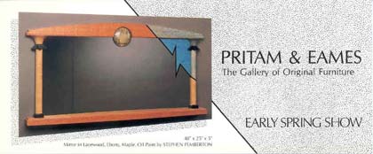 |
||||||||||||||||||||||||||||||||
Stephen
Pemberton - Lacewood, Ebony, Maple, Oil Paint Mirror |
||||||||||||||||||||||||||||||||
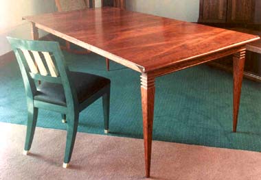 |
||||||||||||||||||||||||||||||||
David
Ebner - Painted Side Chair with Silver Leaf; James Schriber - Bubinga Dining Room Extension Table |
||||||||||||||||||||||||||||||||
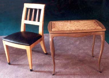 |
||||||||||||||||||||||||||||||||
David
Ebner - Maple and Wenge Chair, Walnut Elm Burl Tea Table |
||||||||||||||||||||||||||||||||
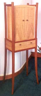 |
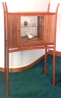 |
|||||||||||||||||||||||||||||||
James
Krenov - Oak and Teak Cabinet |
James
Krenov - Yaca-wood, Mahogany and Glass Cabinet |
|||||||||||||||||||||||||||||||
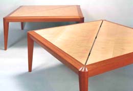 |
||||||||||||||||||||||||||||||||
William
Walker - Mahogany and Swedish Maple Low Tables |
||||||||||||||||||||||||||||||||
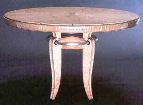 |
||||||||||||||||||||||||||||||||
James
Schriber - Maple, Ebony and Silver Dining Table |
||||||||||||||||||||||||||||||||
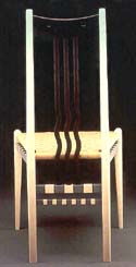 |
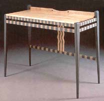 |
|||||||||||||||||||||||||||||||
Don
Krawczyk - Wenge, Maple, and Milk Painted Chair |
Don
Krawczyk - Side Table |
|||||||||||||||||||||||||||||||
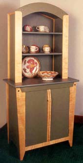 |
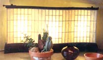 |
|||||||||||||||||||||||||||||||
Dick
Wickman - Lamp
|
||||||||||||||||||||||||||||||||
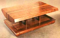 |
||||||||||||||||||||||||||||||||
Don
Krawczyk - Cupboard |
Thomas
Hucker - Walnut Coffee Table |
|||||||||||||||||||||||||||||||
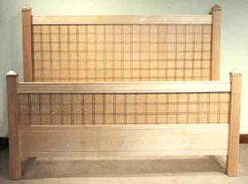 |
||||||||||||||||||||||||||||||||
Rick
Wrigley - Maple, Ebonized Pearwood Bed |
||||||||||||||||||||||||||||||||
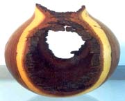 |
 |
|||||||||||||||||||||||||||||||
Todd
Hoyer - Mesquite Bowl |
||||||||||||||||||||||||||||||||
 |
||||||||||||||||||||||||||||||||
Michelle
Holzapfel - Cherry "Oak Leaf" Bowl |
Silas
Kopf - Jarrah and Ebony Azalea Cabinet |
|||||||||||||||||||||||||||||||
 |
||||||||||||||||||||||||||||||||
Thomas
Hucker - Beefwood and Bronze Low Table |
||||||||||||||||||||||||||||||||
 |
||||||||||||||||||||||||||||||||
Ron
Puckett - Bubinga and Wenge Armoire |
||||||||||||||||||||||||||||||||
| On
Board the Edna: EBONY - 1989 |
On
Board the Edna: EBONY - 1989 NOTES: The idea for this show was authored by Tim Philbrick, who acted as distributor for nearly 1,000 board feet of plantation-grown Macassar ebony. The ebony came from Indonesia on board the Edna, a friend's 90-foot steel-hulled schooner. Seven lots of ebony boards were sorted and distributed to John Dunnigan, Hank Gilpin, Richard Scott Newman, Timothy Philbrick, James Schriber, Rosanne Somerson, and Stephen Turino. The pieces in this exhibit were small, respecting the amount of material yielded by the ebony boards. Three pieces from this show broke new ground for their makers: Tim Philbrick's Vide Poche table; Hank Gilpin's 30-inch high, seven-drawer chest, and Richard Newman's eight-sided fluted container. If a single piece could speak for elegance, Philbrick's Vide Poche table certainly has to be a top candidate. The feeling of just-rightness in its proportions is unmistakable and, like a perfect chord in music, it sweeps through the mind and puts it at ease. The title of the table means the piece was designed for a gentleman to empty his pockets at the end of the day. Seeing this table in Macassar ebony, it is difficult to imagine it in any other material. The leg-to-apron design draws from ideas that were present in Philbrick's Pier Table in the opening show: the shaped but vertical leg with its slight knee at the junction with the apron. These ideas and proportions at this scale really works magic. Richard Newman's 16-fluted container runs the pattern of the ebony veneer through the break for the lidded top. At first glance, it is difficult to tell that a lid would be removed by pulling up on the satinwood finial. This leaves the flutes without distraction and gives their circular rhythm its full effect. How to resolve the vertical fluting into the compound curve of the top required solutions that only Newman's standard of craftsmanship could render. The unbroken ebony also dramatizes the spiral satinwood finial -- it might just as well be a flame. The language of the framing of Hank Gilpin's 30-inch high, seven-drawer chest is completely consistent with his chest of drawer work in the mid to late '80s. Because of the small size of the ebony boards, Gilpin decided almost as a novelty to reduce his chest work to this small size. Although reduced in height, Gilpin gives the form a narrow, square cross section that makes it appear tall once again. People fell in love with this piece and had to have it, even though most couldn't imagine what they would use it for. It was so well received that Gilpin went on to make it in a number of woods, including purpleheart and a combination of walnut with pepper oak. |
|||||||||||||||||||||||||||||||
 |
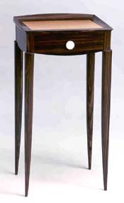 |
|||||||||||||||||||||||||||||||
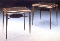 |
||||||||||||||||||||||||||||||||
Steve
Turino - Side Tables |
Timothy
Philbrick - Vide Poche |
|||||||||||||||||||||||||||||||
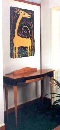 |
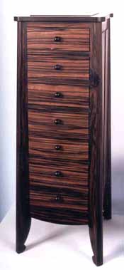 |
|||||||||||||||||||||||||||||||
James
Schriber - Desk, Judy McKie - Giraffe |
Hank
Gilpin - Seven Drawer Chest |
|||||||||||||||||||||||||||||||
 |
||||||||||||||||||||||||||||||||
Richard
Newman - Fluted Box |
||||||||||||||||||||||||||||||||
 |
 |
|||||||||||||||||||||||||||||||
Rosanne
Somerson - Tall Bowl |
John
Dunnigan - Side Table |
|||||||||||||||||||||||||||||||
| Rosanne Somerson's Tall Cup is the first time that she used split, reconstructed turning. She turns, removes a segment, and then reassembles the piece. The small turned leopardwood cup for jewelry is a motif that recurs in past jewelry cabinets as well as in future ones (see Somerson's jewelry cabinet in P&E's 1991 10 x 16 show). Some of her earlier earring cabinets used a half-turned cup that completes itself through reflection in the mirror. The next two shows in 1989 featured work by Michael Hurwitz and Judy McKie. Their exhibits at P&E preceded the Boston MFA's seminal show, New American Furniture, which opened later in the year. That museum show provided an official vetting of 26 furniture makers, many of whom had exhibited at P&E, and represented a climax to a decade of growing self-awareness on the part of makers and P&E that this work would come to be identified as "studio furniture." |
||||||||||||||||||||||||||||||||
| American
Work in Metal - 1989 |
American
Work in Metal - 1989 Michael and Maureen Banner, Garry Knox Bennett, Jamie Bennett, Jonathan Bonner, Ken Carlson, Mardi-Jo Cohen, Colette, Charles Crowley, Robert Davis, Vicki Eisenfeld, Lilly Fitzgerald, Pat Flynn, Skip Gaynard, Robly Glover, Carrie Harper, Bessie Jamieson, Jim Kelso, Robert Kulicke, Curtis LaFollette, Thomas Markusen, Kurt Matzdorf, Tom Muir, Tom Odell, Gene Michael Pijanowski, Hiroko Sato Pijanowski, Eleni Prieston, Janet Prip, Vernon Reed, Michel Royston, Nancy Slagle, Mark Stanitz, Leonard Urso. NOTES: P&E's commitment to metal as a medium deepened during these years, and the gallery featured major work like the weathervanes that Jonathan Bonner fabricated out of copper and granite. On a smaller scale were whimsical utensils by Mardi-Jo Cohen, fabricated out of silver and Colorcore, and Pat Flynn's refined ceremonial beakers in silver, gold, pewter, and lead. Academically trained metalsmiths including Mark Stanitz, Curtis LaFollette, and Tom Muir, seemed less concerned with function than with the exploration of technique as well as narrative content. One is left to wonder what story is being told by Mark Stanitz on his carved and fabricated silver box, or by Tom Muir with his sophisticated silver vessel. There is a sense that these highly imaginative metalsmiths are leaving something unsaid, and it is this aspect of their largely nonfunctional work that entices an exchange with the viewer. A counterpoint to that approach was the unabashedly wearable work of Eleni Prieston. Her 22-karat granulated jewelry is valuable and unapologetic in its purpose of serving the wearer. It accepts adornment as its essential role. It would not be until later in the 1990s that metal would be featured as furniture, with the work of David Secrest and Tom Joyce. |
|||||||||||||||||||||||||||||||
 |
 |
|||||||||||||||||||||||||||||||
 |
||||||||||||||||||||||||||||||||
Garry
Knox Bennett - Bronze and Corian Side Tables |
||||||||||||||||||||||||||||||||
 |
 |
|||||||||||||||||||||||||||||||
Mark
Stanitz - Sterling Silver Box |
Mark
Stanitz - Oxidized Silver, Gold, Enamel Brooch with Emerald |
|||||||||||||||||||||||||||||||
 |
 |
|||||||||||||||||||||||||||||||
Bessie
Jamieson - Gold Hollow Earrings |
Skip
Gaynard - Sterling Silver Flatware |
|||||||||||||||||||||||||||||||
 |
 |
|||||||||||||||||||||||||||||||
Robert
Davis - Sterling Silver, Brass and Copper Spoons |
Mardi-Jo
Cohen - Silver and Colorcore Cake Knife |
|||||||||||||||||||||||||||||||
 |
 |
 |
||||||||||||||||||||||||||||||
Eleni
Prieston - Pearl Earrings in 22K Gold; Opal Pendant with Granulated 22K
Bezel; Woven Silver Chain with Granulated 22K Gold Terminals |
||||||||||||||||||||||||||||||||
 |
|
|||||||||||||||||||||||||||||||
 |
||||||||||||||||||||||||||||||||
Pat Flynn - Beakers in Sterling Silver, 18K Gold, Steel and Lead |
||||||||||||||||||||||||||||||||
Tom
Muir - Silver Vessel |
||||||||||||||||||||||||||||||||
| Judy
Kensley McKie - 1989 |
Judy
Kensley McKie - 1989 NOTES: Judy McKie continued her investigation of bronze work in her second one-person show at Pritam & Eames. At the time, she was still making wood prototypes for bronze casting. Later, she would switch to signboard as the pattern material for the lost-wax castings. Of the two bronzes she created for the exhibit, the Panther Table was an impressive centerpiece. The two powerful predator forms combine to support its glass top. Each panther looks back over its shoulder while gripping one end of the glass top in its mouth. The other end is supported by the backward arching tails. With this aggressive action, the energy of the sculpture penetrates the glass and makes a direct connection between the top and the base. This connection was a breakthrough for McKie, she says. She designed the Lizard Column as a plant stand. Although a stand, McKie thought that it worked better with greenery around it, rather than on it. As such, it has totemic presence and functions beautifully as a quiet garden sculpture. It was carved in plaster and then cast in bronze. The edition size of the Lizard Column was 20, while the numbered edition of Panther Table was eight. McKie would continue to create numbered bronze editions of well-priced small-scale functional work such as bookshelves, doorknockers, and door pulls in future shows. There was a second stand in the show, this one in limewood with boldly painted figures of entwined snakes. The strong black lines on the white ground of the stand are dramatic. One of her two standing chests also uses this palette, the White Fish Chest. Here three black lines further emphasize the rigid horizontal and vertical. These lines also provide a framework for the very fluid pattern of fish, and the pattern continues from façade to façade as if we are looking into an aquarium. The second chest, the Black Fish Chest, was constructed and framed in the same manner but here the mobility of the fish pattern is communicated through straight incised lines. The incised lines are white on a black background and it is interesting to compare the darting energy of the black cabinet to the lazy meander of the white one. The Deer Table was one of the few small dining tables that McKie had shown at the gallery to date. Here the focus is on her ambitiously carved pedestal in darkened walnut and the way in which the glass rests on the ears, horns, and arched necks of the joined quartet of deer. |
|||||||||||||||||||||||||||||||
 |
 |
|||||||||||||||||||||||||||||||
Judy McKie - Bronze
Panther Table |
||||||||||||||||||||||||||||||||
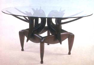 |
 |
|||||||||||||||||||||||||||||||
Judy McKie - Walnut
Deer Table |
Judy McKie - Lizard and Snake Stand |
|||||||||||||||||||||||||||||||
 |
||||||||||||||||||||||||||||||||
Judy McKie - Cast
Handmade Paper Leopard Triptych |
||||||||||||||||||||||||||||||||
 |
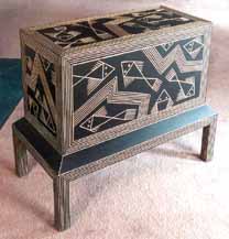 |
|||||||||||||||||||||||||||||||
Judy McKie - White
Fish Standing Chest |
Judy McKie - Limewood
Black Fish Chest |
|||||||||||||||||||||||||||||||
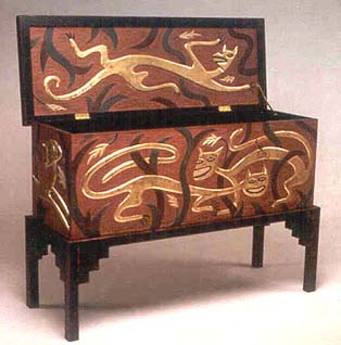 |
||||||||||||||||||||||||||||||||
Judy McKie - Leopard
Chest |
||||||||||||||||||||||||||||||||
Lastly, there is McKie's magnificent Leopard Chest, which appeared in this show slightly ahead of its twin's appearance in the 1989 MFA Boston New American Furniture show. McKie, along with twenty-five other studio furniture artists, had been invited to select a piece from the museum's historical collection and make something that replied to the antique. McKie chose a carved and painted chest made in 1927 by Charles Pendergast. She says that she was especially drawn to the playful, somewhat crude, quality of the Pendergast piece. Critics called Pendergast a "true primitive," and McKie probably would enjoy that description of her own style. The two Leopard Chests that she made stand as the first examples of McKie's experimentation with gold leafing. The leopards are set in bas-relief against a background of deep Pompeiian red and are intertwined with Rousseau-ian vegetation in even deeper tones of red and green. The two cast paper pieces in her P&E show had the same gold leaf/leopard motif as the chests. In fact, the cast paper pieces served as tests for the colors and design that she used on the chests' facades. |
||||||||||||||||||||||||||||||||
| Michael
Hurwitz - 1989 |
Michael
Hurwitz - 1989 The tall, floor-standing cabinet in Mexican and East Indian rosewood, and the two small wall hanging cabinets, presented a means for Hurwitz to experiment with texture and color through paint and distressed surfacing, using wood-burning and sand-blasting techniques. As an aside, Hurwitz became quite ill from the dust of the morado when working on the tall cabinet. He was forced to have someone else finish the piece and then had to clean up his shop while wearing a disposable jumpsuit and respirator. Later he had an additional reaction to the dust of the purpleheart tables, underlining the sometimes hidden threats that the furniture maker faces. The formal properties of his painted pieces were distinctly architectural and one thinks back to his earlier Child Chair and Brandy Vault. Here, again, you can see references to rooflines. The plant stand is part of the permanent collection at the Museum of Fine Arts, Rhode Island School of Design, Providence. |
|||||||||||||||||||||||||||||||
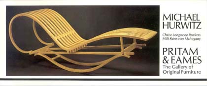 |
||||||||||||||||||||||||||||||||
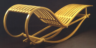 |
||||||||||||||||||||||||||||||||
Michael Hurwitz - Mahogany, Milk Paint Chaise Longue on Rockers |
||||||||||||||||||||||||||||||||
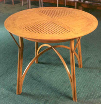 |
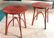 |
|||||||||||||||||||||||||||||||
Michael Hurwitz - Mahogany Tea Table |
Michael Hurwitz - Purpleheart Tables |
|||||||||||||||||||||||||||||||
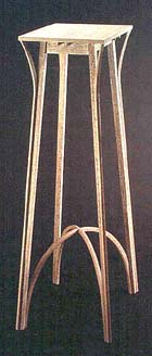 |
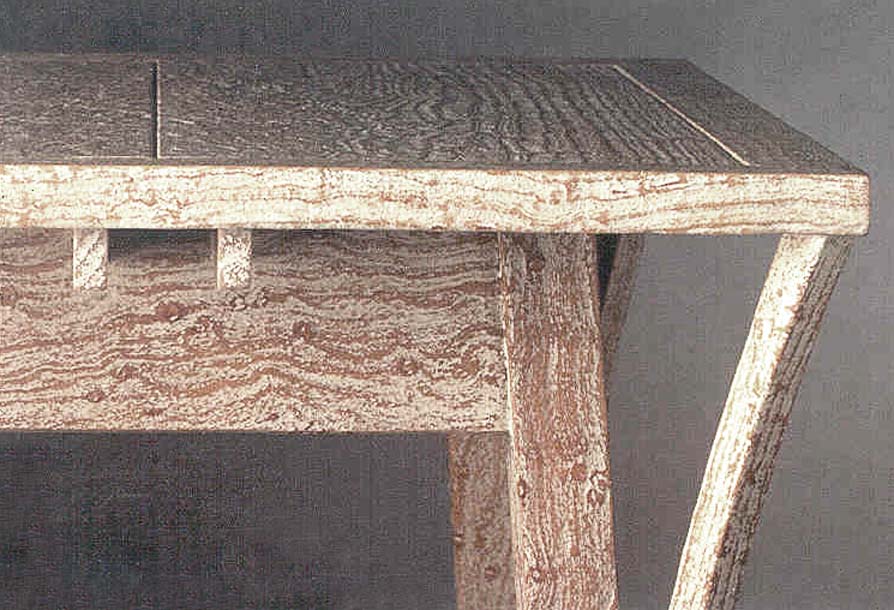 |
|||||||||||||||||||||||||||||||
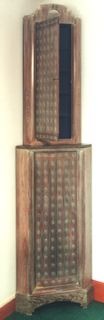 |
||||||||||||||||||||||||||||||||
Michael Hurwitz - Bird's-Eye Maple and Painted Plant Stand, overall and detail |
||||||||||||||||||||||||||||||||
 |
 |
|||||||||||||||||||||||||||||||
Michael Hurwitz - Painted Wall-Hung Cabinets |
Michael Hurwitz - Mexican and East Indian Rosewood Corner Cabinet |
|||||||||||||||||||||||||||||||
| IDCNY
- 1989 NOTES: Patricia Conway, author, teacher, and principal at Kohn, Pederson, Fox & Conway, an influential New York architectural firm, arranged space for Pritam & Eames to exhibit work at the International Design Center in New York (IDCNY) as part of the Center's promotional effort. The exhibit included a new desk by Jere Osgood, a James Schriber dining table, and ceramic and stone dining tables by Bennett Bean. Holloware and glass were also featured. |
||||||||||||||||||||||||||||||||
| New
Work - 1989 |
New
Work - 1989 John Dodd, John Dunnigan, David Ebner, Hank Gilpin, Kristina Madsen, Richard Scott Newman, Peter Pierobon, Timothy Philbrick, James Schriber, Spadone-Rieger, Lee Trench, Geoffrey Warner, Stewart Wurtz. NOTES: The work of Peter Pierobon and Brian Newell, two of the younger makers in this show, would evolve dramatically in the '90s. This was a rare showing of Pierobon's work at P&E. The pierced carving in the door panels distinguishes Brian Newell's simple, slender, wall-hung cabinet. The restless energy of the pattern recalls the controlled chaos of a Pollock painting. It is this artistic energy that Newell would harness as he continued to produce pieces of stunning virtuosity in later work. Kristina Madsen's window seat combines two of her interests: its simple arching form has a Shaker spareness that is often part of her work, and the seat provides the canvas for her continued exploration of pattern. The process in this piece involves inlay and fluting and is among the last that she would make before she began to explore Oceanic-inspired carved patterns. Jamie Robertson's Console with Running Dogs is a wonderful use of unusual materials to create with color. The pale blue of the harewood provides a surreal field for the stretched-out forms of the hounds. The Reiger-Spadone armoire is an unusual speculative venture because the function of an armoire is incorporated so often into built-in work. Stand-alone storage pieces are rare. Reiger-Spadone invest this armoire with a rich Deco appearance. The emulation of this style by studio furniture makers, which began in the early '80s, was in fact coming to the end of its cycle, although it would remain the decorative focus of Wendy Stayman in the early '90s. |
|||||||||||||||||||||||||||||||
 |
 |
|||||||||||||||||||||||||||||||
Peter
Pierobon - Ebonized Mahogany Totem Clocks |
||||||||||||||||||||||||||||||||
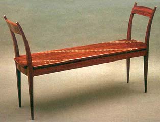 |
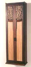 |
|||||||||||||||||||||||||||||||
Kristina
Madsen - Padauk and Maple Window Seat |
Brian
Newell - Pearwood and Cocobolo Wall-Hung Cabinet |
|||||||||||||||||||||||||||||||
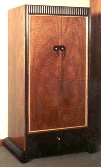 |
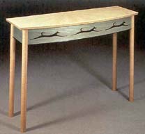 |
|||||||||||||||||||||||||||||||
Jamie
Robertson - Curly Sycamore, Ebony and Aniline Dye Table |
||||||||||||||||||||||||||||||||
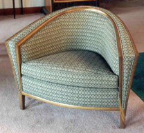 |
||||||||||||||||||||||||||||||||
Spadone-Rieger
- Mahogany, Ebony, Maple and Silver Amoire |
Spadone-Rieger
- Fumed Oak and Woven Wool Arm Chair |
|||||||||||||||||||||||||||||||
| Commissions
- 1989 |
||||||||||||||||||||||||||||||||
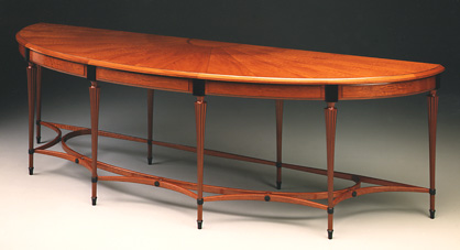 |
||||||||||||||||||||||||||||||||
Richard
Scott Newman - Mahogany and Ebony 10-foot Demilune |
||||||||||||||||||||||||||||||||
 |
||||||||||||||||||||||||||||||||
Bob
Hannan - Painted Cherry Child's Bed |
||||||||||||||||||||||||||||||||
| 1 9 9 0 | ||||||||||||||||||||||||||||||||
| Speaking
of Furniture: Conversations with the New American Masters In anticipation of their 10th anniversary in 1990, Bebe Pritam Johnson and Warren Eames Johnson, PRITAM & EAMES, began a series of interviews with 14 of the artist-craftsmen whose work formed the core of their opening exhibit in 1981. This series of conversations was intended to record in the makers' voices why they do what they do and, along the way, to provide a glimpse into the development of the studio furniture movement. Gradually, the idea evolved into plans for a book that included the interviews, original photography, as well as essays written especially for the book. In 1991, PRITAM & EAMES approached their long-time client, Peter Joseph, to help publish the book. He agreed to publish the book as long as he could participate as co-editor in the production. The three shared editing responsibility for the manuscripts. Although the book was never published, and the manuscript remains largely unread, the interviews provide insight into the thinking of a remarkable group of artist-craftsmen who tell their stories in candid, personal ways. |
||||||||||||||||||||||||||||||||
|
Speaking
of Furniture: Conversations with the New American Masters Table of Contents Preface
and Acknowledgements The Chair Within the Chair With "In the Chair", Joan Retallack In conversation
with: A Few
Thoughts from a Much Less Accomplished Woodworker, Roger Holmes Selected
Bibliography |
|||||||||||||||||||||||||||||||
| Early Spring Show - 1990 |
Early
Spring Show 1990 Dale Broholm, David Ebner, Hank Gilpin, George Gordon, Robert Hannan, Thomas Hucker, Don Krawczyk, Wendy Maruyama, Peter Pierobon, James Schriber, Jeremy Singley, Lee Trench, Stephen Turino, Bruce Volz, William Walker, Geoff Warner, Jonathan Wright, Rick Wrigley. NOTES: This show includes a large cabinet by Hank Gilpin, a furniture form that he would repeat in various woods. This one has 30 panels and is made of curly maple with yew-wood pulls. Its companion blanket chest shows how flexible the style of the cabinet could be as it is brought into a fresh design for a lidded 16-panel chest. Included in the show was another of Jonathan Wright's ingenious dining room extension tables and stand. This time the familiar design was in mahogany and sycamore, rather than bubinga and maple. The announcement card shows how the extension table works. The exuberance of Wendy Maruyama's tall cabinet is, no doubt, due to her rich use of color. But the piece also stands as if on tippy-toes, a feature she used in her 1984 jewelry cabinet. The strong colors here are further dramatized by the use of black in the field as well as in the legs. An Eastern note is given by the door panels, constructed as if from latticework of bamboo staves. It makes one think of a richly colored parrot in a rain forest. Work by Bob Hannan with playful Colorcore graphics used distorted perspective for added whimsy. In the Cloud Cabinet, this is done on the curve and one gets the feeling that the wind blowing the clouds might also be bending the cabinet. The pair of tables by Dale Broholm had a rooted, architectural weight-bearing style and are suitably topped with black granite. This style is a far cry from his edgy use of color in Broholm's student days. George Gordon repeats his elegant bench form, this time in cherry, giving it a lighter feel with fabric instead of woven leather upholstery. It will stand as the most fluid of Gordon's forms. The rocker by Jeremy Singley filled an important niche opened when Robert Whitley ceased making editions of his rocker. The spoke shaved hickory back spindles are formed individually with heat and moisture, giving the chair an open, ribcage-like holding form for relaxation. The nicely formed seat keeps the light feeling of the back by diminishing its thickness at the edges. The runners are not overly long, making this rocker easily placeable. The chair sold well for several years. Don Krawczyk's hutch continues in his folksy style, while his pair of wenge tables changes the tune with their zigzag drama. A delightful surprise comes from Spadone-Reiger -- the Domino Chairs are one of the few pieces of children's furniture to come to the gallery. Peter Pierobon rarely exhibited at Pritam & Eames, but had several entries such as this lamp during his period of working with ebonized mahogany. Rick Wrigley's four-poster bed is a mixed metaphor that would seem unlikely to succeed. On the one hand, the fluted, finial-capped columns are classically referenced, while the imposingly vertical headboard displays sumptuous veneer in a strict, contemporary grid of rectangles. The tall verticals of the headboard are sectioned by trim into narrow forms that complement and seem at home with the four posts. Wrigley continues his consummate touch of elegant detailing, which still has a modern and not overly fussy feel. |
|||||||||||||||||||||||||||||||
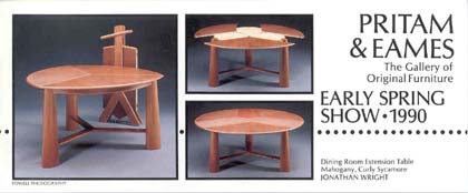 |
||||||||||||||||||||||||||||||||
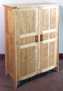 |
||||||||||||||||||||||||||||||||
Hank
Gilpin - Curly Maple and Yew Cabinet |
Hank
Gilpin - Curly Maple Blanket Chest |
|||||||||||||||||||||||||||||||
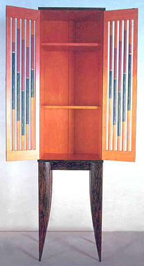 |
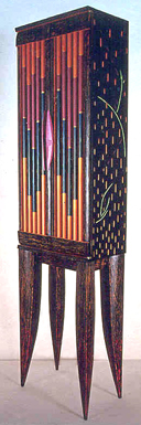 |
|||||||||||||||||||||||||||||||
Wendy
Maruyama - Carved and Polychromed Tall Cabinet |
||||||||||||||||||||||||||||||||
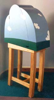 |
||||||||||||||||||||||||||||||||
Robert
Hannan - Yellow Pine, Colorcore, Ebony Cloud Cabinet |
||||||||||||||||||||||||||||||||
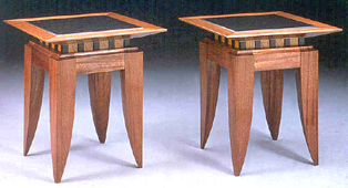 |
||||||||||||||||||||||||||||||||
Dale
Broholm - Mahogany, Satinwood, Ebony and Black Andes Granite Pair of
Tables |
||||||||||||||||||||||||||||||||
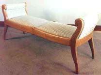 |
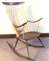 |
|||||||||||||||||||||||||||||||
George
Gordon - Cherry Uphostered Bench |
Jeremy
Singley - Walnut and Hickory Rocker |
|||||||||||||||||||||||||||||||
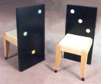 |
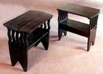 |
|||||||||||||||||||||||||||||||
Spadone/Rieger
- Domino Chairs |
Don
Krawczyk - Wenge Side Tables |
|||||||||||||||||||||||||||||||
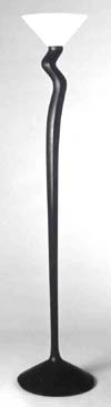 |
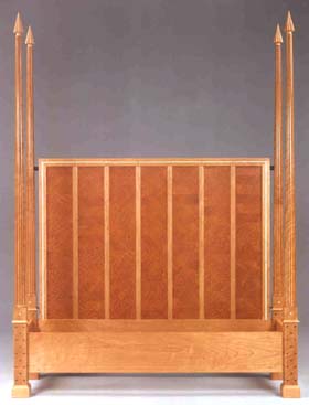 |
|||||||||||||||||||||||||||||||
Peter
Pierobon - Ebonized Mahogany Torchere |
Rick
Wrigley - Mahogany, Pomele Sapele, Fiddleback Makore, Curly Maple and Pearwood Bed |
|||||||||||||||||||||||||||||||
| Furniture
by Jere Osgood - 1990 |
Furniture by Jere Osgood NOTES: After the success of the aerodynamic writing tables and his sweeping rosewood carcase desk, Jere Osgood produced his ebony and lacewood desk, his most elaborate shell work to date and perhaps of his career. The scalloped doors are joined into a domed top -- all shell construction -- and rotate horizontally to enclose the workspace. In shell construction, the individual parts of the form are made from gluing thin layers together and pressing them in a curved form. The engineering of the door section is an amazing technical accomplishment, since the doors have to pivot and recede to the back to reveal the crescent working surface. Osgood has said, "I am not a sculptor; however, my concerns are similar. What I am after in these big pieces, such as the ebony and lacewood desk, is to create both a reasonable work area and, at the same time, a sculptural form that is interesting in all four directions when viewed, say, from 20 feet. The straight top view is as important as the front, back, and side views as I envision the desk in a library and, possibly, viewable from above. By the same token, I am concerned that the piece maintain its visual interest and fluency from close up. For example, I'm satisfied with the way the undercut drawers came out, something you notice only when you are seated at the desk." The library ladder in this show resulted from a client request. This is a case where a commission prompts a classic form from Osgood, a successful stand-alone sculptural form. This piece ended up being used as a valet. Its design as a library ladder starts from a base so rooted that the user feels secure. But this same rootedness gives the piece an organic focus that is a pleasure to see. The grounded strength of the form derives from the forked join of the tapered laminated legs into the flowing stem. By toeing the form inward at the first step, Osgood achieves a spreading upward flow to the top rail. The oval oak dining table is not a piece that attempts to break any boundaries, but stays with clear Osgoodian form. It was purchased as a desk/conference table and served well in that capacity. |
|||||||||||||||||||||||||||||||
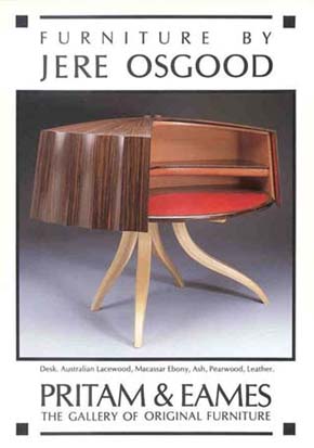 |
||||||||||||||||||||||||||||||||
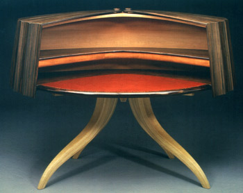 |
||||||||||||||||||||||||||||||||
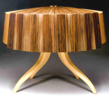 |
||||||||||||||||||||||||||||||||
Jere Osgood - Australian
Lacewood, Macassar Ebony, Ash, Pearwood, Leather Desk |
||||||||||||||||||||||||||||||||
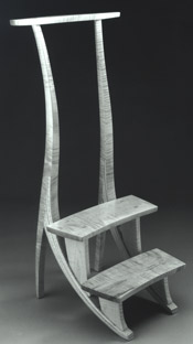 |
||||||||||||||||||||||||||||||||
Jere Osgood - Curly Maple
Library Ladder |
||||||||||||||||||||||||||||||||
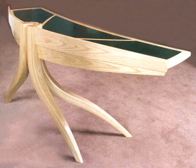 |
||||||||||||||||||||||||||||||||
Jere Osgood - Ash,
Leather Pedestal Desk
|
||||||||||||||||||||||||||||||||
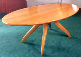 |
||||||||||||||||||||||||||||||||
Jere Osgood - White
Oak Oval Dining Table |
||||||||||||||||||||||||||||||||
| American
Work in Metal - 1990 |
American Work in Metal - 1990 Holloware/Jewelry/Flatware Michael and Maureen Banner, Jonathan Bonner, Ken Carlson, Mardi-Jo Cohen, Colette, Charles Crowley, Jaclyn Davidson, Robert Davis, Vicki Eisenfeld, Pat Flynn, Skip Gaynard, Robly Glover, Carrie Harper, Bessie Jamieson/Robert Kulicke, Marvin Jensen, Jim Kelso, Deborah Krupenia, Curtis LaFollette, Thomas Markusen, John Marshall, Tom Muir, Jacqueline Myers, Robyn Nichols, Tom Odell, Gene Michael Pijanowski, Hiroko Sato Pijanowski, Eleni Prieston, Janet Prip, Vernon Reed, Michel Royston, Jafar Shoja, Nancy Slagle, Mark Stanitz, Leonard Urso. NOTES: The scope of this decade's last featured show in metal broadened to include sculpture. Some academic metalsmiths, including John Marshall and Len Urso, were challenged to push the plasticity/malleability of their material. You could find this same exploration of plasticity in Michael and Maureen Banner's teapot handles that were drawn or "pulled" as though made of clay; Robyn Nichol's wispy tendrilled utensil handles, and Leonard Urso's flowing forms. Urso raised his Giacometti-like figures from sterling silver sheets by a process of repousse. He produced similar miniature repousse wearable objects in his line of high karat jewelry. Eleni Prieston, who works in 22K gold, produces formal yet casual jewelry. The permanence of 22K gold connotes formality while the use of organically shaped precious stones, like boulder opal and natural pearl, ensure an approachable quality. Gold is wrapped around a natural oyster pearl by finger pressure, enhancing its irregularity rather than attempting to formalize it. Her chains are woven by hand, with little reliance on steel tools. Jim Kelso comes from the quiet, highly technical discipline of centuries-old Japanese knife-making techniques. One can feel the texture in his work simply by looking at it. His Damascus steel blades, their handles inlaid with precious stones and mokume-gane, are embellished with insects or foliage. These ceremonial objects display a respectful reverence for beauty and purpose. |
|||||||||||||||||||||||||||||||
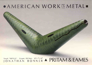 |
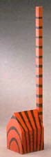 |
|||||||||||||||||||||||||||||||
Jonathan
Bonner - Copper, Oil Paint "Reptiles" Vessel |
Jonathan
Bonner - Copper Acrylic "House Cat" |
|||||||||||||||||||||||||||||||
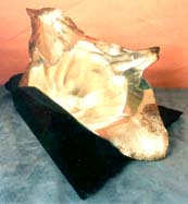 |
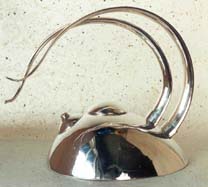 |
|||||||||||||||||||||||||||||||
John
Marshall |
Michael
and Maureen Banner - Silver Double-Handled Teapot |
|||||||||||||||||||||||||||||||
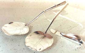 |
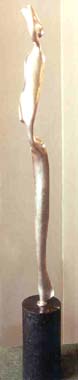 |
|||||||||||||||||||||||||||||||
Robyn
Nichols - Silver Sea Grape Spoons and Calla Lily Butter Knife |
||||||||||||||||||||||||||||||||
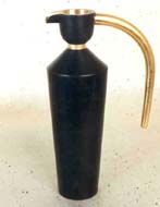 |
||||||||||||||||||||||||||||||||
Charles
Crowley - Brass, Aluminum, Gold Leaf Vessel |
Leonard
Urso - Silver Sculpture |
|||||||||||||||||||||||||||||||
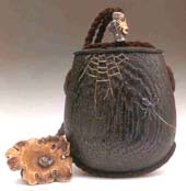 |
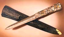 |
|||||||||||||||||||||||||||||||
Jim Kelso - Wenge, Ebony, Gold Spider Tonkatsu; Silver, enameled Gold Ojime; Mammoth Ivory, Silver, Gold Netsuke on Silk Cord |
Jim Kelso - Knife and Scabbard |
|||||||||||||||||||||||||||||||
| Sitting
Pretty - 1990 |
Sitting Pretty An Exhibition of Original Seating David Ebner, George Gordon, Kristina Madsen, Tim Philbrick, James Schriber, Rosanne Somerson, Peter Spadone, Wendy Stayman, Geoff Warner. NOTES: The gallery always welcomes superior upholstered work. Because the chair is frequently acknowledged as the most difficult furniture form to make, chairs from the field generally cannot be competitive in price or production value to those commercially produced. Even if jigged up for a run of twelve or more, the studio furniture maker cannot lessen either the amount of handwork involved in producing a chair nor the huge investment in jigs, patterns, and forms. More often than not, the gallery asked clients to consider a chair as a single piece of furniture. A single chair may require the same work as a dining table, but clients find it impossible that the two could be comparable in value. Even with that said, there are few studio furniture practitioners who succeed in meeting all of the demands of making a really fine chair. In the case of Tim Philbrick's fully upholstered easy chair, it is the flowing line of the pearwood that tailors the upholstered form while continuously exposing the wood. The woodworking, as well as the silk upholstery, makes this chair a labor-intensive piece. The successful outcome, though, is a chair that combines both comfort and elegant form. This chair more than any other in the show demonstrated a sophisticated chairmaker's discipline in its construction and detailing. Wendy Stayman's chair made a point of contrasting the use of wood in its front leg and arm to the rest of the chair's form, which was completely covered in fabric including the underneath of the rear foot. As such, it was a design statement but it did not have the complexity of Philbrick's flowing form. This chair would reappear in her '91 featured show. |
|||||||||||||||||||||||||||||||
 |
 |
|||||||||||||||||||||||||||||||
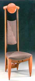 |
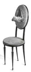 |
|||||||||||||||||||||||||||||||
Rosanne
Somerson - Tall Chair |
Kristina
Madsen - Bird's Nest Chair |
|||||||||||||||||||||||||||||||
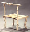 |
||||||||||||||||||||||||||||||||
David
Ebner - Twisted Stick Chair |
||||||||||||||||||||||||||||||||
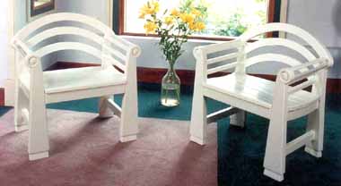 |
||||||||||||||||||||||||||||||||
David Ebner - Bellport Chairs |
||||||||||||||||||||||||||||||||
| Rosanne Somerson's pair of striking tall chairs provided a good tableau for her artful embellishments. The crest rail carries her signature medallion. Kristina Madsen was represented in this show by her bird's nest chair, a piece she had made for an earlier Workbench show based on furniture in masterpiece paintings. James Schriber submitted two tall chairs as simply made as they were enjoyably casual in appeal. Designed for counter-height seating, their informal attitude derived from milk-painted colors in combination with pearwood arm pieces and stretchers. This chair would reappear in the future in several subsequent versions. David Ebner's Stick Chair, more sculptural than sit-able, extends his use of twisted stick material to a new form. As mentioned earlier, he was inspired by Wharton Esherick's credo to make objects from things you could find in your backyard. The honeysuckle-choked sassafras saplings were what he found along the Long Island Railroad's right-of-way. His painted mahogany Bellport outdoor furniture series was one of the most seriously researched works to come out of the studio furniture field. Stylistically, its roots were in the 19th-century English Luton lawn furniture, while its painted finish combined the best of contemporary durable spray painting and the natural weather-resistance of mahogany. |
||||||||||||||||||||||||||||||||
| The
Furniture Art of JOHN DUNNIGAN - 1990 |
The Furniture Art of John Dunnigan NOTES: John Dunnigan's asymmetrical settee, the announcement piece for his second featured show at P&E, introduced perhaps his most memorable upholstered work. Its companion was an asymmetrical easy chair. The front leg to arm and front stretcher design is familiar from his earlier settees. However, the asymmetrical overlapping of the two back crests sets in motion a progression: the large crest overlaps the lower crest, which in turn leads to a lower arm and a more accelerated front curve. The impression is of a piece in balance, a sophisticated design achievement. In the exhibition, the settee and arm chair were separated by a bubinga sideboard with a marble top. The rakishly thin front legs ascended in four tiered steps that complemented the four-tiered drawer structure of the carcase. Although the asymmetrical works were the most demanding and accomplished upholstered pieces, Dunnigan's less complex but familiar conversation chairs were still crowd pleasers. With their low back and arms that spread outward as they project forward, these chairs are inviting and appear much larger and more ample because of the perspective that Dunnigan seduces from the form. In this show, Dunnigan created a trio of these chairs with a crown that might be described as sickle-shaped. The middle chair in this trio has a crown that slopes symmetrically, whereas on the two outer chairs the sickle tilts downward to the outside. As it happened, one client bought the two outside chairs, and another bought the middle chair. The legs on the conversation chair also evolved during the '80s from a simple four-sided saber to an eight-faceted modified saber that looks like it twists outward. The serviceability of this chair goes to the heart of its popularity -- while it looks ample and inviting, the chair is quite portable and can be pulled up for occasional seating. A pair of side tables, one with a marble top, completed the show. |
|||||||||||||||||||||||||||||||
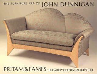 |
||||||||||||||||||||||||||||||||
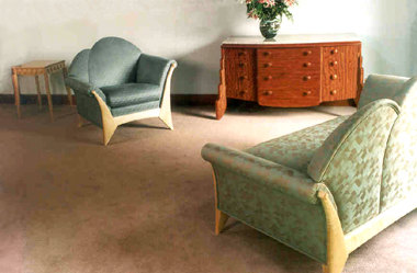 |
||||||||||||||||||||||||||||||||
John Dunnigan - "Metope"
Table, Asymmetrical Arm Chair; Bubinga and Marble Sideboard |
||||||||||||||||||||||||||||||||
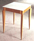 |
||||||||||||||||||||||||||||||||
John Dunnigan - Pearwood
and Marble Pleated Table |
||||||||||||||||||||||||||||||||
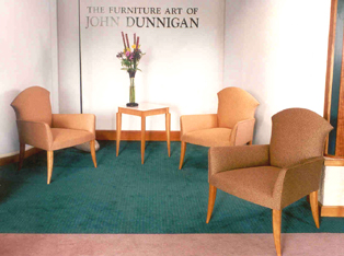 |
||||||||||||||||||||||||||||||||
John Dunnigan - Upholstered Cherry Conversation Chairs |
||||||||||||||||||||||||||||||||
| Gifted - 1990 | Gifted - 1991 Although a small piece, the table lamp by Mark Del Guidice was welcome because of its fresh use of materials and simple construction. It combines phenolic linen and fiberglass with a well-chosen wood palette. |
|||||||||||||||||||||||||||||||
 |
||||||||||||||||||||||||||||||||
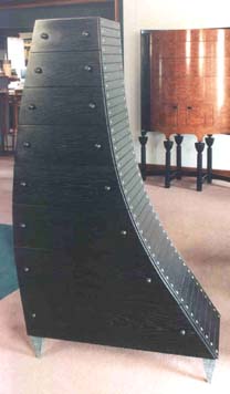 |
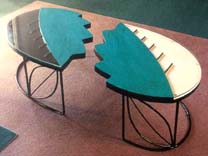 |
|||||||||||||||||||||||||||||||
John
Eric Byers - Ebonized Oak, Mahogany and Copper Rivets "Oh Boy" Behind: Tom Hucker - Ebonized Maple, Mahogany Floating Highboy |
Kam
Ghaffari - Dyed and Bleached Maple and Steel
Folio Tables |
|||||||||||||||||||||||||||||||
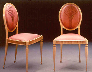 Kristina
Madsen - Maple and Silk Side Chairs
|
||||||||||||||||||||||||||||||||
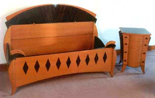 |
||||||||||||||||||||||||||||||||
Steven
Turino - Australian Lacewood, Macassar Ebony Bed and Cabinet |
||||||||||||||||||||||||||||||||
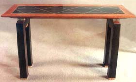 |
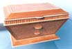 |
|||||||||||||||||||||||||||||||
Stephen
Whitney - Jewel Box |
||||||||||||||||||||||||||||||||
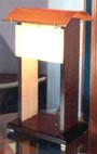 |
||||||||||||||||||||||||||||||||
Stephen
Whitney - Hall Table |
Mark
Del Guidice - Table Lamp |
|||||||||||||||||||||||||||||||
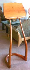 |
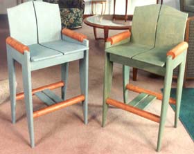 |
|||||||||||||||||||||||||||||||
David
Ebner - Brazilian Mahogany Music Stand |
James
Schriber - Cherry, Milk Paint Tall Chairs |
|||||||||||||||||||||||||||||||
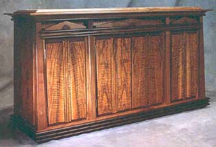 |
||||||||||||||||||||||||||||||||
Ron
Puckett - French Walnut, Wenge and Marble Sideboard |
||||||||||||||||||||||||||||||||
| Commissions - 1990 | ||||||||||||||||||||||||||||||||
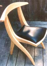 |
||||||||||||||||||||||||||||||||
Jere
Osgood - Ash and Leather Laminated Chair
|
||||||||||||||||||||||||||||||||
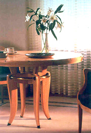 |
 |
|||||||||||||||||||||||||||||||
James
Schriber - Maple and Ebony Conference Table, Executive Desk |
||||||||||||||||||||||||||||||||
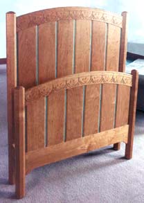 |
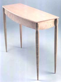 |
|||||||||||||||||||||||||||||||
Lee
Trench - Carved Cherry and Copper Twin Bed |
Timothy
Philbrick - Pair of Maple Console Tables for Midtown New York Bank |
|||||||||||||||||||||||||||||||
| 1 9 9 1 | ||||||||||||||||||||||||||||||||
| James
Krenov & Friends - 1991 |
James Krenov & Friends Brian Newell's tall showcase cabinet in pau ferro and pearwood is composed of two floor-to-top doors, consisting of three long vertical panes of antique glass that are joined with impossibly narrow leading. The arched tops of the two doors lead into a pierced carved pearwood panel. Newell was certainly inspired and nurtured by Krenov, but it is difficult to trace the teacher's influence in this piece. Frequently a Newell piece would follow the small cabinet format of his mentor, but particularly after 2000, his work took a broad departure. His six-legged cabinet, done for the gallery's 20th anniversary show in 2001, caused many, for the first time, to recognize him as a major force in the field. Bill Walker is represented in this show by two low circular tables with a taut, bow-like structure that gives tension to these comfortable, contemporary pieces. His one-person show would come later in the summer. |
|||||||||||||||||||||||||||||||
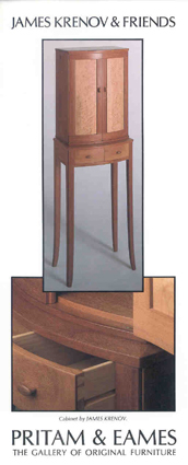 |
||||||||||||||||||||||||||||||||
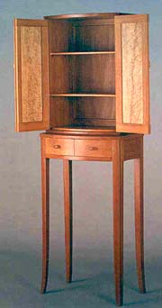 |
||||||||||||||||||||||||||||||||
James
Krenov - Doussie and Maple Cabinet |
||||||||||||||||||||||||||||||||
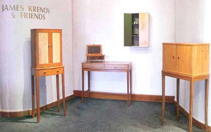 |
||||||||||||||||||||||||||||||||
James
Krenov & Friends at Pritam & Eames |
||||||||||||||||||||||||||||||||
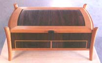 |
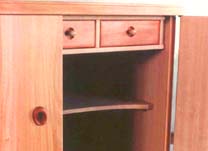 |
|||||||||||||||||||||||||||||||
Jim
Budlong - Rosewood and Yew-wood Jewelry Box |
James
Krenov - Detail of Pearwood, Brazilian Rosewood and Mahogany Cabinet |
|||||||||||||||||||||||||||||||
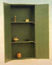 |
||||||||||||||||||||||||||||||||
James
Krenov - Painted Maple Cabinet |
||||||||||||||||||||||||||||||||
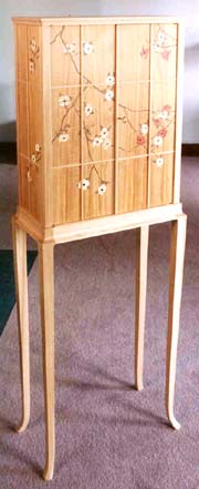 |
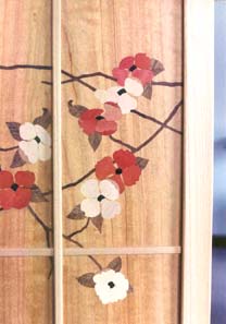 |
|||||||||||||||||||||||||||||||
Zivko
Radenkov - Elm, Satinwood, Pink Ivory, Holly, Teak and Ebony Cabinet |
||||||||||||||||||||||||||||||||
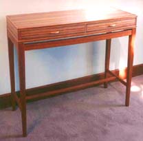 |
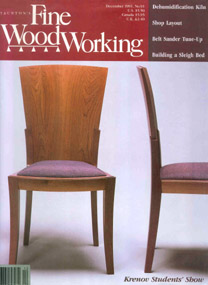 |
|||||||||||||||||||||||||||||||
Paul
Harrell - Bubinga Hall Table |
Bill
Walker - Cherry Dining Chairs |
|||||||||||||||||||||||||||||||
 |
 |
|||||||||||||||||||||||||||||||
Tim Coleman - White Oak and Maple Fluted Cabinet |
Tim Morrow - Pearwood and Spanish Cedar Cabinet |
|||||||||||||||||||||||||||||||
 |
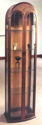 |
|||||||||||||||||||||||||||||||
Gary
Venable - Maple Silver Chest |
||||||||||||||||||||||||||||||||
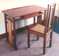 |
||||||||||||||||||||||||||||||||
Marie
Hoepfl - Doussie, Satinwood and Elm Writing Desk and Chair |
Brian
Newell - Pau Ferro and Pearwood Tall Cabinet |
|||||||||||||||||||||||||||||||
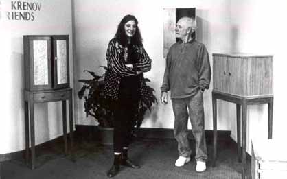 |
||||||||||||||||||||||||||||||||
Bebe Pritam Johnson and James Krenov |
||||||||||||||||||||||||||||||||
The show also included three smaller pieces: a lantern by David Finck, an exquisite English hornbeam writing box by Nicholas Goulden, and, most notably, a Brazilian rosewood and western yew-wood tabletop jewelry cabinet by Jim Budlong. How does one put two such woods together? The yew-wood brings out the undertone of the rosewood perfectly, but also provides quieter figure to frame the wilder rosewood. It is a low and flat case piece supported by four yew-wood legs. |
||||||||||||||||||||||||||||||||
| American
Work in Metal - 1991 |
American Work in Metal Holloware/Jewelry/Flatware Michael and Maureen Banner, Jonathan Bonner, Ken Carlson, Mardi-Jo Cohen, Colette, Jaclyn Davidson, Robert Davis, Vicki Eisenfeld, Peggy Eng, Pat Flynn, Skip Gaynard, Robly Glover, Carrie Harper and Tim McClelland, Bessie Jamieson and Robert Kulicke, Marvin Jensen, Judith Kaufman, Jim Kelso, Deborah Krupenia, Curtis LaFollette, Thomas Markusen, Kurt Matzdorf, Mark Williams Morgan, Tom Muir, Jacqueline Myers, Robyn Nichols, Tom Odell, Eleni Prieston, Janet Prip, Vernon Reed, Michel Royston, Jafar Shoja, Nancy Slagle, Mark Stanitz, Leonard Urso. NOTES: Vicki Eisenfeld's necklace is a masterfully interwoven combination of gold and silver wires and married metals embellished with precious stones. A burst of forms and shapes explodes into a wearable statement. Eisenfeld paints with metal, whereas Mark Stanitz has incorporated miniature paintings in his brooches. Stanitz leaves the three-dimensional world behind with his miniature paintings. This show was not without humor, as illustrated by Jonathan Bonner's sailfish weathervane, Jaclyn Davidson's bizarre use of a prone figure bearing a container, Nancy Slagle's expertly fabricated cartoonish silver Teapot Fitzgerald, and Tim McClelland's meticulously rendered gold and diamond bulldog ring. Tim McClelland collaborated with his wife, Carrie Harper, on a folding child's spoon which, when open, becomes a children's slide complete with figures. Janet Prip's bronze figurative candlesticks evoke the Josephine Baker spirit of the '30s. |
|||||||||||||||||||||||||||||||
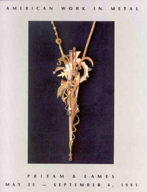 |
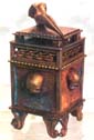 |
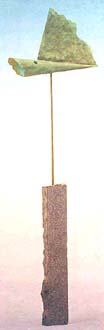 |
||||||||||||||||||||||||||||||
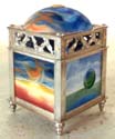 |
||||||||||||||||||||||||||||||||
Mark
Stanitz - Silver Containers |
||||||||||||||||||||||||||||||||
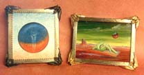 |
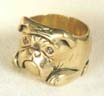 |
|||||||||||||||||||||||||||||||
Mark
Stanitz - Gold, Silver, Oil Paint Brooches |
Tim
McClelland - Gold, Brown Diamonds Bulldog Ring |
Jonathan
Bonner - Copper Granite Sailfish Weather Vane |
||||||||||||||||||||||||||||||
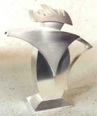 |
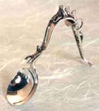 |
|||||||||||||||||||||||||||||||
Nancy
Slagle - Silver "Teapot Fitzgerald" |
Carrie
Harper and Tim McClelland - Silver Baby Spoon with Folding Feeding Handle |
|||||||||||||||||||||||||||||||
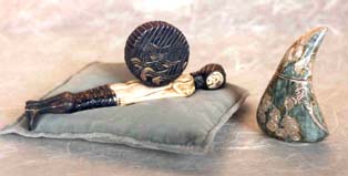 |
||||||||||||||||||||||||||||||||
Jaclyn
Davidson - Containers: (Left) Sterling Silver, 24K Gold Foil, Fossil Ivory; (Right) Sterling Silver, 24K Gold Foil, Basse-Taille Enameling |
||||||||||||||||||||||||||||||||
 |
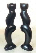 |
|||||||||||||||||||||||||||||||
Mark
Williams Morgan - Vessel |
Janet
Prip - Cast and Fabricated Bronze Figurative Candlesticks |
|||||||||||||||||||||||||||||||
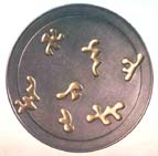 |
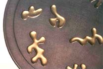 |
|||||||||||||||||||||||||||||||
Janet
Prip - Pewter and Gold Leaf Double Bowl |
||||||||||||||||||||||||||||||||
| 10 x 16: 10th Anniversary - 1991 |
10 x 16: 10th Anniversary - 1991 Timothy Philbrick exhibited a Pier Table in Cuban and quilted Honduras mahogany. His 1981 Pier Table was in East Indian rosewood. The bottom line of the apron in the 1991 piece still reflects the swag or weighted fabric hang of the earlier piece. There is more movement in the legs of the newer table, however, and the two sides tuck in toward the front in an S-curve. It is sometimes said that if you use the S-curve, you're borrowing too heavily from the past. However, the simple curves of most contemporary design have more to do with production values than borrowed aesthetics. Whatever the outcome of the discussion, this Philbrick table looks fresh. James Schriber was represented by one of his Pencil Post Beds first seen in the gallery in his 1986 show with Ron Puckett. This bed, along with his 1981 rosewood bed, was the announcement piece for 10 x 16. Their only common feature is the fan-like adornment that appears on the headboards. Rosanne Somerson's Jewelry Vanity in pau ferro and bleached leopardwood, pearwood, hand painted paper, mother-of-pearl, and a mirror, continues her work in wall-hung jewelry cabinets. The long narrow case is divided at mid-section by a sliver moon-shaped shelf whose front is decorated with mother-of pearl. Their shimmer is reflected in the seven leopardwood drawer fronts below. In front of the mirror on the shelf is a turned pearwood cup to hold earrings, another Somerson trademark. |
|||||||||||||||||||||||||||||||
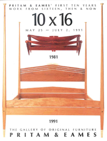 |
||||||||||||||||||||||||||||||||
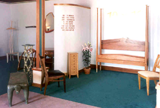 |
||||||||||||||||||||||||||||||||
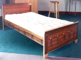 |
||||||||||||||||||||||||||||||||
Bruce Beeken - Goncalo Alves and Maple Child's Bed |
||||||||||||||||||||||||||||||||
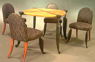 |
||||||||||||||||||||||||||||||||
Wendell Castle - Bubinga, Satinwood, Mahogany, Bronze, Brass, Upholstery Game Table and Four Chairs |
||||||||||||||||||||||||||||||||
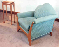 |
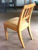 |
|||||||||||||||||||||||||||||||
John Dunnigan - Pearwood Tray Table and Asymmetrical Chair |
David Ebner - Curly Maple and Leather Chair |
|||||||||||||||||||||||||||||||
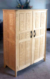 |
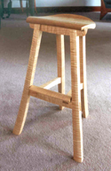 |
|||||||||||||||||||||||||||||||
| Gilpin - Curly Maple Stool | ||||||||||||||||||||||||||||||||
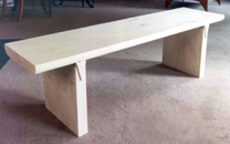 |
||||||||||||||||||||||||||||||||
Hank Gilpin - Curly Red Oak and Wenge Cabinet |
Hank Gilpin - Bleached Elm Ghost Bench |
|||||||||||||||||||||||||||||||
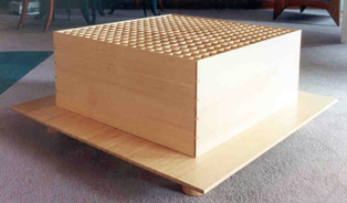 |
||||||||||||||||||||||||||||||||
Thomas Hucker - Sitka Spruce Scent Table |
||||||||||||||||||||||||||||||||
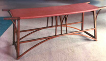 |
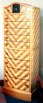 |
|||||||||||||||||||||||||||||||
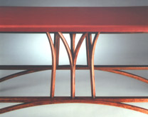 |
||||||||||||||||||||||||||||||||
Michael Hurwitz - Bubinga and Leather Bench |
Silas Kopf - Ash, Marquetry Woods Cabinet with Clock |
|||||||||||||||||||||||||||||||
 |
||||||||||||||||||||||||||||||||
Wendy Maruyama - Poplar and Paint Blanket Chest |
Alphonse Mattia - Maple Lacquer "Knothead" Valet |
|||||||||||||||||||||||||||||||
 |
||||||||||||||||||||||||||||||||
Judy Kensley McKie - Bronze Beast Bench |
||||||||||||||||||||||||||||||||
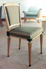 |
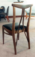 |
|||||||||||||||||||||||||||||||
Richard Scott Newman - Cherry and Ebony Chair |
Jere Osgood - Walnut and Leather Chair |
|||||||||||||||||||||||||||||||
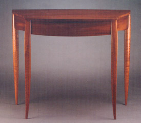 |
||||||||||||||||||||||||||||||||
Timothy Philbrick - Cuban and Quilted Mahogany Pier Table |
||||||||||||||||||||||||||||||||
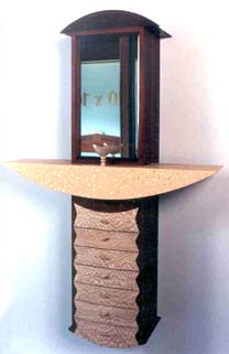 |
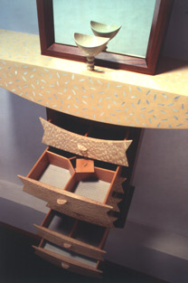 |
|||||||||||||||||||||||||||||||
Rosanne Somerson - Pau Ferro, Bleached Leopard Wood, Bleached Lacewoood, Pearwood, Handpainted Paper, Mother-of-Pearl, Mirror Jewelry Vanity |
||||||||||||||||||||||||||||||||
| 10th Anniversary Celebration | ||||||||||||||||||||||||||||||||
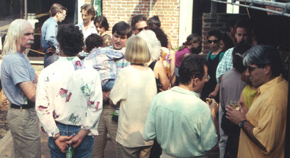 |
||||||||||||||||||||||||||||||||
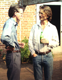 |
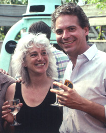 |
|||||||||||||||||||||||||||||||
Jere Osgood and Tom Hucker |
Judy McKie and Tim Philbrick |
|||||||||||||||||||||||||||||||
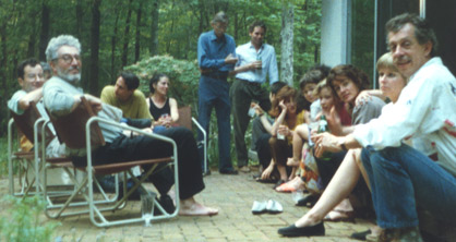 |
||||||||||||||||||||||||||||||||
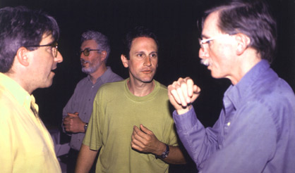 |
||||||||||||||||||||||||||||||||
Alphonse Mattia, John Dunnigan, James Schriber, and Jere Osgood |
||||||||||||||||||||||||||||||||
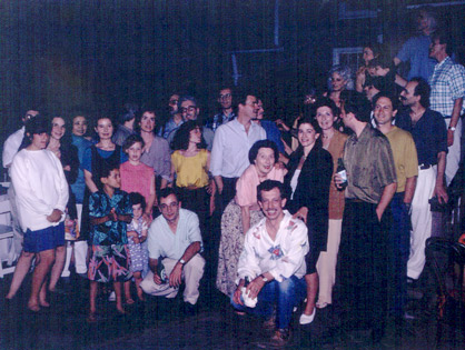 |
||||||||||||||||||||||||||||||||
Artists and clients celebrate 10 years with Pritam & Eames. |
||||||||||||||||||||||||||||||||
Photography Credits: Gil Amiaga, Roger Birn, David Caras, Rameshwar Das, Jody Dole, Chris Eden, |
||||||||||||||||||||||||||||||||
| Although the 10 x 16 survey had more depth than most group shows, it is impressive how many pieces reflected past designs rather than a testing of new boundaries. Does this signal that the 1990s will be less experimental? Or was this simply a timely celebration of hard-won, personally evolved and, by now, maturely nuanced bodies of work? Or would this mature polish restrict innovation? | ||||||||||||||||||||||||||||||||
End of
the Decade |
||||||||||||||||||||||||||||||||
 |
During the next decade, as the archives will show, the gallery would continue its mixed format of group and featured shows. Midway through the 1990s, the partners would initiate a new venture of limited-production furniture based on designs from three leading makers. The core of clientele remained and proved to the partners that the interest in this work continued essentially for the reasons it had begun: people recognized the intrinsic value of this work, infused with the spirit of the maker, and made with highest regard for material and process. How would the longevity of this current cycle of American studio furniture measure up to similar peaks of energy established by other decorative arts movements like European Art Nouveau, Art Deco, Wiener Werkstadte, or the American and English Arts & Crafts? | |||||||||||||||||||||||||||||||
Use of Content from this Web Site |
||||||||||||||||||||||||||||||||
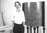
![]()
East Hampton, New York 11937
631-324-7111
connect@pritameames.com
www.PritamEames.com
![]()
Design by Diana Zadarla