|
|
|
|
|
|
||||||||||||||||||||||||||||||||||||||||||||
© Copyright 2009 Pritam & Eames |
||||||||||||||||||||||||||||||||||||||||||||
Pritam & Eames: The Second Decade 1991 - 2001 |
||||||||||||||||||||||||||||||||||||||||||||
Traditionally, furniture was built to satisfy a practical or ceremonial need. It was claimed beforehand: it was bespoken. "Studio furniture," a term coined to describe the work of the mostly college-trained makers of the second half of the 20th-century in this country, includes speculative work -- that is, furniture that no one has requested or specifically needs. The emergence of speculative work was fueled, in part, by the idea that furniture, like art, can be expressive of its maker. It should come as no surprise that the cross-fertilization of ideas that a university environment fosters would inevitably give substance to the revolution brewing within traditional crafts. Craft mediums like glass, clay, and fiber seemed to absorb the functional and non-functional duality of their nature easily. However, because of its historical ties to use, furniture was probably the last of the craft disciplines to embrace the non-functional compact with contemporary art. In a 1991 New York Times article, Witold Rybczynski asks, "If a Chair is a Work of Art, Can You Still Sit on It?":
These issues would play out in the 1980s as university-trained makers challenged the orthodoxy of wood, conventional methods of construction, and the axiom that the crafting of the object was more meaningful than the concept or idea behind it. In the 1960s and 1970s, while Wendell Castle’s stacked, carved, subtractive forms brought the attitude of a sculptor to furniture, process innovations like Jere Osgood’s pioneering work in tapered laminations and compound shell constructions, or Bill Keyser’s innovative vacuum bag pressed forms, or Richard Newman’s sophisticated shaping jigs, provoked their own creative breakthroughs. The 1990s underscored this dual creative channeling -- part sculptural, part process-driven -- as furniture making was stretched against the background dichotomy of function versus art. In order for the spec makers to realize their artistic goals, a gallery system was needed to present, promote, and market their work. It would take time to develop this new marketplace, but by the mid-1980s there were signs of its early strength. Also, it can be said that studio furniture benefited from the post-modernist movement of the times because that decorative arts vogue provided a broader context in which to place it. As one furniture maker notes, “We were almost fashionable in the '80s.” In the 1990s, the saga of studio furniture unfolded with the emergence of New York galleries that sought to have furniture accepted on the same terms as fine art. It would be fair to say that the partners’ representation of furniture as furniture was, to some degree, overshadowed by what went on in New York during the halcyon art-boom days of the 1990s. High-end gallery marketing can bring its own pressure on the kind of work that gets made. This, in turn, can encourage makers to create pieces visualized for a gallery setting rather than furniture’s traditional context, the home. The ultimate divorce between furniture and its historical milieu takes place, however, when the museum enters the picture. By 1990, inclusion in curated/invitational museum exhibits was sufficiently seductive that few furniture makers questioned the appropriateness of new furniture making its first appearance in a museum. Museum exhibits produce lists, and these lists -- whose name is on and whose name is not -- become powerful operatives in the marketplace. Now that the museum has entered the marketplace, a new concept can emerge -- furniture bespoken by the museum, and offered for sale. The sine qua non for success in the craft world appears to include the same roster that dominates the fine-arts world: the museum, curator, patron, dealer, and artist. The auction house will be added to this list shortly. Rybczynski observes:
As some furniture makers aspired to be called artists, some artists lamented what they sensed was their loss. In 2005, Art Spiegelman, artist and writer, observed that the two biggest changes in the last 50 years in art have been the proliferation of museums of contemporary art and art fairs, and budget travel. “This means,” he says, “that more and more artists make works that they never expect will be lived with, looked at day-in and day-out by the same person; that much art is made for fairs or museums, designed to grab a distracted passerby's attention without needing to be experienced twice." Thus, he says, "culture slides into the realm of entertainment.” Until recently, furniture had avoided this unenviable outcome because of its close ties to the home. It is difficult for the partners to talk about the 1990s without talking about Peter Joseph, their client of nearly ten years. In November 1989, at the Quilted Giraffe Restaurant in New York City, Joseph proposed that the partners join him to create a New York gallery. Initially, the three discussed a partnership, but it became clear that their views for the direction of this gallery were divergent. The partners stepped aside, and Peter Joseph opened his Fifth Avenue gallery in New York in 1991. Many eyes were trained on this event. For those on the roster, as well as for those who wanted to be, this gallery venture seemed like a long-awaited validation of their artistic worth. In an important sense, the next moment in studio furniture’s dialectic was played out within the white walls, hardwood floors, and fine arts setting of this urban gallery. There, the work of some makers looked at ease, while others seemed out of place. The Peter Joseph Gallery contracts with makers required world-wide exclusivity. In return, the gallery provided promotion of their work through featured shows, along with catered openings, and color catalogues. This is the art-gallery prototype. By its own terms, this artist-to-gallery relationship required productivity, and the exclusivity of the arrangement required support for the makers. This led to a system of stipends. In order to attract a new clientele, the gallery offered a regular change of shows. The amount of work produced for these shows, however, was ahead of the market, which led, in turn, to a surplus of unsold pieces. The surplus of unsold work led eventually to a practice of serious discounting. It also left a serious question: when a design is constant, productivity is the key. But if the key is creativity, how does the pressure of productivity affect the outcome? Ultimately, the expensive gallery catalogues and commissioned testimonials from academicians and intellectuals like Arthur Danto and Witold Rybczynski notwithstanding, the Peter Joseph Gallery failed to secure the imprimatur of an art establishment. The art world seemed largely indifferent and even hostile to the idea of studio furniture as a 20th-century art form. When the New York gallery closed in 1996, it seemed to underscore the dubious practice of marketing furniture like fine art. An effort, observes Tom Hucker, akin “to trying to bake a chocolate cake with no chocolate. No matter how long you mix it, you ain't gonna get a chocolate cake.” After he closed his gallery and before his death in 1998, Joseph returned to Pritam & Eames as a client. Setting aside differences in their approach to marketing and recent history, he said he wanted to work together and publish the book of interviews begun by the Johnsons in 1989; a project he joined as co-editor in 1992. Sadly, he died before the project was realized. Some questions linger from this period. How does the perception of value get shaped? What makes one artistic pursuit more valuable, viz., remunerative, than another? What makes a chair by Scott Burton, the sculptor, more valuable than a chair by Jere Osgood, a master furniture maker? And who, ultimately, will determine the value of studio furniture: the galleries, collectors, museums, historians, critics, or auction houses? Throughout the 1990s, Pritam & Eames continued its mix of group, featured, and one-person shows. It also initiated the P&E Editions series. By this time, the furniture makers associated with the gallery had evolved distinctive, well-defined styles in their work, which they continue to refine throughout the 1990s. Explosively new and original work by two furniture makers emerged during this period: Kristina Madsen in the mid-1990s and Brian Newell at the end of the decade. By 2001, Pritam & Eames felt fortunate to have been in place for over 20 years, to have hosted a consistently high level of studio work and, also, to have been the beneficiary of a loyal and discerning public. If a Chair Is a Work of Art, Can You Still Sit on It? by Witold Rybczynski. DESIGN VIEW; The New York Times, May 5, 1991. |
||||||||||||||||||||||||||||||||||||||||||||
|
||||||||||||||||||||||||||||||||||||||||||||
|
||||||||||||||||||||||||||||||||||||||||||||
1 9 9 1 |
||||||||||||||||||||||||||||||||||||||||||||
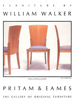
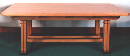
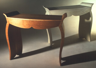
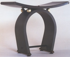
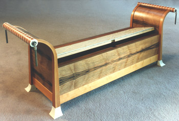
| Furniture by William Walker - 1991 |
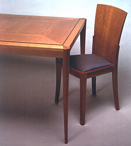
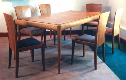
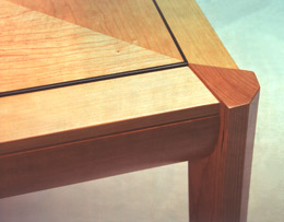
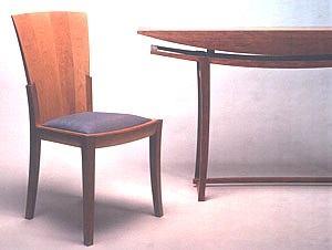
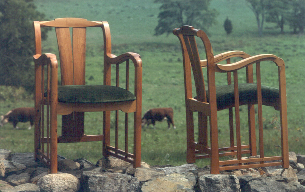
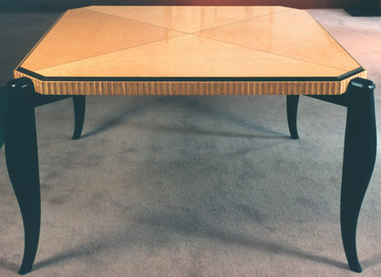
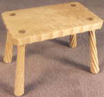
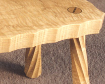
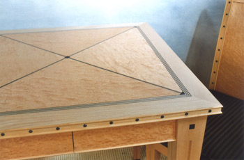
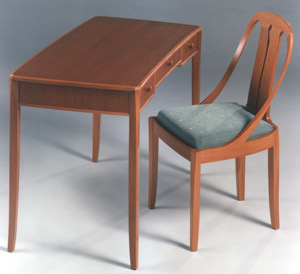
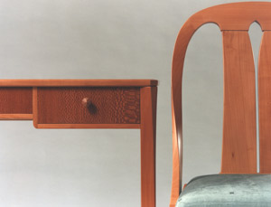
Furniture by William Walker Absent, though, to any considerable extent in this Walker work is an obvious reference to his mentor, James Krenov. In fact, the curved and aerodynamic quality of his side table and his solid fan-backed dining chair seems more in line with the thinking of the Finnish-born architect/designer, Eero Saarinen, or even Jere Osgood. Still, Walker's maple Silver Cabinet does reflect Krenov's attention to material as a major source of inspiration. The centerpiece of scale for this exhibit was Walker’s first dining room extension table. He called his previous table, shown at the gallery in 1987, a breakfast table. This time the table is a fully-fledged dining table with a set of eight chairs. And with this piece, Walker joins a small group of studio furniture makers willing to speculate on a piece of this scale. Richard Newman and James Schriber did so in the gallery's first decade and, although George Gordon, John Dunnigan, and Ron Puckett also made extension tables during this period, they did so on a commissioned basis. Walker's table establishes certain features that he will continue to use in future dining tables. Each one will have beautifully decorated surface created by sequential band-saw cuts of unusually thick veneer. The advantage of this veneer process is that it allows the best use of the most beautiful wood but, by being unusually thick, (1/8”), it also provides opportunity to refinish a daily used surface without fear of going through a delicate veneer. The second feature of this table is that the top is not just supported by four legs, but the legs are set into the top in such a way that they establish a dramatic design character for the entire table. By joining the legs at 45-degrees to the apron sides, they seem to stand proud of the apron and define the projection or extension of the table itself. This impression is augmented by their interesting shaping. Three forward facets create the surface that project out and into the room. The leg, itself, intersects with the table's apron with two larger facets which themselves join to define a corner of the eating surface. The part of the leg that faces towards the table’s interior is completed with a rounded section. At cross section, this is a complex shape. The three flat surfaces are flat only in their width, as these faces travel down the leg to its foot, the leg has a gentle saber curve. The crisp intersection of these facades is one of the table’s tailored features. The downward curved surface of the apron supports and reinforces the curves found in the legs. With unusual perception, Walker combines the tailored aspect of precise intersections with the flowing and biomorphic quality of his curves. The apron also gives the top a dimension of depth and solidity. The top of the table presents a dining surface with a difference: the apron that joins the legs has a flat top surface several inches wide that gently cants away from the eating surface. This is a friendly invitation to rest the diner’s arm. The dining surface itself is raised slightly proud of this apron surface and is defined by an ebony line. A band of veneer further defines the dining surface within the ebony line with grain pattern running from table edge to center suggesting the area for flatware. These bands are mitered at the corners and pleasantly suggest the diagonal projection of the legs. A narrow rectangle of veneer surface is left to the inside. The third feature of this extension table that Walker will continue to use in future dining tables is its wood extension mechanism. Despite the inherent strength of steel mechanisms, this wood feature universally pleased gallery visitors. There is something about the pleasure of secret treasure when a feature of quality is hidden within. Eight chairs accompany the table. In the solid wood fan-back dining chair, you can see Walker looking back at Eero Saarinen. This, however, is no Arts and Crafts-era chair, but a fully conceived contemporary design that would appear on the cover of Fine Woodworking later this year. To be comfortable, the coopered solid back was not only curved around the back, but also fitted to the incline of the spine and shoulders. It is kept as a simple unbroken form that joins into an upward extension of the rear legs. The legs themselves reference the dining table, as do their aprons. The upholstered seat sits into the chair’s frame, upping the difficulty of the process considerably over the use of an overlapping upholstered form. |
|||||||||||||||||||||||||||||||||||||||||||
 |
||||||||||||||||||||||||||||||||||||||||||||
 |
||||||||||||||||||||||||||||||||||||||||||||
Cherry & Ebony Dining Table & Chairs |
||||||||||||||||||||||||||||||||||||||||||||
 |
||||||||||||||||||||||||||||||||||||||||||||
 |
||||||||||||||||||||||||||||||||||||||||||||
Cherry & Ebony Dining Table & Chairs |
||||||||||||||||||||||||||||||||||||||||||||
 |
||||||||||||||||||||||||||||||||||||||||||||
Cherry Chair & Bubinga, Maple Sideboard |
||||||||||||||||||||||||||||||||||||||||||||
 |
||||||||||||||||||||||||||||||||||||||||||||
Bubinga, Maple Sideboard + |
||||||||||||||||||||||||||||||||||||||||||||
 |
||||||||||||||||||||||||||||||||||||||||||||
Writing Table |
||||||||||||||||||||||||||||||||||||||||||||
 |
||||||||||||||||||||||||||||||||||||||||||||
 |
||||||||||||||||||||||||||||||||||||||||||||
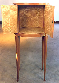
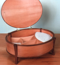
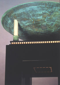
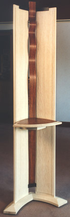
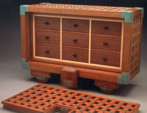
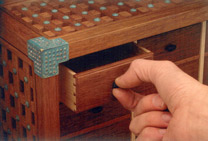
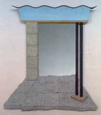
Eastern & Swedish Maple Silver Cabinet |
||||||||||||||||||||||||||||||||||||||||||||
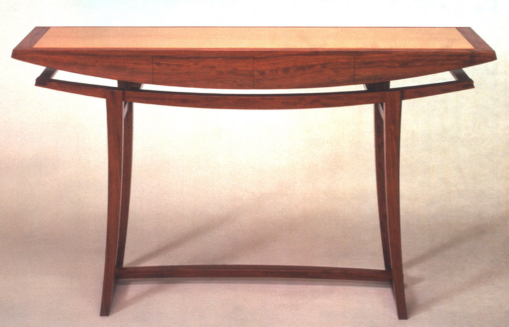
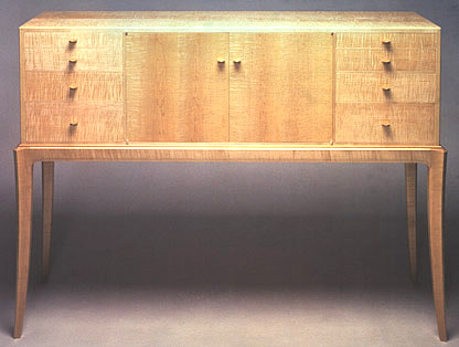
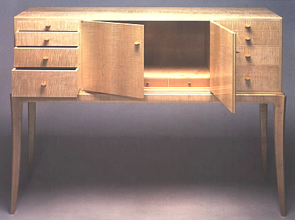
Every accomplished maker creates work that comes to be seen as his or her signature piece. For Walker, the bubinga sideboard or console is one such piece, and one well remembered by gallery visitors. Within Walker’s body of work, it is unusually sculptural. The boat shaped volume of its top has less to do with functionality, although it does house two narrow drawers, and has more to do with form: in this case, a streamlined and water borne volume floating serenely above its supporting table base. The curve of the rail of this table base strengthens the form, suggesting surface tension and buoyancy. The same curve is nicely reversed to add visual tension in the lower stretcher, which runs lengthwise between the legs. This piece again reflects more the quality of Saarinen’s work and less traditional table architecture. The single tonal drama is produced by a maple veneer rectangle that is centered on the top. Walker’s Silver Cabinet or sideboard was another candidate to steal the show. In this piece, he looks back to his 1987 sideboard in ash that set the theme for his affection for long, chest-high cabinets that sit on a delicate, elegant table base and whose legs seem improbable supports for the cabinet mass they carry. In the 1987 piece, Walker used a double horizontal stretcher at the top of the legs to create structure with no lower leg stretchers. Here, too, he follows this formula of simple, uncluttered elegance where everything depends on the joinery at the legs’ top for the piece’s stability. Like the dining table, the sideboard's legs are set in at 45-degrees. The front is composed of two central doors, flanked by two sets of four shallow drawers. The drawers graduate in size and become narrow in depth as they approach the top. Beyond this, the visual pleasure of the front of the cabinet is left entirely to the use of figured re-sawn maple which, like the earlier ash cabinet, flows horizontally across the drawer fronts, but vertically on the doors. This stark pattern is striking, and is enhanced further by its utter simplicity. Also, the use of re-sawn figured maple reflects Krenov’s attention to material as a major source of inspiration. There is more ample space for serving pieces beyond the doors. Narrow drawers are also included in the bottom of this space; not surprisingly, their width is asymmetrical, a sure Krenov touch. Over the years, there will be two more of these cabinet/sideboards to come from Walker’s shop to the gallery. It is interesting to study the different design solutions he employs in each cabinet to visually integrate the line of the leg into the bottom of the cabinet. |
||||||||||||||||||||||||||||||||||||||||||||
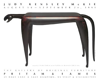
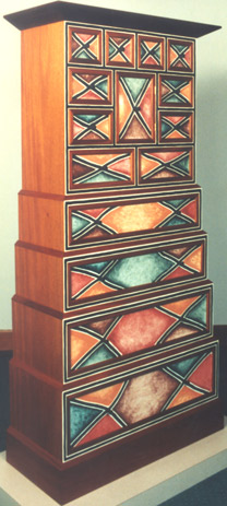
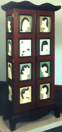
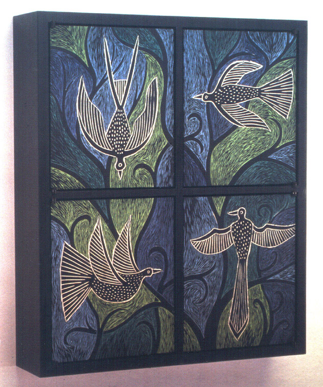
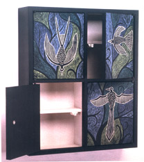
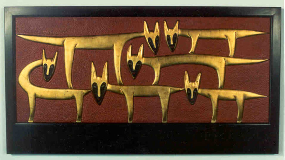
Judy Kensley McKie - 1991 |
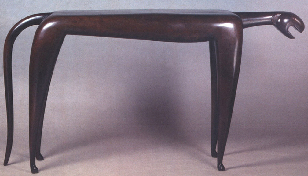
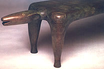
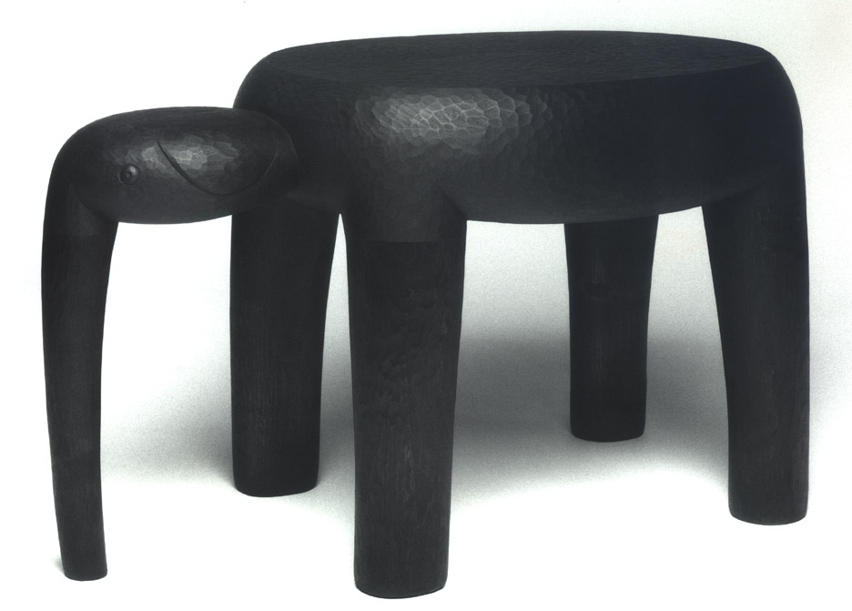
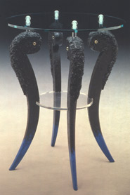
Judy Kensley McKie The Jaguar Table illustrates McKie’s great talent for combining a useful piece of furniture seamlessly with her sculptured animal forms. Rather than terminating abruptly, the long flat back of the jaguar creates a line of tension that extends to the neck of its taut form. In the detail of the head, notice the simplified abstraction that suggests the nose and eyes. As said before, the abstraction of McKie's detailing has kinship with Alaskan or African carving and little to do with the romantic realism of a Frederic Remington mountain lion. McKie will occasionally make wood pieces in small editions such as the Baby Elephant Table, which was an edition of five. Past small wood editions have included the Bird Table (1982) and the Snake Table (1987). There is a freedom that seems to come with this scale of piece for McKie, and the Baby Elephant Table was a piece cherished by gallery visitors. The utter simplicity of its form captures the contentment of simply being where it is -- truly a benign quality. The elephant stands with its legs pouring downward into the ground. What is fascinating is McKie’s ability to express and create dramatic differences through simple form. We also see this in the Jaguar Table, a similarly rooted vertical form, but one that expresses an intense energy and strength of movement. Case pieces in the show include the Pattern Chest, the Family Tree Chest, and the Flying Birds cabinets. There were also two carved mirrors, and two carved headboards. The two largest pieces in the show were a tall chest of drawers and a tall freestanding cabinet. The chest of drawers suggests a pyramid construction in that the four large bottom drawers each step in successively from the base. This stack of four drawers itself provides a base for the top tower of ten drawers and door. This piece is distinguished by the colored monotypes under glass that compose the drawer fronts. The diamond pattern of the monotypes, intentionally irregular, is reminiscent of the expressive dynamic of flag graphics. The reds, orange, and pale blues all with a light field grinning through make the colors seem weathered. The pediment and top molding are without gesture and simply frame this stack of drawers. The Family Tree Cabinet also uses monotypes under glass. Both the footed base and the crown have an exaggerated curviness that suggests the mobility of the mouth: this cabinet wants to talk. Its two full-length doors are each composed of a vertical series of four framed cartoon-like heads that mostly face each other as if in conversation. The third tier of heads contrarily face away. The sides of the cabinet also sport these framed heads, this time they're stacked vertically. Dark frames and oxblood red framing members contrast with the pale colors of the faces of these dark brunettes. In the artist’s words, "this is a goofy piece." This piece is not only a rare use of human form in McKie’s body of work, it stands as exceptional in its attitude, like a mis-struck coin. The Flying Bird Cabinet is a shallow cabinet whose carved and painted limewood doors were also the basis for a linocut series of these birds in flight. On the cabinet, the door panels occupy almost the entire front and through shallow carving of the limewood, McKie has created the lightly dimensioned detail of the birds in flight. The bird forms are in black and white with the carved lines retaining the light tones of the limewood. McKie uses deep tones of blue and green in the background field of flora to lift these birds away and give depth. Each of the four panels is unique, whereas it would have been simpler to reverse the diagonally opposite forms. The two mirrors in this show were the same scale and format, but with entirely different personalities. Formally, the mirrors are unusual in that they are squares. But much more unusual is the proportion of the square of mirrored glass to the frame itself, hardly more than 10%, suggesting more a forbidden view than a place to review and arrange oneself. It is almost like the small window in the door of a private club. Beyond this, the personalities of the two mirrors could not be more different due to McKie’s bas-relief carved patterns. In the first, four snakes coil around the mirror. Their bodies are dramatically covered in gold leaf, which is augmented by red and black pigment. The second mirror, as self-effacing as the first is dramatic, uses a delicately carved vine motif with no color differentiation in the wood surface except for the shadow cast by the carving. |
|||||||||||||||||||||||||||||||||||||||||||
 |
||||||||||||||||||||||||||||||||||||||||||||
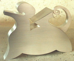
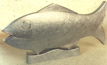
Painted Poplar Jaguar Side Table |
||||||||||||||||||||||||||||||||||||||||||||
 |
||||||||||||||||||||||||||||||||||||||||||||
Bronze version of Jaguar Side Table + |
||||||||||||||||||||||||||||||||||||||||||||
 |
||||||||||||||||||||||||||||||||||||||||||||
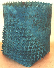
Bronze Beast Bench detail |
||||||||||||||||||||||||||||||||||||||||||||
 |
 |
|||||||||||||||||||||||||||||||||||||||||||
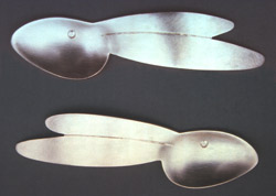
Walnut Elephant Table |
||||||||||||||||||||||||||||||||||||||||||||
+ |
||||||||||||||||||||||||||||||||||||||||||||
 |
 |
|||||||||||||||||||||||||||||||||||||||||||
Mahogany, monotypes under glass Chest with Many Drawers |
Poplar, monotypes under glass, milk paint "Family Tree" Cabinet |
|||||||||||||||||||||||||||||||||||||||||||
 |
 |
|||||||||||||||||||||||||||||||||||||||||||
Carved & painted limewood Flying Birds Cabinet |
||||||||||||||||||||||||||||||||||||||||||||
+ |
||||||||||||||||||||||||||||||||||||||||||||
 |
 |
|||||||||||||||||||||||||||||||||||||||||||
Carved limewood, gold leaf, milk paint Mirror with Snakes |
Carved limewood Mirror with Vines |
|||||||||||||||||||||||||||||||||||||||||||
 |
||||||||||||||||||||||||||||||||||||||||||||
Bleached & carved maple "Watching Dogs" Headboard |
||||||||||||||||||||||||||||||||||||||||||||
 |
||||||||||||||||||||||||||||||||||||||||||||
Carved maple with gold leaf & paint "Watching Dogs" Headboard + |
||||||||||||||||||||||||||||||||||||||||||||
 |
||||||||||||||||||||||||||||||||||||||||||||
"Grinning Bear" Monotype |
||||||||||||||||||||||||||||||||||||||||||||
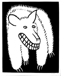
Included in McKie’s show were two queen-sized headboards, each aptly called the Watching Dog headboard. The thought was to mount these on the wall with the wide bottom part of the frame at pillow height. Though individually carved, these headboards do, in fact, have the same graphic. Like the mirrors, one is polychromed and the second monochromatic but, unlike the mirrors, the bas-relief graphic in the headboards is the same. Beyond this, they are strongly different in their impact. The first headboard is carved and bleached maple, a monochrome except for the shadows thrown by the carved lines. The watching dogs stand in a strict left to right formation. The drama of the headboard is created entirely by the five faces turned 90- degrees from the body, yielding five pairs of eyes looking intently at the viewer. The second headboard has exactly the same form but the bodies of the dogs are done in gold leaf. They stand proud of a deep red painted field that is bordered by a black frame. A part of the dog’s faces, including the eyes, are painted black. In the maple version, we are mainly aware of the intent gaze of the five pairs of eyes. In the second headboard, the gold leafing of the dogs emphasizes their forms, the black of the faces de-emphasizing the gaze. They appear more as magical creatures in a dramatic landscape. The Grinning Bear monotype was one of McKie’s larger two- dimensional images from this period. It is a charming cartoon in its devilish duplicity. The bear’s grin is negated by everything else we see -- its porcupine hair, its extended claws -- as if its grinning will hide its own great sense of fright. The monotype creates a white bear on a black field. |
||||||||||||||||||||||||||||||||||||||||||||
| New Work - November 1991/January 1992 |
New Work The last show in a banner season came in November and bridged into 1992. The announcement piece was a pearwood settee by Don Krawczyk. Trained at RISD, Krawczyk also worked for his teachers, Rosanne Somerson and Alphonse Mattia, as an assistant, while producing his own furniture as well. The “lightning” motif cutouts in the bent laminated back panels first became part of his design language in a pair of end tables that he introduced at P&E in 1990. The thickened legs on the settee also reflect an aesthetic of the late 1980s, perhaps itself a reaction to the elegant Deco-inspired furniture that had come just before. Small settees like this one are a pleasing project for a studio furniture maker because of their scale and the opportunity to extend one’s thinking about seating beyond a chair. From the client’s view, however, it seems that the appeal of a settee is limited, perhaps settees are more associated with parlor furniture and not in keeping with contemporary comforts. Included in this show was the work of three makers trained by James Krenov: Owen Edwards, Paul Harrell, and Zivko Radenkov. The fir cabinet by Edwards has elements of Krenov’s walk-about designs as well as his classic cabinet-on-stand prototype. The three-sided facade front also reflects Krenov’s designs as well as the shaping of the legs. Its delicate glass and slender fir stiles give this piece the right aspect for a collector’s favorite small piece. The idiosyncratic combination of fir, mahogany, and yew is yet but another indication of his teacher’s approach to design through materials. Paul Harrell, an experienced maker in his own right by this time, has in this case offered a stationery box that also closely reflects the thinking of Krenov. Zivko Radenkov’s elm and satinwood cabinet is his first attempt at the oval form since his perfectly rendered 1986 cabinet. The personality of this cabinet, however, is bolder and thus champions of the first oval cabinet might not be as taken with the second. It is slightly larger, and the marquetry is less restrained. Also, the satinwood field has a luminescence that makes one think of Louis XIV, rather than the almost Zen-like restraint of the earlier cabinet. The jewelry box from Robert Ingham represents the first of a series of complex small cases to come from this English maker. Ingham had already spent many years in charge of studio production at Parnham House under the direction of John Makepeace. The Modrian-style linear graphics of the aesthetic of this box give it a different look from anything happening in the American furniture scene at this time. The delicate use of handmade hinges and distinct materials makes one think of Krenovian touches, although the strict geometry of the box would be at odds with this comparison. His use of color, in this case red dyed sycamore, expresses more of the freedom of American thinking. This strict geometry is nicely balanced by the very active, organic figure of the olive wood. Ingham explained that his own personal workplace at the school was not large, and he had learned to develop intricate highly controlled techniques that were aimed at constructing these case pieces. During this decade, it is not surprising that strong work from Hank Gilpin suddenly appears at the gallery. This was characteristic of the partners' relationship with him. The timing of the arrival of his work had less to do with the opening of a particular show or strength of the sales season, than when he could do it. In these three pieces we find both a repeated chair classic and a fresh, once-done bench: the chair a classic like a good oil painting; and the bench, fresh like a just-done watercolor. The yewwood chairs are one of a number of variants to come out of Gilpin’s Chinese-influenced, Arts and Crafts styled chairs. Here, note the back splat extends to a lower stretcher connecting the two rear legs. The arms of the chair say, “ Sit back in me,” and indeed this is a side chair rather than a dining chair. The height of the arms where the hands rest would conflict with many dining table aprons. But it is this delicious uplifting curve that gives this version of his chair its special personality. Gilpin will mostly avoid the use of an S-curve. The bench has a design simplicity that would make it at home in modernism but for the proud appearance of the pedestal tenons through the top. He uses this simple piece to show off the special textural beauty of elm. Gilpin is saying, “Just look at this. We don’t need anything more.” You could say that Gilpin has had more fresh takes and made more once-done pieces than most people working in the field.
|
|||||||||||||||||||||||||||||||||||||||||||
 |
||||||||||||||||||||||||||||||||||||||||||||
Don Krawczyk - Pearwood Settee |
||||||||||||||||||||||||||||||||||||||||||||
 |
||||||||||||||||||||||||||||||||||||||||||||
Robert Ingham - Olive, Ash, Dyed Sycamore "Ceres" Chest & Jewelry Box |
||||||||||||||||||||||||||||||||||||||||||||
 |
 |
|||||||||||||||||||||||||||||||||||||||||||
Robert Ingham - Olive, Ash, Dyed Sycamore Jewelry Box |
||||||||||||||||||||||||||||||||||||||||||||
 |
||||||||||||||||||||||||||||||||||||||||||||
David Ebner - Renwick Stool and Purpleheart Bench |
||||||||||||||||||||||||||||||||||||||||||||
 |
||||||||||||||||||||||||||||||||||||||||||||
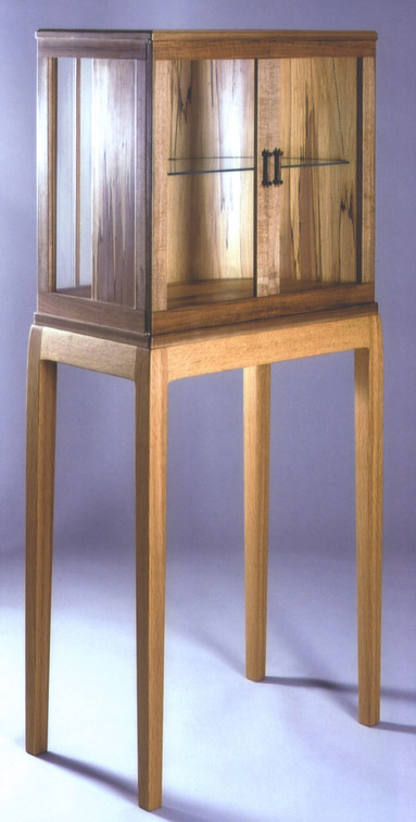
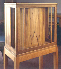
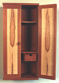
Owen Edwards - Fir, Mahogany, Yew "Story Cabinet" |
||||||||||||||||||||||||||||||||||||||||||||
 |
||||||||||||||||||||||||||||||||||||||||||||
Hank Gilpin - Yew Wood Chairs + |
||||||||||||||||||||||||||||||||||||||||||||
 |
||||||||||||||||||||||||||||||||||||||||||||
Hank Gilpin - Elm Bench |
||||||||||||||||||||||||||||||||||||||||||||
 |
||||||||||||||||||||||||||||||||||||||||||||
Paul Harrell - Maple Box
|
||||||||||||||||||||||||||||||||||||||||||||
 |
 |
|||||||||||||||||||||||||||||||||||||||||||
Zivko Radenkov - Elm, Satinwood, Pink Ivory, Holly, Teak, Ebony Cabinet with Marquetry |
||||||||||||||||||||||||||||||||||||||||||||
 |
||||||||||||||||||||||||||||||||||||||||||||
Ron Puckett - Pearwood, Macassar Ebony, Curly Anigre Writing Desk |
||||||||||||||||||||||||||||||||||||||||||||
 |
 |
|||||||||||||||||||||||||||||||||||||||||||
Don Green - Ebonized Mahogany, Bloodwood, Wall Hung Chest of Drawers |
Rosanne Somerson - Fumed Oak, Maple Cabinet with Mirror |
|||||||||||||||||||||||||||||||||||||||||||
 |
||||||||||||||||||||||||||||||||||||||||||||
 |
||||||||||||||||||||||||||||||||||||||||||||
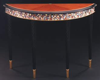
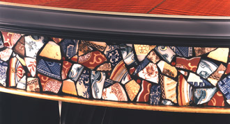
Rick Wrigley - Fiddleback Makore, black-dyed Pearwood, Maple, ebonized Maple, Gold Leaf, pique assiette Demilune Table |
||||||||||||||||||||||||||||||||||||||||||||
| 1 9 9 2 | ||||||||||||||||||||||||||||||||||||||||||||
| Early Spring Show - 1992 |
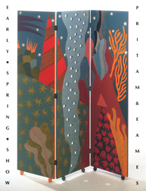
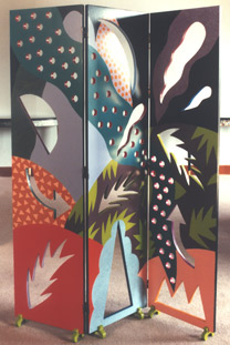
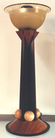
Early Spring Show The Early Spring Show (ESS) had become a standard feature at the gallery, and during the 1990s, it would be used as a more flexible format in its inclusion of makers. It also provided the gallery more leeway to continue to learn from its public’s reaction. The piece on the announcement is a three-paneled screen by Lisa Houck and is an example of stretching the group show envelope. Houck is a painter from the Boston area and not trained as a furniture maker. Another painterly inclusion in the ESS was the House Mirror by Lee Trench. Trench was trained as a furniture maker at the Program in Artisanry at Boston University, but chose the mirror to serve as her canvas for this show. She hoped that customers might like the idea of commissioning her to paint their homes as part of her mirror series. Trench’s furniture had been seen at the gallery from the mid-1980s. Side by side with this work were new arrivals from Krenov-trained makers, as well as two pieces by Krenov himself. The 1990s would prove to yield a strong flow of new cabinets from him. As was often the case with Krenov, he would call the gallery to say he had just finished a new piece or two and ask, "Are you interested?" The work would arrive soon afterwards making it virtually impossible to announce the pieces in printed material. This spring he sent two cabinets: his most recent example of a walk-about cabinet -- this one transparent from all sides, and another cabinet in which he experimented with freed and flared front door panels. The first cabinet reflected the novelty of being able to use a cabinet as a small exhibition space from the front, sides, and rear. But it was just as much about the interior space in this piece because, according to Krenov, it is the sense of space he remembers from the Stockholm Opera House. In this cabinet, the interior space was created by using a curved interior wall of spalted hickory, which provided a wonderful opportunity for the use of unusual material. In both cabinets, Krenov is experimenting with the tension of curves within frames and, in both, the use of spalted material for his shaped and coopered curves. In the “opera house” cabinet, the stand and cabinet are kwila; while in the second cabinet, he challenges us with the combination of English walnut, spalted alder, and black oak, the former material providing the framing and legs of the table/stand. The stand can be seen itself as a beautiful console with two drawers. But it is the cabinet doors that we focus on with their panels flying free of the frame on the outer sides. Note how the door pulls are used to reflect in reverse the outside curve of the flared sides. When Darrell Sewell, then curator of 20th-century decorative arts at the Philadelphia Museum of Art, visited the gallery and saw this Krenov piece, he went up and hugged it. The cabinet is in the permanent collection of that museum. Two other pieces come from Krenov trained makers: an exquisite jewelry box from Ken Frye continues his work with round and oval containers. In the lid’s delicate marquetry, he reflects more the influence of his friend, Zivko Radenkov, the interior uses asymmetry as well as curves in the design of its partitions. This time a Radenkov cabinet comes without marquetry. Atypically as well, it is wall hung. Its simplicity is also its elegance, allowing the curly ash door panels to be featured. The table lamp from Peter Thiebeault uses Depression-era glass for its upward casting shade, while the form of the wenge base reflects the then strong influence of the post- modern wave in architecture. Tweaking one of the balls on the base operates as a convenient on-off switch. John Eric Byers milk painted ash cabinet continues to show the diverse experimentations with form and color within the studio craft field. Three other makers submitted pieces representing well-honed forms from their designs. Any gentleman would prize David Ebner’s elegant mahogany valet. Its bent laminated wishbone legs demonstrate his allegiance to both Wharton Esherick and his teacher, Wendell Castle. Rick Wrigley's demilune with its aluminum-faced apron follows his previous demilune whose apron was pieced from broken dishes. The accompanying chair is unusual because of its differently styled front and rear legs. While being designed to yield an elegant chair form with decorative panache, its intention was also not to be overly complex in construction so as to be affordable. In Wrigley’s playful style, he combines the chair's fluted legs with decorative detailing in the chair back using industrial screws. The demilune uses a similar decorative feature. Lastly, included in the show was a table of scale by Jonathan Wright. Known for his fascinating rounded triangle extension tables in the 1980s, this time he opts for a post and beam structural composition over modernism and comes up with a dining table whose demeanor is more Arts and Crafts. The solid top extends well out from the legs and stretchers making for flexible seating. |
|||||||||||||||||||||||||||||||||||||||||||
 |
 |
|||||||||||||||||||||||||||||||||||||||||||
Lisa Houck - Oil on Wood Screen, "A Cyclone in the Area" |
Lisa Houck - Oil on Wood Screen, "A Tornado Watch is in Effect" |
|||||||||||||||||||||||||||||||||||||||||||
 |
 |
|||||||||||||||||||||||||||||||||||||||||||
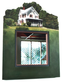
Lee Trench - Basswood, Oil/Milk Paint House Mirror |
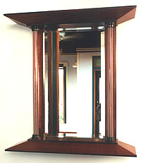
Dale Broholm - Pomelle, ebony, mahogany Mirror |
|||||||||||||||||||||||||||||||||||||||||||
 |
 |
|||||||||||||||||||||||||||||||||||||||||||
James Krenov - Kwila, spalted hickory Cabinet + |
 |
|||||||||||||||||||||||||||||||||||||||||||
 |
||||||||||||||||||||||||||||||||||||||||||||
 |
||||||||||||||||||||||||||||||||||||||||||||
James Krenov - English Walnut, Spalted Alder, Black Oak Cabinet |
||||||||||||||||||||||||||||||||||||||||||||
 |
 |
|||||||||||||||||||||||||||||||||||||||||||
Ken Frye - Pearwood, Rosewood Oval Jewelry Box |
||||||||||||||||||||||||||||||||||||||||||||
 |
 |
|||||||||||||||||||||||||||||||||||||||||||
Zivko Radenkov - Pearwood Wall Cabinet |
Peter Thiebeault - Wenge, Maple Torchere |
|||||||||||||||||||||||||||||||||||||||||||
 |
||||||||||||||||||||||||||||||||||||||||||||
John Eric Byers - Ash, milk paint "Ruba" Cabinet |
||||||||||||||||||||||||||||||||||||||||||||
 |
 |
|||||||||||||||||||||||||||||||||||||||||||
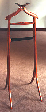
David Ebner - Mahogany, ebony Valet Rack |
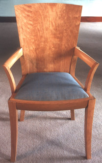
Bill Walker - Cherry Armchair |
|||||||||||||||||||||||||||||||||||||||||||
 |
||||||||||||||||||||||||||||||||||||||||||||
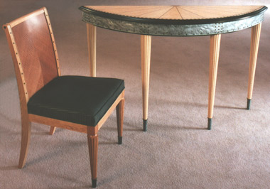
Rick Wrigley - Cherry, Makore, Steel Rivets Chair |
Rick Wrigley - Bird's-eye Maple, Makore, Aluminum Demilune Table |
|||||||||||||||||||||||||||||||||||||||||||
 |
||||||||||||||||||||||||||||||||||||||||||||
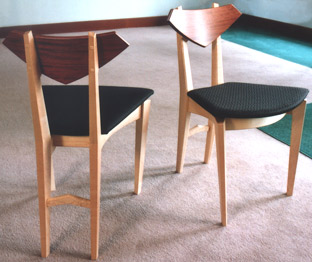
Stewart Wurtz - Maple, Bubinga Chairs |
||||||||||||||||||||||||||||||||||||||||||||
 |
||||||||||||||||||||||||||||||||||||||||||||
Jonathan Wright - Cherry, Padauk, Rosewood Table |
||||||||||||||||||||||||||||||||||||||||||||
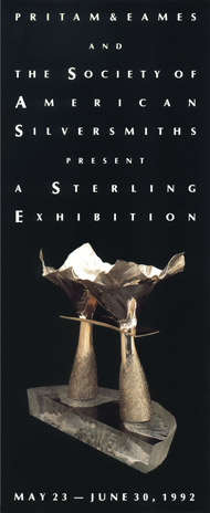
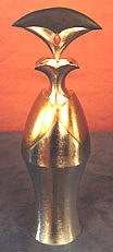
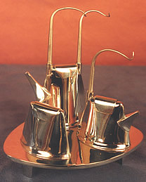
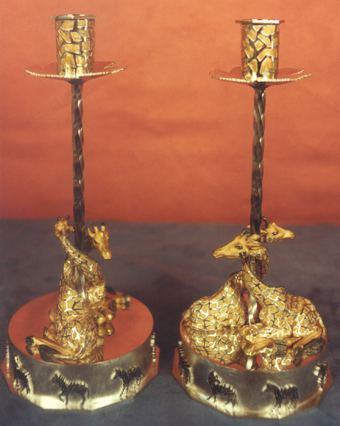
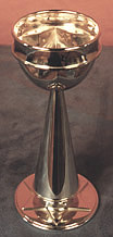
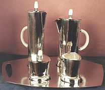
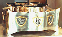
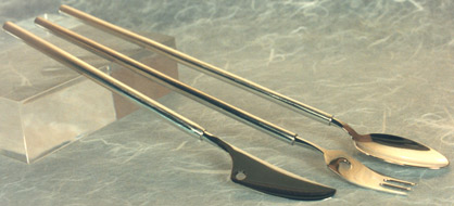
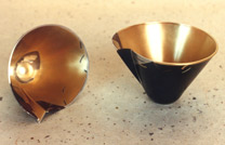
| A Sterling Exhibition - 1992 | A Sterling Exhibition In 1992, the Society of American Silversmiths (SAS) approached Pritam & Eames to host an exhibit of holloware and flatware, which they had curated. They were aware of the gallery's interest in the field of contemporary decorative metalwork. After the P&E exhibition, the silver show traveled to the National Ornamental Museum in Nashville, TN. Although the sheer number of pieces represented in this exhibit would not to be repeated at the gallery, P&E continued to host the work of a number of metal smiths in following years in an effort to develop a durable audience for American work in metal. The husband and wife team of Michael and Maureen Banner fashioned lyrical tea sets with cat-like tails as handles. Highly functional and beautifully executed, their work was appreciated by gallery clientele. Also of note was the work of Robert Butler, whose candlesticks of vermeil established a standard for metalwork. The giraffes that gracefully entwine at the base are somehow reminiscent of Renaissance metalwork. Butler's work reflects mastery over a number of technical skills that includes sculpting, casting, fabrication, soldering, cold joining of forms, and vermeil--the plating of gold over silver. The giraffes are anatomically correct, a feat itself given the scale of the work. The candlesticks conveyed several layers of messages: simple, yet technically complex and varied, functional, yet richly decorative, and lighthearted, but traditional. Kurt Matzdorf is a major figure in the field of ceremonial metal pieces, as is John Marshall, Curtis LaFollete, Robin Nichols and Leonard Urso, among others. They all had serious careers in the field of metal, and operated businesses from their studios, while supplementing their businesses with teaching. Although there was immense respect on the part of the gallery staff for astoundingly complicated pieces like Robert Oppecker's magnificent raised silver bowl, and Randy Stromsoe's' pedestal bowl, it appeared that P&E would not be able to generate sufficient public support for metalwork. However, the gallery did continue to sponsor shows of metalwork, particularly holloware, for several more years. Even today, P&E represents the holloware, flatware, and jewelry of Leonard Urso and Tom Odell, as well as the work of ten other studio jewelers. |
|||||||||||||||||||||||||||||||||||||||||||
 |
 |
|||||||||||||||||||||||||||||||||||||||||||
Sue Amendolara |
||||||||||||||||||||||||||||||||||||||||||||
 |
||||||||||||||||||||||||||||||||||||||||||||
John Marshall |
Michael & Maureen Banner |
|||||||||||||||||||||||||||||||||||||||||||
 |
 |
|||||||||||||||||||||||||||||||||||||||||||
Marilyn da Silva |
||||||||||||||||||||||||||||||||||||||||||||
 |
||||||||||||||||||||||||||||||||||||||||||||
Robert Butler + |
Robert Davis |
|||||||||||||||||||||||||||||||||||||||||||
 |
 |
|||||||||||||||||||||||||||||||||||||||||||
Susan Ewing |
Fred Fenster |
|||||||||||||||||||||||||||||||||||||||||||
 |
||||||||||||||||||||||||||||||||||||||||||||
 |
||||||||||||||||||||||||||||||||||||||||||||
Roger H. Horner |
||||||||||||||||||||||||||||||||||||||||||||
William Frederick |
 |
|||||||||||||||||||||||||||||||||||||||||||
 |
||||||||||||||||||||||||||||||||||||||||||||
Curtis LaFollette |
Thomas Markusen |
|||||||||||||||||||||||||||||||||||||||||||
 |
 |
|||||||||||||||||||||||||||||||||||||||||||
Kurt Matzdorf |
Robert Oppecker |
|||||||||||||||||||||||||||||||||||||||||||
 |
 |
|||||||||||||||||||||||||||||||||||||||||||
Randy Stromsoe |
Leonard Urso |
|||||||||||||||||||||||||||||||||||||||||||
 |
||||||||||||||||||||||||||||||||||||||||||||
Wendy Yothers |
||||||||||||||||||||||||||||||||||||||||||||
| American Work in Metal - 1992 |
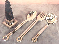
American Work in Metal American Work in Metal opened in 1992 with a lively show of work from metalsmiths working in traditional materials. Since this was an exhibition organized by P&E, the gallery partners felt they could learn a lot from their public's reaction to it. The show encompassed a spirited group who were offering a pointedly practical dimension to the work: it worked. From Jonathan Bonners' stone and copper weathervanes and Rabbit Spoons, to Mardi-Jo Cohens' Formica and silver utensils, to Robert Davis' salt and pepper shakers, it seemed like these artists were also having fun! Contrast that work with the decorative work of Mark Williams Morgan and Marvin Jensen. They were producing vessels in the technically complex Japanese tradition of mokume gane (wood grain metal), composed of many sheets of different alloys welded together and then carved and worked to produce various wood grain-like patterns. These pieces are then treated with the Japanese chemical rokusho to color the various metals used and to emphasize the pattern. It's subtle and sophisticated work. Janet Prip's bold vessels in the shape of a fish or a face brought a smile to all. Fabricated out of heavy sheets of pewter, she spent a great deal of time on her surface texture, swirling emery-paper in varying grades to create the final brushed result. Jewelry 1992 The audience was enthusiastic and supportive as the gallery continued to exhibit the work of master enamel artist Colette, as well as the wearable work of Pat Flynn, Bessie Jamieson, Tom Odell, Eleni Prieston and Joan Parcher. Pat Flynn continued to defy his public by creating "precious" wearable jewelry out of rusty steel nails, set with diamonds. He balances these raw and beautiful pieces with his ceremonial cups of pewter, silver, and gold. There was a feel of spontaneity in his work that translated across functional, decorative, and wearable lines and made his pieces extremely appealing. The gallery also hosted Vicki Eisenfeld fabricated and woven pieces of gold and silver, which she turned into alluring and utterly wearable necklaces. |
|||||||||||||||||||||||||||||||||||||||||||
 |
 |
|||||||||||||||||||||||||||||||||||||||||||
Jonathan Bonner - Brass, Gold Leaf, Granite "Quaverous Cube" Weathervane |
||||||||||||||||||||||||||||||||||||||||||||
 |
 |
|||||||||||||||||||||||||||||||||||||||||||
Robly Glover - Sterling Silver "Howling Hey Man Crested Tea Thing" |
||||||||||||||||||||||||||||||||||||||||||||
 |
||||||||||||||||||||||||||||||||||||||||||||
Jonathan Bonner - Copper, Granite "Sail Fin" Weathervane |
||||||||||||||||||||||||||||||||||||||||||||
Jonathan Bonner - Sterling Silver Rabbit Spoons |
||||||||||||||||||||||||||||||||||||||||||||
 |
 |
|||||||||||||||||||||||||||||||||||||||||||
Ken Carlson - Woven Copper Baskets |
||||||||||||||||||||||||||||||||||||||||||||
 |
||||||||||||||||||||||||||||||||||||||||||||
Robert Davis - Sterling Silver, Onyx, Mother of Pearl "Symmetra" Salt & Pepper Shaker Set |
||||||||||||||||||||||||||||||||||||||||||||
 |
||||||||||||||||||||||||||||||||||||||||||||
|
Robert Davis - Sterling Silver Baby Spoons |
||||||||||||||||||||||||||||||||||||||||||||
 |
||||||||||||||||||||||||||||||||||||||||||||
Pat Flynn - Sterling Silver, 24K Gold Plate, 18K Gold, Pewter Beakers |
||||||||||||||||||||||||||||||||||||||||||||
 |
||||||||||||||||||||||||||||||||||||||||||||
Skip Gaynard - Sterling Silver Long Stem Flatware |
||||||||||||||||||||||||||||||||||||||||||||
 |
 |
|||||||||||||||||||||||||||||||||||||||||||
Carrie Harper - Sterling Silver Ice Teaspoons Bill Gudenrath - Ice Tea Glasses |
Tom Muir - Sterling Silver, Nickel Liqueur Cups |
|||||||||||||||||||||||||||||||||||||||||||
 |
||||||||||||||||||||||||||||||||||||||||||||
Marvin Jensen - Mokume Gane Sphere Vessel |
||||||||||||||||||||||||||||||||||||||||||||
 |
 |
|||||||||||||||||||||||||||||||||||||||||||
Deborah Krupenia - Sterling Silver, Kuromido, 10K Pink Gold, 22K Gold, 24K Gold Plate, Japanese Copper Alloys Liqueur Cups VII & VIII |
Mark Williams Morgan - Cast Bronze with Mokume Gane inlay, colored with Rokusho |
|||||||||||||||||||||||||||||||||||||||||||
 |
||||||||||||||||||||||||||||||||||||||||||||
John Marshall - Silver & Copper Mokume Gane Helmet Form; Acrylic Base |
||||||||||||||||||||||||||||||||||||||||||||
 |
||||||||||||||||||||||||||||||||||||||||||||
Robyn Nichols - Sterling Silver Watermelon Vegetable Spoon and Pastry Server |
||||||||||||||||||||||||||||||||||||||||||||
 |
||||||||||||||||||||||||||||||||||||||||||||
Janet Prip - Pewter Fish Vessel |
||||||||||||||||||||||||||||||||||||||||||||
 |
 |
|||||||||||||||||||||||||||||||||||||||||||
Michel Royston - Forged Silver Ladle |
Nancy Slagle - Sterling Silver, Wood "New Mexico Teapot" |
|||||||||||||||||||||||||||||||||||||||||||
 |
||||||||||||||||||||||||||||||||||||||||||||
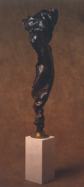
Leonard Urso - Copper, Limestone Sculpture |
||||||||||||||||||||||||||||||||||||||||||||
 |
||||||||||||||||||||||||||||||||||||||||||||
Leonard Urso - Repoussed Fine Silver Bowl + |
||||||||||||||||||||||||||||||||||||||||||||
| A Tradition of New American Furniture - 1992 |
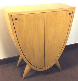
A Tradition of New American Furniture - 1992 NOTES: The Museum of Fine Arts, Boston organized two seminal exhibits that featured work from the studio furniture field: in 1989, the MFA Boston offered the New American Furniture exhibit and, in 2004, The Maker's Hand, an historical survey of 20th-century American studio furniture. Both exhibits included work by Hank Gilpin. Gilpin's curly maple chest of drawers, featured on the 1992 P&E announcement, was included in the 2004 Museum of Fine Arts, Boston exhibit, The Maker's Hand: American Studio Furniture, 1940-1990. This exhibit was organized in collaboration with The Furniture Society, an international membership organization in which Bebe Johnson was very active. In 1989, Gilpin made a wardrobe for the Museum of Fine Arts, Boston 1989 New American Furniture exhibit, which inspired a number of similar case pieces of scale in the following years. The spalted elm chest that Gilpin made for this P&E show was the latest in the series of his large wardrobe-like pieces. Here, the elm dictated the final proportions of the cabinet. The two six-panel doors were one of the two aspects that defined the sense of the piece. The other aspect was the design of the legs, which extended from the floor to butt flush with the underside of the top. They achieved a "friendly" corner by being set in a 45-degree angle. But they defined the feel of the piece by being tapered upwards throughout the length of the leg. This tapered leg set in at an angle had become a signature of Gilpin's case pieces, and had evolved from pieces appearing at the gallery as early as 1987. A bench, blanket chest, and small seven-drawer chest would complete Gilpin's work for the show. In addition, there was a firewood holder made from recycled church pews, which was indicative of Gilpin's spontaneous creations as well as his open-mindedness about the use of materials. By this time, John Dunnigan's work had become more detail oriented and less focused on form as in his earlier upholstered work. However, the Corner Chair, one of seven pieces submitted for this show, was a strong fusion of original Dunnigan form as well as detail. The broad shield-style back may owe something to Hucker, but the lush upholstered detailing and reeded tapered posts was vintage Dunnigan. His Cabinet with Sticks is an example of the more decorated direction in which Dunnigan's work was headed. James Schriber's featured piece, a pearwood and maple glass paneled tall cabinet, struck a formal note when compared to his folk-inspired work. There have always been a number of stylistic dimensions in Schriber's body of work, and elegant Deco-inspired pieces have held their place since the 1980s.This case piece could sit well in a room with one of his pedestal dining tables and his upholstered dining chairs. As with the Deco cabinet above, Schriber produces what he refers to as his historically referenced work. This would include his folk inspired pieces. In this show, however, it is a not folk but an architectural reference he draws upon in the leather upholstered chair and ottoman -- William Morris, in this case. Two contemporary styled consoles in cherry and ash completed his work for this show. |
|||||||||||||||||||||||||||||||||||||||||||
 |
|
|||||||||||||||||||||||||||||||||||||||||||
 |
||||||||||||||||||||||||||||||||||||||||||||
Hank Gilpin - Spalted Elm Cabinet |
||||||||||||||||||||||||||||||||||||||||||||
 |
 |
|||||||||||||||||||||||||||||||||||||||||||
Hank Gilpin - Recycled church pews Firewood Holder |
Hank Gilpin - Assorted cutoff woods Blocks |
|||||||||||||||||||||||||||||||||||||||||||
Hank Gilpin - Walnut Blanket Chest |
||||||||||||||||||||||||||||||||||||||||||||
 |
 |
|||||||||||||||||||||||||||||||||||||||||||
John Dunnigan - Cabinet with Sticks
|
||||||||||||||||||||||||||||||||||||||||||||
 |
|
|||||||||||||||||||||||||||||||||||||||||||
 |
||||||||||||||||||||||||||||||||||||||||||||
John Dunnigan - Tufted Bench
|
||||||||||||||||||||||||||||||||||||||||||||
John Dunnigan - Bubinga, patinaed Brass, Small Faceted Cabinet |
||||||||||||||||||||||||||||||||||||||||||||
 |
||||||||||||||||||||||||||||||||||||||||||||
John Dunnigan - Corner Chair |
||||||||||||||||||||||||||||||||||||||||||||
 |
||||||||||||||||||||||||||||||||||||||||||||
James Schriber - Pearwood, Maple, Sycamore, Glass Floor Standing Cabinet
|
||||||||||||||||||||||||||||||||||||||||||||
 |
||||||||||||||||||||||||||||||||||||||||||||
Schriber Bubinga, Leather Chair and Ottoman |
||||||||||||||||||||||||||||||||||||||||||||
 |
||||||||||||||||||||||||||||||||||||||||||||
James Schriber - Cherry, Ash Side Tables with Drawers |
||||||||||||||||||||||||||||||||||||||||||||
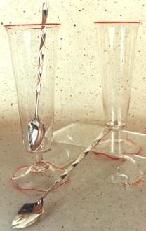
| Glass 1992 |
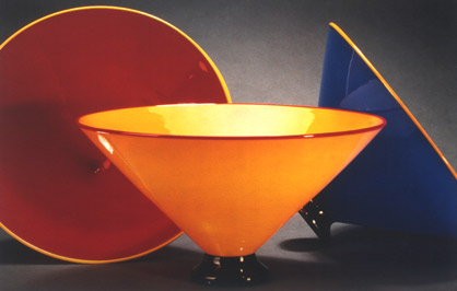
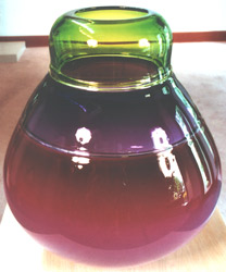
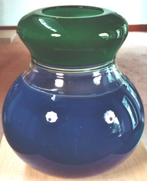
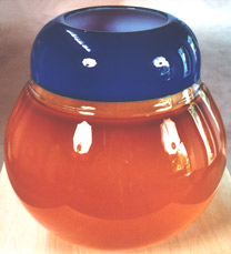
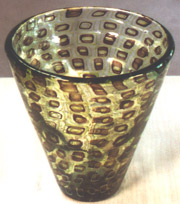
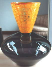
Glass '92 Art glass was a hot medium in the 1990s. The gallery's focus on functional glass forms --vases, glasses, bowls, and platters -- limited its attraction to collectors who sought mostly one-of-a-kind, non-functional art glass. Nevertheless, the color, verve, and fun of IBEX and Pinkwater Glass work found an appreciative audience at P&E. |
|||||||||||||||||||||||||||||||||||||||||||
 |
 |
|||||||||||||||||||||||||||||||||||||||||||
|
IBEX |
||||||||||||||||||||||||||||||||||||||||||||
 |
||||||||||||||||||||||||||||||||||||||||||||
IBEX |
||||||||||||||||||||||||||||||||||||||||||||
 |
||||||||||||||||||||||||||||||||||||||||||||
IBEX |
||||||||||||||||||||||||||||||||||||||||||||
 |
||||||||||||||||||||||||||||||||||||||||||||
 |
 |
|||||||||||||||||||||||||||||||||||||||||||
Sonia Blomdahl |
||||||||||||||||||||||||||||||||||||||||||||
 |
||||||||||||||||||||||||||||||||||||||||||||
 |
||||||||||||||||||||||||||||||||||||||||||||
Robin Mix |
||||||||||||||||||||||||||||||||||||||||||||
 |
 |
|||||||||||||||||||||||||||||||||||||||||||
 |
 |
|||||||||||||||||||||||||||||||||||||||||||
Pinkwater Glass |
||||||||||||||||||||||||||||||||||||||||||||
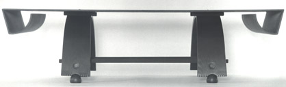
| David Ebner and Ivan Barnett - 1992 |
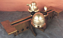
David Ebner and Ivan Barnett NOTES: David Ebner and Ivan Barnett met as draftees during the Vietnam War period. They both ended up in an Army unit dedicated to display booth fabrication. Although Barnett went on to specialize in metal fabrication and jewelry, and Ebner went on the study furniture making at RIT, they stayed in touch. In the early 1990s, they decided to collaborate and produce a body of work designed with available parts made in production for other purposes. This included the bentwood parts that Mennonites used for wheels, steel harrow disks, and tool parts, particularly handles. The oak and steel low table provided a particularly calligraphic announcement, but the favorite piece in the show was the stool. The dark tonalities of the painted finishes were a integral part of the theme, as was keeping most metal parts true to their industrial look. |
|||||||||||||||||||||||||||||||||||||||||||
 |
||||||||||||||||||||||||||||||||||||||||||||
 |
||||||||||||||||||||||||||||||||||||||||||||
Oak & Steel Low Table |
||||||||||||||||||||||||||||||||||||||||||||
 |
||||||||||||||||||||||||||||||||||||||||||||
Oak, Steel, White Gold Leaf, Pigment Stool |
||||||||||||||||||||||||||||||||||||||||||||
 |
||||||||||||||||||||||||||||||||||||||||||||
Wood & Steel Low Table |
||||||||||||||||||||||||||||||||||||||||||||
 |
||||||||||||||||||||||||||||||||||||||||||||
Wood, Steel, Leather Bench #2 |
||||||||||||||||||||||||||||||||||||||||||||
 |
||||||||||||||||||||||||||||||||||||||||||||
Wood & Steel Two Seater Bench |
||||||||||||||||||||||||||||||||||||||||||||
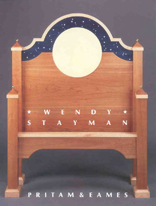
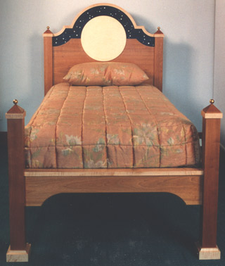
| Wendy Stayman - 1992 |
Wendy Stayman: Furniture NOTES: This was Wendy Stayman's second one-person show at P&E. Throughout the 1980s, a number of studio furniture makers had developed skills that could emulate the finest detailing of the neo-classical and Art Deco periods. These modern furniture makers had the capability to work with an extraordinary degree of accuracy in all phases of furniture construction. The quality achieved within the field, particularly by Richard Scott Newman working in Rochester, NY set high standards. The Rochester area was not the only area in the country focusing on advanced craft. The College of the Redwoods in Mendocino, CA also cultivated furniture built with the highest refinement, although the skills taught there were less technically driven. In addition to Newman in Rochester, the work coming out of the nearby Wendell Castle Studio in Scottsville, NY reached an ultra-refined level of production as well. Wendy Stayman was one of Castle's protégées and a product of his studio school. She set about to achieve her signature in work that derived from a wide knowledge of materials and techniques as a result of her background in restoration work. In this, her second featured show at the gallery, she produced a body of work stunningly detailed. From mother-of-pearl seed beads and semi-precious stones to silver, the materials matched the creative poetry of the detailing. She was not alone, however, in the number of contemporary makers to turn away from ivory and use a synthetic substitute. In her writing desk, the facade panels were covered with pattern stamped leather rather than veneer. With the ebonized cherry framing and legs detailed with imitation bone, the decorative richness was topped off by a leopard jasper doughnut shaped pull on the fall-front. Although Stayman was accomplished with elegantly evolved curves, this piece stood nicely at attention, an appropriate attitude for the light/dark motif. The Liquor Box on Table also stood squarely with perfect symmetry of form. The unbroken Cuban mahogany planes of the box itself were star-dusted with tiny seed beads, which together with the cirrus figure of the mahogany, created the subtlest of illusions. The box was hinged so that not only the top, but the front and sides opened as well.
Altogether, there were thirteen pieces in this exhibit, a significant output by a furniture maker for a featured show. Although some of the major pieces did sell, the response was not commensurate with the quality and inspirational power of the work. The handwriting was on the wall. After supporting a growing body of finely detailed European referenced work through the 1980s, the field's small collecting public was beginning to look for something else. The following year, the shallow relief pattern work of Kristina Madsen would present just such a direction. |
|||||||||||||||||||||||||||||||||||||||||||
 |
||||||||||||||||||||||||||||||||||||||||||||
 |
||||||||||||||||||||||||||||||||||||||||||||
Cherry, Curly Maple, Curly Sycamore, Bolivar, Mother-of-Pearl, Brass
"Les Tres Riche Heures" Bed |
||||||||||||||||||||||||||||||||||||||||||||
 |
||||||||||||||||||||||||||||||||||||||||||||
 |
||||||||||||||||||||||||||||||||||||||||||||
Ebonized Cherry, Cherry, Stamped Leather, Imitation Bone, Jasper, Fiber
" Bon Heure de Jour" Writing Desk |
||||||||||||||||||||||||||||||||||||||||||||
 |
||||||||||||||||||||||||||||||||||||||||||||
Curly Bird'seye Maple, Gaboon Ebony, Ebonized Cherry Dining Table for Four |
||||||||||||||||||||||||||||||||||||||||||||
 |
||||||||||||||||||||||||||||||||||||||||||||
+ |
||||||||||||||||||||||||||||||||||||||||||||
 |
||||||||||||||||||||||||||||||||||||||||||||
Cuban Mahogany, Mahogany, Satinwood, Seed Beads, Brass Liquor Box on Table |
||||||||||||||||||||||||||||||||||||||||||||
 |
||||||||||||||||||||||||||||||||||||||||||||
Sapele, Curly Maple, Gaboon Ebony Bench |
||||||||||||||||||||||||||||||||||||||||||||
 |
||||||||||||||||||||||||||||||||||||||||||||
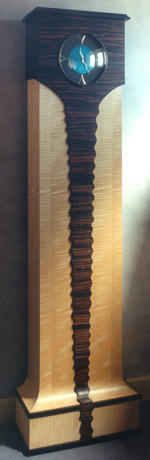
Curly Sycamore, Macassar Ebony, Ebonized Cherry, Silver, Malachite, Hematite, Azurite Clock |
||||||||||||||||||||||||||||||||||||||||||||
 |
||||||||||||||||||||||||||||||||||||||||||||
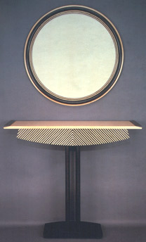
Ebonized Mahogany, Maple, Ebony Zebra Table with Mirror |
||||||||||||||||||||||||||||||||||||||||||||
 |
||||||||||||||||||||||||||||||||||||||||||||
Curly Maple, Ebony Upholstered Chair; Curly Maple, Ebony "Henson" Table |
||||||||||||||||||||||||||||||||||||||||||||
 |
||||||||||||||||||||||||||||||||||||||||||||
 |
||||||||||||||||||||||||||||||||||||||||||||
Macassar Ebony, Swiss Pearwood, imitation Bone, Silver Window Seat |
||||||||||||||||||||||||||||||||||||||||||||
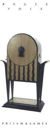
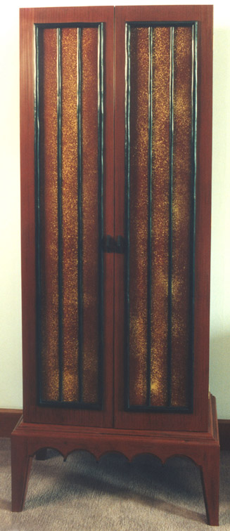
| Bruce Volz - 1992 |
Bruce Volz NOTES: Volz's second featured show was notable for the return of his American Flyer Cabinet, a cabinet on legs whose facade was reminiscent of a legendary locomotive, and the Te Fatou cabinet, whose inspiration came from the South Seas. Although the cabinet's exact reference to Paul Gauguin is unclear, the style of the cabinet is clear. The grill of what appears to be hand fashioned dark tropical wood bars separates the user from bursts of gold dust. This, in turn, plays off a background of blackened red paint, which lends a feeling of the tropic's decay. Inside, there are upper and lower shelves with a mid-section of saw toothed, black trimmed, gold leafed drawers.
|
|||||||||||||||||||||||||||||||||||||||||||
 |
 |
|||||||||||||||||||||||||||||||||||||||||||
Painted Cherry, Dyed Oak, Gold Leaf, Gold, Horsehair "American Flyer 92 " TV Cabinet |
Poplar, Ebony, Mahogany, Copper, Gold Leaf "Te Fatou" Audio Cabinet + |
|||||||||||||||||||||||||||||||||||||||||||
 |
|
|||||||||||||||||||||||||||||||||||||||||||
 |
||||||||||||||||||||||||||||||||||||||||||||
Dyed Walnut, Holly, Copper Light |
||||||||||||||||||||||||||||||||||||||||||||
 |
||||||||||||||||||||||||||||||||||||||||||||
Painted Cherry, Lucite, Sawdust "Vanishing Species" Table |
Dyed Maple, painted Poplar, Ebony, Granite Chips "Thing I" Clock |
|||||||||||||||||||||||||||||||||||||||||||
| A Gathering - 1992 |
A Gathering This small autumn show re-captures some of the surprising quality of 1980s group shows. The reason for this off-season show was simply that the work was ready. Through a series of informal telephone conversations, this group show came together. In a two-man show with Ben Mack in 1988, John Dodd introduced the idea of a movable screen/partition that can be hybridized into a cabinet, hall tree, and table as in the case of the announcement piece. Here the lightness of the ash dramatizes the ripple of the pau ferro that is suspended as a narrow central panel. The small table surface suggests a function beyond accent. The oval hall table by Hank Gilpin is distinguished by a trestle-like base, a through drawer, and a brushed and bleached finish. Like most trestles, the posts are connected by a single stretcher, which is held tight by friction fit wedge tenons. In this case, the posts are two board thickness curved solid sections. Through drawers are normally fussy since they have to work well through a double depth. The through drawer is in keeping with the oval top which itself suggests use from either side. The brushed finish was inspired by a bar in a steak house underneath the Brooklyn Bridge where the tables were wire brushed down every evening after the bar closed. Tim Philbrick was represented by a pair of his Vide Poche tables, a table form he introduced in the 1989 Ebony show. Here the material is Honduras rosewood with a vellum table surface. The single drawer is dramatized by a single ivory pull and a swag curved drawer bottom. Philbrick used what he calls "mammoth ivory" which tells the public that the material is not harvested from living species. Beautifully tapered legs give the table its tall appearance and, once again, rhythm. The table's surface is bounded on three sides by a coved border, which rises on the rear of the table to complement the swag curve of the drawer bottom. This kwila cabinet is the first work by Greg Smith to arrive at the gallery. As will be true of his future work, the quality that first strikes the viewer is its warmth and gentle understatement. In this waist high piece, two drawers are situated above two doors, which enclose interior shelves. Another distinctive feature of Smith's work is the hand fabricated metal pulls. The thick kwila veneer of the front of the cabinet uses the sapwood of the plank to the outside to give the piece a visual taper upwards. This piece is a treasure from the quiet side of woodworking. Smith worked in a commercial cabinet shop until he decided to study with James Krenov at the College of the Redwoods. Richard Newman's child's stool allowed him to break away, at least momentarily, from the discipline of his more formal pieces. The milk stool stance gives it a charming familiarity, but the spiral fluting of the legs is unmistakably Newman's panache. In keeping with the milk stool reference, the rounded tenon ends of the solid legs pierce the top surface of the stool's scalloped solid top. And yes, there is some ebony carefully veneered to the circumference of the leg tenons. A thin line of ebony, another Newman trademark, delineates its top as well as declaring the fastening wedge. The maple and ebony side table is a classic Newman design that was first seen at the gallery in his 1989 show. It appeared in that show with straight fluting of the leg. However, he was already working on the jig that would produce the reverse spiral flute that appears here. Rick Wrigley was represented in the show by a writing table and a chair in a by now recognizable style of simple classic lines and accented veneer work. His reserved neo-classical style is given a contemporary twist by the use of small black industrial screws as a repeating detail. The careful choice of veneer surrounded by ebony periling is also typical of Wrigley work at that time. His chair, a light and comfortable edition piece, extends the simple elegance of the desk. Tim Coleman also made a writing table and chair, this set in pearwood and Australian silky oak. Coleman's table structure is substantially different from the Wrigley piece in that there are three drawers. The two outside drawers are nested in the corner while the central drawer is shallower to allow for legroom. This demanded a much more complicated table frame than Wrigley's. This is an unusual and rewarding pairing of materials where the minimal figure of the pearwood is used to frame the much more active silky oak. The chair as well has its unusual aspect in that the outside stiles supporting the crest rail evolved in a ribbon like fashion to join into the sides of the seat rather than the back. This embrasure of the sitter is complemented by the gentle inward curve of the tabletop. Coleman's work is not dissimilar in feeling from early Bill Walker pieces. Coleman worked as an apprentice to Bill Walker before going to study with James Krenov at the College of the Redwoods. |
|||||||||||||||||||||||||||||||||||||||||||
 |
 |
|||||||||||||||||||||||||||||||||||||||||||
John Dodd - Ash, Pau Ferro "Table Niche" |
||||||||||||||||||||||||||||||||||||||||||||
 |
||||||||||||||||||||||||||||||||||||||||||||
Hank Gilpin - Oak Oval Hall Table |
||||||||||||||||||||||||||||||||||||||||||||
 |
||||||||||||||||||||||||||||||||||||||||||||
Timothy Philbrick - Honduras Rosewood, Vellum, Mammoth Ivory "Vide Poches" |
||||||||||||||||||||||||||||||||||||||||||||
 |
||||||||||||||||||||||||||||||||||||||||||||
Greg Smith - Kwila, Maple Cabinet |
||||||||||||||||||||||||||||||||||||||||||||
 |
 |
|||||||||||||||||||||||||||||||||||||||||||
Richard Scott Newman - Curly Maple, Ebony Child's Stool |
||||||||||||||||||||||||||||||||||||||||||||
 |
||||||||||||||||||||||||||||||||||||||||||||
Richard Scott Newman - Curly Maple, Ebony Circular Tables |
||||||||||||||||||||||||||||||||||||||||||||
 |
||||||||||||||||||||||||||||||||||||||||||||
 |
||||||||||||||||||||||||||||||||||||||||||||
Rick Wrigley - Cherry, Makore, Steel Rivets Desk & Chair |
||||||||||||||||||||||||||||||||||||||||||||
 |
||||||||||||||||||||||||||||||||||||||||||||
 |
||||||||||||||||||||||||||||||||||||||||||||
Tim Coleman - Pearwood, Australian Silky Oak Writing Table & Chair |
||||||||||||||||||||||||||||||||||||||||||||
| Commissions - 1992 |
||||||||||||||||||||||||||||||||||||||||||||
 |
|
|||||||||||||||||||||||||||||||||||||||||||
 |
||||||||||||||||||||||||||||||||||||||||||||
Noel & Janene Hilliard - Sconces |
||||||||||||||||||||||||||||||||||||||||||||
James Schriber - Media Cabinet |
||||||||||||||||||||||||||||||||||||||||||||
 |
||||||||||||||||||||||||||||||||||||||||||||
 |
||||||||||||||||||||||||||||||||||||||||||||
George Gordon - Credenza |
||||||||||||||||||||||||||||||||||||||||||||
| 1 9 9 3 | ||||||||||||||||||||||||||||||||||||||||||||
| Early Spring Show - 1993 |
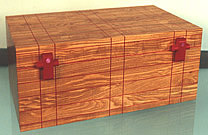
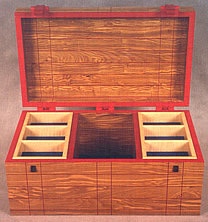
Early Spring Show NOTES: Work by talented makers continued to be sufficiently abundant in a softening market to create a spring group show with such unrepeated gems as the announcement's Strongbox by Reg Herndon. Herndon, trained by James Krenov, was at the College of the Redwoods in the 1980s, along with Zivko Radenkov. A certain design freedom accompanies occasional seating. The delight of Jamie Robertson’s Water Bench reflects this energy and brings to mind other visual confections such as the upholstered benches of Wendy Stayman and Kristina Madsen done earlier. Robertson was self-taught in furniture making, and distinguished himself with his work in veneer, which involved both marquetry images as well as sinuously curving edge banding. He will have a show with Dale Broholm at P&E in 1994. Also appearing in the 1993 show was Jane Greenberg's Tre-foil Coffee Table, which was inspired by the mobius strip. Greenberg, trained as a mathematician, often used mathematical puzzles in her furniture forms. David Secrest is the first maker associated with the gallery to use steel patterned with corroded iron, such as in his elemental Garden Bench. Jonathan Wright was known to the gallery's clientele for the originality of the design of his three-legged, triangular dining table (see 1982). One of the distinctions of that table design was its massive solidness. Here the delight of this small six- sided table is its transparency and lightness, in fact, the impression is that of fret-work. Even the bottom stretchers are composed of thin members of wood. In this piece, Wright focuses on a hexagonal design, a medium height table with six legs. The owners of this table will ultimately protect this fret-work top with a hexagonally shaped piece of glass.
|
|||||||||||||||||||||||||||||||||||||||||||
 |
||||||||||||||||||||||||||||||||||||||||||||
 |
 |
|||||||||||||||||||||||||||||||||||||||||||
Reginald Herndon - Kwila, Honduras Rosewood, Lebanese Cedar, Maple, Ebony, Brass Strong Box |
||||||||||||||||||||||||||||||||||||||||||||
 |
||||||||||||||||||||||||||||||||||||||||||||
Dale Broholm - Curly Maple, Walnut, Glass Rods Screen |
||||||||||||||||||||||||||||||||||||||||||||
 |
||||||||||||||||||||||||||||||||||||||||||||
Dale Broholm - Curly Maple, Ebony, Bubinga, cast epoxy resin , Abalone Flip Top Table |
||||||||||||||||||||||||||||||||||||||||||||
 |
||||||||||||||||||||||||||||||||||||||||||||
Jamie Robertson - Poplar, Purpleheart, rebar, Japan & water colors "A Distant Mirror" |
||||||||||||||||||||||||||||||||||||||||||||
 |
||||||||||||||||||||||||||||||||||||||||||||
Jamie Robertson - Lemonwood, East Indian Rosewood, Cherry Water Bench + |
||||||||||||||||||||||||||||||||||||||||||||
 |
 |
|||||||||||||||||||||||||||||||||||||||||||
Don Green - Douglas Fir, Milk Paint over Mahogany Cabinet |
John Dodd - Maple, Cherry Room Divider with Table |
|||||||||||||||||||||||||||||||||||||||||||
 |
||||||||||||||||||||||||||||||||||||||||||||
Jane Greenberg - Mahogany, Wenge, Tiger Maple Tre-foil Coffee Table |
||||||||||||||||||||||||||||||||||||||||||||
 |
 |
|||||||||||||||||||||||||||||||||||||||||||
Ron Puckett - Mahogany, Maple, Marble Table |
David Secrest - Wrought Iron, Steel Garden Bench |
|||||||||||||||||||||||||||||||||||||||||||
 |
||||||||||||||||||||||||||||||||||||||||||||
Michael Burns - Swiss Pearwood, Jarrah Cabinet
|
||||||||||||||||||||||||||||||||||||||||||||
 |
||||||||||||||||||||||||||||||||||||||||||||
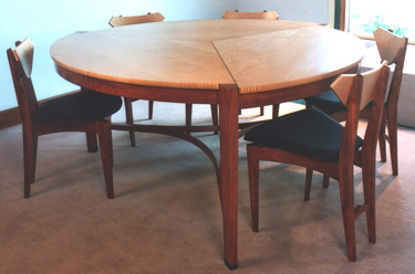
Stewart Wurtz - Bubinga, Curly Maple, Ebony Dining Table & Chairs |
||||||||||||||||||||||||||||||||||||||||||||
 |
||||||||||||||||||||||||||||||||||||||||||||
Jonathan Wright - Table |
||||||||||||||||||||||||||||||||||||||||||||
 |
||||||||||||||||||||||||||||||||||||||||||||
Leonard Urso - Blackened Copper Sculpture on Marble; Bennett Bean - Ceramic Pedestal; Wendy Stayman - Chair; Judy Kensley McKie - "Black Leopard" print; |
||||||||||||||||||||||||||||||||||||||||||||
| New American Furniture - 1993 |
New American Furniture NOTES: The season's second exhibit was comprised of work by a group of established makers: new bronze work from Judy McKie, a James Krenov cabinet in English beech and doussie, and an ample chest of drawers in maple and rosewood by Hank Gilpin. Zivko Radenkov produces another oval cabinet with cherry tree branches depicted in the marquetry. (There is an interval of seven years between these cabinets.) And William Walker's maple breakfast room scaled table with its crisscrossed, bowed stretchers, shows him at the top of his table form. Judy McKie’s Alligator Bench represents her second bench using bronze as a medium; the first was the Beast Bench in 1991. This piece shows McKie in a more whimsical mood. It certainly delighted her public, and ended up as a guardian to at least one swimming pool. Her Butterfly Cabinet is the second in a series of case pieces in which the work is in the facade of the piece, framed within its drawer fronts. The shape of the piece has an ancient architectural feel to it as in the stepped pyramid construction of the flat-topped Mayan temples. Starting with the base, each of the succeeding four drawers steps in from the one underlying it, while the top third of the chest becomes a tower. Michael Hurwitz exhibited two richly structured pieces for this show. The first was his curly hickory Silver Chest. Its hinged, lidded top mirrors the function of an old fashioned chest in which one might find valuables. The felt rusticity of the case was enhanced by the smoky quality of hickory used as a latticed exterior. The grid, defined by the lattice, continues down the legs that support the chest at waist height. This grid is transformed into a complex arched form of strut supports. Hurwitz describes a monastery outside Kyoto, Japan, built onto the side of a cliff and supported by an arched, bridge-like structure, as a source of inspiration for this piece. His second piece, a plant stand with a mosaic top, is equally unusual in its structure. In this piece, the round top is supported by a number of thin vertical elements, which progress almost to the floor before they turn inward, as if cinched in by the tightening belt of the pediment or base. The slenderness of these elements is given rigidity through this bottom curve as well as what appears to be a series of purely decorative, almost free form, short, diagonally crisscrossing pieces. Their function, however, is that they are jointed stretchers keeping each vertical element rigid to its neighbor. The whole of this structure is pickled off-white, and its delicate almost basket woven appearance is a perfect foil for the circle of the subtle rose floral mosaic. This piece has the effect of effortlessness with the lightness of a basket-like structure, perfectly chosen for its role. This could be one of Hurwitz’s most sublime pieces. James Krenov’s small cabinet is another example in which a rustic manner is used to present an evocative enclosure to hold something of value to its owner. His small beech cabinet is quite distinct as it sits atop its Brazilian stand with doussie drawers. Its two doors and single shelf interior leave its use to the owner’s imagination. Beginning with the 1989 P&E ebony show, On Board the Edna: Ebony, Hank Gilpin made a number of small seven-drawer chests in different combinations of wood. This one, in curly maple with ebony pulls, is emblematic of this classic in Gilpin's repertoire. Gilpin’s five-drawer chest is constructed as an ample, but not large, chest of drawers. Its sense of generosity comes largely from the proportion of the width to its height –- the height of the chest emphasizes the width of the drawers. The five drawers diminish slightly in their own height from bottom to top. The rosewood handles provide a decorative detail without distracting. This belongs within Gilpin’s evolving family of case pieces where the legs are jointed into the carcass frame at 45 degrees. As usual, for Gilpin, the given board or matched boards will dictate the dimensions of the piece he will make. In this case, he used some of his legendary curly maple. This show also included tables in a variety of forms through the work of Richard Newman, Timothy Philbrick and William Walker. The Newman table is a hall table in cherry, ebony and gold done in his by now identifiable neo-neo classical style. As usual, the cherry in the table top would come from a board that Newman treasured for its figure. The ebony background enhances the use of gold. This hall table, unusually for Newman, includes a shelf, which performs the function of a stretcher between the legs partway from the floor. The legs, which ascend to support a table height of 34 inches, capture the eye for their slender elegance. The simple curving sweep of the octagonal shaped legs belies the complexity of their construction. There are, in fact, many parts to this leg. At their core, there is a steel rod insert that gives the leg rigidity that wooden components wouldn't be able to produce. The leg itself comes apart at the anklet to allow the bracelet to enclose a fully supporting bracket for the shelf. The bracket extensions themselves are fashioned from ebony. The eight-sided ebony cladding to the legs curves slightly outwards to a point just below the table’s apron where the cherry of the leg is exposed in a turned transition to the leg’s final extension into the squared apron corners. The two faces of the apron corners, veneered again in ebony, provide a perfect canvas for the beautiful starburst ormolu in vermeil. Tim Philbrick’s bedside table uses the smooth tones of pearwood combined with curly maple in its two slender drawer fronts and side and back aprons. The aesthetic of this table is the billowing feeling of cushioned or hung fabric. The drawer and apron bottoms follow the line of the swag, whilst the turned and shaped legs seem cinched by rings only to pillow again to set off the gentle curve of the swag. Philbrick has often used a solid top in his work. Here, he carefully shapes the sides and corners to reflect the casework and the top of the turned legs underneath. Bill Walker’s breakfast table shows him at the top of his table forms. Its relatively small size for an eating table allows him to come up with a stretcher system that is both functional as well as elegantly original. From just above the floor on the back of each leg the two members of the stretchers curve outward and upward, crossing their diagonally opposite partners at a central overlapping crisscross joint. The apron is curved under, but also curves gently outward along its length; it is jointed into the legs at each end. This produces an inviting facade for the human users to engage. Its top is surfaced with a simple grid of Walker’s identifiably heavy cut veneer. Lastly, we turn to the cabinet form and Zivko Radenkov’s return to the oval form. This time his oval cabinet is slightly larger than its predecessor of seven years ago. This cabinet’s facade also uses a slender grid-like structure to break the marquetry field and create the illusion of looking through a shoji lattice. Again, through this lattice we look at blossoms, this time cherry on a field of quilted maple. Though not prolific, Radenkov continues to affect the onlooker with the inspired beauty of his cabinets. |
|||||||||||||||||||||||||||||||||||||||||||
 |
||||||||||||||||||||||||||||||||||||||||||||
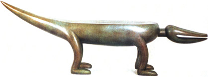 |
||||||||||||||||||||||||||||||||||||||||||||
Judy Kensley McKie - Bronze Alligator Bench |
||||||||||||||||||||||||||||||||||||||||||||
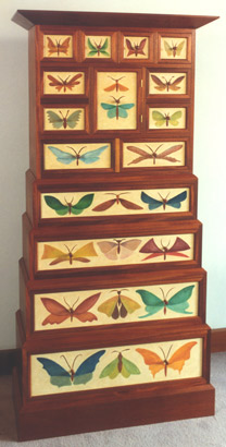 |
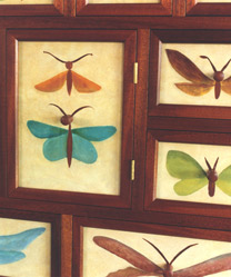 |
|||||||||||||||||||||||||||||||||||||||||||
Judy Kensley McKie - Butterfly Cabinet |
||||||||||||||||||||||||||||||||||||||||||||
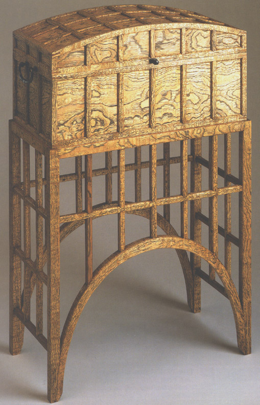 |
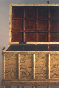 |
|||||||||||||||||||||||||||||||||||||||||||
Michael Hurwitz - Curly Hickory Silver Chest |
||||||||||||||||||||||||||||||||||||||||||||
+ |
||||||||||||||||||||||||||||||||||||||||||||
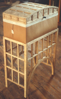 |
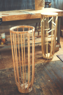 |
|||||||||||||||||||||||||||||||||||||||||||
Michael Hurwitz - Curly Hickory Silver Chest |
Michael Hurwitz - Bleached Cherry Plant Stand |
|||||||||||||||||||||||||||||||||||||||||||
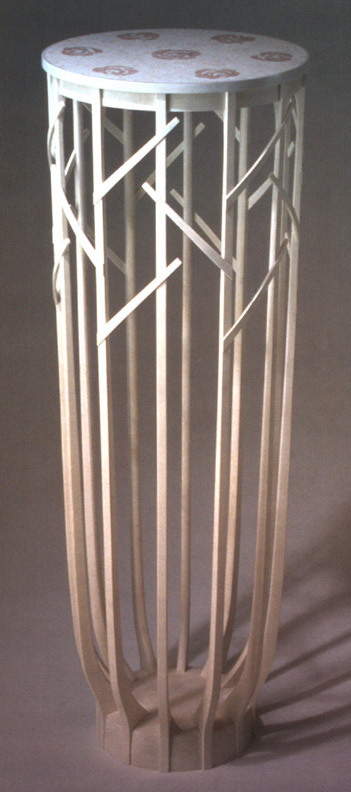 |
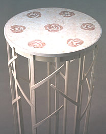 |
|||||||||||||||||||||||||||||||||||||||||||
Michael Hurwitz - Bleached Cherry with Marble Mosaic Plant Stand |
||||||||||||||||||||||||||||||||||||||||||||
+ |
||||||||||||||||||||||||||||||||||||||||||||
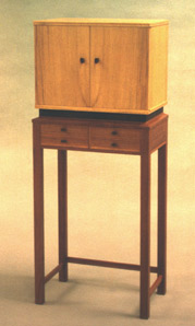 |
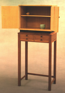 |
|||||||||||||||||||||||||||||||||||||||||||
James Krenov - English Beech, Doussie, Brazilian Rosewood Cabinet with Drawers |
||||||||||||||||||||||||||||||||||||||||||||
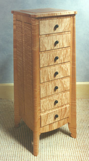 |
||||||||||||||||||||||||||||||||||||||||||||
Hank Gilpin - Curly Maple, Ebony Small Chest of Drawers |
||||||||||||||||||||||||||||||||||||||||||||
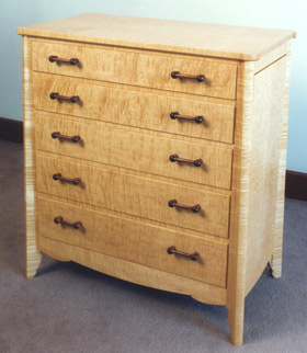 |
||||||||||||||||||||||||||||||||||||||||||||
Hank Gilpin - Curly Maple, Rosewood Chest of Drawers |
||||||||||||||||||||||||||||||||||||||||||||
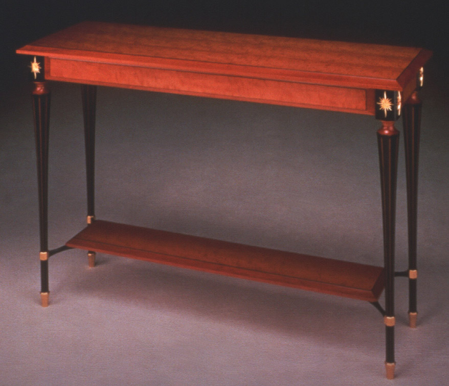 |
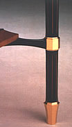 |
|||||||||||||||||||||||||||||||||||||||||||
Richard Newman - Cherry, Ebony, Gold Hall Table with Shelf + |
||||||||||||||||||||||||||||||||||||||||||||
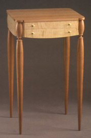 |
||||||||||||||||||||||||||||||||||||||||||||
Tim Philbrick - Pearwood, Curly Maple Bedside Table |
||||||||||||||||||||||||||||||||||||||||||||
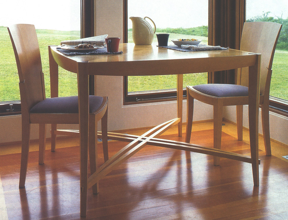 |
||||||||||||||||||||||||||||||||||||||||||||
William Walker Maple Breakfast Table and Chairs + |
||||||||||||||||||||||||||||||||||||||||||||
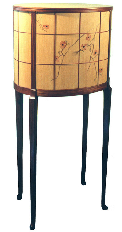 |
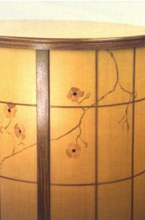 |
|||||||||||||||||||||||||||||||||||||||||||
Zivko Radenkov - Western Quilted Maple, Pearwood, Rosewood, Pink Ivory, Myrtle Oval Cabinet |
||||||||||||||||||||||||||||||||||||||||||||
+ |
||||||||||||||||||||||||||||||||||||||||||||
 |
||||||||||||||||||||||||||||||||||||||||||||
William Walker & Zivko Radenkov |
||||||||||||||||||||||||||||||||||||||||||||
| American Work in Metal - 1993 |
American Work in Metal A blurring of the traditional boundaries seemed to be the theme of this year's American Work in Metal show. The artists were deconstructing teapots, inventing apparatus for display, and using non-precious metals -- all in an effort to engage themselves and their public in a dialogue. One sensed humor and lightheartedness in this show, although the work was technically just as demanding on the metalsmiths as traditional work. Consider Curtis LaFollette's Tea Infuser Set, or any of his brass stands that he crafts so successfully to hold silver spoons. Humor dominates his So You're Only Having Half a Cup? copper teapot, but does not diminish the difficulty to raise and fabricate such a piece. Mark Morgan, who did the sensitive mokume pieces in the last show, sets off in a new direction in this show with his bronze castings presenting what appears to be the crystalline structure of the metal itself. Jonathan Bonner, ever a pragmatist in his choice of materials, designed and constructed the Bird Lamp of copper sheet and mica. |
|||||||||||||||||||||||||||||||||||||||||||
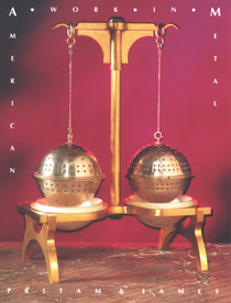 |
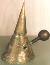 |
|||||||||||||||||||||||||||||||||||||||||||
Curtis LaFollette - Sterling Silver, Brass, Blue Steel Tea Infuser Set |
Curtis LaFollette - Copper, Silver Teapot |
|||||||||||||||||||||||||||||||||||||||||||
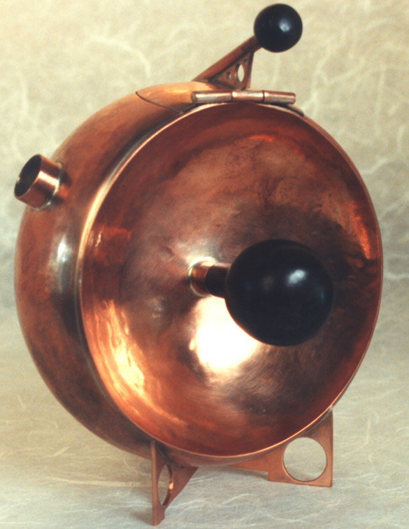 |
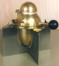 |
|||||||||||||||||||||||||||||||||||||||||||
Curtis LaFollette - Copper, Purpleheart "So you're only having half a cup?" + |
Curtis LaFollette - Silver, Brass, Acrylic Creamer |
|||||||||||||||||||||||||||||||||||||||||||
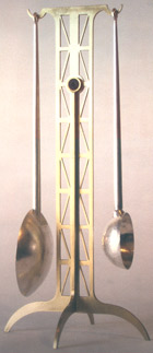 |
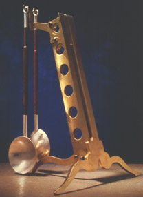 |
|||||||||||||||||||||||||||||||||||||||||||
Curtis LaFollette - Sterling Silver, Brass Measuring Spoons with Stand |
Curtis LaFollette - Sterling Silver, Brass, Rosewood 2 Spoon Serving Set |
|||||||||||||||||||||||||||||||||||||||||||
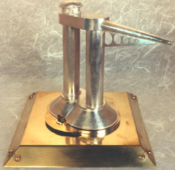 |
||||||||||||||||||||||||||||||||||||||||||||
Curtis LaFollette - Sterling Silver, Brass Olive Oil Container |
||||||||||||||||||||||||||||||||||||||||||||
|
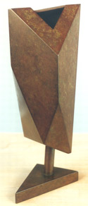 |
|||||||||||||||||||||||||||||||||||||||||||
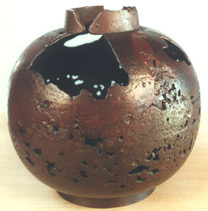 |
||||||||||||||||||||||||||||||||||||||||||||
Mark Williams Morgan - Cast Bronze colored in Rokusho |
||||||||||||||||||||||||||||||||||||||||||||
Mark Williams Morgan - Cast Bronze colored in Rokusho |
||||||||||||||||||||||||||||||||||||||||||||
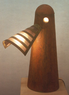 |
||||||||||||||||||||||||||||||||||||||||||||
Jonathan Bonner - Copper, Mica Bird Lamp #1 |
||||||||||||||||||||||||||||||||||||||||||||
| Jewelry 1993 |
Jewelry 1993 The gold and silversmiths whose work adorns the body have a different challenge than metalsmiths doing holloware. Often limited by size and the seriousness of the materials, it is a different thing to "lighten-up" and imbue an object on an earlobe with a sense of humor. Eleni Prieston, known for her use of natural pearls, says that she often makes mismatched earrings in an effort to remind both the wearer and herself to maintain some spontaneity in the work, and not take things too seriously. The appeal of materials like 22K gold, fine silver, pearls, and black Australian opals stemmed from the preciousness of the materials and the success of her small- scale engineering feats. Jim Kelso's skills as a knifemaker (see Archives, First Decade, 1990) are evident in his depiction of the delicate flora and fauna pieces like his Frog Brooch and Orchid Brooch, in gold and silver. Tom Odell says that for a jeweler, brooches offer the broadest possibilities for sculptural compositions and can reflect a wide range of metalworking techniques, materials, and finishes. His work often introduces Japanese patination and alloying techniques such as Kuromido, Shibuichi, and Shakudo; these processes are defined by their varying proportions and combinations of gold, copper, and silver that have been enhanced with rokusho patina.
|
|||||||||||||||||||||||||||||||||||||||||||
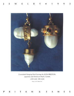 |
||||||||||||||||||||||||||||||||||||||||||||
Eleni Prieston - Japanese and American Pearls, Garnet, 22K Gold, 18K Gold Granulated Hanging Pearl Earrings |
||||||||||||||||||||||||||||||||||||||||||||
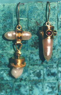 |
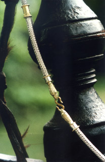 |
|||||||||||||||||||||||||||||||||||||||||||
Eleni Prieston - Japanese Pearls, Garnet, 22K Gold, 18K Gold Granulated Hanging Pearl Earrings |
Eleni Prieston - Fine Silver Quadruple Chain, 22K Gold Granulated Collars, 14K Gold Eagle Head Terminals |
|||||||||||||||||||||||||||||||||||||||||||
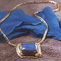 |
 |
|||||||||||||||||||||||||||||||||||||||||||
Eleni Prieston - 22K Gold Double Loop-n-Loop Chain with Black Opal Pendant in Granulated 22K Gold |
Eleni Prieston - Japanese Biwa Pearls in 22K Granulated Gold |
|||||||||||||||||||||||||||||||||||||||||||
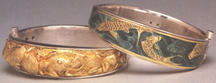 |
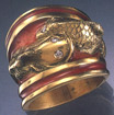 |
|||||||||||||||||||||||||||||||||||||||||||
Jaclyn Davidson - 18K Gold, Silver, Enamel Bracelets |
Jaclyn Davidson - 18K Gold, Enamel "Carps" Ring |
|||||||||||||||||||||||||||||||||||||||||||
 |
 |
|||||||||||||||||||||||||||||||||||||||||||
Jim Kelso - Sterling Silver Frog Pin |
Jim Kelso - Sterling Silver, 18K Gold Lady's-Slipper Orchid Brooch/Pendant |
|||||||||||||||||||||||||||||||||||||||||||
 |
||||||||||||||||||||||||||||||||||||||||||||
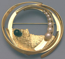 |
||||||||||||||||||||||||||||||||||||||||||||
Tom Odell - 18K Gold, Black Pearl, 7 Graduated Cultured Pearls Brooch |
||||||||||||||||||||||||||||||||||||||||||||
Tom Odell - 18K Gold, Japanese Alloys Brooch |
||||||||||||||||||||||||||||||||||||||||||||
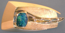 |
||||||||||||||||||||||||||||||||||||||||||||
Tom Odell - 18K Gold, Boulder Opal, Diamonds Brooch |
||||||||||||||||||||||||||||||||||||||||||||
| Glass 1993 |
Glass 1993 NOTES:The functional glass work of Robin Mix, IBEX Studio [David Levi, Dimitri Michaelides, and Sam Stang], and Pinkwater Glass continued to find their place at Pritam & Eames during the 1990s. Although the IBEX partners had gone different ways by this time, the gallery showed their work on an individual basis for a while. It would be the glasswork of Sam Stang, however, that would continue on at P&E. For a short time (1991 -'93), Robin Mix and Sam Stang worked together and explored the technically challenging traditional European glassblowing method of murrini, a process whereby, in Sam's words, "I begin by making glass rods that are patterned in cross section. The rods are cooled and cut into thin pieces and arranged on an iron plate, which is then heated to fuse the murrini. This is then rolled into a tube on the end of a blowpipe and shaped into the final form." |
|||||||||||||||||||||||||||||||||||||||||||
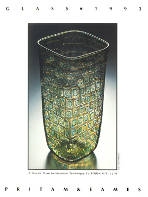 |
||||||||||||||||||||||||||||||||||||||||||||
Robin Mix
|
||||||||||||||||||||||||||||||||||||||||||||
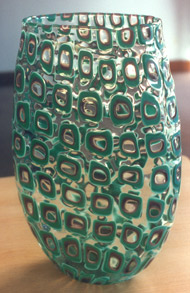 |
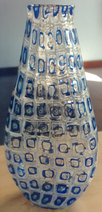 |
|||||||||||||||||||||||||||||||||||||||||||
Robin Mix
|
||||||||||||||||||||||||||||||||||||||||||||
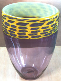 |
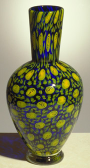 |
|||||||||||||||||||||||||||||||||||||||||||
Robin Mix |
Sam Stang |
|||||||||||||||||||||||||||||||||||||||||||
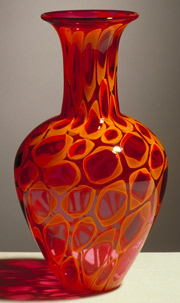 |
 |
|||||||||||||||||||||||||||||||||||||||||||
Sam Stang |
||||||||||||||||||||||||||||||||||||||||||||
| Markings: Furniture by Kristina Madsen - 1993 |
Markings NOTES: This is Kristina Madsen's first show of work after her return from a year-long sojourn in Fiji as a Fulbright grantee where she mastered intaglio, shallow relief carving. At her request, her mentor, Makiti Koto, also exhibited traditional Fijian artifacts like headrests, bowls, and clubs. Madsen's pattern work rendered through intaglio technique created a new decorative vocabulary for her furniture forms. But these forms departed from familiar Western chords as well with the low scale of the two benches and the unusual cabinets. Together these qualities gave the show an exotic look. There were no Fijian furniture forms that Madsen could use as a canvas for her astonishingly carved patterns. Of her work, Madsen says, "As the carved surface has become more and more important to my furniture design, I have begun to view my work as a study of pattern, with furniture as its medium. I am investigating and experimenting with many types of pattern -- repetitive, non- repetitive, figurative, abstract, geometric, monochromatic, polychromatic -- always keeping in mind the reflected light. It is this light, the reflected light, and the bouncing light, that I love. Drawings do little to inform one of the effect of the carving, so each new pattern is developed on sample boards. A seemingly inconsequential mark on one sample might later spark an idea or find its way into a new pattern. |
|||||||||||||||||||||||||||||||||||||||||||
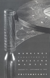 |
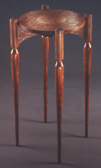 |
|||||||||||||||||||||||||||||||||||||||||||
Kristina Madsen - Bubinga Table |
||||||||||||||||||||||||||||||||||||||||||||
Having followed the work of Kristina Madsen over the last decade, Edward S. Cooke, Jr., |
||||||||||||||||||||||||||||||||||||||||||||
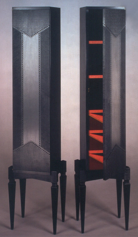 |
||||||||||||||||||||||||||||||||||||||||||||
+ |
||||||||||||||||||||||||||||||||||||||||||||
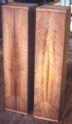 |
 |
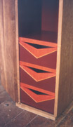 |
||||||||||||||||||||||||||||||||||||||||||
Kristina Madsen - Blackened Imbuya Cabinets |
||||||||||||||||||||||||||||||||||||||||||||
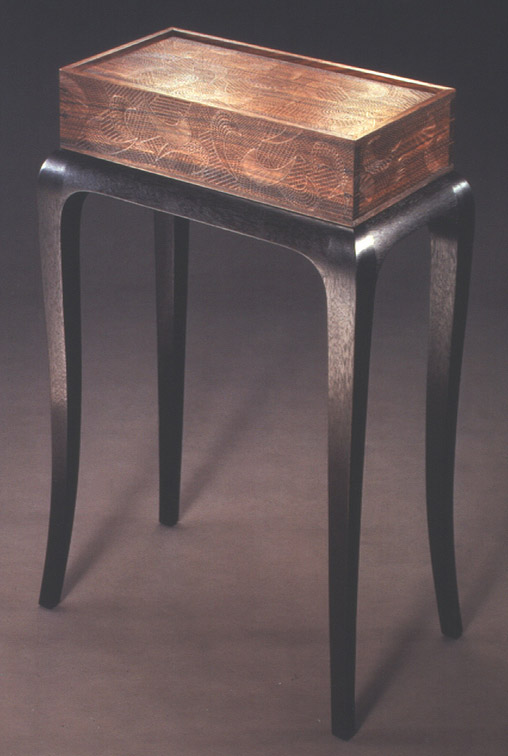 |
||||||||||||||||||||||||||||||||||||||||||||
|
Kristina Madsen - Pau Ferro, Blackened Sucupira Box on Stand + |
||||||||||||||||||||||||||||||||||||||||||||
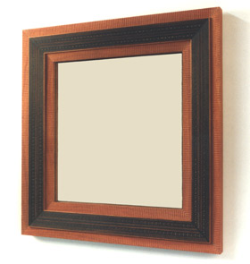 |
||||||||||||||||||||||||||||||||||||||||||||
Kristina Madsen - Bubinga, Ebony Veneer Mirror |
||||||||||||||||||||||||||||||||||||||||||||
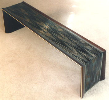 |
||||||||||||||||||||||||||||||||||||||||||||
Kristina Madsen - Ebony Veneer over Maple, with Wenge Bench |
||||||||||||||||||||||||||||||||||||||||||||
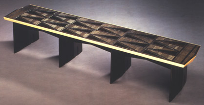 |
||||||||||||||||||||||||||||||||||||||||||||
Kristina Madsen - Ebony Veneer over Maple, Blackened Sucupira Bench |
||||||||||||||||||||||||||||||||||||||||||||
 |
||||||||||||||||||||||||||||||||||||||||||||
Kristina Madsen & Makiti Koto |
||||||||||||||||||||||||||||||||||||||||||||
Jere Osgood - 1993 |
Jere Osgood NOTES: The piece featured in this Osgood show was the Elliptical Shell Desk. Jere returned with a fresh take on this desk after more than twenty years had elapsed. The stretched hemispherical shape of the carcass was perched on a pedestal formed by gently S-curving legs. The simplicity of the carcass form seemed a perfect use of shell construction. The organic rootedness of the base, the elegant lines, and the nascent quality of the shell made this piece the favorite Osgood desk for many. The tonality of the wenge gives a dramatic separation for the shell carcass. The wenge also worked well in the bending process, and the bonding of the laminated layers. This is always a consideration when Osgood chooses material for his tapered laminate pedestals. When the “samovar” style lid is lifted, revolving over the rear section of the shell form, a second contrasting wood is revealed, this time in the maple interior shelf and drawer construction. This choice self-illuminates the interior, and its gently curving partitions are synchronized with the shell itself. One other desk, called the Nantucket Desk, is notable for the use of lapstraking in the construction of the side and back panels. Lapstraking, or overlapping horizontal siding members, has been used for hundreds of years in boat construction as a means of forming aqua dynamic curves in hulls. The desk itself has a more traditional four-legged support and ample working surface. The maple and bubinga side chairs are a chair design for desk or dining usage. Two curved stretchers that are unusually independent of the seat create back support. This produces an airy, branch-like look to the back, and emphasizes the flow of line from floor to crown. The rear apron of the seat is situated forward of the back plane of the chair allowing for a very strong construction. Novelty in chair design is usually calligraphic only and reliant on non-wood materials for strength. Osgood’s novelty springs as much from design aesthetics as structural sophistication. The sturdy walnut chair is Danish in attitude with its broad crest rail and it is a close relative to the chair that represented Osgood in the early years of the gallery. The earlier chair used stretched belt leather, as opposed to an upholstered seat. The beautiful claro walnut table was suitable for a small telephone desk or writing table. The four-foot sweep of its width does not preclude the appearance of a familiar Osgood sculptural design. |
|||||||||||||||||||||||||||||||||||||||||||
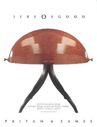 |
||||||||||||||||||||||||||||||||||||||||||||
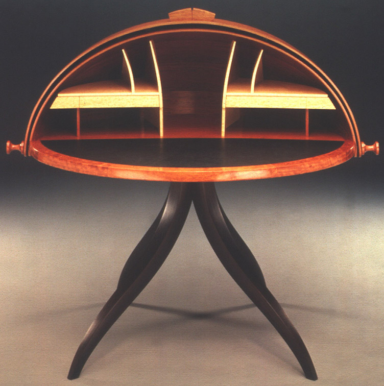 |
||||||||||||||||||||||||||||||||||||||||||||
Bubinga, Wenge, Bird's-eye Maple Elliptical Shell Desk + |
||||||||||||||||||||||||||||||||||||||||||||
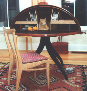 |
||||||||||||||||||||||||||||||||||||||||||||
Elliptical Shell Desk at/as home. |
||||||||||||||||||||||||||||||||||||||||||||
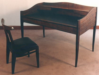 |
||||||||||||||||||||||||||||||||||||||||||||
Walnut Nantucket Desk |
||||||||||||||||||||||||||||||||||||||||||||
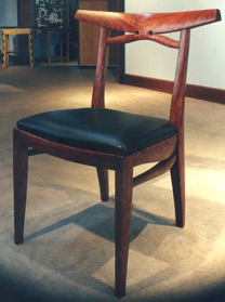 |
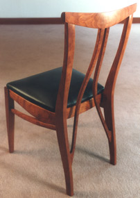 |
|||||||||||||||||||||||||||||||||||||||||||
Walnut Chair |
Bubinga Chair |
|||||||||||||||||||||||||||||||||||||||||||
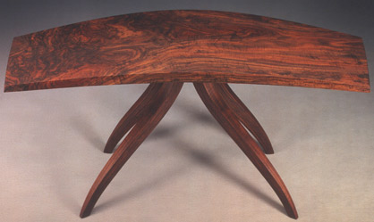 |
||||||||||||||||||||||||||||||||||||||||||||
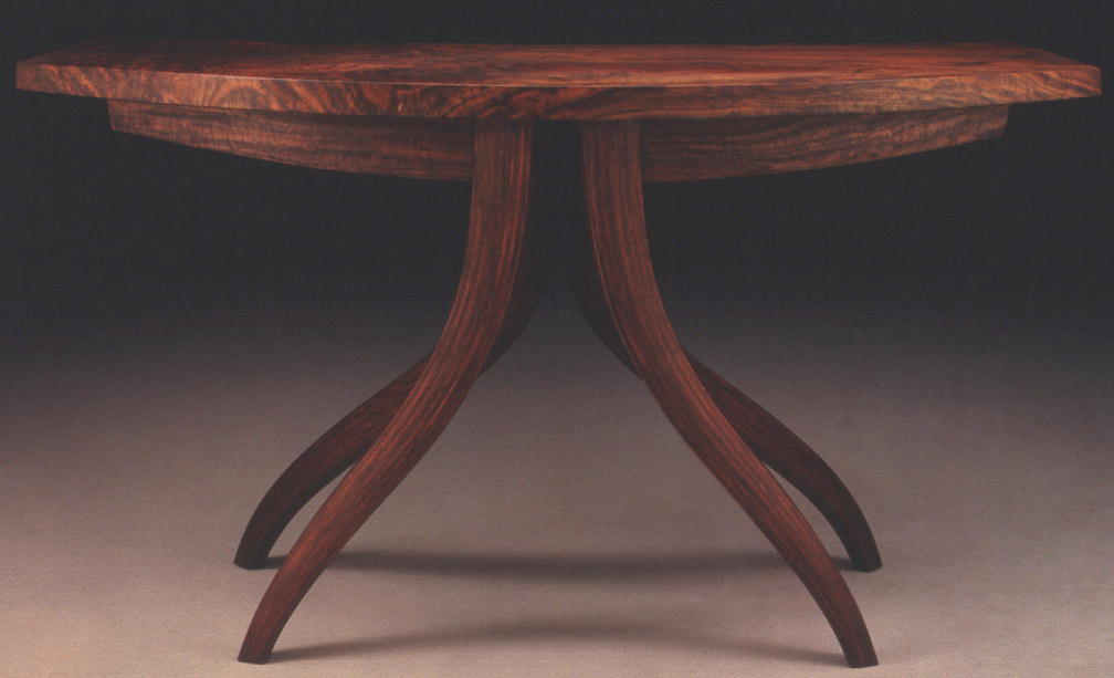 |
||||||||||||||||||||||||||||||||||||||||||||
Santa Clara Walnut Guild Table + |
||||||||||||||||||||||||||||||||||||||||||||
| James Krenov - September 1993 |
||||||||||||||||||||||||||||||||||||||||||||
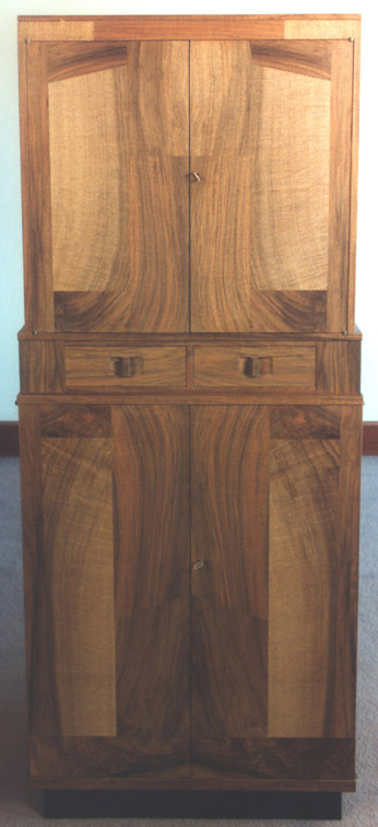 |
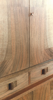 |
James Krenov presented the gallery with a surprise cabinet in the early fall of 1993. He knew he had taken a major departure in his work with this piece. The first thing that strikes the eye is the uncharacteristically solid, rectilinear appearance of the piece. The strong secondary form that appears is projected by the use of the English walnut veneer resawn from one of Krenov’s prized boards. Now we have the illusion of a strongly organic form shaped by a potter’s hands, tightly framed by the austerity of the cabinet’s exterior. This piece has a raw, primitive power that has no antecedents. |
||||||||||||||||||||||||||||||||||||||||||
|
English Walnut Cabinet |
||||||||||||||||||||||||||||||||||||||||||||
+ |
||||||||||||||||||||||||||||||||||||||||||||
| Commissions - 1993 |
||||||||||||||||||||||||||||||||||||||||||||
 |
||||||||||||||||||||||||||||||||||||||||||||
Judy Kensley McKie - Bedside Tables |
||||||||||||||||||||||||||||||||||||||||||||
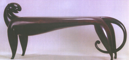 |
||||||||||||||||||||||||||||||||||||||||||||
Judy Kensley McKie - Bronze Jaguar Bench |
||||||||||||||||||||||||||||||||||||||||||||
 |
||||||||||||||||||||||||||||||||||||||||||||
Wendy Stayman - Ebony, Silver, Holly, Granite Sideboard |
||||||||||||||||||||||||||||||||||||||||||||
| 1 9 9 4 | ||||||||||||||||||||||||||||||||||||||||||||
| Spring 1994 | Furniture 1994 This group exhibition stretches the boundaries that are still present in studio furniture. The most unusual ventures came from makers not associated with the core of the field: Robert Hannan’s exuberant sweater chest and David Secrest’s geo-physical iron and steel bench. Andy Buck was already exhibiting in Boston in the 1980s, after having studied with Alphonse Mattia at RISD. The small green and maple table, while delightful, would not, however, signify his work to come. It is interesting to see the simple sweeping legs and organic detailing of Buck’s table envisioned independently through Osgood’s eyes years later (see Osgood-Wurtz 1995) in his Owassa table. Look at David Secrest’s bench and you can see how his sculpture is rooted in the geo-physical forces that shape the mountain country of his adopted Montana home. Even some of the bench’s complex patterning suggests the endless intricacy of stone pattern. The dangers of working his iron and steel medium with its particular vaporous by-products would prove to be a serious obstacle in his work. The gallery partners had first seen Secrest’s work at a 1980s craft fair where he exhibited his layered iron and steel forged handles (see 1987). Based on the handsome functional work he was doing at the time, the partners invited him to show his work at P&E. Years later he told them that he couldn't make a living doing functional work like that, so he would be moving on to more sculptural forms. He did, however, return to functional work in a 1996 show with metalsmith Tom Joyce at P&E. The exhibition also included the latest Krenov cabinet, as well as cabinets from three makers who studied with him: Ken Frye, Tim Morrow, and Greg Zall. Krenov’s cabinet is one of his simplest and strongest forms. The signature of the piece comes at once from its felt sense of proportioning, its sparseness, and the quietly involving veneer pattern of its upper cabinet. In this piece he comes as close as ever to a true Eastern “less is more” aesthetic. The veneer itself could be a subtle kimono pattern. Krenov’s metaphor for this cabinet is revealed by the name he chose: Fossil Cabinet. The delicate oval form of Ken Frye’s pearwood cabinet seems perched on its impossibly long and slender legs. The oval form itself is given attention by the use of a diamond pattern in its parquetry surface. What leads a maker to make something of such an ephemeral nature when the making of it requires such a dedicated effort? It’s a rare gift that's never fully explained by the piece’s utility. Tim Morrow’s jewelry box on stand has a similar attitude at its core. Its service seems more metaphorical than utilitarian. Greg Zall’s standing jewelry cabinet is designed to be placed on top of a chest or dresser. The asymmetry of the marquetry design lends a playful attitude to the piece. His larger floor standing cabinet nuances an earlier Arts and Crafts era. Hank Gilpin’s elm table with frieze came about as part of his investigation of furniture forms for the upcoming venture – P&E Editions. This frieze is like a jazz riff, but its fresh, puzzle-like composition would not be reproduced in the future edition work because of the time involved in laying out the pieces. |
|||||||||||||||||||||||||||||||||||||||||||
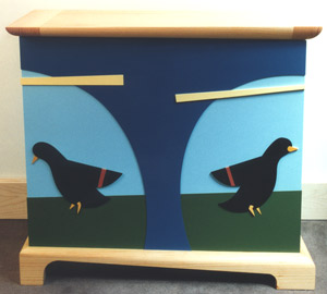 |
||||||||||||||||||||||||||||||||||||||||||||
Robert Hannan - White Pine, Colorcore Sweater Chest |
||||||||||||||||||||||||||||||||||||||||||||
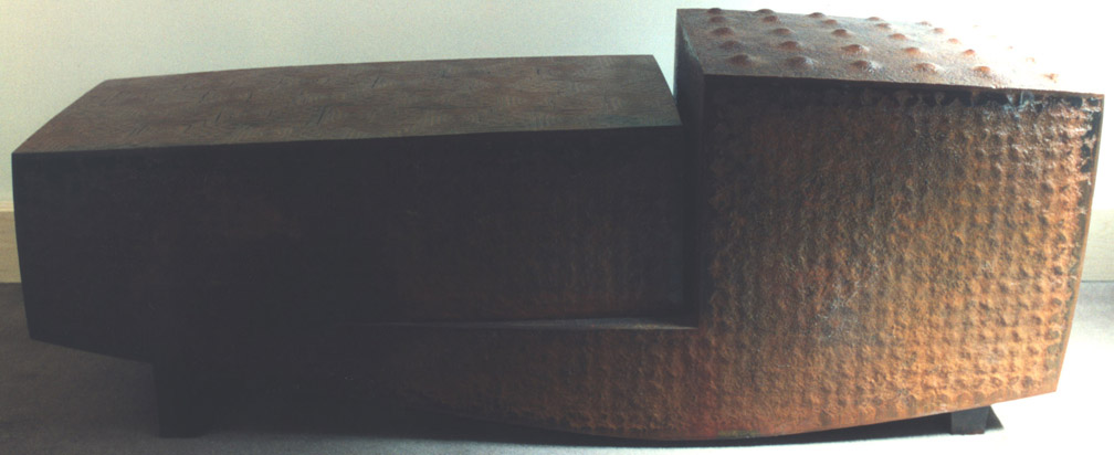 |
||||||||||||||||||||||||||||||||||||||||||||
David Secrest - Iron, Steel Sculptural Bench + |
||||||||||||||||||||||||||||||||||||||||||||
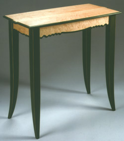 |
||||||||||||||||||||||||||||||||||||||||||||
Andy Buck - Maple, Milk Paint Table for Spring |
||||||||||||||||||||||||||||||||||||||||||||
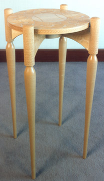 |
|
|||||||||||||||||||||||||||||||||||||||||||
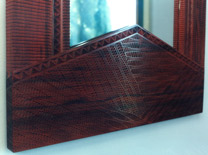 |
||||||||||||||||||||||||||||||||||||||||||||
Kristina Madsen - detail Mexican Chakte Coc Mirror |
||||||||||||||||||||||||||||||||||||||||||||
Kristina Madsen - Carved Maple Circular Table |
||||||||||||||||||||||||||||||||||||||||||||
 |
||||||||||||||||||||||||||||||||||||||||||||
James Krenov - Kwila, Hickory, Olive Fossil Cabinet |
||||||||||||||||||||||||||||||||||||||||||||
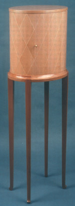 |
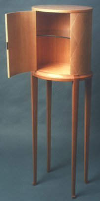 |
|||||||||||||||||||||||||||||||||||||||||||
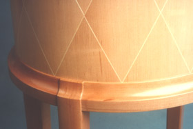 |
||||||||||||||||||||||||||||||||||||||||||||
Ken Frye - Pearwood, English Sycamore, Cypress Oval Cabinet |
||||||||||||||||||||||||||||||||||||||||||||
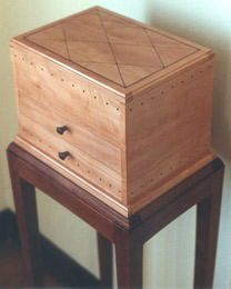 |
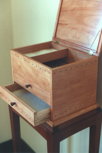 |
|||||||||||||||||||||||||||||||||||||||||||
Tim Morrow - Pearwood, Brazilian Rosewood, Silk Jewelry Box |
||||||||||||||||||||||||||||||||||||||||||||
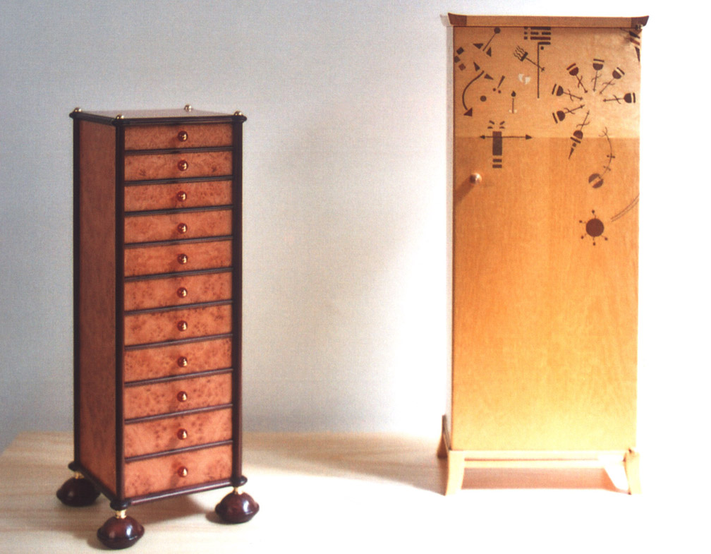 |
||||||||||||||||||||||||||||||||||||||||||||
Robert Ingham - Burr Maple, Kingwood, Australian Gum, Gold, Carnelian Swallowtail Cabinet + |
Greg Zall - Satinwood, Douglas Fir Jewelry Box + |
|||||||||||||||||||||||||||||||||||||||||||
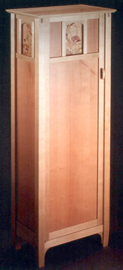 |
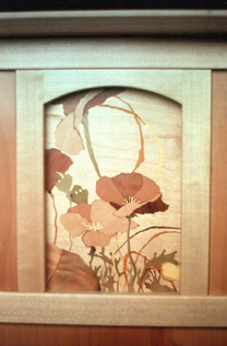 |
|||||||||||||||||||||||||||||||||||||||||||
Greg Zall - Maple, unsteamed European Pear; Marquetry woods Pear, Bubinga, Holly, Nutmeg, Osage Orange, Penumbuco, Jara, Lignum Vitae, Vinhatico, Poplar "Poppies" Cabinet |
||||||||||||||||||||||||||||||||||||||||||||
 |
||||||||||||||||||||||||||||||||||||||||||||
 |
||||||||||||||||||||||||||||||||||||||||||||
Hank Gilpin - Elm Table with Freize |
||||||||||||||||||||||||||||||||||||||||||||
| Late Spring 1994 | PRITAM & EAMES introduces P&E Editions, a new venture created to bring the design talent of highly recognized furniture makers to that most special place -- the home. As the oldest established gallery in the country for the studio furniture movement, PRITAM & EAMES has hosted the work of American artist-craftsmen over the last 15 years and placed many pieces in private and museum collections across the country. While the rarity of the one-of-a-kind work is in itself a value, the gallery has long wished that its charm and integrity could be accessible to a wider audience. NOTES: Although the prices for studio furniture had appreciated during the 1980s, these gains were modest. There was considerable feeling among some of the makers that the upward trend of pricing had to improve. And the 1990s did see a more rapid increase in the overall price structure, which was influenced to a considerable extent by the entry into the furniture field by New York galleries. Also, to an important extent, Pritam & Eames owed its early survival to clients, some of whom were now being squeezed out by higher prices. The concept of P&E Editions came about as a way of bringing much of the quality of studio furniture to pieces that could be marketed at a small edition cost level. The idea was to combine the production facilities of individual makers’ studios for prototype work and then develop a system of small production into a single, larger facility. The concept was based on producing designs generated by a small group of selected makers. These could be rendered in a single prototype or, as in the case of Bill Walker, a small edition run. In addition to Walker, Hank Gilpin, Jere Osgood and Wendy Stayman completed the group represented in the early meetings. Although there was a planned timetable to bring pieces from all four makers to the floor at the same time for the opening of P&E Editions, Hank Gilpin was first out of the gate with such surplus energy that the editions opened almost entirely based on his work. At that time, it was called the American Forest Series, which sought to promote the use of lesser known domestic hardwoods, a Gilpin specialty. Gilpin was familiar with Steve Herrick of Herrick & White, a Cumberland, RI fabricator with nearly 100 mill workers, that made specialized fixtures for high-end retail stores. The undertaking was ambitious but, ultimately, not successful; P&E Editions was mostly phased out after five years. In hindsight, the endeavor would have been much better served if edition numbers could have grown with the gallery’s capacity to market the work. Unlike the Maine furniture manufacturer, Thomas Moser, Pritam & Eames did not own its production facilities, and it was not able to begin with small enough numbers, which could gradually expand as demand increased. From the beginning, the edition numbers required by Herrick & White to meet the price point were too high and this created classic inventory problems. From the marketing end, there were efforts to outsource to others, for instance Dean & Deluca and the retail store at the American Craft Museum in New York. However, the percent of sales return to the gallery was not sufficient to pay the artists’ royalties and to justify the gallery’s considerable input. The distribution, therefore, remained mostly on the gallery premises, itself not a highly trafficked, visible location. Also, no sooner had the opening collection of designs been unveiled, but the year had rolled around and clients expected new designs to appear. In truth, there hadn't been sufficient time for the partners to learn how to most effectively deal with the initial editions. Although promising, it's possible that the timing of the venture was premature. The gallery ceased P&E Editions production in 1998. Despite its short run, P&E Editions spurred some original thinking in furniture terms, such as Bill Walker's steel and hardwood tables, and Hank Gilpin's fresh takes on wood tables. |
|||||||||||||||||||||||||||||||||||||||||||
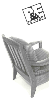 |
||||||||||||||||||||||||||||||||||||||||||||
 |
American Forest Series: Furniture & Accessories by Hank Gilpin The American Forest Series presents fresh design, quality and affordability in this new line of furniture and accessories created by Hank Gilpin. Moreover, with the use of 20 non-threatened wood species, Gilpin and PRITAM & EAMES are contributing to a more balanced approach of forest management. With the production skills of Rhode Island's Herrick & White, Ltd., we are able to offer you these beautiful objects for everyday use. |
|||||||||||||||||||||||||||||||||||||||||||
| Hank Gilpin |
||||||||||||||||||||||||||||||||||||||||||||
 |
"I'm trying to put a picture of the tree, the lumber, and the furniture together in people's minds by making fun things that don't cost an arm and a leg and by using woods I find delightful but most people don't know exist." -- Hank Gilpin |
|
||||||||||||||||||||||||||||||||||||||||||
Hank Gilpin |
||||||||||||||||||||||||||||||||||||||||||||
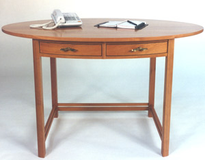 |
||||||||||||||||||||||||||||||||||||||||||||
Hank Gilpin - Oval Desk |
||||||||||||||||||||||||||||||||||||||||||||
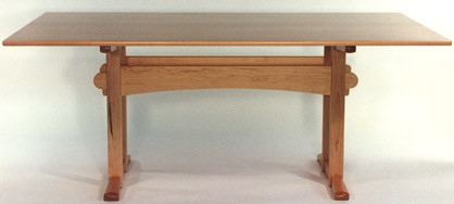 |
||||||||||||||||||||||||||||||||||||||||||||
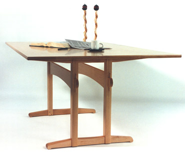 |
||||||||||||||||||||||||||||||||||||||||||||
Hank Gilpin - Trestle Table |
||||||||||||||||||||||||||||||||||||||||||||
 |
 |
|||||||||||||||||||||||||||||||||||||||||||
Hank Gilpin - Tall Bookstand |
Hank Gilpin - CD Floor Cabinet |
|||||||||||||||||||||||||||||||||||||||||||
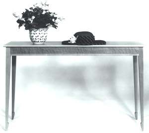 |
||||||||||||||||||||||||||||||||||||||||||||
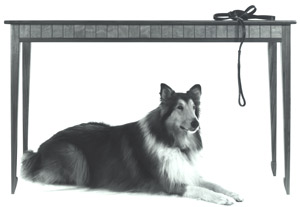 |
||||||||||||||||||||||||||||||||||||||||||||
Hank Gilpin - Sofa Tables |
||||||||||||||||||||||||||||||||||||||||||||
 |
 |
|||||||||||||||||||||||||||||||||||||||||||
Hank Gilpin - Cutting Boards |
Hank Gilpin - Curved Handle Trays |
|||||||||||||||||||||||||||||||||||||||||||
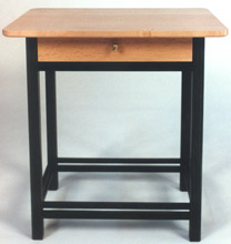 |
||||||||||||||||||||||||||||||||||||||||||||
Hank Gilpin - Side Table with Drawer |
||||||||||||||||||||||||||||||||||||||||||||
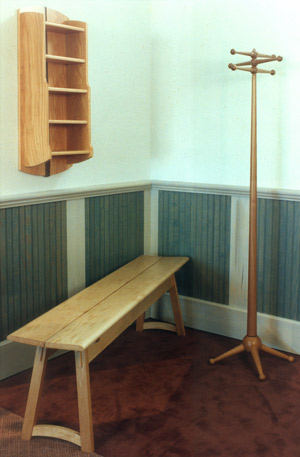 |
||||||||||||||||||||||||||||||||||||||||||||
Hank Gilpin - Bench, Wall-Hung CD Cabinet, Coat Rack |
||||||||||||||||||||||||||||||||||||||||||||
|
 |
|||||||||||||||||||||||||||||||||||||||||||
 |
||||||||||||||||||||||||||||||||||||||||||||
Hank Gilpin - Umbrella/Plant Stands |
||||||||||||||||||||||||||||||||||||||||||||
Hank Gilpin - Bookcase |
||||||||||||||||||||||||||||||||||||||||||||
| Jere Osgood | ||||||||||||||||||||||||||||||||||||||||||||
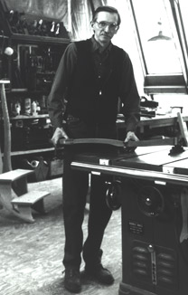 |
||||||||||||||||||||||||||||||||||||||||||||
Jere Osgood |
||||||||||||||||||||||||||||||||||||||||||||
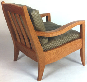 |
||||||||||||||||||||||||||||||||||||||||||||
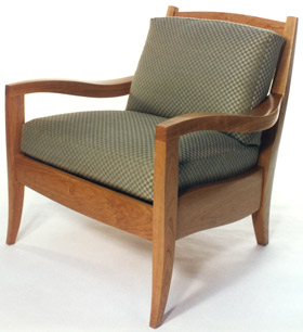 |
||||||||||||||||||||||||||||||||||||||||||||
Jere Osgood - Cherry Easy Chair |
||||||||||||||||||||||||||||||||||||||||||||
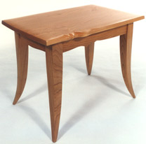 |
||||||||||||||||||||||||||||||||||||||||||||
Jere Osgood - Owassa Table |
||||||||||||||||||||||||||||||||||||||||||||
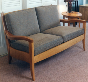 |
||||||||||||||||||||||||||||||||||||||||||||
Jere Osgood - Settee |
||||||||||||||||||||||||||||||||||||||||||||
 |
||||||||||||||||||||||||||||||||||||||||||||
Jere Osgood - Pencil Trays |
||||||||||||||||||||||||||||||||||||||||||||
| William Walker | ||||||||||||||||||||||||||||||||||||||||||||
 |
 |
|||||||||||||||||||||||||||||||||||||||||||
Bill Walker - Steel Top Side Table |
||||||||||||||||||||||||||||||||||||||||||||
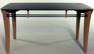 |
||||||||||||||||||||||||||||||||||||||||||||
Bill Walker - Steel Top Coffee Table |
||||||||||||||||||||||||||||||||||||||||||||
 |
||||||||||||||||||||||||||||||||||||||||||||
Bill Walker - Horizontal Shelf |
||||||||||||||||||||||||||||||||||||||||||||
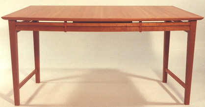 |
||||||||||||||||||||||||||||||||||||||||||||
Bill Walker - Bow Front Desk |
||||||||||||||||||||||||||||||||||||||||||||
 |
||||||||||||||||||||||||||||||||||||||||||||
Bill Walker - Vertical Wall-Hung Book Shelf |
||||||||||||||||||||||||||||||||||||||||||||
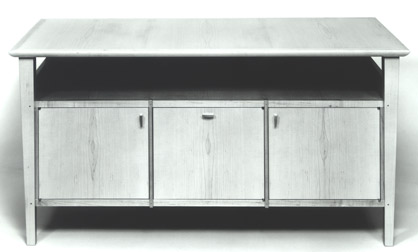 |
||||||||||||||||||||||||||||||||||||||||||||
Bill Walker - Credenza |
||||||||||||||||||||||||||||||||||||||||||||
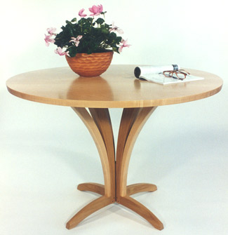 |
||||||||||||||||||||||||||||||||||||||||||||
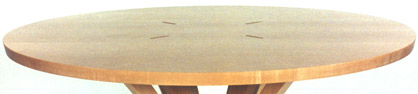 |
||||||||||||||||||||||||||||||||||||||||||||
Bill Walker - Circle Top Table |
||||||||||||||||||||||||||||||||||||||||||||
| Furniture - Summer 1994 |
Summer 1994 The announcement for the summer of 1994 showed a new low table by James Schriber. As the term “coffee table” became dated, low table replaced the commonly used term for a table situated in front of seating. The piece shows Schriber’s recurrent experimentalism in combining materials in a piece: wood; painted and textured foiled copper; stone, this time Vermont slate, and perforated metal. The enlarging leg, as if engorged by gravity as it descends to the foot, turns elegance on its head and was used recurrently by different makers in the late 1980s. The table was playful in its materials, but the heaviness of its stone top and the legs gave a sense of gravitas. David Ebner’s work also used dark milk painted tonalities, which he had developed with Ivan Barnett the preceding year. He continued his furniture experimentation using existing industrial parts. Hank Gilpin’s white oak desk is more of a visual investigation than a serious furniture solution for writing surface and drawer space. As usual in his work, the white oak material was used to stunning effect. This James Krenov cabinet seemed a return to his earlier themes of the box on stand. The Claro walnut Easy Chair was Jere Osgood’s first lounge chair design since the 1970s. Its powerful solid wood members projected an even more generous furniture personality than the actual scale of the chair. It was originally shown at Pritam & Eames without its seat and back cushions making it possible to see the design beauty of the back slats from the front. Osgood was convinced that this chair, with some simplification of its construction details, could be produced for the upcoming P&E Editions series. For this Claro walnut chair, there were over 50 jigs involved in shaping its members. Christoph Neander’s Column of Drawers can be viewed in conjunction with his hall table shown in the Fall 1995 show: both pieces exhibit an exterior use of a skeletal-like structure. As an interesting aside, it was Christoph's musician ancestors who owned the Neander valley in Germany where the first remains of a form of early man were discovered -- and subsequently named "Neanderthal". (A far cry from the sophisticated work of the contemporary Neander!) |
|||||||||||||||||||||||||||||||||||||||||||
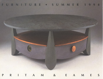 |
||||||||||||||||||||||||||||||||||||||||||||
James Schriber - Milk Paint over Poplar, Cherry, Slate, Copper Coffee Table with Drawers |
||||||||||||||||||||||||||||||||||||||||||||
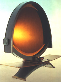 |
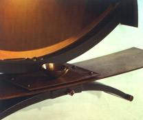 |
|||||||||||||||||||||||||||||||||||||||||||
David Ebner - Dresser Mirror |
||||||||||||||||||||||||||||||||||||||||||||
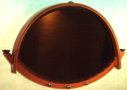 |
||||||||||||||||||||||||||||||||||||||||||||
David Ebner - Mirror |
||||||||||||||||||||||||||||||||||||||||||||
 |
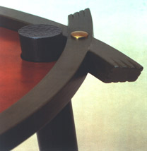 |
|||||||||||||||||||||||||||||||||||||||||||
David Ebner - Forged & peened Steel, Leather Table |
||||||||||||||||||||||||||||||||||||||||||||
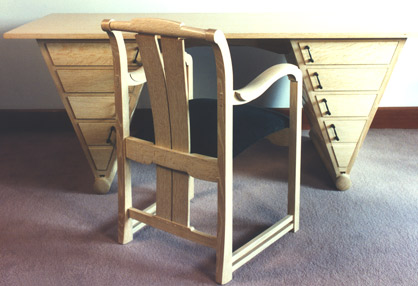 |
||||||||||||||||||||||||||||||||||||||||||||
Hank Gilpin - White Oak, Ebony Desk; White Oak Chair |
||||||||||||||||||||||||||||||||||||||||||||
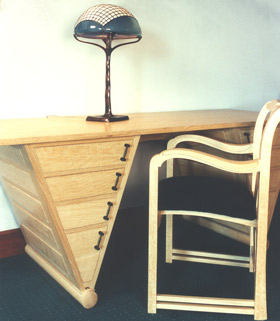 |
||||||||||||||||||||||||||||||||||||||||||||
Hank Gilpin - White Oak, Ebony Desk; White Oak Chair; Noel & Janene Hilliard - Handblown Glass, Bronze Table Lamp |
||||||||||||||||||||||||||||||||||||||||||||
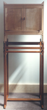 |
||||||||||||||||||||||||||||||||||||||||||||
James Krenov - Kwila, quilted Bird's-eye Maple, Yew Cabinet |
||||||||||||||||||||||||||||||||||||||||||||
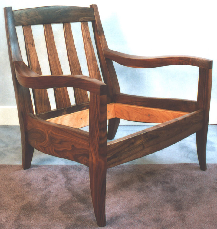 |
||||||||||||||||||||||||||||||||||||||||||||
Jere Osgood - Claro Walnut Easy Chair + |
||||||||||||||||||||||||||||||||||||||||||||
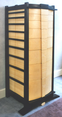 |
|
|||||||||||||||||||||||||||||||||||||||||||
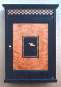 |
||||||||||||||||||||||||||||||||||||||||||||
Rick Wrigley - Ebonized Cherry, Makore, marquetry woods, Gold Leaf Saturn Cabinet |
||||||||||||||||||||||||||||||||||||||||||||
Christoph Neander - Northern White Pine Column of Drawers |
||||||||||||||||||||||||||||||||||||||||||||
| Dale Broholm & Jamie Robertson: New Work - 1994 |
Dale Broholm & Jamie Robertson: New Work NOTES: Dale Broholm was considered one of the young Turks of PIA's program in the 1980s. He was known for his use of wood veneers dyed in brilliant colors (see 1984). In the 1990s, Broholm's work took on architectural references. For this show, he collaborated with Chatham Glass, a Cambridge, MA glass group, to fabricate details such as the columns in his mirror, rods in the standing screen, and finials for the four-poster bed. Jamie Robertson had developed a reputation for outstanding veneer work, as well as figurative and stylized marquetry and inlay. His earliest pieces in the mid-1980s at the gallery were a pair of curved ebony lunettes with outstanding marquetry of dogwood branches in blossom across the front. These were followed by a very well received ebony and harewood mirror with stylized vines in flower ascending the side panels. Tables with an inlaid running hound motif were also admired. Then, in the early 1990s, came the first illusionist pieces, creating a sense of architectural perspective on an essentially two-dimensional plane. Although visitors to the gallery will probably think of Robertson for his headboards veneered in brilliant sunbursts of lemonwood and banded by curving ribbon-like details of rosewood, the new work for this show was focused in this illusionist direction. In a sense, Robertson's tricks of perspective were parallel to what John Cederquist was doing on the west coast, although Robertson's surfaces are handled quite differently. Stone-paved pathways project toward the viewer and backwards towards an arched or crowned aperture, sometimes represented by mirrored glass, or cabinet doors as in the announcement piece. |
|||||||||||||||||||||||||||||||||||||||||||
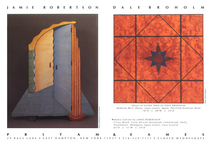 |
||||||||||||||||||||||||||||||||||||||||||||
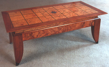 |
||||||||||||||||||||||||||||||||||||||||||||
Dale Broholm - Madrone Burl, Ebony, Lapus Lazuli, Agate, Petrified Dinosaur Bone Coffee Table |
||||||||||||||||||||||||||||||||||||||||||||
|
 |
|||||||||||||||||||||||||||||||||||||||||||
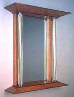 |
||||||||||||||||||||||||||||||||||||||||||||
Dale Broholm - Pomelle, Ebony, Glass Mirror |
||||||||||||||||||||||||||||||||||||||||||||
Dale Broholm - Etched Glass, Pearwood, Ebony Music Stand |
||||||||||||||||||||||||||||||||||||||||||||
 |
||||||||||||||||||||||||||||||||||||||||||||
Dale Broholm - Madrone Burl, Cherry, Glass Finials Bed |
||||||||||||||||||||||||||||||||||||||||||||
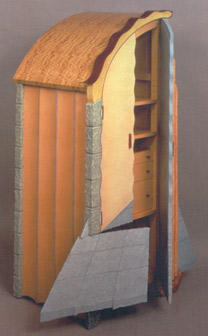 |
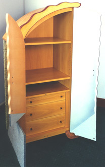 |
|||||||||||||||||||||||||||||||||||||||||||
Jaime Robertson - Citrus Wood, Curly African Satinwood, Lemonwood, Holly, Purpleheart, Mahogany, Japan colors, faux granite Media Cabinet |
||||||||||||||||||||||||||||||||||||||||||||
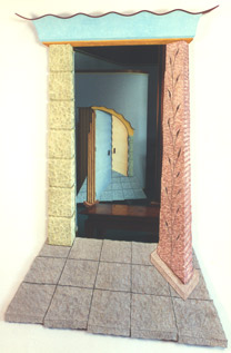 |
||||||||||||||||||||||||||||||||||||||||||||
Jamie Robertson - Basswood, Mahogany, Purpleheart, faux Granite, mirror, Japan colors "Into the Maze" |
||||||||||||||||||||||||||||||||||||||||||||
 |
||||||||||||||||||||||||||||||||||||||||||||
Jaime Robertson - Poplar, Ebony, Citrus Wood "Tick" & "Tock" Mantle Clocks |
||||||||||||||||||||||||||||||||||||||||||||
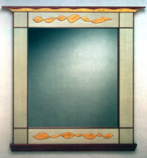 |
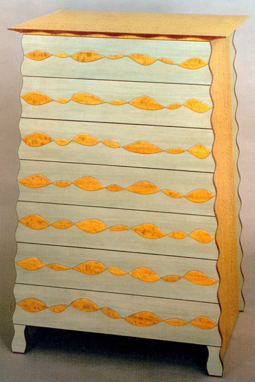 |
|||||||||||||||||||||||||||||||||||||||||||
Jamie Robertson - Curly African Satinwood, dyed Poplar, Purpleheart, Cherry, Mahogany "The Ripple Mirror " |
Jamie Robertson - Curly African Satinwood, dyed Poplar, Purpleheart, Cherry, Mahogany "The Ripple Chest" + |
|||||||||||||||||||||||||||||||||||||||||||
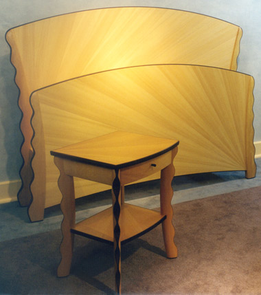 |
||||||||||||||||||||||||||||||||||||||||||||
Jaime Robertson - Lemonwood, Pau Amarello, Rosewood "Sunrise/Sunset" Bed and Bedside Table |
||||||||||||||||||||||||||||||||||||||||||||
The Furniture Art of Judy Kensley McKie - 1994 |
The Furniture Art of Judy Kensley McKie NOTES: The fourth in Judy McKie's series of one-person exhibits at the gallery, and the largest of her shows to date, with fifteen pieces. Of this number, two are significant new bronzes; six are major pieces in wood. By 2000, the bronze pieces would be in the majority. If you had to pick the major piece in the show, it would be the bronze Lion Bench, a piece inspired by Central American stone carving best described as line carving on a volume slab or block. The calm solidity of the volume is dominated by the head with its thick mane flowing back dynamically from the ferocity of the face. The scene-stealer in this show, however, was the Monkey Chair of wood and bronze, a combination that McKie would not repeat until 2004. When you sit in the Monkey Chair, you feel empowered as if seated on a throne. When approaching the chair, however, it is not clear whether the monkeys are, in fact, friendly or not; in this sense, they are true guardians. As already seen in the Lion Bench, this ambiguity is often evident in McKie’s work. The Black Bird Mirror, with its intense colors and imagery, also has an unsettling effect. On the other hand, there are benign visions in McKie’s world, and both the Turtle Low Table and Fox Side Tables offered considerable pleasure to McKie’s public. However, even her ostensibly more benign visions have undertones. The sly grin on the fox of the table by that name might indeed be beckoning Red Riding Hood. The Monkey Settee was a large piece and, as such, not as place-able as the chair. However, the originality of the settee was that it extended the chair’s seat into a usable table surface that was common to the second seat. McKie said that the idea for the Monkey Settee actually preceded that of the Monkey Chair, but the solutions for the chair came more easily than the settee; thus, it was made first.
The Turtle Table was another piece that gave McKie’s public considerable pleasure. Its out-stretched head is tentative, but the tension in the strongly bowed legs suggests sudden movement. The concentric design of the top already sets the piece in motion. The other table in the show, the medium sized Circle Table, also uses a strong linear graphic. This time shallow relief carving is used to delineate white lines on a black background. There is a strong sense of geometry in the design, but also because of the way the patterns intersect, just as strong a feeling of random selection. This table’s other feature of note is the unusual totemic shaped legs.
Two large case pieces are included in McKie’s selection: Sideboard with Greenery is just that, and perhaps the calmest piece in the show. Very different is the agitation of the Frog Cabinet with its towering stature and surge of aerated borders. The muscular frogs move up and down, only interrupted by the thin molding, which separates the upper and lower doors.
In addition to the Lion Bench, the other bronze piece of scale was the Female Vessel. A sub-title of sisterhood would not be out of place, suggested strongly by the joined upheld hands of the five figures surrounding the vessel. Also the concentric rings, a feature that appears in a number of McKie pieces, appear around the heads of the figures and suggest habits or cowling, as well as hair. The overall form is unambiguously chested, its five-breasted vessel form lends a magical but impersonal force to the term Female. The narrow base leads to a lowered half of the female figures, which emphasizes nurturing, as opposed to fertility.
|
|||||||||||||||||||||||||||||||||||||||||||
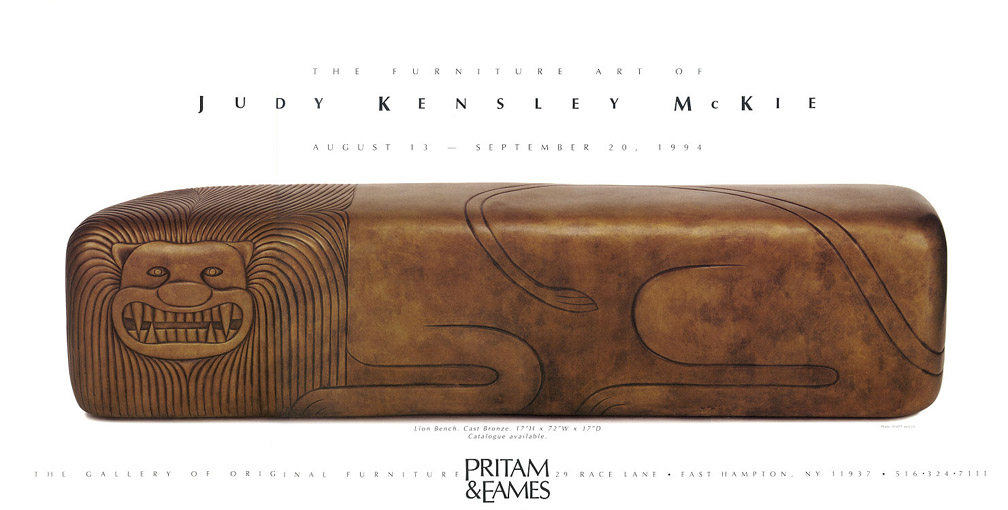 |
||||||||||||||||||||||||||||||||||||||||||||
Bronze Lion Bench + |
||||||||||||||||||||||||||||||||||||||||||||
Judy Kensley McKie Today, as we stand awash - sometimes shoulder deep - in an art world A daughter of artists, a painter with a fine understanding of organic form, Now restored, we sense in the perception of each McKie First mastering the fast machines in wood shops, she then appropriated hand tools No one told her that women don't make furniture. If Judy McKie had instead become a performer (it is easy to imagine this) Jack Lenor Larsen, President Emeritus, American Craft Council, Hon. RDI |
||||||||||||||||||||||||||||||||||||||||||||
 |
||||||||||||||||||||||||||||||||||||||||||||
Jack Lenor Larsen & Judy Kensley McKie |
||||||||||||||||||||||||||||||||||||||||||||
 |
||||||||||||||||||||||||||||||||||||||||||||
Sideboard with Greenery |
||||||||||||||||||||||||||||||||||||||||||||
 |
||||||||||||||||||||||||||||||||||||||||||||
Frog Cabinet |
||||||||||||||||||||||||||||||||||||||||||||
 |
||||||||||||||||||||||||||||||||||||||||||||
Monkey Chair + |
||||||||||||||||||||||||||||||||||||||||||||
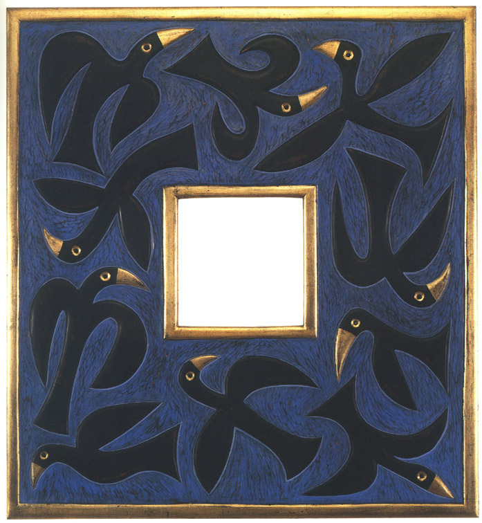 |
||||||||||||||||||||||||||||||||||||||||||||
Mirror with Black Birds + |
||||||||||||||||||||||||||||||||||||||||||||
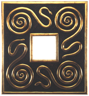 |
||||||||||||||||||||||||||||||||||||||||||||
Mirror with Snakes |
||||||||||||||||||||||||||||||||||||||||||||
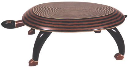 |
||||||||||||||||||||||||||||||||||||||||||||
Turtle Table |
||||||||||||||||||||||||||||||||||||||||||||
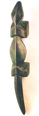 |
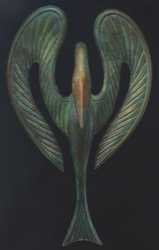 |
|||||||||||||||||||||||||||||||||||||||||||
Lizard Handle |
Swan Sconce |
|||||||||||||||||||||||||||||||||||||||||||
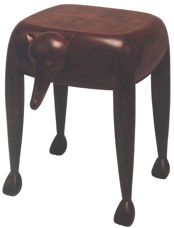 |
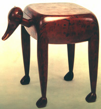 |
|||||||||||||||||||||||||||||||||||||||||||
Fox Tables |
||||||||||||||||||||||||||||||||||||||||||||
+ |
||||||||||||||||||||||||||||||||||||||||||||
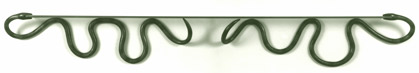 |
||||||||||||||||||||||||||||||||||||||||||||
Snake Shelf |
||||||||||||||||||||||||||||||||||||||||||||
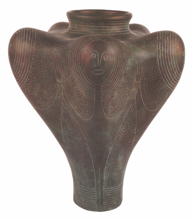 |
||||||||||||||||||||||||||||||||||||||||||||
Female Vessel + |
||||||||||||||||||||||||||||||||||||||||||||
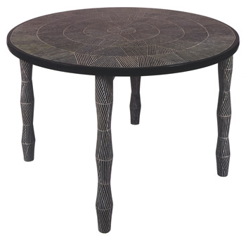 |
||||||||||||||||||||||||||||||||||||||||||||
Circle Table |
||||||||||||||||||||||||||||||||||||||||||||
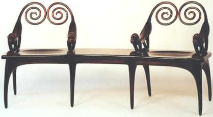 |
||||||||||||||||||||||||||||||||||||||||||||
Monkey Settee |
||||||||||||||||||||||||||||||||||||||||||||
| Commissions - 1994 |
Commissions - 1994 | |||||||||||||||||||||||||||||||||||||||||||
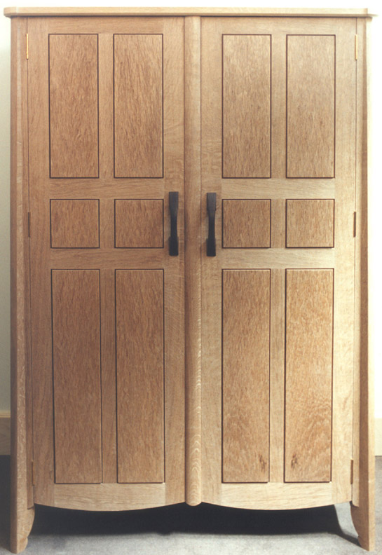 |
||||||||||||||||||||||||||||||||||||||||||||
Hank Gilpin - White Oak Wardrobe + |
||||||||||||||||||||||||||||||||||||||||||||
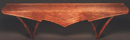 |
||||||||||||||||||||||||||||||||||||||||||||
 |
||||||||||||||||||||||||||||||||||||||||||||
Kristina Madsen - Carved Bubinga Bench |
||||||||||||||||||||||||||||||||||||||||||||
 |
||||||||||||||||||||||||||||||||||||||||||||
Jere Osgood - Claro Walnut Stool |
||||||||||||||||||||||||||||||||||||||||||||
 |
||||||||||||||||||||||||||||||||||||||||||||
Jere Osgood - East Indian Rosewood Desk |
||||||||||||||||||||||||||||||||||||||||||||
| 1 9 9 5 | ||||||||||||||||||||||||||||||||||||||||||||
| Spring 1995 | Spring 1995 NOTES: A modest card belied the robust strength of this 1995 Early Spring Show group show. A pair of leather and maple chairs marked a rare appearance of work at the gallery by Bruce Beeken and Jeff Parsons. A great deal of the character of these chairs came from the use of stretched belt leather cleverly tensioned over the chair’s structural members. The ties for the leather were festooned with tassel details that were a similar decorative detail except in silk for the Child’s Bed exhibited in the 10th anniversary show in 1991. The maple chosen for the chair was grade B, or was not pure creamy maple but material that included patches of dark brown coloration. This was significant not because it added to the rusticity of the chair’s look so much as that it gave a window into the thinking of Beeken and Parsons with respect to the use of material. The chairs have, as Beeken puts it, "a real material presence." Both Beeken and Parsons had developed a deep commitment to harvesting regional hardwoods from their Vermont environs, with the added integrity of not wasting but using as much of the tree as possible. Andy Buck’s second piece to come to the gallery was more in line with the work that would come from him in future years. Harold was African in inflection with bold horizontal striping, and round and squat like a kettledrum. The primitive carved feel of this piece, as well as the complex dark colors, would be his signature for work to come. Hank Gilpin’s small cabinet on stand was one of his extemporaneous pieces that came to the gallery when it was done. Like Krenov, Gilpin’s entries were rarely premeditated. This was truly a sweet idiosyncratic piece. Its low stand gave the cabinet just enough height to maintain the user’s comfort. The signature of the piece, however, comes from the complexity of the pieced door panels, a technique that captivated this maker at the time. The frames of the door panels are unusually coved at the top and gently tapered towards the midpoint at the bottom. The cabinet sits on a rolling pin base allowing it to be shifted on its low stand. The only use of a secondary wood is in the minimal doorknobs. This would be the only showing of Peter Murkett's work at the gallery. His entries, the second of three pairs of chairs in the show, share a certain rusticity with the Beeken-Parsons chairs, although they reflect a more traditional influence of slat back chair design. For instance, the Murkett chairs are certainly not strangers to green chair tradition as practiced currently by Brian Boggs in Kentucky. The contemporary style of Christoph Neander’s furniture makes another appearance, this time in a revolving bookcase called the Guggenheim. As a small revolving bookcase, it follows a functional tradition. The bookcase was constructed with a square vertical shaft in its center. Neander finalized his witty take-off statement by turning this shaft into a tiny, lit gallery complete with hanging miniature prints of contemporary masters' paintings from the Guggenheim Museum: a modernist’s doll house. Jane Swanson’s Chippendale-style chair was an unusual entrant in the gallery for two reasons: first because it represented such a faithful adherence to the Chippendale tradition and second, it was the first piece to come to the gallery from a graduate of the North Bennett Street School in Boston. This school, established in 1885, is unusual today in that its curriculum is devoted to furniture making based on hand skills and proven craft technique. It is a curriculum that largely avoids the confrontations dealing with contemporary art/craft/design issues. Ron Puckett’s side tables continued his participation in gallery exhibitions. The lightness of these pedestal-based tables was in contrast to his earlier solidly architectural pieces. There is a nice balance in this pair of side tables between traditional furniture references rendered in a postmodern look. This tall cabinet by Peter Spadone presages the work that he will do for his show with Rick Wrigley the following year. Its intriguing character results from a small diorama inspired space atop a stack of drawers. His consummate carved detailing around the window of the diorama gives the illusion that the verdancy of the interior is escaping to the outside. Also in the show were two of David Secrest's iron and steel benches. The base of Secrest's Curvilinear Bench is a mathematically accelerating curve. This sculptural premise is less in line with his geologically influenced forms. It is nonetheless richly textured and includes the use of his laminated iron/steel “tiles”. The Ark (see his 1996 show with Tom Joyce), on the other hand, looks like it might have come from an ancient Sumerian garden. The third pair of chairs in this exhibition came from Rick Wrigley. These chairs occupy a very useful territory but one seldom entered -- that is, they are a cross between dining/desk chairs and an easy chair. These chairs are comfortable, relatively portable, and, with their arms, one could imagine they would promote more conversation than the kind of posture needed at a dining table or desk. The recline of the back is not as steep as one finds in an easy chair but the shell back and the ample upholstered leather seat offer an unusual degree of comfort. The rich fumed oak material of the chairs is further embellished with small-refined uses of parquetry detailing. |
|||||||||||||||||||||||||||||||||||||||||||
 |
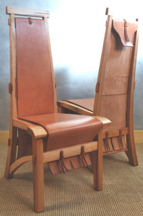 |
|||||||||||||||||||||||||||||||||||||||||||
Bruce Beeken-Jeff Parsons |
||||||||||||||||||||||||||||||||||||||||||||
 |
||||||||||||||||||||||||||||||||||||||||||||
Andy Buck - Poplar, milk paint "Harold" + |
||||||||||||||||||||||||||||||||||||||||||||
 |
 |
|||||||||||||||||||||||||||||||||||||||||||
Hank Gilpin - Mosaic Cabinet |
||||||||||||||||||||||||||||||||||||||||||||
+ |
||||||||||||||||||||||||||||||||||||||||||||
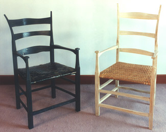 |
||||||||||||||||||||||||||||||||||||||||||||
Peter Murkett - Scavenged Materials "Salvage Chair" |
Peter Murkett - Hickory "Bone Chair" |
|||||||||||||||||||||||||||||||||||||||||||
 |
 |
|||||||||||||||||||||||||||||||||||||||||||
Christoph Neander - Maple revolving "Guggenheim" Bookcase |
||||||||||||||||||||||||||||||||||||||||||||
 |
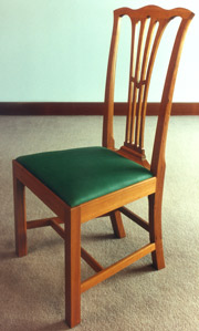 |
|||||||||||||||||||||||||||||||||||||||||||
Ross Day - Pearwood, Silver Mirror |
Jane Swanson - Cherry, Abalone Chippendale Chair |
|||||||||||||||||||||||||||||||||||||||||||
 |
||||||||||||||||||||||||||||||||||||||||||||
Ron Puckett - Bubinga, Curly Blush Anigre, Ebony Side Tables |
||||||||||||||||||||||||||||||||||||||||||||
 |
||||||||||||||||||||||||||||||||||||||||||||
Peter Spadone - Wenge, Maple Burl, Walnut Cabinet |
||||||||||||||||||||||||||||||||||||||||||||
 |
||||||||||||||||||||||||||||||||||||||||||||
David Secrest - pattern welded Iron & Steel Curvilinear Bench |
||||||||||||||||||||||||||||||||||||||||||||
 |
||||||||||||||||||||||||||||||||||||||||||||
Rick Wrigley - Oak, Ebony Pair of Armchairs + |
||||||||||||||||||||||||||||||||||||||||||||
| 27 = Useful Things - 1995 |
27 = Useful Work in Wood, Metal, Ceramics, Glass, and Jewelry NOTES: In addition to furniture, the gallery continued to devote space and attention to smaller functional objects for the home. They allocated nearly 25% of their floor space towards this purpose. Wood: You could still discover delightful, functional wood pieces at regional craft shows like the American Craft Council's (ACC) Baltimore show in the 1990s. P&E was devoted to the idea of beautiful objects for everyday use and delighted in discovering Brad Smith's series of kitchen area pieces that included counter stools built with axe handles and pitchforks, and cheese slicers in various woods that resembled musical instruments with their custom metal hardware. Another wonderful addition to any kitchen is a selection of Jonathan Simon's spoons. He is a cook's cook and his inventive arsenal of wild cherry spoons seem to anticipate every chef's need. A Coloradoan, Bob Womack, used found mountain woods that he carved into effective and sensual letter openers. |
|||||||||||||||||||||||||||||||||||||||||||
 |
 |
|||||||||||||||||||||||||||||||||||||||||||
Brad Smith - Ash, Cherry, painted Steel Ax Handle Stools |
Brad Smith - Ash, Cherry, painted Steel Pitchfork Stool |
|||||||||||||||||||||||||||||||||||||||||||
 |
 |
|||||||||||||||||||||||||||||||||||||||||||
Brad Smith - Varioius woods, Stainless Steel Cheese Slicer |
||||||||||||||||||||||||||||||||||||||||||||
 |
||||||||||||||||||||||||||||||||||||||||||||
Bob Womack - Carved Letter Openers |
Jonathan Simons - Wild Cherry Spoons |
|||||||||||||||||||||||||||||||||||||||||||
 |
American Work in Metal 1995
|
|||||||||||||||||||||||||||||||||||||||||||
Tom Odell - Cast Bronze patinaed Vessels |
||||||||||||||||||||||||||||||||||||||||||||
 |
Ceramics Joyce Nagata,Hiroshi Nakayama, James Makins, Pat Warwick NOTES: The gallery continued to feature functional ceramics, with an occasional exception granted to the mostly ceremonial one-of-a-kind porcelain vessels of James Makins. These bottle-like shapes and their warm, sumptuous earth tones evoke the soft play of the clay material itself. You can almost see these forms being squeezed out through the hands of the ceramist. In the mid-1990s, Makins commuted weekly between his New York studio and the Philadelphia College of the Arts, where he taught ceramics. Later, as he was spending more and more time in Japan, Makins was less able to supply the gallery with his functional porcelain "Chromoline" ware that clients coveted. Joyce Nagata was teaching ceramics at Swarthmore College in PA while she made her appealing, and eminently functional, Majolica earthenware pieces. Since her ceramics department was located within the art department, Nagata admitted that she was being pressured to make non-functional work, although her functional pieces flew out of the gallery. Hiroshi Nakayama's stoneware ceramics are distinguished by their marble glaze, a formula worked out between he and his former partner, Judith Glasser. Very Japanese in form and function, these Nakayama pieces appealed to a cultivated taste in functional ceramics. It was the porcelain ceramics of Izuki Teraki and Jeanne Bisson, whose studio is called Romulus Craft, that took good, clean design armed with functional considerations to new, satisfactory heights. Their tableware settings reflected a quiet regard for Japanese aesthetics (Ikuzi was born and trained in Kyoto, Japan), but their practical applications centered on good old Yankee serviceability.
|
|||||||||||||||||||||||||||||||||||||||||||
James Makins - Porcelain |
||||||||||||||||||||||||||||||||||||||||||||
 |
||||||||||||||||||||||||||||||||||||||||||||
James Makins -Chromoline Porcelain |
||||||||||||||||||||||||||||||||||||||||||||
 |
||||||||||||||||||||||||||||||||||||||||||||
Joyce Nagata - Majolica Earthenware |
||||||||||||||||||||||||||||||||||||||||||||
 |
||||||||||||||||||||||||||||||||||||||||||||
Joyce Nagata - Majolica Platter
|
||||||||||||||||||||||||||||||||||||||||||||
 |
||||||||||||||||||||||||||||||||||||||||||||
Hiroshi Nakayama - Marble Glaze Stoneware |
||||||||||||||||||||||||||||||||||||||||||||
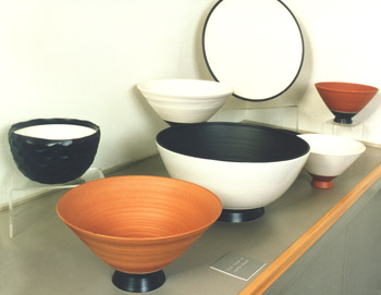 |
||||||||||||||||||||||||||||||||||||||||||||
Romulus Craft - Porcelain Dinnerware |
||||||||||||||||||||||||||||||||||||||||||||
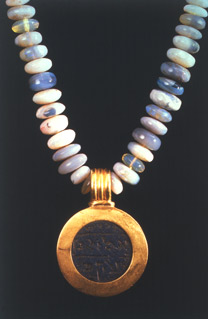 |
|
American Jewelry 1995 Work from 12 studio jewelers continued the gallery's commitment to a second decade with this show of wearable jewelry. High karat work by Ellen Baumritter is bold and colorful. Her hand wrought chains of 22K gold, large precious and semi-precious stones and handmade findings all contribute to her spirited scaled up classical jewelry. Bessie Jamieson and Eleni Prieston, both working in the same high karat gold classical tradition, bring a different twist to their jewelry. Eleni Prieston has a lighter and more organic touch, whereas Bessie Jamieson's work reflects a more historically referenced one. Tom Odell brought his traditional Japanese mokume techniques to a body of wearable pieces in this show, which incorporated copper, silver, gold and pearls. Loosely shaped geometric forms are soldered together in a marriage of subtle colors. Helene Safire threaded brilliantly colored dichroic glass beads onto silk cord, resulting in bright lyrical necklaces. Joan Parcher, whose work appears in the Cooper Hewitt and Renwick Museum collections, often employs vitreous enamel flowers and discs in saturated chalky colors. She has incorporated mica, gold, oxidized silver, steel cable, enamel, pearls, and diamonds into her line of light-hearted, approachable, and appealing work. The thread of approachability, wearability, comfort, and appeal was securely running through the body of goldsmiths represented by the gallery during this period. |
||||||||||||||||||||||||||||||||||||||||||
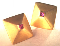 |
||||||||||||||||||||||||||||||||||||||||||||
Ellen Baumritter - 22K Gold with Pink Tourmalines Pyramid Earrings |
||||||||||||||||||||||||||||||||||||||||||||
Ellen Baumritter - Opal Beads with Ancient Hebrew Object in 22K Gold |
||||||||||||||||||||||||||||||||||||||||||||
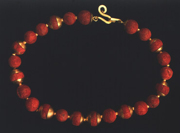 |
||||||||||||||||||||||||||||||||||||||||||||
Ellen Baumritter - Sponge Coral Beads with 22K Gold Caps, Spacers, and Clasp |
||||||||||||||||||||||||||||||||||||||||||||
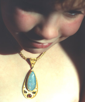 |
||||||||||||||||||||||||||||||||||||||||||||
Eleni Prieston - Boulder Opal with Green Tourmalines and Rhodolite Garnet in 22K Gold with Granules, handwoven 22K Gold Quadruple Loop Chain |
||||||||||||||||||||||||||||||||||||||||||||
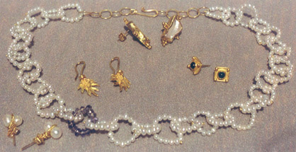 |
||||||||||||||||||||||||||||||||||||||||||||
Eleni Prieston - 22K Gold with Pearls, Sapphires, Green Tourmalines |
||||||||||||||||||||||||||||||||||||||||||||
 |
 |
|||||||||||||||||||||||||||||||||||||||||||
Joan Parcher - Mica and Silver Brooch |
Joan Parcher - Mica Chain Necklace |
|||||||||||||||||||||||||||||||||||||||||||
 |
 |
|||||||||||||||||||||||||||||||||||||||||||
Joan Parcher - Vitreous Enamel on Copper, tumbled Hematite, Oxidized Sterling, 14K Gold Flower Earrings |
Joan Parcher - Vitreous Enamel on tin can lid, Oxidized Silver Tin Can Brooch |
|||||||||||||||||||||||||||||||||||||||||||
| Krenov - 1995 |
Krenov In Fire & Smoke and the Elm Cabinet, the effects are dramatic. By avoiding any neat rules of panel banding, Fire and Smoke is almost totemic in its presence. Like his 1993 walnut piece, this is a cabinet on a cabinet, without curves. This time, however, the mid-section is not broken with drawers. While Fire & Smoke is a cabinet on a cabinet base, the Elm Cabinet is a more expected form from Krenov -- a cabinet on a stand. Again, the veneer is given full center stage to create a visage with an almost shroud-like imprint. The third cabinet is recognizable from its predecessors. In this piece, the upper cabinet appears to be shrinking and perching. The next two cabinets are by John Cameron and Tim Coleman, both of whom studied with Krenov. This will be a single entrant at the gallery by Cameron: a showcase cabinet in a more traditional vein. There is no use of a secondary wood in the exterior, but a delicate use of glass in the upper showcase. It is more common to find hickory used in traditional chair making. In this case, its use in the cabinet is calming. Tim Coleman studied with Krenov after apprenticing with Bill Walker in Seattle. His three- story cabinet is a beautifully crafted, idiosyncratic maker’s vision. The piece’s complexity comes not only from its detailing, but also from the convex shaping of the lower cabinet’s front with the transition to concave shaping in the upper stories. Much of the unusual quality of the cabinet comes from the proportion of the two upper stories to the lower cabinet, almost like a monastery perched on a mountain. His oak cabinet, a generally more functional piece, derives its unusual character from the detailing of the doors. Here the viewer is led to think of the dramatic pleating of performance curtains. Ross Day’s entry in this show is a functionally considered, well- proportioned sheet music cabinet. He makes very sweet use of the cherry material. Unabashedly influenced by a Japanese aesthetic, Seth Janofsky’s sideboard was designed close to the floor. This is low storage and the viewer is tempted to complete the scene with tatami mats in front. Bille Koch’s small piece depends on a table or sideboard to operate. Its beautiful work in kwila frames the glass facades of this display cabinet. This is a symmetrical and functional architectural vision. An early bravura piece arrived from Brian Newell from the midwest during a period in which he was producing prototypes for a Chicago toy maker. While this cabinet does not presage the animation of his end-of-the-century body of work, it certainly demonstrates his originality. The use of fragile leaded glass lights for the flanked central chamber gives the piece a cathedral-like feeling. Like his 2001 “broken ice” cabinet, the form of the cabinet is projected upwards from the plan view of the base.
This small wall cabinet was unusual for Zivko Radenkov in that it did not use marquetry. Its simple beauty is derived entirely from the ash panels of the two slender doors. His ebony and paper lamp, also Japanese influenced, gives a pleasant ambient light.
|
|||||||||||||||||||||||||||||||||||||||||||
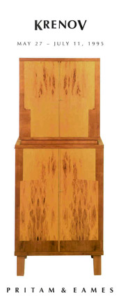 |
 |
|||||||||||||||||||||||||||||||||||||||||||
James Krenov - Pearwood, Alerice, & Pernambuco "Fire and Smoke" Cabinet + |
||||||||||||||||||||||||||||||||||||||||||||
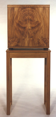 |
||||||||||||||||||||||||||||||||||||||||||||
James Krenov - English Elm, English Oak Cabinet |
||||||||||||||||||||||||||||||||||||||||||||
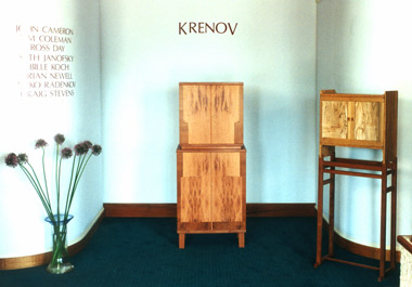 |
||||||||||||||||||||||||||||||||||||||||||||
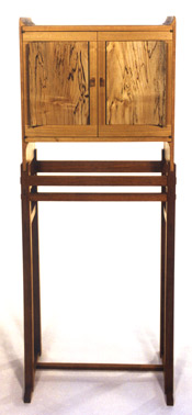 |
||||||||||||||||||||||||||||||||||||||||||||
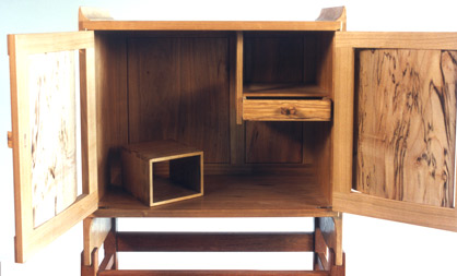 |
||||||||||||||||||||||||||||||||||||||||||||
James Krenov - Maple and Olive 'Owl' Cabinet |
||||||||||||||||||||||||||||||||||||||||||||
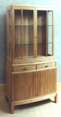 |
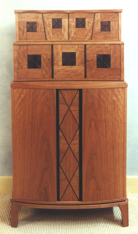 |
|||||||||||||||||||||||||||||||||||||||||||
John Cameron - Hickory Showcase Cabinet |
Tim Coleman - Cherry, Morado, Karina "Three Stories" Cabinet + |
|||||||||||||||||||||||||||||||||||||||||||
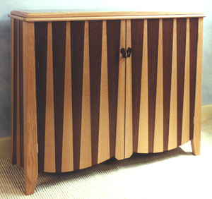 |
||||||||||||||||||||||||||||||||||||||||||||
Tim Coleman - White Oak, English Brown Oak Cabinet |
||||||||||||||||||||||||||||||||||||||||||||
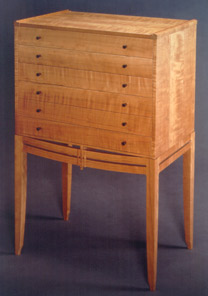 |
||||||||||||||||||||||||||||||||||||||||||||
Ross Day - Japanese Oak, Brown Ebony, Eastern Maple, patinaed Bronze Cabinet |
||||||||||||||||||||||||||||||||||||||||||||
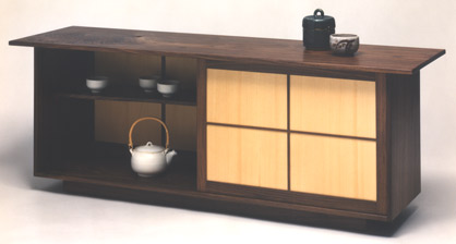 |
||||||||||||||||||||||||||||||||||||||||||||
Seth Janofsky - Black Walnut, Port Orford Cedar Sideboard |
||||||||||||||||||||||||||||||||||||||||||||
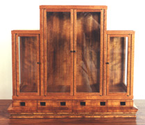 |
||||||||||||||||||||||||||||||||||||||||||||
Bille Koch - Kwila Display Cabinet |
||||||||||||||||||||||||||||||||||||||||||||
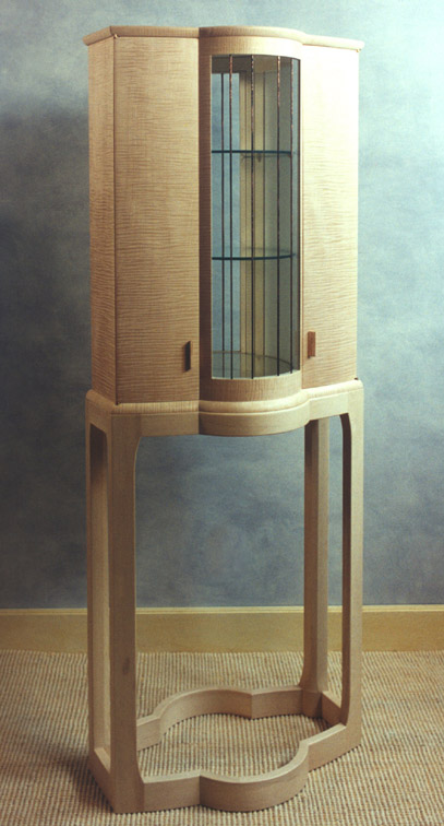 |
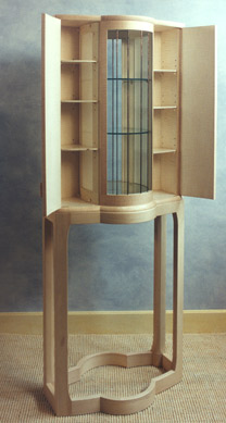 |
|||||||||||||||||||||||||||||||||||||||||||
Brian Newell - Curly English Sycamore, European Hornbeam, Holly, Copper "Ghost" Cabinet |
||||||||||||||||||||||||||||||||||||||||||||
+ |
||||||||||||||||||||||||||||||||||||||||||||
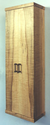 |
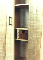 |
 |
||||||||||||||||||||||||||||||||||||||||||
Zivko Radenkov - Curly Maple, Brazilian Rosewood, and Secupira Wall Cabinet |
Zivko Radenkov - Macassar Ebony, African Sedua, Chiri Paper Lamp |
|||||||||||||||||||||||||||||||||||||||||||
| Jere Osgood & Stewart Wurtz - 1995 |
Jere Osgood & Stewart Wurtz NOTES: This is the third show featuring Osgood's work. Stewart Wurtz had previously shown at the gallery as a recent graduate of the PIA program where he had studied with Jere Osgood. Later, he shared shop space for a number of years with Bill Walker in Seattle. This would be the second time the master Osgood would exhibit his work with that of a former student, the last time it was Thomas Hucker. Osgood would create two major pieces for this show; both were projects that required months to complete. The Tall Desk will be the more challenging of the two pieces since it has no ready references. When you say "tall desk", you might think of a secretary, but what Osgood had in mind had more to do with the privacy of a library carrel. Two tall pocket doors, besides making the work area private, open to reveal the original architecture of an interior that soars upward from the user. A pullout-writing surface expands the workspace. His second major piece is a low chest of drawers with a broad swelling volume that contains three ample drawers. What form could more ably convey "chest" of drawers? There is not only the compound swelling up through the drawer fronts, the carcass itself swells from the bottom and cinches to the rear. The only flat surface to greet the viewer is the top, which terminates in the rear in a shaped ledge. This horizontal volume is such a convincing and satisfying form, one creating such a pleasing flow of curves, that you have to remind yourself that the piece actually derives from an equally impressive, but vertical, chest of drawers. (see Archives, First Decade, The Boston Influence, 1984). Osgood’s work also included two side tables that would become signature pieces for him: the Owassa and Layton tables, one representing a four-legged and the other a pedestal designed table. Osgood often names his tables after people or places significant to him. The organic shaping and gently sweeping saber legs of his Owassa table would evolve into a stockier version, with a weight more suitable to accompany his easy chair. This version would be produced in small numbers for P&E Editions. The trick on the apron for Osgood was to create an organic design that has a fresh, once done look and yet could be re-produced. The Layton table is a great example of Osgood’s talent for using asymmetry both in the pedestal support, which is reminiscent of his desks, and the curved sweep of the top. The work by Stewart Wurtz -- a daybed, a three-legged dining table and chairs to seat six, a desk and chair suite -- does not remind one of Osgood any more than William Walker's work would remind you of Jim Krenov. Both Walker and Wurtz share a contemporary take on modernism where the detailing is sensitive but not relied upon for major impact. This "west coast" look was not as impacted by an Art Deco or neo-Classicism look as happened in the East in the 1980s. Nor is there a particular indebtedness to the 20th-century Scandinavian designers. Theirs was a grass roots style that draws on the energy of their two great teachers, Jere Osgood and James Krenow. Wurtz’s desk and chair are good examples of his contemporary aesthetic. The desk’s low ridge of sliding door compartments is sufficient to define a private workplace; otherwise, the piece is a study of flat and curved intersecting planes with a distinct contemporary architectural sense. The low backed chair is in keeping with the profile of the desk. The front and rear legs, arms, and back interlock in an interesting solution to racking forces. His daybed is very much scaled for the height of present day humans. The slatted sides produce a modern openness. The decorative detailing of the legs may seem unmotivated by the form, but it is reminiscent of the more aggressive detailing of his earlier PIA work. Wurtz's three-legged table comes from a family of forms that could be labeled pinwheel, a form used by Wendell Castle earlier. Usually legs will project outward to define the pinwheel more aggressively, for example in Castle's game table in the 1981-opening exhibit of Pritam & Eames. Here, in Wurtz's piece, the legs are neatly tucked into a triangular division of a circular table form. This leads to a more interesting shape than a simple 120-degree division of a circle. It also helps to accomplish a rigid joinery for the legs. Sometimes the extension of an extended leg junction leads to a less than satisfactory stability to a large table, but this table was rock solid. The three legs also nicely accomplish space for seating six. |
|||||||||||||||||||||||||||||||||||||||||||
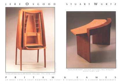 |
||||||||||||||||||||||||||||||||||||||||||||
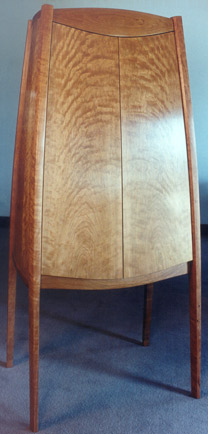 |
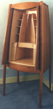 |
|||||||||||||||||||||||||||||||||||||||||||
Jere Osgood - Cherry, Maple, Leather Tall Desk with Pocket Doors |
||||||||||||||||||||||||||||||||||||||||||||
 |
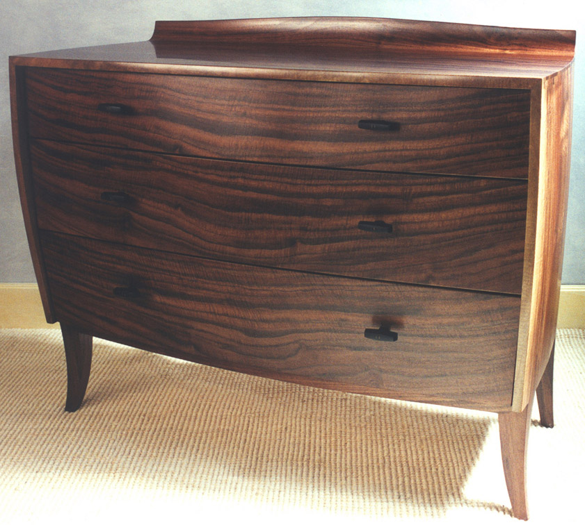 |
|||||||||||||||||||||||||||||||||||||||||||
Jere Osgood - Claro Walnut Low Chest of Drawers |
||||||||||||||||||||||||||||||||||||||||||||
+ |
||||||||||||||||||||||||||||||||||||||||||||
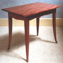 |
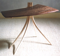 |
|||||||||||||||||||||||||||||||||||||||||||
Jere Osgood - Bubinga Owassa Table |
Jere Osgood -Walnut Layton Table |
|||||||||||||||||||||||||||||||||||||||||||
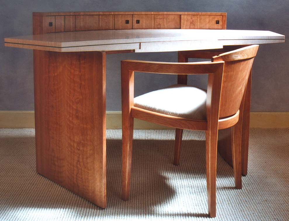 |
||||||||||||||||||||||||||||||||||||||||||||
Stewart Wurtz - Curly Maple, Figured Cherry, Ebony, Sterling Silver Desk + |
||||||||||||||||||||||||||||||||||||||||||||
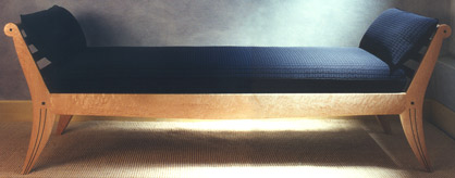 |
||||||||||||||||||||||||||||||||||||||||||||
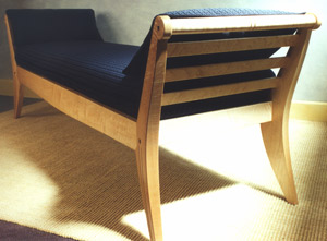 |
||||||||||||||||||||||||||||||||||||||||||||
Stewart Wurtz - Daybed |
||||||||||||||||||||||||||||||||||||||||||||
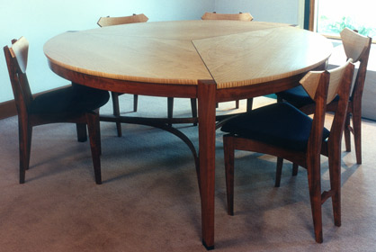 |
||||||||||||||||||||||||||||||||||||||||||||
Stewart Wurtz -Bubinga and Maple Dining Table and Chairs |
||||||||||||||||||||||||||||||||||||||||||||
| Kristina Madsen - 1995 |
Kristina Madsen NOTES: This is Kristina Madsen's second solo exhibit that features her work in shallow relief carving. The three major pieces completed for this show were all horizontal carcass pieces: a chest on stand, a chest of drawers, and a blanket chest. And all three pieces are more familiar as furniture forms than the work of her first show. These pieces are truly canvasses for her new pattern explorations. The chevron motif on the blanket chest maintains the angularity of the Fijian influence. The chest-on-stand is on the move with its curved pattern shapes: an irregular sickle motif is super-imposed over a background of fan patterns conceived with the energy of brush strokes. On the chest of drawers, a similar background serves host to a pattern of grasshopper figures. Although the figure is consistent, it undulates with the movement in the background. Her gesso technique involves the following steps: The wood is first sealed, and then carved. Acrylic gesso is applied (scrubbed into the Madsen's intaglio carved dining chair also appears in this show. At first glance, a viewer is struck with the European sensibility of the chair's magnificent fan-shaped crest rail but, on closer inspection, one sees that the pattern work is much closer to its Fijian inspiration. Madsen's oval table shares the combined aesthetic of the chair. It shares the overall reference to traditional western furniture with its turned legs, ball transitions, delicate stretchers, and plum-line feet as well as the elegant oval top. Like the chair, we then focus on the wealth of carving with its Fijian origin. Madsen's low bench has a stark quality that is enhanced by her combination of ebony and walnut. The crispness of her intaglio carving is heightened by the piece’s linear geometry and the aggressive nature of the Oceanic markings. This is an occasional seat that instructs, “Sit with respect!” |
|||||||||||||||||||||||||||||||||||||||||||
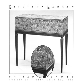 |
||||||||||||||||||||||||||||||||||||||||||||
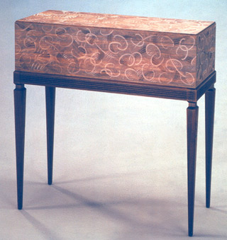 |
||||||||||||||||||||||||||||||||||||||||||||
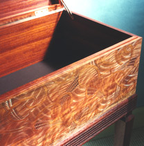 |
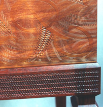 |
|||||||||||||||||||||||||||||||||||||||||||
Kristina Madsen - Chacte Coc, Padauk Chest on Stand |
||||||||||||||||||||||||||||||||||||||||||||
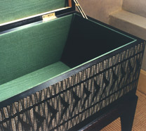 |
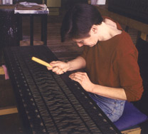 |
|||||||||||||||||||||||||||||||||||||||||||
Kristina Madsen - Blanket Chest |
||||||||||||||||||||||||||||||||||||||||||||
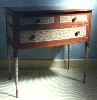 |
||||||||||||||||||||||||||||||||||||||||||||
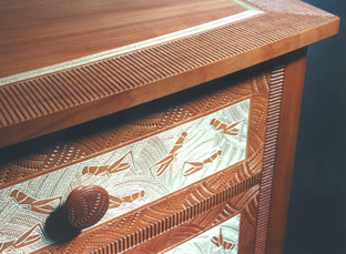 |
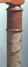 |
|||||||||||||||||||||||||||||||||||||||||||
Kristina Madsen - Pearwood with Gesso Grasshopper Chest |
||||||||||||||||||||||||||||||||||||||||||||
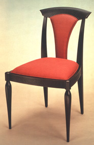 |
||||||||||||||||||||||||||||||||||||||||||||
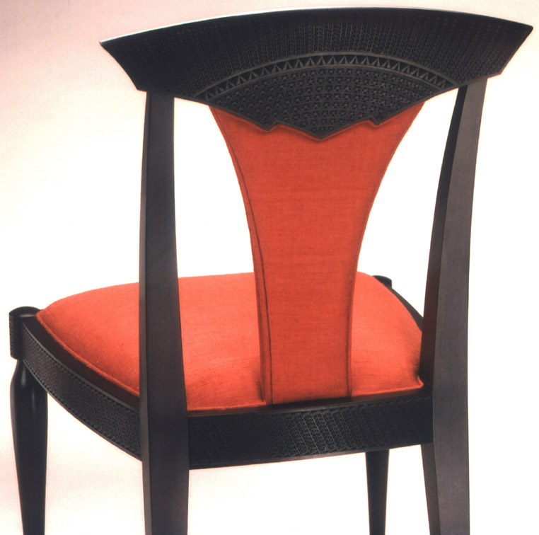 |
||||||||||||||||||||||||||||||||||||||||||||
Kristina Madsen - Blackened Imbuya Dining Chair + |
||||||||||||||||||||||||||||||||||||||||||||
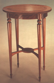 |
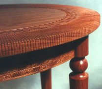 |
|||||||||||||||||||||||||||||||||||||||||||
Kristina Madsen - Bubinga Oval Table |
||||||||||||||||||||||||||||||||||||||||||||
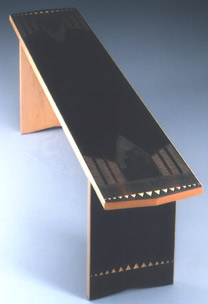 |
||||||||||||||||||||||||||||||||||||||||||||
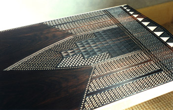 |
||||||||||||||||||||||||||||||||||||||||||||
Kristina Madsen - Ebony, Maple Bench |
||||||||||||||||||||||||||||||||||||||||||||
| David Ebner & Ivan Barnett/Fall 1995 |
David Ebner & Ivan Barnett/ Fall 1995 NOTES: In this fall exhibit, a group of table lamps and a floor standing lamp are shown. This work continued Ebner and Barnett's exploration of combining pre-existing industrial parts within the craft process. Also in this show were tables of different heights by Ron Puckett, Christoph Neander, and Jim Plukas, which were intended to serve various functions. |
|||||||||||||||||||||||||||||||||||||||||||
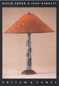 |
||||||||||||||||||||||||||||||||||||||||||||
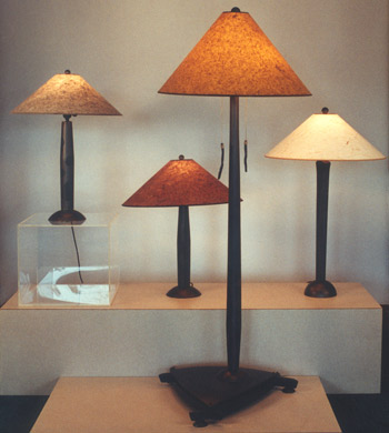 |
||||||||||||||||||||||||||||||||||||||||||||
 |
||||||||||||||||||||||||||||||||||||||||||||
Ronald Puckett - Bubinga, Figured Bubinga, Ebony Pair of Tables |
||||||||||||||||||||||||||||||||||||||||||||
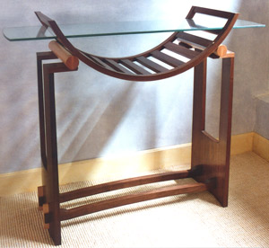 |
||||||||||||||||||||||||||||||||||||||||||||
Christoph Neander - Black Walnut, Maple, Glass Hall Table |
||||||||||||||||||||||||||||||||||||||||||||
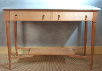 |
||||||||||||||||||||||||||||||||||||||||||||
James Plukas - Maple, Marble Side Table |
||||||||||||||||||||||||||||||||||||||||||||
| Commissions - 1995 |
||||||||||||||||||||||||||||||||||||||||||||
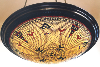 |
||||||||||||||||||||||||||||||||||||||||||||
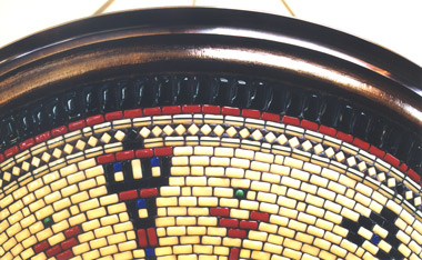 |
||||||||||||||||||||||||||||||||||||||||||||
Noel & Janene Hilliard - Glass, Bronze Indian Basket Pendant Lamp |
||||||||||||||||||||||||||||||||||||||||||||
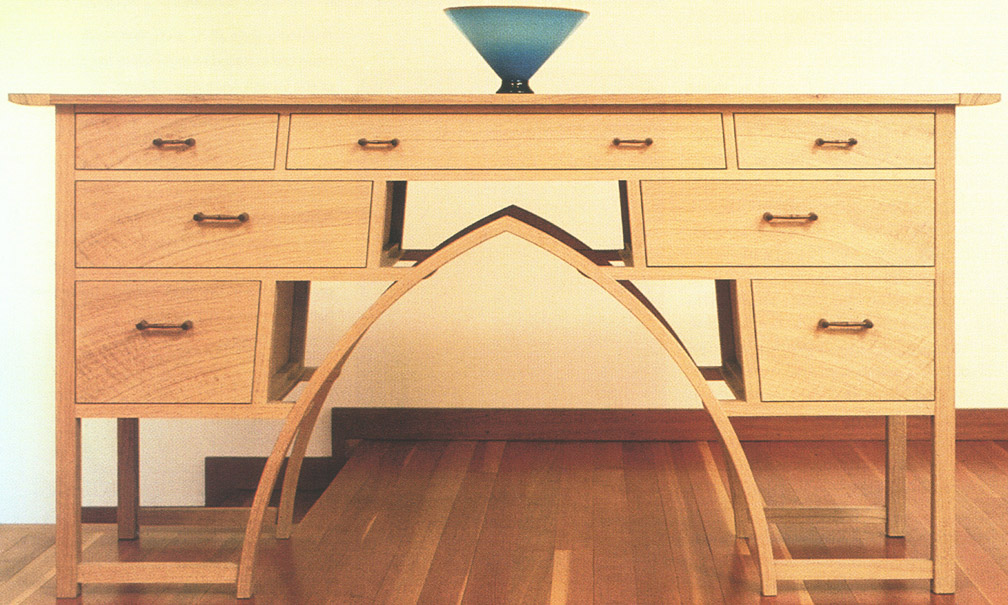 |
||||||||||||||||||||||||||||||||||||||||||||
Hank Gilpin - White Oak Sideboard + |
||||||||||||||||||||||||||||||||||||||||||||
| 1 9 9 6 | ||||||||||||||||||||||||||||||||||||||||||||
| Early Spring Show - 1996 |
Early Spring Show NOTES: You can't help but notice Brian Newell's pierced carving detail in the announcement's piece. It's not the unusual shelf-like pedestal base that captures the eye, but the carved detail as the forked top of the leg joins the apron. Andy Buck’s Figaro bench in the form of a double mandolin continues the heavily carved, solid style of his Harold (see Early Spring Show, 1995). Quadrants of deep color in his hand-worked technique give this piece a strong graphic presence. In this show, Rick Wrigley’s desk and chair are recognizable furniture forms of his by this time. The ebonized cherry frame sets off the drama of the diagonally sectioned maple and makore parquetry to maximum effect. This suite shows how powerfully surface choices can produce a stylistic effect. The use of aluminum for the feet lends a metallic, but neutral, feature. Also of note in this show were the beautiful birch and gingko paper sconces by David Finck with their hand planed detailing. These sconces, as much of Finck's work, are Japanese in sensibility.
|
|||||||||||||||||||||||||||||||||||||||||||
 |
||||||||||||||||||||||||||||||||||||||||||||
Brian Newell - Curly American Sycamore, European Hornbeam, Holly Console Table |
||||||||||||||||||||||||||||||||||||||||||||
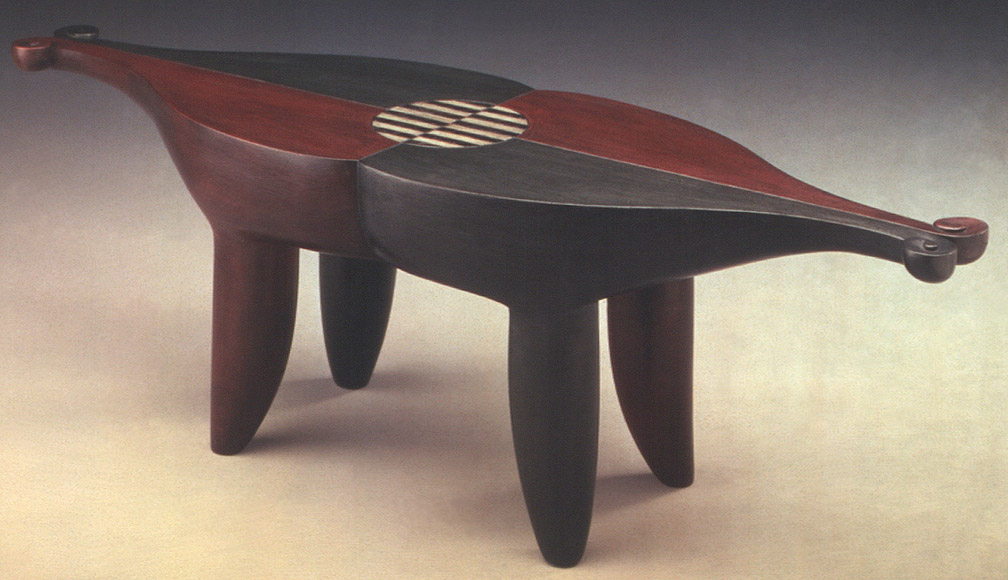 |
||||||||||||||||||||||||||||||||||||||||||||
Andy Buck - Poplar, Milk Paint "Figaro" Bench + |
||||||||||||||||||||||||||||||||||||||||||||
 |
|
|||||||||||||||||||||||||||||||||||||||||||
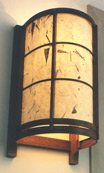 |
||||||||||||||||||||||||||||||||||||||||||||
David Finck - Walnut, Kozo Ha-iri (Gingko Paper) backed with fiberglass Sconce |
||||||||||||||||||||||||||||||||||||||||||||
Dale Broholm - Plywood, Milk Paint Chair |
||||||||||||||||||||||||||||||||||||||||||||
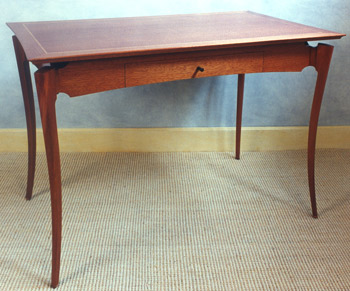 |
||||||||||||||||||||||||||||||||||||||||||||
David Ebner - Ribbon Mahogany, Satinwood Writing Table |
||||||||||||||||||||||||||||||||||||||||||||
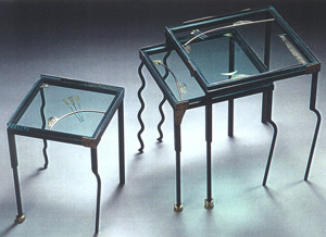 |
||||||||||||||||||||||||||||||||||||||||||||
Gary S. Magakis - Steel, Bronze, Copper, Glass Nesting Tables |
||||||||||||||||||||||||||||||||||||||||||||
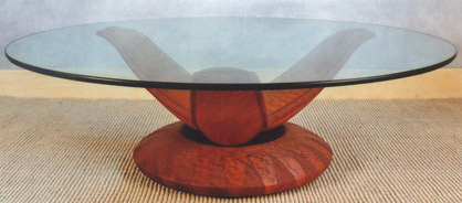 |
||||||||||||||||||||||||||||||||||||||||||||
Colin Reid - Quilted Mahogany, Glass Coffee Table |
||||||||||||||||||||||||||||||||||||||||||||
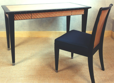 |
||||||||||||||||||||||||||||||||||||||||||||
Rick Wrigley - Queensland Maple, Fiddleback Makore, Ebonized Cherry, Aluminum Desk & Chair |
||||||||||||||||||||||||||||||||||||||||||||
| 15th Anniversary Exhibition - 1996 |
15th Anniversary Exhibition NOTES: Two furniture pieces stand out in this show -- Judy McKie's Pattern Table and Kristina Madsen's Darner's Chest of Drawers. McKie uses a simple Parsons table form to serve as the canvas for her carved pattern work. The top, aprons and legs of this large table, 30"H x 95"W x 35.5"D, are covered with shallow, carved relief pattern work. Chevron, triangle, and trapezoidal forms, communicating diagonally, utilize mahogany colored gouged surfacing that is contrapuntally interspersed with red and green pigment. Where Madsen's chest brings to mind the finest lace work, McKie's table takes the viewer to African art and jazz. In addition to the Pattern Table, McKie made a tall cabinet called the Frog Cabinet, and a bronze bird fountain. Like Madsen, McKie uses surface carving in the Frog Cabinet; however, stating this common process doesn't get one very far in understanding the work, since the styles render such different effects. Whereas the one suggests the intricacy of fine embroidery, the other refers more to the primitive power of expressionism. The Bird Fountain is a very beautiful and simple form. This form would evolve further into the sculptural piece she created for the Garden of Peace in Boston, which opened in 2004. Despite its beauty, it was not a popular collector’s choice, very possibly because of the extensive planning it took for placement. Kristina Madsen's five-drawer Darners chest was the largest work to date to utilize her pattern work. Lacework is strongly suggested with her use of a gesso technique that highlights much of the fine carving in white. As in her earlier three-drawer chest, the white of the gesso technique is framed by the tones of pearwood. Darners, also known as dragonflies, appear as a pattern in the facade of the largest and lowest drawer, as well as in the chest's side panels. The shallow relief pattern carving is impressive in detail but astonishing as it covers, in effect, the entire surface of the chest. The Madsen piece represents the finest of furniture craft in its drawer and carcass construction. David Powell, founder of the Leeds Design School in Easthampton, MA, trained Madsen. Powell, himself, studied in England with the British Arts and Crafts master, Edward Barnsley. The gallery had shown the work of Janene and Noel Hilliard since the early 1990s. Their table lamps seem to evoke some of their best experiments with form. The bronze Red Lamp with its zigzagging pattern of small black and red glass tiles that are fashioned into a boat shaped shade brings to mind the feeling of a couture design. The small, but jewel-like, lamp functioned as an accent light. Also included in this show was a pair of bronze and glass tile "bamboo" sconces by the Hilliards. The log cabin style corners lent rusticity to a sophisticated design. Depending on the internal fixture, this sconce could project upwards, downwards, or both, while greeting the passerby with a soft, golden ambient light. Hank Gilpin’s ash and yew, large and small, end tables showed how fresh and simply a recognizable form could come off. Here it is the beautiful use of ash with yew detailing that gives these tables a light, contemporary feel. The second stretcher with the small yew cross members gives the table its signature. The half spade, or ballet shoe, foot was common in Gilpin’s table work of this period. The point to underline here is how work can be fresh without straining at originality. Also in this show was Wendy Stayman’s second Bon Heure de Jour desk. It is the material as well as the decorative touches that subtly differentiate this desk from the first. Her bubinga end tables continue her development of this elegant work. The long curved taper of the narrow legs is complemented by the long tasseled pulls. Layton Table II, another one of Jere Osgood's tables with personality, was named after the place where Osgood conceived it, in this case, Peter's Valley in Layton, NJ. The principal distinction between Table I and II is the bubinga marquetry top of the second table. This is the third of Bill Walker’s dining tables to reach the gallery; again, he chose to work in cherry. Once more, we see the subtle infusion of North- western architectural style. It is easy to see the table in front of a large unbroken window framed by a post-and-beam referenced structure, a house with a low angled roof and ample overhangs facing the Pacific Ocean, isn't it? The design of the table is an interesting hybrid of trestle legs and pedestal. A pedestal-like lifting of the table’s top, the arching shell end stretchers puts the legs at the corners of the top but draws the central trestle back from the ends of the table to facilitate comfortable seating. |
|||||||||||||||||||||||||||||||||||||||||||
 |
||||||||||||||||||||||||||||||||||||||||||||
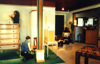 |
||||||||||||||||||||||||||||||||||||||||||||
At work left to right: Diana Zadarla, Kristina Madsen. Judy McKie, George Gordon |
||||||||||||||||||||||||||||||||||||||||||||
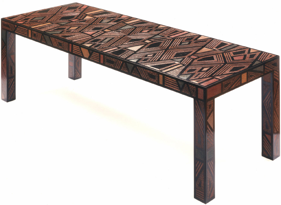 |
||||||||||||||||||||||||||||||||||||||||||||
+ |
||||||||||||||||||||||||||||||||||||||||||||
 |
||||||||||||||||||||||||||||||||||||||||||||
Judy Kensley McKie - Carved Walnut; oil & pigment Table with Pattern |
||||||||||||||||||||||||||||||||||||||||||||
 |
 |
|||||||||||||||||||||||||||||||||||||||||||
Judy Kensley McKie - Carved and Painted Limewood Frog Cabinet |
||||||||||||||||||||||||||||||||||||||||||||
 |
||||||||||||||||||||||||||||||||||||||||||||
Judy Kensley McKie - Bronze Bird Fountain |
||||||||||||||||||||||||||||||||||||||||||||
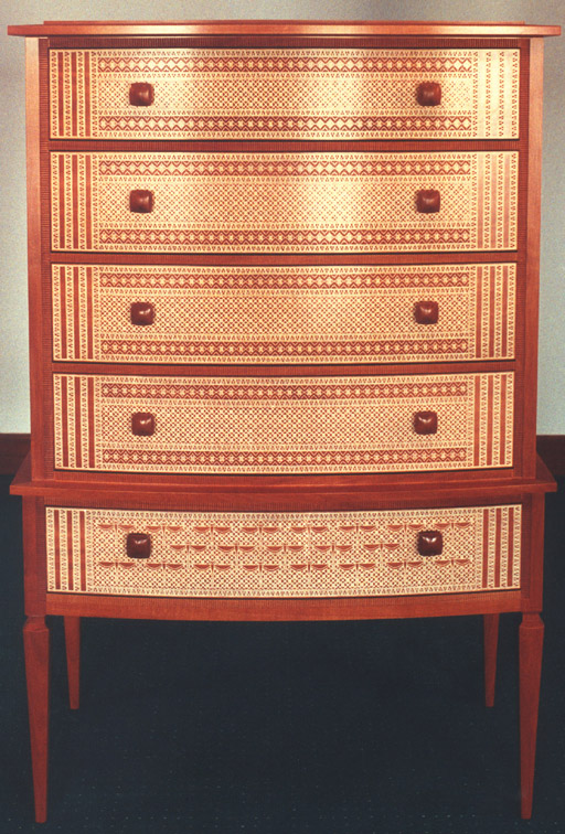 |
||||||||||||||||||||||||||||||||||||||||||||
+ |
||||||||||||||||||||||||||||||||||||||||||||
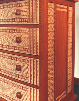 |
||||||||||||||||||||||||||||||||||||||||||||
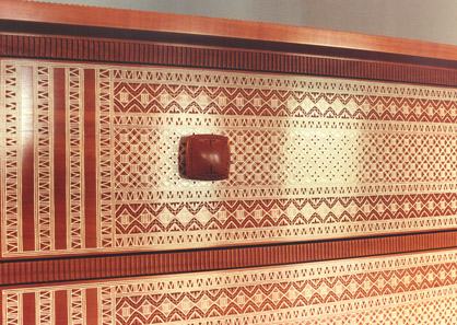 |
||||||||||||||||||||||||||||||||||||||||||||
Kristina Madsen - Bubinga, Gesso Darners Chest |
||||||||||||||||||||||||||||||||||||||||||||
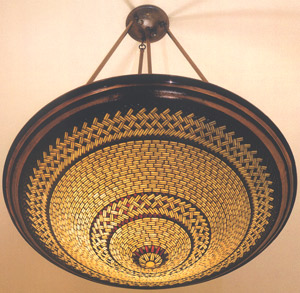 |
||||||||||||||||||||||||||||||||||||||||||||
Noel & Janene Hilliard - Handblown Glass, Bronze Ming Pendant Lamp |
||||||||||||||||||||||||||||||||||||||||||||
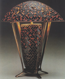 |
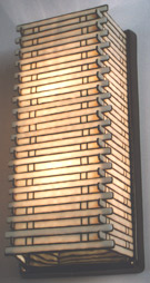 |
|||||||||||||||||||||||||||||||||||||||||||
Noel & Janene Hilliard - Handblown Glass, Bronze Red Lamp |
Noel & Janene Hilliard - Handblown Glass, Bronze Bamboo Sconce |
|||||||||||||||||||||||||||||||||||||||||||
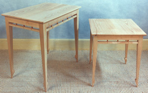 |
||||||||||||||||||||||||||||||||||||||||||||
Hank Gilpin - Ash, Yew, large and small tables |
||||||||||||||||||||||||||||||||||||||||||||
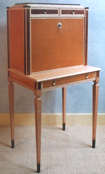 |
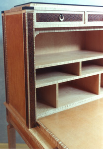 |
|||||||||||||||||||||||||||||||||||||||||||
Wendy Stayman - Maple, Curly Maple, Beech, Macassar Ebony, Leather, Stamped Leather, Bone, Fiber, Silver Pulls "Bon Heure de Jour" Writing Desk |
||||||||||||||||||||||||||||||||||||||||||||
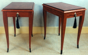 |
||||||||||||||||||||||||||||||||||||||||||||
Wendy Stayman - Bubinga, Macassar Ebony, Bone and Fiber pulls End Table Set |
||||||||||||||||||||||||||||||||||||||||||||
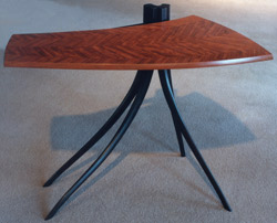 |
||||||||||||||||||||||||||||||||||||||||||||
Jere Osgood - Marquetry Bubinga, Wenge Layton Table II |
||||||||||||||||||||||||||||||||||||||||||||
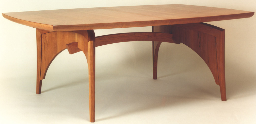 |
||||||||||||||||||||||||||||||||||||||||||||
William Walker - Cherry, Ebony Dining Extension Table + |
||||||||||||||||||||||||||||||||||||||||||||
| Peter Spadone & Rick Wrigley - 1996 |
Peter Spadone & Rick Wrigley NOTES: Peter Spadone had shown occasionally at the gallery since his PIA days. But this group of pieces represented a distinct personal direction after his collaborative years with Stephen Rieger had concluded. The work combined the refinement of high Deco furniture with the addition of a flora and fauna motif. In Spadone's work, painted or carved snakes or leaves, realistic in detail, will appear -- a snake climbs up and over the rear edge of a table, and a bench, with allusions to an ancient temple, has pockets of leaves thrust onto its formal ebony surface. In Spadone's wall hung multi-drawered Temple Viper Snake Cabinet, a snake appears comfortably at home against the background of a finely painted jungle habitat. Here the theatrical flair is evident, with the diorama interior set off dramatically by the highly lacquered surface of the cabinet. The redwood burl arches and pearwood columns establish the proscenium for the unfolding drama within. Rick Wrigley, who had an impressive start landing some major corporate commissions through the Workbench Gallery in NYC, had participated marginally in P&E shows during the late '80s. Increasingly a contributor in the early '90s, he is known for his strong skills in marquetry composition and veneer work. His work for the show included two cabinets utilizing surface carving for texture and pattern. The first, called simply Cabinet with Wasp, was a chest high vertical cabinet whose single door opened to reveal an interior of silver-leaf. The door front is laid out in a herringbone pattern of makore veneer. These warm tones set up a much smaller panel of Macassar ebony that frames a single wasp, an accomplished marquetry composition. The strength of Wrigley's style came from setting up the whole with a sparing use of detail. Here the pull and wasp panel were framed by a tiny checkerboard parquetry pattern. The pull itself is planished and leafed. The carcass surround of the door, as well as the substantial plinth, is black and its surface is carved with a gouged texture directed diagonally to median divisions. The announcement card for Rick Wrigley shows his piece of scale in the show: a cherry sideboard with makore veneer, marquetry woods and a Negro margina marble top. The sideboard’s focus is two ample doors, which enclose the interior shelves. In their centers are the small marquetry panels of the tortoise on the left door, and the hare on the right, the tortoise proverbially leading the hare. As in his cabinet, the fields of these small panels are ebony surrounded by a small frame of checkerboard parquetry. The scale seems perfect to bring off the central figures’ drama. The remainder of the door panels is divided into quadrants with the lively makore curl radiating outwards towards the corners. This is using understatement as well as compelling wood figure in a sophisticated composition. . The handsome marble top's overhang is supported by a generous cherry cove molding.
The tortoise reappears, inclined vertically, on a pedestal based console table. The table’s quilted maple is set off by an ebonized base with subtly pillowed surfaces. It's easier to see the ebonized pillowed base in the image of the second console table, which has a mayfly panel against a makore background. |
|||||||||||||||||||||||||||||||||||||||||||
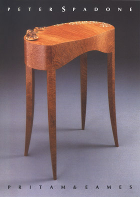 |
||||||||||||||||||||||||||||||||||||||||||||
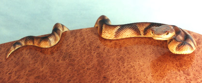 |
||||||||||||||||||||||||||||||||||||||||||||
Redwood Burl, Basswood, Holly inlay, Acrylics Terrapin Table |
||||||||||||||||||||||||||||||||||||||||||||
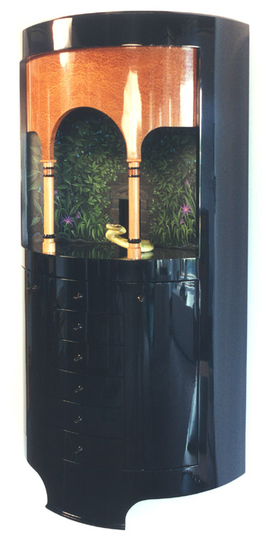 |
||||||||||||||||||||||||||||||||||||||||||||
Black Lacquer, Redwood Burl, Ebony, Pearwood, Acrylics Snake Cabinet Basswood, Acrylics Temple Viper Snake + |
||||||||||||||||||||||||||||||||||||||||||||
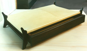 |
||||||||||||||||||||||||||||||||||||||||||||
Vellum, Ebony Arrowhead Container |
||||||||||||||||||||||||||||||||||||||||||||
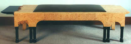 |
||||||||||||||||||||||||||||||||||||||||||||
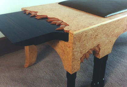 |
||||||||||||||||||||||||||||||||||||||||||||
Maple Burl, Ebony, Pearwood Bench |
||||||||||||||||||||||||||||||||||||||||||||
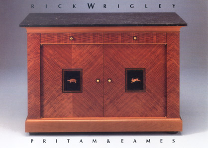 |
||||||||||||||||||||||||||||||||||||||||||||
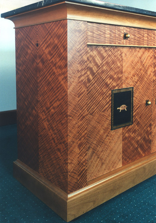 |
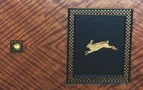 |
|||||||||||||||||||||||||||||||||||||||||||
Cherry, Makore, Marqetry Woods, Negro Marquina Marble Sideboard with Tortoise & Hare |
||||||||||||||||||||||||||||||||||||||||||||
+ |
||||||||||||||||||||||||||||||||||||||||||||
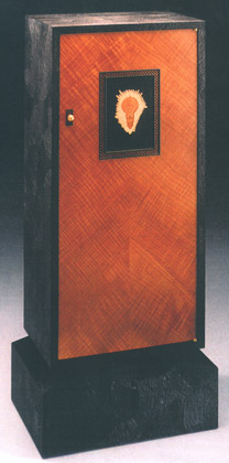 |
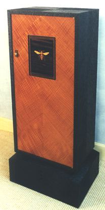 |
|||||||||||||||||||||||||||||||||||||||||||
Carved and ebonized Walnut, Makore, Ebony, Marquetry Woods, Silver Leaf, Brass Cabinet with Light Bulb |
Carved and ebonized Walnut, Makore, Ebony, Marquetry Woods, Silver Leaf, Brass Cabinet with Wasp |
|||||||||||||||||||||||||||||||||||||||||||
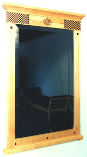 |
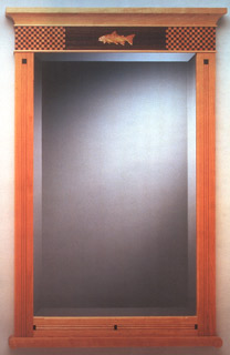 |
|||||||||||||||||||||||||||||||||||||||||||
Maple, Rosewood, Ebony, Makore Mirror with Bull's Eye |
Cherry, Rosewood, Ebony Mirror with Trout |
|||||||||||||||||||||||||||||||||||||||||||
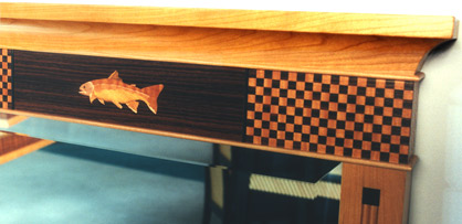 |
||||||||||||||||||||||||||||||||||||||||||||
Detail of Cherry, Rosewood, Ebony Mirror with Trout |
||||||||||||||||||||||||||||||||||||||||||||
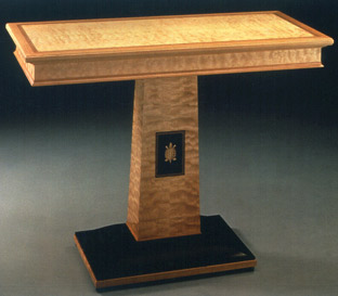 |
 |
|||||||||||||||||||||||||||||||||||||||||||
Quilted Maple, Ebony, Cherry, Marquetry Woods, ebonized base Table with Turtle |
||||||||||||||||||||||||||||||||||||||||||||
 |
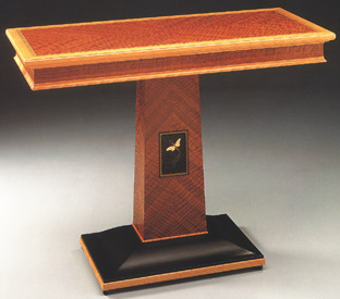 |
|||||||||||||||||||||||||||||||||||||||||||
Makore, Cherry, Marquetry Woods, ebonized base Table with May Fly |
||||||||||||||||||||||||||||||||||||||||||||
| Tom Joyce & David Secrest - 1996 |
Tom Joyce & David Secrest NOTES: Although David Secrest's work had evolved into almost purely sculptural pieces by this time, his benches for this show represent a return to his functional foundation -- a direction welcomed by the gallery. The arched bench on the announcement can be seen as a bridge, but also as the collision of two plates. There is often a geologic reference in Secrest's work. By constructing from steel plate, Secrest gives the illusion of conjoining huge strata of material, and he sometimes emphasizes the separate levels with large faux dovetail joints. Also, he will add to the tension by suggesting that one large plate or section could shift over another. Tom Joyce dropped out of high school to apprentice to a blacksmith at the age of 13. He worked at a local forge in New Mexico where he repaired agricultural machines. In 2000, Joyce received the "genius" award from the MacArthur Foundation for excellence in his field. He, too, had moved away from functional work. For this show, he did have a body of forged, folded, and laminated steel vessels and plates. However, what was of particular interest to this gallery was a pair of folded steel lamps and a steel and granite low table by Joyce. A simple, forged sculptural envelope conveys the idea of a grounded lantern. To create a warm, broken specter of light, mica shades are used in the vertical apertures. |
|||||||||||||||||||||||||||||||||||||||||||
 |
||||||||||||||||||||||||||||||||||||||||||||
Pattern Welded and Fabricated Steel & Wrought Iron "Infrastructure" Bench |
||||||||||||||||||||||||||||||||||||||||||||
 |
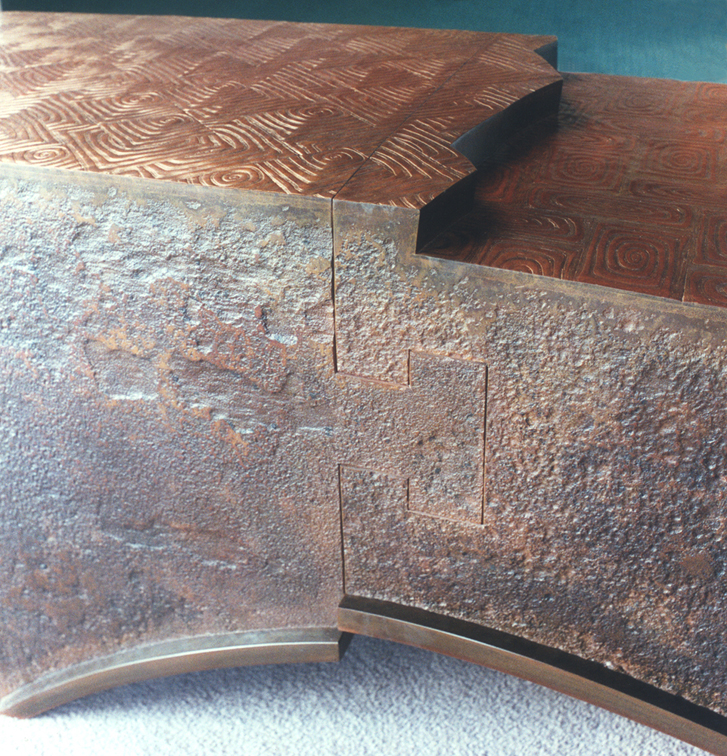 |
|||||||||||||||||||||||||||||||||||||||||||
Details of Pattern Welded and Fabricated Steel & Wrought Iron "Infrastructure" Bench |
||||||||||||||||||||||||||||||||||||||||||||
+ |
||||||||||||||||||||||||||||||||||||||||||||
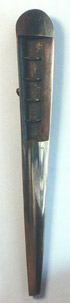 |
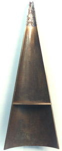 |
|
||||||||||||||||||||||||||||||||||||||||||
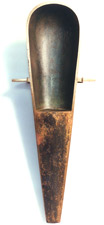 |
||||||||||||||||||||||||||||||||||||||||||||
Sand cast Bronze Reliquary |
||||||||||||||||||||||||||||||||||||||||||||
Sand cast Bronze, Forged Iron |
Sand cast Bronze, Pate de Fer "Diluvium" |
|||||||||||||||||||||||||||||||||||||||||||
 |
||||||||||||||||||||||||||||||||||||||||||||
+ |
||||||||||||||||||||||||||||||||||||||||||||
 |
||||||||||||||||||||||||||||||||||||||||||||
Pattern Welded and Fabricated Steel & Wrought Iron Ark Bench |
||||||||||||||||||||||||||||||||||||||||||||
 |
||||||||||||||||||||||||||||||||||||||||||||
Pair of Pattern Welded and Fabricated Steel & Wrought Iron Wedged Dovetail Seats |
||||||||||||||||||||||||||||||||||||||||||||
 |
||||||||||||||||||||||||||||||||||||||||||||
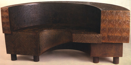 |
||||||||||||||||||||||||||||||||||||||||||||
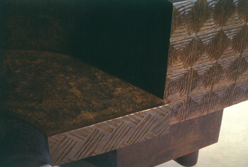 |
||||||||||||||||||||||||||||||||||||||||||||
Eroded Steel Plate, Pattern Welded Wrought Iron & Steel Buhrstone Bench |
||||||||||||||||||||||||||||||||||||||||||||
 |
||||||||||||||||||||||||||||||||||||||||||||
Forged Mild Steel "Inside Out Folded Bowl" |
||||||||||||||||||||||||||||||||||||||||||||
 |
||||||||||||||||||||||||||||||||||||||||||||
Forged Mild Steel Large Pieced-Plate Bowl |
||||||||||||||||||||||||||||||||||||||||||||
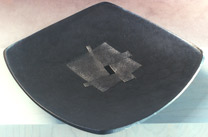 |
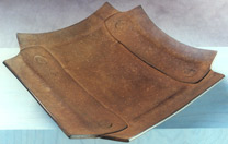 |
|||||||||||||||||||||||||||||||||||||||||||
Forged Mild Steel Locked Square Bowl |
Forged Mild Steel Fibonaci Bowl |
|||||||||||||||||||||||||||||||||||||||||||
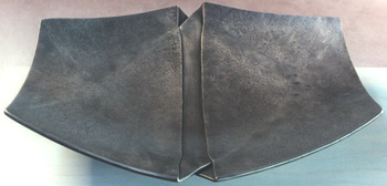 |
||||||||||||||||||||||||||||||||||||||||||||
Forged Mild Steel Double Spiral Compressed Bowl |
||||||||||||||||||||||||||||||||||||||||||||
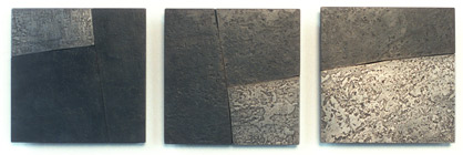 |
||||||||||||||||||||||||||||||||||||||||||||
Forged Mild Steel Three Part Wall Piece |
||||||||||||||||||||||||||||||||||||||||||||
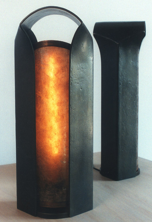 |
||||||||||||||||||||||||||||||||||||||||||||
Forged Mild Steel, Mica Pair of Folded Table Lamps + |
||||||||||||||||||||||||||||||||||||||||||||
 |
||||||||||||||||||||||||||||||||||||||||||||
Forged Mild Steel, Granite Coffee Table |
 |
|||||||||||||||||||||||||||||||||||||||||||
| 1 9 9 7 | ||||||||||||||||||||||||||||||||||||||||||||
| Early Spring Show - 1997 |
Early Spring Show NOTES: The early spring shows established a gallery tradition to introduce work of those not on its regular roster -- sometimes it featured work with promising new talent, and sometimes with established talent. This spring saw contributions from Jon Brooks and Craig Nutt, both established makers with their own following. Brooks' ladderback chairs are fine examples of his work. The beautifully shaped solid wood seats, arm rests, and back slats are combined with organically shaped branch material for the legs and rungs. The branch material was finished in black lacquer, and overlaid with colored scribble-like figure. Craig Nutt's well-known, surreal vegetable compositions included a table with spring onions and another table with brilliantly colored red hot chili peppers legs jointed into a natural wood table surface. In a pair of chairs, Nutt abstains from paint and uses the natural color of fruitwood to highlight the faux vegetable forms in his composition: chili pepper front legs, carrot back stretchers, capped by a bold crest rail wonderfully carved as a pea pod. There has been a tradition in the West of the use of vegetable forms in architecture, furnishings and the fine arts. Nutt's pieces are witty, easily understood, and functional. Andy Buck's now recognizable primitive and folk forms with complexly worked colored surfaces have become his signature. He is often at his best with smaller pieces: here a two-drawer wall hung cabinet as well as a mirror/cabinet combination, named Pandora and Polka Dot respectively. While the intensity of the craft process made much of the work in the 1980s seem like a serious affair, the wit and irreverence of the first three makers show another, vital side to the studio furniture movement. James Krenov's influence as a teacher is again felt in this show. Wood, Krenov's muse, is used variously as the sole expression of material and color in the pieces of David Finck, Paul Harrell, and Brian Newell. Newell, although staying in the small cabinet tradition of his mentor, is pushing to find a more expressive vocabulary for himself. Although not presaging the powerful burst of work that is still a couple of years away, this cabinet is nonetheless singular. In a somewhat totemic form, the piece flourishes in its decorative detailing: the carved crest element at the crown. In all, the piece is a very controlled, couture-like statement. David Finck's Garden Gate wall hung cabinet is a pleasurable pictorial statement, and an expressive use of various woods, and handmade paper. Paul Harrell's sideboard brings to mind a tradition of heavier pieces but, in his hands, remains a slighter, graceful understatement. Gary Magakis's medium is metal, and the gallery had included a piece of his furniture each spring since 1996. Forging steel is a considerably demanding process, but you can also make metal furniture through bending, forming, and joining by means of weld and solder. This faster process of fabrication has the benefit of productivity, and is the path that Magakis takes. His metal surfaces are usually textured with calligraphic markings. Incidental to this show, the gallery received a number of pieces from Michael Hurwitz and James Schriber. In part this was due to the closing of the Peter Joseph Gallery in New York, which created a greater availability of work from the group of makers whose histories intertwined between the two galleries. Amongst the pieces from Hurwitz was his mosaic- writing table inspired by a vanity commissioned of him by his sister. This mosaic writing table will stand as one of the most accomplished pieces of his career. The tapered laminated arch work of the leg support system is both sublimely graceful and structurally meaningful -- a truly gifted design. A smooth mosaic writing surface counterpoints the cashew lacquered curly ash material as successfully as does the antique inspired silver pulls for the desk drawers. The Handkerchief Table was another piece that came from the Peter Joseph gallery after it closed in 1996. Its carved textured legs offer visual contrast to the strict geometry of the padauk-veneered top. Hurwitz was also experimenting with Escher-like parquetry patterns, which offered illusions of depth and complex visual involvement to the viewer. The top of his elm table displays an example of this. The legs and stretchers demonstrated again the graceful organic result that the lamination process can offer. The James Schriber work included two pairs of bedside cabinets, a pair of armchairs, and a blanket chest. This last was a nod to a great vernacular form, but also a canvas to explore what he referred to as his "folk-inspired" forms. A blue painted surround enhanced the carved “curtaining” of the facade. The crowning of the top worked to complete the draping effect of the piece. The pair of armchairs brings to mind the high style of the Normandy. The addition of arms to an occasional chair, while adding comfort, is also challenging. There's a great Deco feel to Robert Ingham's jewelry cabinet without any direct referencing to that period. While the mirror is reminiscent of dresser mirrors of the 1920-1930s, the revolve-to-open drawers are a fresh approach that is enhanced by the laminated curved drawer fronts. The corner post and turquoise finial design of the structure is reflective of Ingham's thinking of this period. |
|||||||||||||||||||||||||||||||||||||||||||
 |
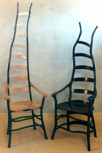 |
|||||||||||||||||||||||||||||||||||||||||||
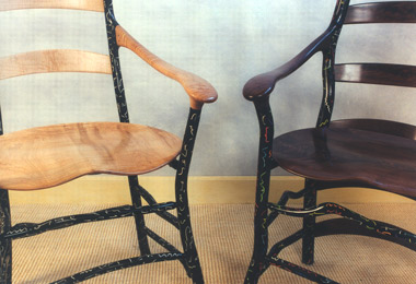 |
||||||||||||||||||||||||||||||||||||||||||||
Jon Brooks - Chairs |
||||||||||||||||||||||||||||||||||||||||||||
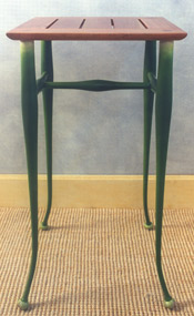 |
||||||||||||||||||||||||||||||||||||||||||||
Craig Nutt - Cherry, Painted Wood Onion Blossom Table |
||||||||||||||||||||||||||||||||||||||||||||
 |
||||||||||||||||||||||||||||||||||||||||||||
Craig Nutt - Pau Amarello with dyed inlay Pepper Table with Fireworks |
||||||||||||||||||||||||||||||||||||||||||||
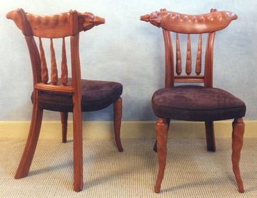 |
||||||||||||||||||||||||||||||||||||||||||||
Craig Nutt - Swiss Pear and Leather Celery Chairs with Peppers, Carrots and Sno Pea |
||||||||||||||||||||||||||||||||||||||||||||
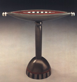 |
||||||||||||||||||||||||||||||||||||||||||||
Andy Buck - Harmony Table |
||||||||||||||||||||||||||||||||||||||||||||
|
|
 |
|||||||||||||||||||||||||||||||||||||||||||
 |
||||||||||||||||||||||||||||||||||||||||||||
Andy Buck - Pandora |
||||||||||||||||||||||||||||||||||||||||||||
Andy Buck - Polka Dot Piece |
||||||||||||||||||||||||||||||||||||||||||||
 |
||||||||||||||||||||||||||||||||||||||||||||
Andy Buck - Red Baron |
||||||||||||||||||||||||||||||||||||||||||||
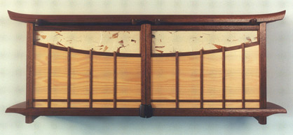 |
||||||||||||||||||||||||||||||||||||||||||||
David Finck - Walnut, Port Orford Cedar, Kozo Ha-iri "Garden Gate Cabinet"
|
||||||||||||||||||||||||||||||||||||||||||||
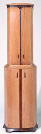 |
||||||||||||||||||||||||||||||||||||||||||||
Brian Newell - Swiss Pear, Cocobolo, Cedar of Lebanon Tall Cabinet |
||||||||||||||||||||||||||||||||||||||||||||
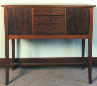 |
||||||||||||||||||||||||||||||||||||||||||||
Paul Harrell - Sideboard |
||||||||||||||||||||||||||||||||||||||||||||
|
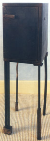 |
|||||||||||||||||||||||||||||||||||||||||||
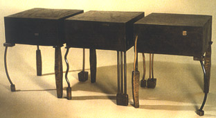 |
||||||||||||||||||||||||||||||||||||||||||||
Gary Magakis - Patinaed Steel, Bronze, Copper "Love Seats" Bench/SideTables/Stools |
||||||||||||||||||||||||||||||||||||||||||||
Gary Magakis - Patinaed Steel, Bronze, Copper Cabinet |
||||||||||||||||||||||||||||||||||||||||||||
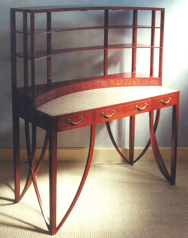 |
||||||||||||||||||||||||||||||||||||||||||||
+ |
||||||||||||||||||||||||||||||||||||||||||||
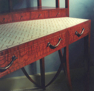 |
||||||||||||||||||||||||||||||||||||||||||||
Michael Hurwitz - Figured Ash, Sycamore, Silver Copper, Marble Mosaic, Cashew Lacquer Desk |
||||||||||||||||||||||||||||||||||||||||||||
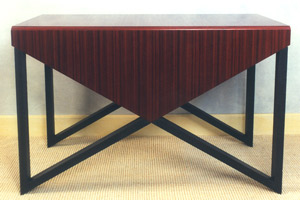 |
||||||||||||||||||||||||||||||||||||||||||||
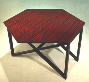 |
||||||||||||||||||||||||||||||||||||||||||||
Michael Hurwitz - Padauk, Milk Paint over Poplar Envelope Table |
||||||||||||||||||||||||||||||||||||||||||||
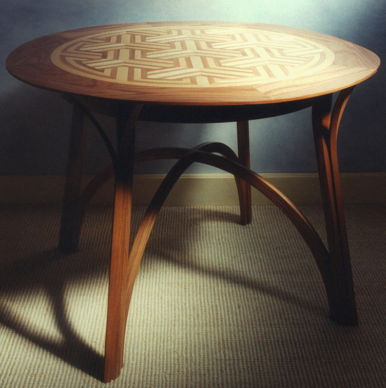 |
||||||||||||||||||||||||||||||||||||||||||||
Michael Hurwitz - Elm Breakfast Table + |
||||||||||||||||||||||||||||||||||||||||||||
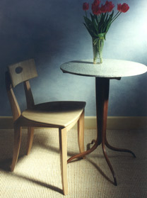 |
||||||||||||||||||||||||||||||||||||||||||||
Michael Hurwitz - Ash, Indian Silk under Lacquer Cafe Chair; Walnut, Terrazzo Cafe Table |
||||||||||||||||||||||||||||||||||||||||||||
James Schriber - Cherry, Milk Paint Blanket Chests |
||||||||||||||||||||||||||||||||||||||||||||
 |
||||||||||||||||||||||||||||||||||||||||||||
James Schriber - Cherry Bedside Cabinets |
||||||||||||||||||||||||||||||||||||||||||||
 |
||||||||||||||||||||||||||||||||||||||||||||
James Schriber - Mahogany, Macassar Ebony Arm Chairs |
||||||||||||||||||||||||||||||||||||||||||||
 |
||||||||||||||||||||||||||||||||||||||||||||
James Schriber - Sycamore, Maple, Holly Bedside Cabinets |
||||||||||||||||||||||||||||||||||||||||||||
 |
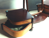 |
|||||||||||||||||||||||||||||||||||||||||||
Robert Ingham - Jewelry Box with Mirror |
||||||||||||||||||||||||||||||||||||||||||||
+ |
||||||||||||||||||||||||||||||||||||||||||||
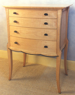 |
||||||||||||||||||||||||||||||||||||||||||||
Peter Shepard - Curly Maple, Ebony Hall Chest |
||||||||||||||||||||||||||||||||||||||||||||
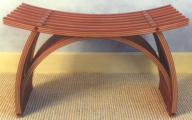 |
||||||||||||||||||||||||||||||||||||||||||||
Yokhai Givon - Padauk & Maple Bench |
||||||||||||||||||||||||||||||||||||||||||||
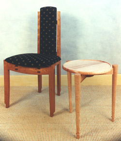 |
||||||||||||||||||||||||||||||||||||||||||||
Geoff Warner - Walnut, Ebony, String Tray; Cherry, Wenge Chair |
||||||||||||||||||||||||||||||||||||||||||||
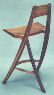 |
||||||||||||||||||||||||||||||||||||||||||||
Jeff Wynn & Linda Condy - Applewood, Pearwood, Rosewood "Tri-Stool" |
||||||||||||||||||||||||||||||||||||||||||||
| Start of the Summer - New Work - 1997 |
Start of the Summer - New Work NOTES: Noel and Janene Hilliard began showing their lamps made from glass tiles and cast bronze at P&E in 1993. After a number of memorable pieces, such as Janene's Red Lamp, Noel Hilliard created Queen of the Nile that would set the bar even higher. The vase-like base of the lamp involved a double sleeve of rare green glass. Its perimeter is guarded by arching bronze supports that extend outward to grip a broad, swelling shade. The shade is composed of squares, each a soldered grid of nine glass tiles. The largest tile, a central dichroic glass square, contains a subtle hieroglyphic. These grids form lines that sweep back across the form of the shade. But the compound curving of the form causes the dimension of each grid to change, expanding with the swelling. This is a remarkable lamp that would serve as an archetype for Janene Hilliard's Ivory Reed lamp in 2001, shown in the gallery's 20th anniversary exhibition. Tim Philbrick's Paris Meets Narragansett table is subtle wit for furniture lovers as it refers to a marriage of two furniture styles co-joined in the front apron. Once again, with his characteristic restraint, Philbrick creates an elegant piece. In Tom Hucker's Chime Table, he continues to explore forms of pillowed shell construction that he began with his scent table series for his shows at the Peter Joseph Gallery in New York. The continuation of veneer pattern around the form is remarkable and gives the impression of a carved volume. Viewers were charmed by the notion of a hidden chime inside, although it is perhaps the table's least important attribute. The sideboard from Ron Puckett shows his evolution as a maker accommodating contemporary taste and architectural referencing. Though elegant, there is less of an individual signature or DNA in this piece. A design for a writing table that utilized steel as an essential part of the leg design showed Schriber's determination to keep his mind open to the inclusion of non-wood materials. Here the use of stainless steel accomplishes the transition of the vertical descent of the leg into the flatness of the footing. Wendy Stayman's media cabinet in ebonzied oak with maple panels was initially conceived as a P&E Editions design. By this time, the difficulties of keeping the editions series fresh and afloat were daunting. Her shop-made prototype was exhibited as a one-of-a-kind cabinet. Jere Osgood and David Ebner were represented by furniture forms they had originated earlier, but each offered fresh takes with their material choices. It is not unusual in a group show to have an absentee. In this show, difficulties due to the occupational hazards of noxious fumes and heavy metal particles led to the absence of work from David Secrest. This brings to mind The New York Times Op Ed piece by Sebastian Junger where he spoke to the many occupations where we all expect the risks to be taken by others. In the 1980s, for example, Ron Puckett had a serious hand injury from a shop accident, and was saved from permanent damage to his hand by the good fortune of immediate and expert surgical attention. |
|||||||||||||||||||||||||||||||||||||||||||
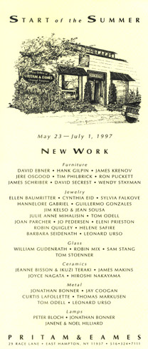 |
 |
|||||||||||||||||||||||||||||||||||||||||||
|
||||||||||||||||||||||||||||||||||||||||||||
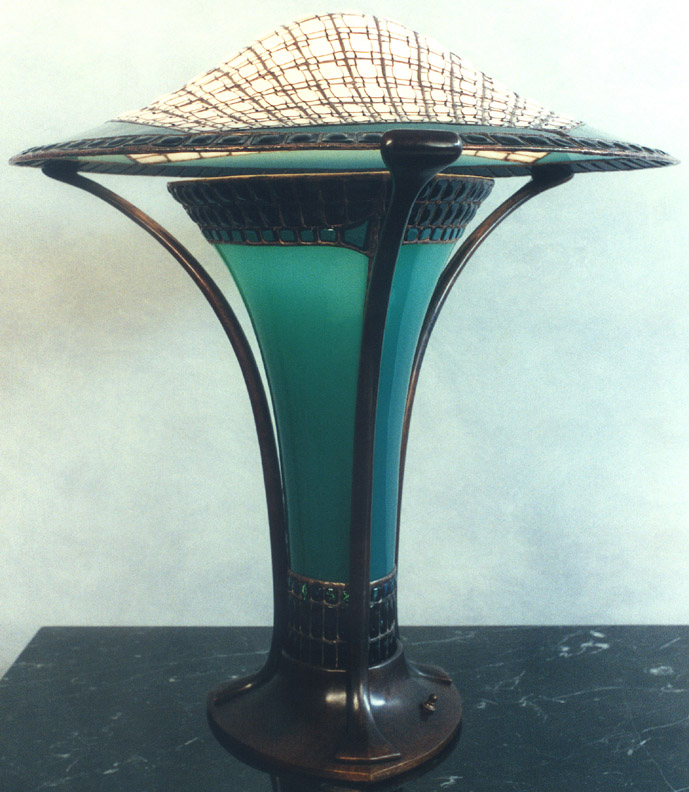 |
||||||||||||||||||||||||||||||||||||||||||||
+ |
||||||||||||||||||||||||||||||||||||||||||||
 |
||||||||||||||||||||||||||||||||||||||||||||
Noel Hilliard - Handblown Glass, Bronze "Queen of the Nile" Lamp |
||||||||||||||||||||||||||||||||||||||||||||
 |
||||||||||||||||||||||||||||||||||||||||||||
Noel & Janene Hilliard - Handblown Glass, Bronze Chandelier |
||||||||||||||||||||||||||||||||||||||||||||
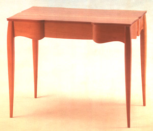 |
||||||||||||||||||||||||||||||||||||||||||||
Tim Philbrick - Swiss Pearwood "Paris Meets Newport in Narragansett" Tea Table |
||||||||||||||||||||||||||||||||||||||||||||
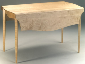 |
||||||||||||||||||||||||||||||||||||||||||||
Tim Philbrick - Curly Maple Drop Leaf Table |
||||||||||||||||||||||||||||||||||||||||||||
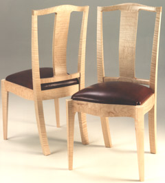 |
||||||||||||||||||||||||||||||||||||||||||||
Tim Philbrick - Curly Maple, Leather Dining Chair |
||||||||||||||||||||||||||||||||||||||||||||
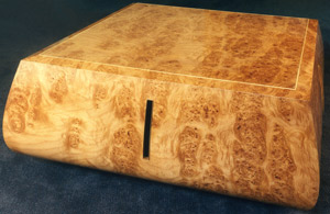 |
||||||||||||||||||||||||||||||||||||||||||||
Tom Hucker - Chime Table |
||||||||||||||||||||||||||||||||||||||||||||
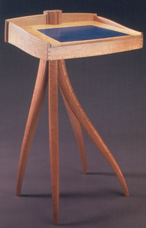 |
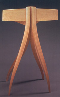 |
|||||||||||||||||||||||||||||||||||||||||||
Jere Osgood - Australian Lacewood StandUp Desk |
||||||||||||||||||||||||||||||||||||||||||||
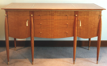 |
||||||||||||||||||||||||||||||||||||||||||||
Ron Puckett - Pearwood, Curly Maple, Blush Anigre, Ebony Sideboard |
||||||||||||||||||||||||||||||||||||||||||||
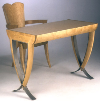 |
||||||||||||||||||||||||||||||||||||||||||||
James Schriber - Curly Bird's-eye Maple, Harewood, Sandblasted Stainless Steel Writing Table Bird's-eye & Curly Maple, Harewood, Fabric Chair |
||||||||||||||||||||||||||||||||||||||||||||
|
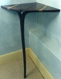 |
|||||||||||||||||||||||||||||||||||||||||||
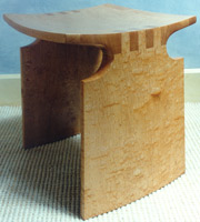 |
||||||||||||||||||||||||||||||||||||||||||||
David Ebner - Figured Maple Renwick Stool |
||||||||||||||||||||||||||||||||||||||||||||
David Ebner - Zercotti Corner Table |
||||||||||||||||||||||||||||||||||||||||||||
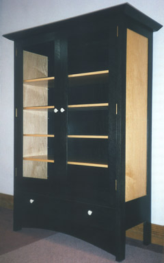 |
||||||||||||||||||||||||||||||||||||||||||||
Wendy Stayman - Ebonized Oak, Maple, glass, Lacquer Media Cabinet |
||||||||||||||||||||||||||||||||||||||||||||
| InCase - A Show of Containers - 1997 |
InCase - A Show of Containers NOTES: By this time, it was unusual for the gallery to have a theme show rather than a featured show for an individual maker in a summer period. The idea of a show of smaller scale work, however, did not imply that the pieces created were less of a commitment. The announcement carried the image of a small chest-on-stand by Michael Hurwitz. This is a piece done with modest simplicity in structural design though in form it has its relationships with other 1990s work. You think of Hurwitz's hickory silver chest (see New American Furniture, 1993) with its open stand and arched hinged top, also the stand's use of graphic stretchers compares with his envelope table (see Early Spring Show, 1997) design. Here, too, the stretchers miter into the legs creating a pointed foot. Lifting the hinged lid on this exhibit's small chest revealed a paper surfaced interior, created by a decoupage of road maps colored over in golden orange hues in harmony with the exterior to create a pod and seed pattern. Suzy Holsinger collaborated with Hurwitz for this collage. Kristina Madsen's box, for example, broke new ground in her pattern work. The shallow pattern carving in the box's ebonized pearwood exterior reveals an underlying substratum of marquetry figure. This marquetry figure actually contains a calligraphic message recognizable only with concerted study. It says, "I see Gaywings nearby." The number of humidors in this show seemed to herald the comeback of cigars. Wendy Stayman's humidor continued her featured show's "high style" use of decorative materials. The eggshell lacquer technique combined with blackened manta ray skin created an exotic exterior for a box. Dale Broholm's humidor took a neo-classical approach: architecturally simple, faced with elegant veneer, the piece gained its panache from the use of glass columns by Chatham Glass. John Eric Byers's humidor was a box with carved surface that used a checkered grid on the lid for interest and made use of his ability with milk paint for color. By contrast, David Ebner's humidor was an organic statement set off by an out-sized twisted stick handle for the lid. On the lighter, more sculptural side, Andy Buck's erotically tinged, though playful, Love Letter Boxes stand as one of his most original and endearing creations. For the InCase theme, Tom Hucker came across with a fresh, original contribution. Entitled Collector's Box, it was essentially a stack of containers much like a stack of drawers, or one might think of the Japanese bento stack of lunch boxes. In Hucker's construction, the top of the stack was an opaque glass panel with a clear center that allowed you to look down through the series of glass bottoms. Although somewhat fussy in function, this was one of the more challenging designs in the show. There was a small, brightly colored wall hung cabinet that came from Tom Loeser. His surfacing, like John Eric Byers, used a carved fluted technique although the distinctiion of the Loeser piece comes from his placement and changing scale of the carved pulls. Loeser's cardboard chest used a laminated cardboard that was finger jointed on the corners. The lid's curved surface cut through the laminations obliquely to create a pattern effect. The satinwood box by Brian Newell exhibited original thinking about form -- not exactly organic but, metaphorically, very much alive. This would presage a series of major pieces by Newell that begin in 2000, which would define his place in studio furniture. Newell was a self-taught carver before learning the craft of furniture making from James Krenov. His collection of carved miniature fish in boxwood, with their African blackwood containers, allowed him a return to this earlier passion. Jere Osgood's idiosyncratic eye for form gives his small jewelry cabinet its identity. The skateboard half-pipe-like swoop of its hinged lid allows the user easy access. There are an additional two drawers of storage below. Its small scale allows for a judicious use of scarce resource -- Anadaman padauk. Another contribution to the show was a small jewelry chest by David Finck, which used a hinged top and lower storage drawer design. It was made of pearwood, bloodwood, and bird's-eye maple. The simple, but elegant, pearwood box by Tim Philbrick treats the user to a pull made from amber, whereas the reward of Zivko Radenkov's container is his rendition of blossom imagery through marquetry. Tim Coleman's hexagonal boxes offered no specific function, their indented surfaces inspired by Kristina's Madsen's use of shallow relief carving. However, Coleman uses metal stamps to impress his designs. The gallery had previously exhibited Jamie Robertson's Sunrise/Sunset bed as well as accompanying side tables. This show expands the bedroom suite with a lemonwood blanket chest. There was a second blanket chest in the show, this one contributed by Hank Gilpin. In the paneling of this Claro walnut chest, he continued his experimentation of creating surfaces by fitting smaller sections of wood together with contrasting figure. A couple of small boxes were pried out of Phil Weber for the show. He began exhibiting his box specialty at craft shows, and built himself a sufficiently large following so that he was always pressed for inventory. They made excellent gifts, and were never on the shelf long in the gallery.
|
|||||||||||||||||||||||||||||||||||||||||||
 |
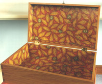 |
|||||||||||||||||||||||||||||||||||||||||||
Michael Hurwitz |
||||||||||||||||||||||||||||||||||||||||||||
 |
||||||||||||||||||||||||||||||||||||||||||||
Kristina Madsen + |
||||||||||||||||||||||||||||||||||||||||||||
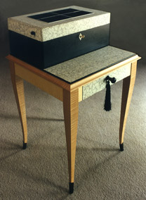 |
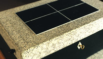 |
|||||||||||||||||||||||||||||||||||||||||||
Humidor - Wendy Stayman |
||||||||||||||||||||||||||||||||||||||||||||
 |
 |
|||||||||||||||||||||||||||||||||||||||||||
Dale Broholm |
John Eric Byers |
|||||||||||||||||||||||||||||||||||||||||||
 |
||||||||||||||||||||||||||||||||||||||||||||
Andy Buck - Love Letter Boxes + |
||||||||||||||||||||||||||||||||||||||||||||
 |
 |
|||||||||||||||||||||||||||||||||||||||||||
Andy Buck - "Topper" |
||||||||||||||||||||||||||||||||||||||||||||
 |
||||||||||||||||||||||||||||||||||||||||||||
Thomas Hucker Collector's Box |
||||||||||||||||||||||||||||||||||||||||||||
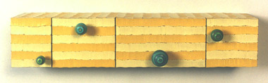 |
||||||||||||||||||||||||||||||||||||||||||||
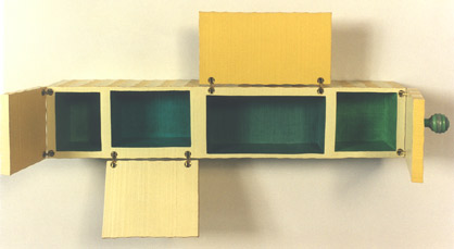 |
||||||||||||||||||||||||||||||||||||||||||||
Tom Loeser |
||||||||||||||||||||||||||||||||||||||||||||
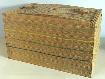 |
||||||||||||||||||||||||||||||||||||||||||||
Tom Loeser - Cardboard Box |
||||||||||||||||||||||||||||||||||||||||||||
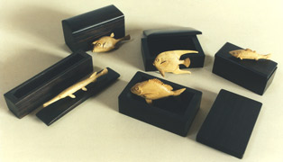 |
||||||||||||||||||||||||||||||||||||||||||||
Brian Newell |
||||||||||||||||||||||||||||||||||||||||||||
 |
 |
|||||||||||||||||||||||||||||||||||||||||||
Brian Newell Satinwood box + |
Jere Osgood |
|||||||||||||||||||||||||||||||||||||||||||
 |
 |
|||||||||||||||||||||||||||||||||||||||||||
David Ebner |
David Finck |
|||||||||||||||||||||||||||||||||||||||||||
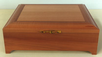 |
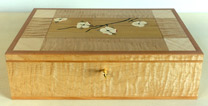 |
|||||||||||||||||||||||||||||||||||||||||||
Timothy Philbrick |
Zivko Radenkov |
|||||||||||||||||||||||||||||||||||||||||||
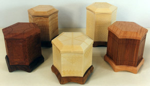 |
||||||||||||||||||||||||||||||||||||||||||||
Tim Coleman |
||||||||||||||||||||||||||||||||||||||||||||
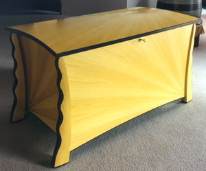 |
||||||||||||||||||||||||||||||||||||||||||||
Jamie Robertson |
||||||||||||||||||||||||||||||||||||||||||||
Steve Herrick |
||||||||||||||||||||||||||||||||||||||||||||
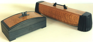 |
||||||||||||||||||||||||||||||||||||||||||||
|
Phil Weber |
||||||||||||||||||||||||||||||||||||||||||||
| Judy Kensley McKie - 1997 |
Judy Kensley McKie NOTES: This is Judy McKie's fifth solo exhibit at P&E, and it introduces her first work in marble, steel, and resin. This show would make its mark as McKie's most ambitious use of different media. In addition to pieces in wood and bronze, she would add a bench in marble, a steel table, as well as two other wood pieces utilizing steel parts, and lastly, a sconce in resin. It wasn't just the number of different media that she employed in this show, but rather it was her thinking about form that pushed this work into uncharted territory. The sleek fullness of the marble Polar Bear Bench could not stand more in contrast to the Calder-like planes of McKie's small Bird Table. The sensuality of the polychrome forms in McKie's low Duck Table make it easy to overlook the structural ingenuity of her counter-racking design. And the almost painful beauty of the once-done Bird Chair shows how deeply this artist can express form. A second low serving piece in the show came in the form of the bronze Dragon Table and illustrates how differently this artist could strike a mood. The friendly gabfest feeling of the Duck Table is replaced here by a primordial energy. The two creatures engage as if in a mating ritual and their sleek forms express implicit power. Bronze is also a favorite medium for McKie's smaller pieces. The Lizard Door Knocker has the weight to be gently tapped or to resonate through the door. Using both wood and steel, the Kissing Horse Bench has warmth and informality that would make any hall or porch a friendly and inviting place. Its flat monochromes stand in contrast to the rich polychrome complexities of both the Bird Chair and the Duck Table. The second piece that used both wood and steel is the Aquarium Chest. Early on, McKie reports, she had made a list of materials with which she intended to experiment. Nails were on that list. In this piece, she uses nail heads quite expressively as they appear as fish scales, eyes, and air bubbles. The aqua wash of the chest is a snorkler's vision. The snake form always splits the public into phobias and enthusiasts. Here in the Snake Stand bronze was used to recast an earlier idea: her 1980's polychrome Snake Table. Another second visitation took its form in the Giraffe Headboard, which is another version of the Watching Dog Headboard from 1991. The largest of the wood pieces in this show was McKie's Chest with Diamonds and Dots. Architecturally, it brings to mind North Africa or perhaps a Sumerian palace. The freely carved lines give the large piece a wonderfully alive feeling -- the drawers graphically lyrical though their actual organization is strictly graduated. The partners always viewed the safe transport of work to and from the gallery as the bottom of the iceberg in their furniture business. P&E was particularly disadvantaged in this regard because of the limited number of qualified local movers at their disposal. Although the preference is always to hire "art movers", the exorbitant cost of deadheading a truck to the eastern end of the longest island in America precluded habitual use of this service. In the case of McKie's marble pieces, however, there was no question that specialized movers would be required to handle this work. The marble benches would arrive on a flatbed truck with a specialized "girdle" around their middle. Inside the gallery, the movers would construct a gantry that would, in this case, hoist the 2,000-pound Polar Bear Bench into place. It was always an occasion of joy and relief when the marble piece was ensconced with all of its toes unscathed. The Polar Bear Bench was the first of McKie's marble pieces. For the bear, she chose a Vermont Danby marble, a cold looking white marble with black/gray striations running horizontally along its flanks. The bear is 20"H x 72"H x 20"D. Although McKie carved her full scale prototype out of laminated signboard, the initial stone carving was done by laser scanning, which is followed by hand work. The Polar Bear Bench stands as one of the most beloved of McKie's pieces, one that appealed to almost everyone including, and especially, children. Its directness and the apparent Inuit-like simplicity belie its sculptural integrity. |
|||||||||||||||||||||||||||||||||||||||||||
 |
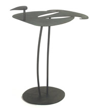 |
|||||||||||||||||||||||||||||||||||||||||||
Steel Bird Table |
||||||||||||||||||||||||||||||||||||||||||||
 |
||||||||||||||||||||||||||||||||||||||||||||
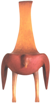 |
||||||||||||||||||||||||||||||||||||||||||||
Alaskan Cedar, Paint Bird Chair /Ad in American Craft Magazine |
||||||||||||||||||||||||||||||||||||||||||||
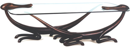 |
||||||||||||||||||||||||||||||||||||||||||||
Cast Bronze, Glass Dragon Table |
||||||||||||||||||||||||||||||||||||||||||||
 |
||||||||||||||||||||||||||||||||||||||||||||
Cast Bronze Lizard Knocker |
||||||||||||||||||||||||||||||||||||||||||||
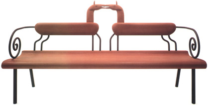 |
||||||||||||||||||||||||||||||||||||||||||||
Pine, Milk Paint, Metal Horse Bench |
||||||||||||||||||||||||||||||||||||||||||||
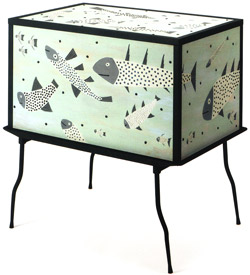 |
||||||||||||||||||||||||||||||||||||||||||||
Basswood, Paint, Metal Aquarium Chest |
||||||||||||||||||||||||||||||||||||||||||||
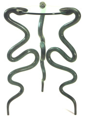 |
||||||||||||||||||||||||||||||||||||||||||||
Cast Bronze, Glass Snake Stand |
||||||||||||||||||||||||||||||||||||||||||||
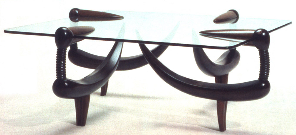 |
||||||||||||||||||||||||||||||||||||||||||||
Walnut, Paint, Glass Duck Table + |
||||||||||||||||||||||||||||||||||||||||||||
 |
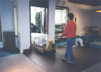 |
|||||||||||||||||||||||||||||||||||||||||||
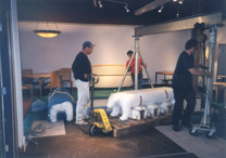 |
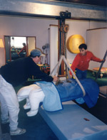 |
|||||||||||||||||||||||||||||||||||||||||||
 |
||||||||||||||||||||||||||||||||||||||||||||
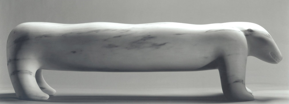 |
||||||||||||||||||||||||||||||||||||||||||||
Danby Marble Polar Bear Bench + |
||||||||||||||||||||||||||||||||||||||||||||
 |
||||||||||||||||||||||||||||||||||||||||||||
Resin Bird Sconce |
||||||||||||||||||||||||||||||||||||||||||||
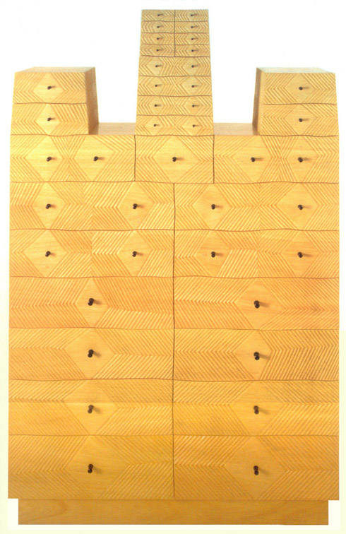 |
||||||||||||||||||||||||||||||||||||||||||||
Carved Obeche, Ebony, Poplar Chest with Diamonds and Dots + |
||||||||||||||||||||||||||||||||||||||||||||
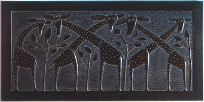 |
||||||||||||||||||||||||||||||||||||||||||||
Carved Walnut Giraffe Headboard |
||||||||||||||||||||||||||||||||||||||||||||
| Commissions - 1997 |
||||||||||||||||||||||||||||||||||||||||||||
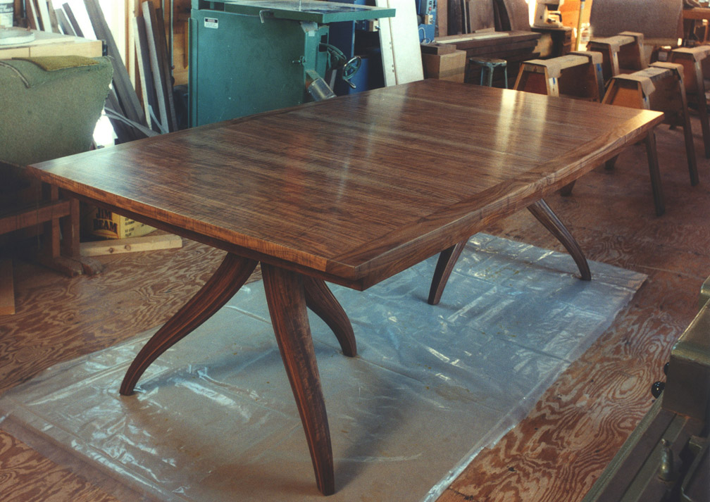 |
||||||||||||||||||||||||||||||||||||||||||||
+ |
||||||||||||||||||||||||||||||||||||||||||||
 |
||||||||||||||||||||||||||||||||||||||||||||
Jere Osgood |
||||||||||||||||||||||||||||||||||||||||||||
 |
||||||||||||||||||||||||||||||||||||||||||||
James Schriber |
||||||||||||||||||||||||||||||||||||||||||||
 |
||||||||||||||||||||||||||||||||||||||||||||
James Schriber |
||||||||||||||||||||||||||||||||||||||||||||
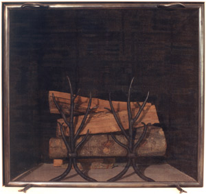 |
||||||||||||||||||||||||||||||||||||||||||||
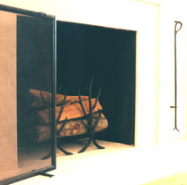 |
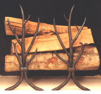 |
|||||||||||||||||||||||||||||||||||||||||||
Fran Taubman - Forged Steel Fire Screen, Andirons, Fire Tool |
||||||||||||||||||||||||||||||||||||||||||||
| 1 9 9 8 | ||||||||||||||||||||||||||||||||||||||||||||
| Early Spring Show - 1998 |
Early Spring Show NOTES: Although the gallery had hosted holloware, cast bronze, and the fabricated bronze/steel work of Gary Magakis, forged steel did not appear as a furniture medium until the work of Fran Taubman arrived. A RISD graduate in industrial design who studied metalsmithing at Pratt Institute, Taubman's first major piece for the gallery, the "Branch Lamp," was an immediate hit. This is a standing lamp with a tripod base that ascends into a triad trunk. The trunk breaks just below the lamp height into an articulation of fine branches. The surrounding branches suspend a handmade canister shade so that the central light broadcasts the branches onto the shade. In the Branch Lamp, Taubman creates both a beautiful and useful work. Also notable in this show is a waist high oval cabinet in rosewood by Greg Smith. Trained by James Krenov, Smith is a master of the "quiet" furniture expression that his teacher espoused. The oval facade of Smith's cabinet is continuous and unbroken aside from the two doors that are set flush into the facade. The rosewood pattern on the doors runs without interruption into the surround. The success of the piece is based upon perfect execution. Later Smith furniture would display his talent for forging steel details. Rick Wrigley submitted a superior circular dining room table, and joins a handful of makers who are truly familiar with large dining room tables. This ample eight-seater joins a circular top with a square pedestal. The four sides of the plinth rise gracefully in a flattened ogee to the base of the pedestal trunk. The trunk itself is scaled sufficiently wide so that you have visual confidence in the large extending top. The trunk gradually narrows as it ascends. This convergence is aided visually by the herringbone application of makore veneer. The pedestal is accented by narrow maple trim used like piping. The top is laid out in quarters, with the figure of the makore veneer running toward the center. This causes the figure of the two quadrants to abut in a herringbone pattern. These intersections create lines like the axis of a compass, and are graced by small, silver-edged ebony circles. Wrigley's style is to keep detailing refined even when dealing with a piece this large in scale. It is a style in which, when you stand back, you find no false notes. |
|||||||||||||||||||||||||||||||||||||||||||
 |
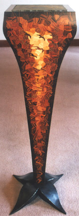 |
|||||||||||||||||||||||||||||||||||||||||||
Michael Cullen - Basswood, Pearwood, Cedar, Stained Glass, Milk Paint "The Little Prince" |
Jack Alberti - Various woods, Steel "Storm's Exodus" Pedestal |
|||||||||||||||||||||||||||||||||||||||||||
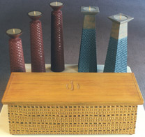 |
||||||||||||||||||||||||||||||||||||||||||||
Michael Cullen - Mahogany, Milk Paint "Trio" Candlesticks; Basswood, Milk Paint "Atlantis" Candlesticks; Mahogany, Nutmeg, Milk Paint "Treasure Chest II" |
||||||||||||||||||||||||||||||||||||||||||||
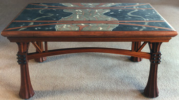 |
||||||||||||||||||||||||||||||||||||||||||||
Craig Nutt - Concrete, Mahogany, Wenge "Bridge Table" |
||||||||||||||||||||||||||||||||||||||||||||
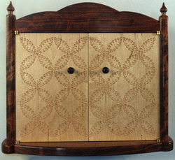 |
||||||||||||||||||||||||||||||||||||||||||||
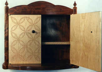 |
||||||||||||||||||||||||||||||||||||||||||||
Tim Coleman - Bubinga, Maple, stamped "Full Circle" Wall Cabinet |
||||||||||||||||||||||||||||||||||||||||||||
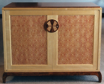 |
||||||||||||||||||||||||||||||||||||||||||||
Tim Coleman - Bubinga, Maple, stamped & carved "CrissCross" Cabinet |
||||||||||||||||||||||||||||||||||||||||||||
 |
||||||||||||||||||||||||||||||||||||||||||||
 |
||||||||||||||||||||||||||||||||||||||||||||
Jenna Goldberg - Mahogany, carved & painted Maple "Night, Day and All Things" Wall Chest |
||||||||||||||||||||||||||||||||||||||||||||
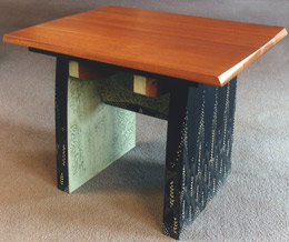 |
||||||||||||||||||||||||||||||||||||||||||||
Jenna Goldberg - Mahogany, carved & painted Maple, Xerox transfer "Willow Table" |
||||||||||||||||||||||||||||||||||||||||||||
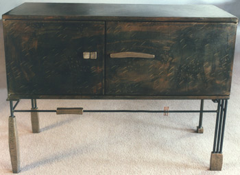 |
||||||||||||||||||||||||||||||||||||||||||||
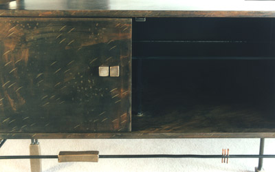 |
||||||||||||||||||||||||||||||||||||||||||||
Gary Magakis - Steel, Bronze Side Cabinet |
||||||||||||||||||||||||||||||||||||||||||||
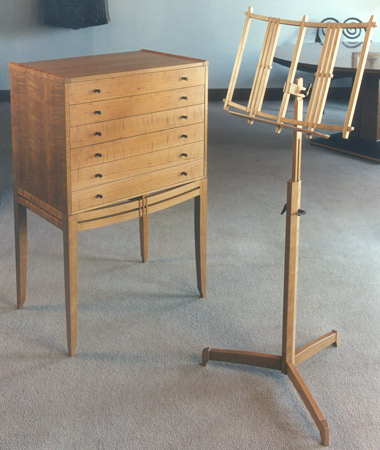 |
||||||||||||||||||||||||||||||||||||||||||||
Ross Day - Figured Cherry, Maple, East Indian Rosewood Cabinet Figured Cherry, Rosewood, Bronze Music Stand "Musician's Suite" |
||||||||||||||||||||||||||||||||||||||||||||
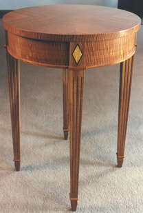 |
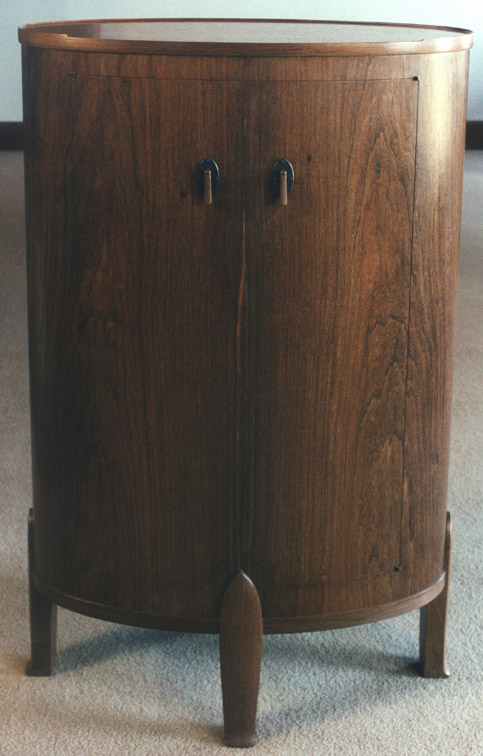 |
|||||||||||||||||||||||||||||||||||||||||||
Jim Plukas - Makore, Satinwood, Ebony, Mahogany Round Table |
Greg Smith - Honduras Rosewood, Pear, Brass Hall Cabinet + |
|||||||||||||||||||||||||||||||||||||||||||
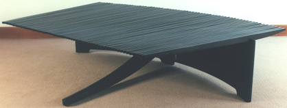 |
||||||||||||||||||||||||||||||||||||||||||||
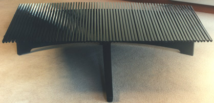 |
||||||||||||||||||||||||||||||||||||||||||||
Tom Hucker - Slatted Coffee Table |
||||||||||||||||||||||||||||||||||||||||||||
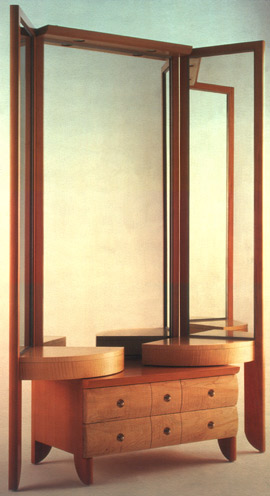 |
||||||||||||||||||||||||||||||||||||||||||||
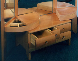 |
||||||||||||||||||||||||||||||||||||||||||||
James Schriber - Pearwood, Curly Maple, Stainless Steel, Mirror Dresser |
||||||||||||||||||||||||||||||||||||||||||||
 |
||||||||||||||||||||||||||||||||||||||||||||
Fran Taubman - Forged Steel Branch Lamp + |
||||||||||||||||||||||||||||||||||||||||||||
 |
||||||||||||||||||||||||||||||||||||||||||||
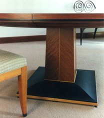 |
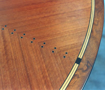 |
|||||||||||||||||||||||||||||||||||||||||||
Rick Wrigley - Mottled Makore Veneers with stained Cherry edging, Maple and Cherry inlay, Ebony, Sterling Silver Dining Table |
||||||||||||||||||||||||||||||||||||||||||||
| Furniture - 1998 |
Furniture NOTES: The featured piece on the announcement card is a chest-on-stand by Kristina Madsen. The cabinet, small in scale compared to the Darners' Chest from two years earlier, is a good synthesis of studio furniture sensibilities and her evolving pattern work. James Krenov bears some responsibility for making this species of furniture -- the collector's cabinet -- such a recognizable genre. Its simple two-door function with the companion front/side panels gives Madsen an excellent canvas for her pattern work. The pattern that she used here has its beginning as far back as 1993 in her small box on stand. In this latest piece, she begins experimenting with light, curved floating forms superimposed on a denser grid of interweaving patterns. In her 1995 chest-on- stand, these curved forms begin to resemble pieces of ribbon, and finally in this cabinet, they take on a intricate three- dimensional pattern of turning and folded ribbons. Her use of ebony tones, which are delineated by the revealed tonality of bubinga, makes for strikingly rich pattern work. Here something interesting happens. Some of the ribbons appear to transform into forms with vertebrae; others swirl independently with metaphorical heads and tails. This gives the whole pattern an almost wild and seething energy. At the gallery, we began to refer to this cabinet informally as Madsen's "Sargasso Sea" cabinet. Historically, there has been sufficient respect for chair making that it had its own guild in Europe. Amongst studio furniture makers, there are some who are considered good at it. In terms of craft, the requirements of comfort, style and strength lead to a structure where 90 degrees is no longer a reference in joinery. But chair making also requires the kind of mind that can visualize a shape three-dimensionally as it relates to the complexity of the seated human form. And then, it takes experience. In this show two such makers, working at the high point of their skills, contributed upholstered chairs. The dining chair with arms by James Schriber is classical in sensibility, but sufficiently contemporary in feel that it would feel at home in most high style interiors-- from Art Deco to postmodern. The arm supports are accomplished by continuing the curly maple of the front leg up from the seat, but sweeping it back with an S-curve before meeting the horizontal plane of the arm. This brings the arm itself back inches from the front of the chair, which facilitates tucking the chair closer to a dining table when not in use. The sweep of the rear leg also continues upward, and the curved back of the seat facilitates joining the leg at an angle so that the bow-like form creates a fan back. The curves of the rear, and the suggested saber shape of the front legs, give the chair its European quality, and the pillowing of the wood surfaces give the chair its elegance. Another fine detail to note is the way the maple arms accomplish the transition to the front leg. The allusion to an upholstered form on the arms neatly hides the joint to the leg. If all the angles play together just right, as in this chair, a comfortable seat is produced, and the chairmaker's art accomplishes one of the most important services of furniture. Tim Philbrick made one of his club chairs for the show. He is one of the few makers to take on the upholstered form, and his club chair was received like no other easy chair since John Dunnigan's upholstered work in the 1980s. Philbrick had worked on the easy chair form since his PIA training in the 1970s. In the early 1980s, he was commissioned to do a series of upholstered seating pieces for the Edward Steichen house in Connecticut. His chairs stand out today as contemporary forms in complete control of their many curving lines. In these chairs, the visible flow of the wood continues up the front leg, through the arm, up the side of the back, and into the crown rail. The curving front edge of the upholstered seat forms the front of the chair, without resorting to a separate cushion. Philbrick's last easy chair, described in the 1990 show Sitting Pretty, had even more exposed wood, particularly in its ample front rail. In the later club chairs he would make, the front face takes charge of the design. It is not only in the use of a similar, ample front rail, but the leg front has its broad dimension forward which sweeps upward to the horizontal plane of the fully upholstered chair arm. One of the best lines in the chair takes the bottom line of the side from the front leg to the rear in a gentle, compound S-curve. This show also introduced Osgood's Standing Desk in cherry and leather, a waist high variation of his pedestal desk. The extra height allows the tapered laminate legs to show to great effect. The writing surface lifts in school desk fashion for storage in the top's curved, rectangular carcass. This piece doubles beautifully as a lectern. Even lighter in appearance is David Ebner's Potter's Bench, again designed around his use of bleached branch and sapling forms. Strong, although its members are minimally dimensioned, this skeletal-like bench hardly seems to support its name. Ebner's creation, however, came from memory of a fully functional potter's bench that he had once seen. |
|||||||||||||||||||||||||||||||||||||||||||
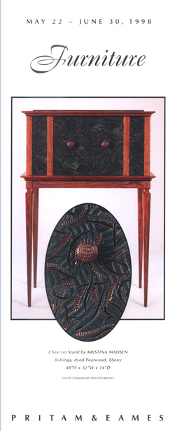 |
||||||||||||||||||||||||||||||||||||||||||||
Kristina Madsen - Bubinga, dyed Pearwood, Ebony Chest on Stand |
||||||||||||||||||||||||||||||||||||||||||||
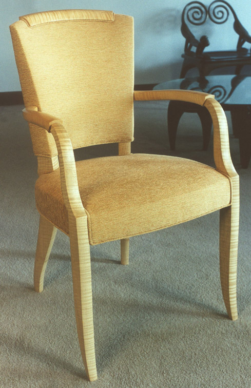 |
||||||||||||||||||||||||||||||||||||||||||||
James Schriber - Curly Maple Arm Chair + |
||||||||||||||||||||||||||||||||||||||||||||
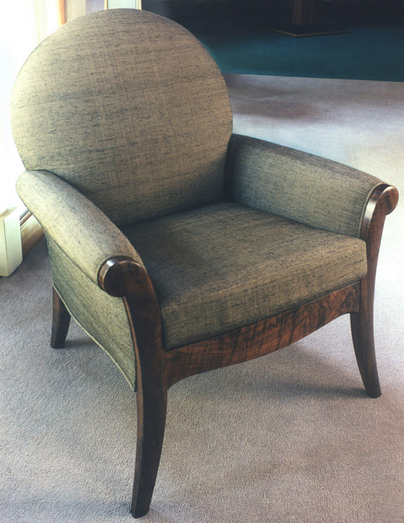 |
||||||||||||||||||||||||||||||||||||||||||||
Tim Philbrick - Claro Walnut, Larsen fabric Club Chair + |
||||||||||||||||||||||||||||||||||||||||||||
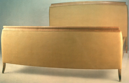 |
||||||||||||||||||||||||||||||||||||||||||||
James Schriber - Maple, Bronze Upholstered Bed |
||||||||||||||||||||||||||||||||||||||||||||
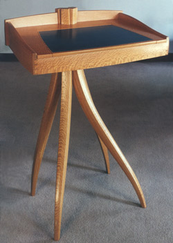 |
||||||||||||||||||||||||||||||||||||||||||||
Jere Osgood - Australian Lacewood, Leather Lectern/Stand Up Desk |
||||||||||||||||||||||||||||||||||||||||||||
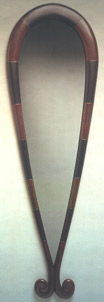 |
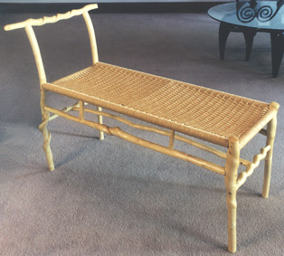 |
|||||||||||||||||||||||||||||||||||||||||||
Andy Buck - Poplar, Milk Paint, Graphite "Small Hands" Mirror |
David Ebner - Sassafras Potter's Bench |
|||||||||||||||||||||||||||||||||||||||||||
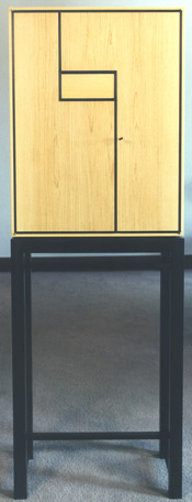 |
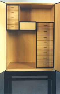 |
|||||||||||||||||||||||||||||||||||||||||||
Adrian Ferrazzutti - Guatum Bu, Katalox Cabinet |
||||||||||||||||||||||||||||||||||||||||||||
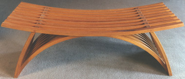 |
||||||||||||||||||||||||||||||||||||||||||||
Yokhai Givon - Mahogany, Cedar Bench #21 |
||||||||||||||||||||||||||||||||||||||||||||
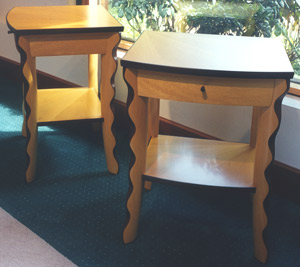 |
||||||||||||||||||||||||||||||||||||||||||||
Jamie Robertson - Pau Amarillo, Lemonwood, East Indian Rosewood Pair of End Tables |
||||||||||||||||||||||||||||||||||||||||||||
| Small Things at Large - 1998 |
Small Things at Large A quietly designed treasure in this show was Michael Hurwitz's chopsticks that were boxed elegantly in sliding cover containers. The announcement piece, a bowl by Andy Buck, and also a long wall hung cabinet by Tom Loeser, share a carved and painted technique. Buck's piece has the connection to primitive hollowed log ware but strikes a more sophisticated attitude with its jester-like handles. Loeser's black and white incremental composition has the sense of rhythm and scale underlined by the keyboard metaphor. A new piece from Janene Hilliard was always welcome at the gallery. And this table lamp, with its au couture attitude, continued her strong originality in lamp design. |
|||||||||||||||||||||||||||||||||||||||||||
 |
 |
|||||||||||||||||||||||||||||||||||||||||||
Andy Buck |
||||||||||||||||||||||||||||||||||||||||||||
 |
||||||||||||||||||||||||||||||||||||||||||||
Tim Coleman |
Tom Loeser |
|||||||||||||||||||||||||||||||||||||||||||
 |
 |
|||||||||||||||||||||||||||||||||||||||||||
Janene Hilliard - "Sushi" Lamp + |
Jere Osgood |
|||||||||||||||||||||||||||||||||||||||||||
 |
 |
|||||||||||||||||||||||||||||||||||||||||||
Hank Gilpin |
||||||||||||||||||||||||||||||||||||||||||||
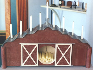 |
||||||||||||||||||||||||||||||||||||||||||||
James Schriber - Barn Menorah |
||||||||||||||||||||||||||||||||||||||||||||
 |
||||||||||||||||||||||||||||||||||||||||||||
James Schriber |
||||||||||||||||||||||||||||||||||||||||||||
 |
||||||||||||||||||||||||||||||||||||||||||||
Michael Hurwitz |
||||||||||||||||||||||||||||||||||||||||||||
 |
||||||||||||||||||||||||||||||||||||||||||||
Rick Wrigley |
||||||||||||||||||||||||||||||||||||||||||||
| The Furniture of William Walker 1998 |
The Furniture of William Walker In writing about this work, Jon Binzen notes: "In appearance and approach, Walker's furniture has lines to Hans Wegner and Alvar Aalto, two mid-century masters he admires. As they did, Walker thinks like an engineer as well as an artist. And, just as they were, he is consumed by the pursuit of an elegant process." Four elegant legs support the rock-steady 12-foot long table. When you study the arched stretcher that provides the stability of triangulation, you think of Walker the engineer. You also see Jere Osgood-type solutions to structure rather than those of Walker's actual mentor, James Krenov. In the 1995 Jere Osgood/Stewart Wurtz show, the gallery NOTES section mentions Walker while discussing Wurtz and refers to a "west coast" style. It is fun to compare the treatment of the leg and tabletops in Walker's closed version of the extension table to that of Wurtz's table in 1995. Binzen also notes that Walker had set off for Europe to study violin making, but ended up instead at Krenov's school in California. His large maple credenza completed for this show is called, "Cremona Cabinet" after a small town in Italy renown for centuries as a center for violin making. It is a wistful reference, but the bowed underbelly and concave cradle for the soapstone top do suggest the graceful curves of the instrument. The front is so serene that its stylistic accents bring to mind the subtlety of a tie on a stately obi, or the sliding screen to an inner sanctuary. |
|||||||||||||||||||||||||||||||||||||||||||
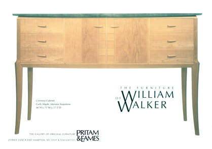 |
||||||||||||||||||||||||||||||||||||||||||||
Maple, Soapstone Cremona Cabinet |
||||||||||||||||||||||||||||||||||||||||||||
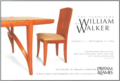 |
||||||||||||||||||||||||||||||||||||||||||||
American Craft Magazine Aug/Sept 1998 |
||||||||||||||||||||||||||||||||||||||||||||
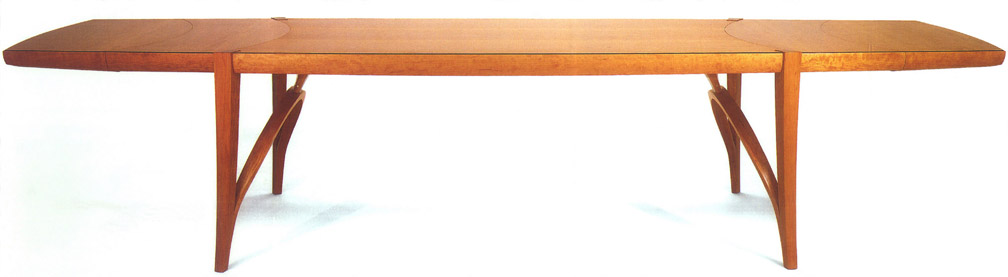 |
||||||||||||||||||||||||||||||||||||||||||||
Cherry, Ebony, Stainless Steel Extending Dining Table + |
||||||||||||||||||||||||||||||||||||||||||||
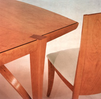 |
||||||||||||||||||||||||||||||||||||||||||||
Cherry with Ebony Detail Extension Dining Table and 12 Cherry, Larsen Silk Chairs |
||||||||||||||||||||||||||||||||||||||||||||
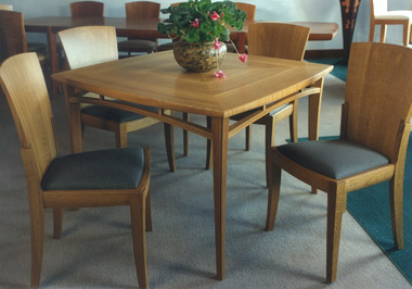 |
||||||||||||||||||||||||||||||||||||||||||||
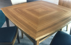 |
||||||||||||||||||||||||||||||||||||||||||||
American White Oak Square Table American White Oak with Larsen Cotton/Rayon Chairs |
||||||||||||||||||||||||||||||||||||||||||||
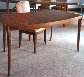 |
||||||||||||||||||||||||||||||||||||||||||||
Bubinga, Maple Desk & Bubinga, leather Chair |
||||||||||||||||||||||||||||||||||||||||||||
| Commissions - 1998 |
||||||||||||||||||||||||||||||||||||||||||||
 |
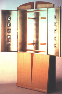 |
|||||||||||||||||||||||||||||||||||||||||||
James Schriber - Portable Ark |
||||||||||||||||||||||||||||||||||||||||||||
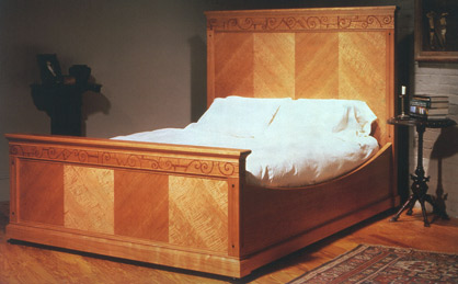 |
||||||||||||||||||||||||||||||||||||||||||||
Rick Wrigley - King size Bed |
||||||||||||||||||||||||||||||||||||||||||||
Gallery Interior - 1999 |
1 9 9 9 | |||||||||||||||||||||||||||||||||||||||||||
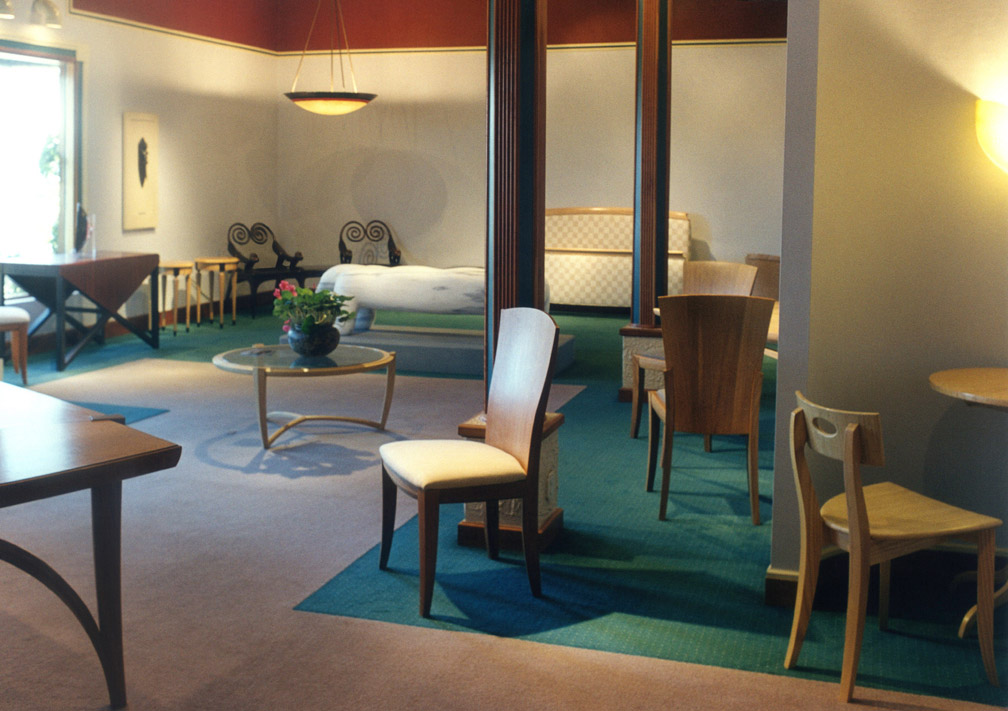 |
||||||||||||||||||||||||||||||||||||||||||||
+ |
||||||||||||||||||||||||||||||||||||||||||||
| Early Spring Show - 1999 |
Early Spring Show NOTES: Joe Tracy's small tables, featured on the announcement, would continue to be made by him and would become the most widely collected small table in the gallery's history. The source of Tracy's popple stones, tidal washed and shaped granite rocks that he uses to anchor the tables, come from a small island inlet off mid-coastal Maine. Also featured in this Early Spring Show was John Eric Byers' carved mahogany and milk painted wall hung liquor cabinet. His work first appeared at the gallery in 1990 with his Oh Boy Chest of Drawers, a piece which appeared to take a glance back at Osgood's 1972 whimsical Chest O Chair. Byers had studied at Wendell Castle's studio school in Scottsville, NY in the late 1980s. By the late 1990s, Byers' work became associated with carved surface patterns. The first appearance at the gallery of a piece with carved surface was his humidor in the 1997 show, InCase. In this 1999 Early Spring Show, his predominantly yellow wall hung cabinet would give decorative weight and focus to any interior. It seems to burst from the wall with its warmth and energy. Tom Hucker's bubinga and satinwood low table had the novelty of secondary function as a showcase. Through the glass top, its satinwood interior can be seen here exhibiting a shell. His pillowed laminated shell formed sides for the table were light and strong, doing away with the need for classic mortise and tenon skeletal structure. Brian Newell's East Indian rosewood and apple lidded jewelry box with sectioned tray shows his imaginative exploration of paneled form, at this time presaging his singular cabinet forms of the next century. The little chest rises from its constrained base into a pillowed top that seems necessarily bound by a cross band of rosewood. Rather than use rails on the inside of the carcass, the tray is raised on its own legs. Quiet, elegant form became a distinctive quality of the work of Ted Blachley, as his furniture became known through New Hampshire Furniture Masters Association exhibitions. This demilune shows both the influence of his association with the shop of Jere Osgood as well as the superior traditional work of his peers in NHFMA. This show also showcased the vibrant ceramic and upholstered furniture of a Canadian trio -- Barbara Campbell, the seamstress, Nisha Crawley, the ceramist, and Dan Ferguson, the furniture maker--whose Toronto shop was called Dizzy Designs. From Minnesota, Linda Sue Eastman's distinctive, hand tooled stitched leather furniture makes its appearance. Here, her Samurai Bench lives up to its name with shield-like sides. After being trained in engineering, Eastman joined her father making parts for his clock works. Physical difficulties caused her to abandon wood and metalworking involved in clockworks for the softer medium of fiber. Later, Eastman earned a BFA in Technical Theater in 1986, and had learned techniques in costume and set design that involved working with diverse materials. She began experimenting with tooling, weaving and other decorative uses of leather. Her furniture forms became the canvas for her decorative work in leather. Eastman says of the Samurai Bench: "In the Samurai Bench I have chosen to carefully follow some details of Japanese armor such as the laced plates under the bench seat where each lacing, set of holes, and scales were traditionally identified according to their specific features. More loosely, I follow some of the colors used -- brown, black, red and green. The tassels are reminiscent of the plumes either carried on standards or worn on helmets to identify warriors on the battlefield. The pattern work on the inside and outside of the bench arms reflect the rhythmic patterns found throughout suits of armor." Michael Cullen's beautiful carved and painted decorative surfaces of the Rain Chest reflect the influence of Kristina Madsen's intaglio in the 1990s. Both Cullen and Madsen had studied with David Powell at Leeds Design Workshop, although she in the 1970s, and he in the 1980s. Cullen, too, keeps the furniture form simple -- the main focus being the decorative surface of the Rain Chest. Duncan Gowdy, who studied with Wendy Maruyama at San Diego State University, contributed his witty Keyhole Mirror. This Early Spring Show fulfilled its function by giving the gallery some freedom to bring together both new and formative voices evident in the field of studio furniture. |
|||||||||||||||||||||||||||||||||||||||||||
 |
||||||||||||||||||||||||||||||||||||||||||||
Joe Tracy - Wenge, Curly Redwood, Granite Pair of Side Tables |
||||||||||||||||||||||||||||||||||||||||||||
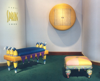 |
||||||||||||||||||||||||||||||||||||||||||||
|
||||||||||||||||||||||||||||||||||||||||||||
John Eric Byers - Mahogany, milk paint, Copper Round Cabinet + |
||||||||||||||||||||||||||||||||||||||||||||
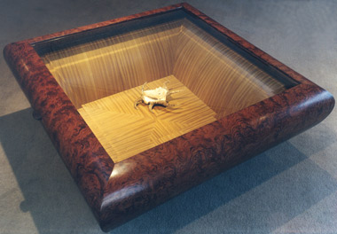 |
||||||||||||||||||||||||||||||||||||||||||||
Tom Hucker - Bubinga, Satinwood, Glass Display Table |
||||||||||||||||||||||||||||||||||||||||||||
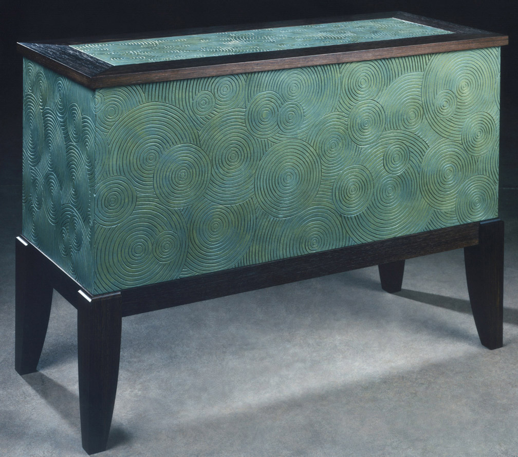 |
||||||||||||||||||||||||||||||||||||||||||||
Michael Cullen - Mahogany, Wenge, Nutmeg, Milk Paint "Spring Rain" Chest + |
||||||||||||||||||||||||||||||||||||||||||||
 |
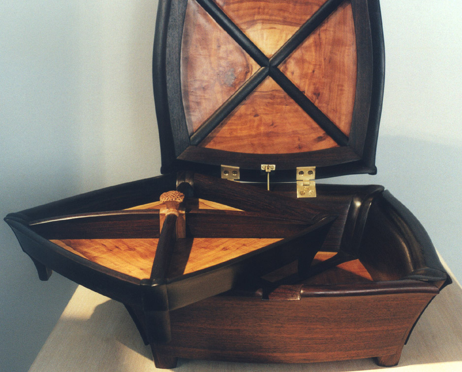 |
|||||||||||||||||||||||||||||||||||||||||||
Brian Newell - East Indian Rosewood, Applewood Lidded Box with Tray |
||||||||||||||||||||||||||||||||||||||||||||
+ |
||||||||||||||||||||||||||||||||||||||||||||
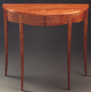 |
||||||||||||||||||||||||||||||||||||||||||||
Ted Blachly - Bubinga, Rosewood, Ash Demilune |
||||||||||||||||||||||||||||||||||||||||||||
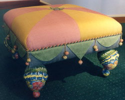 |
||||||||||||||||||||||||||||||||||||||||||||
Dizzy Designs - Ceramic, Wood, raw Silk Sunburst Footstool |
||||||||||||||||||||||||||||||||||||||||||||
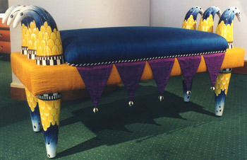 |
||||||||||||||||||||||||||||||||||||||||||||
Dizzy Designs - Ceramic, Wood, raw Silk Six-Horned Bench |
||||||||||||||||||||||||||||||||||||||||||||
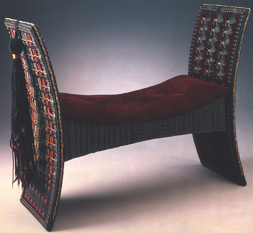 |
||||||||||||||||||||||||||||||||||||||||||||
Linda Sue Eastman - Tooled Leather, Leather lacing, Suede, Floss embroidery, Brass Samurai Bench + |
||||||||||||||||||||||||||||||||||||||||||||
 |
 |
|||||||||||||||||||||||||||||||||||||||||||
Duncan Gowdy - Plywood, Cherry, paint Keyhole Mirror |
Mark Wilkins - Curly Maple, Fishtail Oak, Poplar, Cherry, Mahogany "Burlesque" Telephone Table |
|||||||||||||||||||||||||||||||||||||||||||
 |
||||||||||||||||||||||||||||||||||||||||||||
Gary Magakis - Bronze, Steel "Truth & Beauty/Lust & Desire" Bench |
||||||||||||||||||||||||||||||||||||||||||||
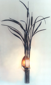 |
||||||||||||||||||||||||||||||||||||||||||||
Fran Taubman - Forged & fabricated Steel, Bronze, sandblasted Glass Cattail & Grass Sconce |
||||||||||||||||||||||||||||||||||||||||||||
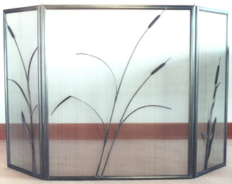 |
||||||||||||||||||||||||||||||||||||||||||||
Fran Taubman - Forged & fabricated Steel Cattail & Grass Fire Screen |
||||||||||||||||||||||||||||||||||||||||||||
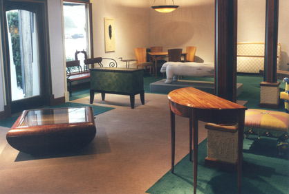 |
||||||||||||||||||||||||||||||||||||||||||||
| 19th Summer Season - 1999 |
19th Summer Season NOTES: The bench by Andy Buck is a witty, but also wistful, comment about the culture in which he finds himself. The modest bench is slender and elegant in proportion. There is, however, a Magritte improbability to the slender legs that extend into the skinniest of arms to support a giant, but colorful, bar bell. It is like the aspirations of Walter Mitty, and funny as such. The six-horned ceramic bench from Dizzy Designs extends, but does not expand, the ideas with which they have experimented. The colors are less bold, but well controlled. Brian Newell had just begun to produce work in his shop in Kanagawa, Japan, outside Tokyo. He made a return visit stateside and brought along this ebony display cabinet. The facade of the base is covered with a Macassar ebony parquetry based on a pattern of squares cut from thick, resawn veneer. This technique will be the basis that leads to further experimentation of brick or tile laid surfacing over curving forms that will characterize his later work. This étagère has a distinct Chinese attitude that reflects his recent exposure to Oriental furniture. A pair of fine side cabinets by James Schriber demonstrates his openness to contemporary architectural influences.
|
|||||||||||||||||||||||||||||||||||||||||||
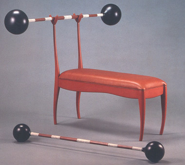 |
||||||||||||||||||||||||||||||||||||||||||||
Andy Buck - Poplar, Mahogany, Paint, Leather "Benchpress" |
||||||||||||||||||||||||||||||||||||||||||||
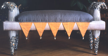 |
||||||||||||||||||||||||||||||||||||||||||||
Barbara Campbell, Nisha Crawley, Dan Ferguson - Ceramic, wood, raw Silk Six-Horned Bench |
||||||||||||||||||||||||||||||||||||||||||||
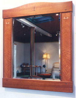 |
||||||||||||||||||||||||||||||||||||||||||||
Rick Wrigley - Makore, Figured Makore, Ebony, color Xerox transfer of drawing, Sterling Silver Mirror |
||||||||||||||||||||||||||||||||||||||||||||
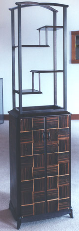 |
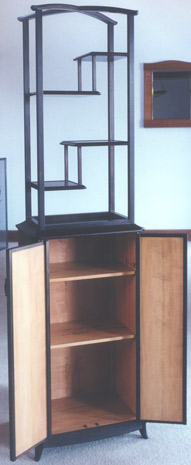 |
|||||||||||||||||||||||||||||||||||||||||||
Brian Newell - Macassar Ebony, Pearwood Display Cabinet
|
||||||||||||||||||||||||||||||||||||||||||||
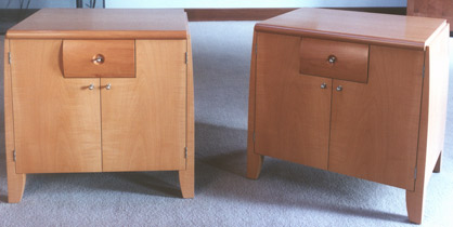 |
||||||||||||||||||||||||||||||||||||||||||||
James Schriber - Pear, Steel Pair of Side Cabinets |
||||||||||||||||||||||||||||||||||||||||||||
| Lacquerware by Yuji Kubo |
Lacquerware by Yuji Kubo It was during Michael Hurwitz's furniture maker artist's residency in Japan that he came upon the lacquerware of Yuji Kobo and the oke (vessels) of Yasutaka Shimizu. Hurwitz called Pritam & Eames and said, "You really ought to have this work." Knowing that many of their best leads for new work come from teachers, the partners did not hesitate to invite both Kubo and Shimizu's work to the gallery. Kubo's lacquerware follows the traditional practice that involves 45 stages and over two months to produce a single lacquer piece. |
|||||||||||||||||||||||||||||||||||||||||||
 |
||||||||||||||||||||||||||||||||||||||||||||
Chest of Drawers |
||||||||||||||||||||||||||||||||||||||||||||
|
 |
|||||||||||||||||||||||||||||||||||||||||||
 |
||||||||||||||||||||||||||||||||||||||||||||
Salad Bowl |
||||||||||||||||||||||||||||||||||||||||||||
Stacking Drawers |
||||||||||||||||||||||||||||||||||||||||||||
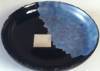 |
||||||||||||||||||||||||||||||||||||||||||||
Moonlight Bowl |
||||||||||||||||||||||||||||||||||||||||||||
| Oke by Yasutaka Shimizu |
Oke by Yasutaka Shimizu Pritam & Eames' audience appreciated these lovely wooden vessels, or buckets, made of a cedar-like wood. |
|||||||||||||||||||||||||||||||||||||||||||
Japanese Cedar Oke (vessels); Lacquer Tray by Yuji Kubo |
||||||||||||||||||||||||||||||||||||||||||||
Japanese Cedar Oke (vessels) |
||||||||||||||||||||||||||||||||||||||||||||
| Jere Osgood/Thomas Hucker: New Furniture - 1999 |
Jere Osgood/Thomas Hucker NOTES: The second "Tom and Jere" show at the gallery, and it represents a reunion of two furniture makers at the top of their form: Jere Osgood and Tom Hucker. Hucker's contribution included three tall standing cabinets, each working differently with the concept of light. In his Sagarra Cabinet, light is transmitted through translucent panels on the cabinet's sides. The entire facade is composed of two large curved doors. The curve becomes more convex with the ascent of the doors, causing the doors to swell out. The two doors are covered with a large square parquetry of madrone burl. This is arresting, and we're engaged in pondering the idea of a square covering a compound curved surface. The Kueihsing Cabinet has the translucent Japanese product called "silk glass" in its front and rear. Like the Sagarra Cabinet, its form is determined largely by the intersection of two vertical concave sections. In this cabinet, the point of intersection of the two sides provides narrow interior panels for electric lighting. Its openness to light, front and back, and the semi clarity of the glass panels, give this cabinet more of a showcase nature, while the Sagarra Cabinet suggests storage or safekeeping. If placed in front of a window or other light source, light for the third cabinet, an open concave shield with oval shelves is transmitted through its Fiberglass back. Hucker's two low tables, made in collaboration with stone sculptor Bart Uchida, are more conceptual. The tables are composed of black granite pieces -- sculpted, flattened and polished -- which are positioned on platforms of Sitka spruce. Here again, Hucker is playing with the idea of contrasts -- soft spruce/hard stone; white/black. The resulting composition is a testament to the fusion of furniture and sculpture. Osgood's Summer '99 Shell Desk departs from the 1993 Elliptical Shell Desk in three principal ways: First, the ends of this shell are truncated in horizontal planes. Secondly, instead of a single tree-like pedestal, Osgood uses two sets of "divider" shaped legs that are joined by a horizontal stretcher that is the width of the desk. And thirdly, instead of the shell rotating back on its axis, it is mounted on a pair of brass arms. Shell construction carries its own brand of beauty. There is a wonder at all of those perfectly jointed curved tapering planes, which are highlighted by the flow of repeating wood patterns. Then, there is the lightness and strength that is the essence of "shell." Osgood also made a new console table, which he calls Wave Table for the exhibit. Nine tapered legs provide reed-like support and pierce the table's low shelf much as if the legs had descended into an estuary's water. The top and apron continue the metaphor of wave and dune. The show also included a queen size Osgood version of a sleigh bed, his stand up desk, a side
|
|||||||||||||||||||||||||||||||||||||||||||
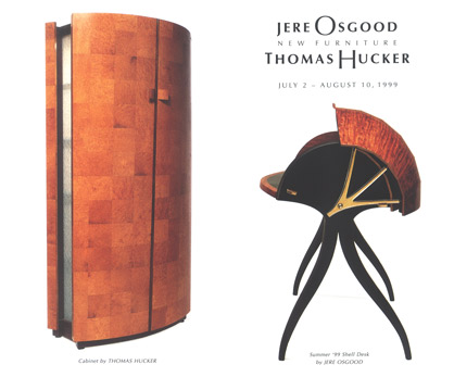 |
||||||||||||||||||||||||||||||||||||||||||||
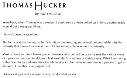 |
||||||||||||||||||||||||||||||||||||||||||||
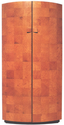 |
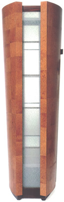 |
|||||||||||||||||||||||||||||||||||||||||||
Madrone Burl, Mahogany, Glass "Sagarra Cabinet" |
||||||||||||||||||||||||||||||||||||||||||||
 |
||||||||||||||||||||||||||||||||||||||||||||
Pau Ferro, Bronze Low Table |
||||||||||||||||||||||||||||||||||||||||||||
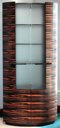 |
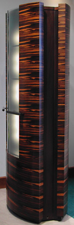 |
|||||||||||||||||||||||||||||||||||||||||||
Macassar Ebony, Mahogany, Silk Glass "Kueihsing Cabinet" |
||||||||||||||||||||||||||||||||||||||||||||
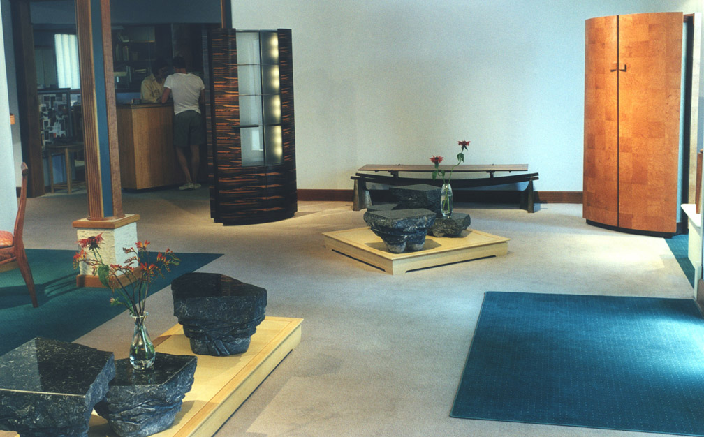 |
||||||||||||||||||||||||||||||||||||||||||||
|
+ |
||||||||||||||||||||||||||||||||||||||||||||
 |
||||||||||||||||||||||||||||||||||||||||||||
Maple, Rice/Fiberglass Paper Display Cabinet |
||||||||||||||||||||||||||||||||||||||||||||
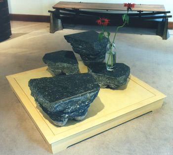 |
||||||||||||||||||||||||||||||||||||||||||||
Portuguese Black Marble, Sitka Spruce Square Stone Table |
||||||||||||||||||||||||||||||||||||||||||||
 |
||||||||||||||||||||||||||||||||||||||||||||
Portuguese Black Marble, Sitka Spruce Square Rectangular Table |
||||||||||||||||||||||||||||||||||||||||||||
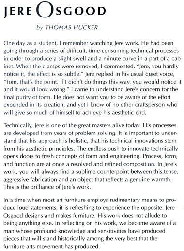 |
||||||||||||||||||||||||||||||||||||||||||||
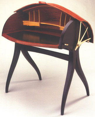 |
||||||||||||||||||||||||||||||||||||||||||||
 |
||||||||||||||||||||||||||||||||||||||||||||
Bubinga, Wenge, Ceylonese Satinwood, Leather, Brass "Summer '99 Shell Desk" |
||||||||||||||||||||||||||||||||||||||||||||
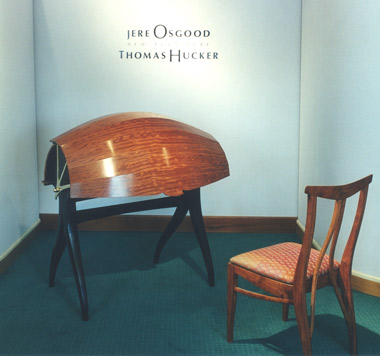 |
||||||||||||||||||||||||||||||||||||||||||||
Bubinga, Wenge, Ceylonese Satinwood, Leather, Brass "Summer '99 Shell Desk" Bubinga Chair |
||||||||||||||||||||||||||||||||||||||||||||
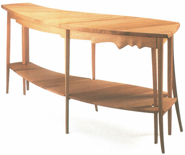 |
||||||||||||||||||||||||||||||||||||||||||||
Sycamore Wave Table |
||||||||||||||||||||||||||||||||||||||||||||
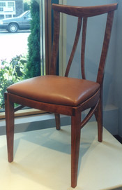 |
||||||||||||||||||||||||||||||||||||||||||||
Cherry, Brown Leather Chair |
||||||||||||||||||||||||||||||||||||||||||||
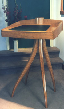 |
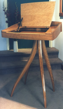 |
|||||||||||||||||||||||||||||||||||||||||||
Cherry, Leather Stand Up Desk/Lectern |
||||||||||||||||||||||||||||||||||||||||||||
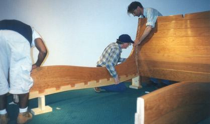 |
||||||||||||||||||||||||||||||||||||||||||||
Jere Osgood (center) assisted by Tom Hucker (right) in assembling Jere's Cherry Queen Size Bed |
||||||||||||||||||||||||||||||||||||||||||||
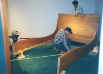 |
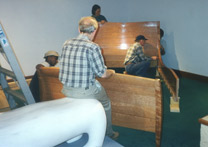 |
|||||||||||||||||||||||||||||||||||||||||||
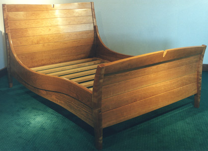 |
||||||||||||||||||||||||||||||||||||||||||||
Cherry Queen Size Bed |
||||||||||||||||||||||||||||||||||||||||||||
| Furniture by Kristina Madsen - 1999 |
Furniture by Kristina Madsen NOTES: Kristina Madsen's two low chests with drawers are as low as a low table, roughly 16 inches high. Unusual as furniture, they have a natural sweep and grace that is anything but problematic. The choice of swirl versus the "heron" pattern, and the drama of black on red versus gesso on pearwood, gives each chest a distinctive personality. The swirl pattern could incorporate a bold pull, but the heron motif required a less intrusive pull. In Madsen's Cabinet on Stand, the cabinet presents a facade taken up completely by two large rectangular doors. They serve to exhibit a diamond pattern, symmetrical left and right of center. Each door is comprised of a pattern based on a grid of diamonds. Each diamond, or square on point, is split into its two equilateral triangles. A different underlying wood is used in each half of the diamond so that when the secondary pattern is carved through, there is a strong left and right differentiation of tonality. A swirl pattern is used over the warm toned imbuya. A saw-toothed arrangement of repeating marks is used with the maple underlay. With the doors opened, the underlying colors of the pattern work are reversed. A hall table with drawer and two mirrors complete the show. The table is made in pau ferro and has a drawer lined in Larsen silk. Pattern work embellishes the edge of the top as well as apron surround, which includes the drawer front, which is designed without a pull. The composition of the pattern work has a distinctively non-Western feel; the use of small marks and repeating design brings it closer to a near-Eastern tradition. The use of curves is spare, while the use of saw-tooth or interlocking teeth pattern is dominant. In this respect, the carving is both refined and aggressive. The sense of endless progression and the lack of intrusion by the individual characterize an important part of Madsen's work. |
|||||||||||||||||||||||||||||||||||||||||||
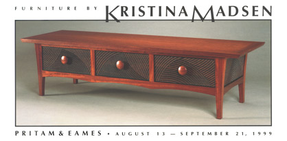 |
||||||||||||||||||||||||||||||||||||||||||||
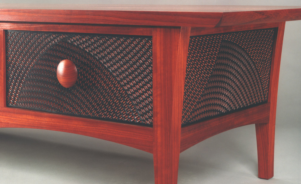 |
||||||||||||||||||||||||||||||||||||||||||||
Padauk, dyed Pearwood, Chakte Kok, Silk Low Chest of Drawers + |
||||||||||||||||||||||||||||||||||||||||||||
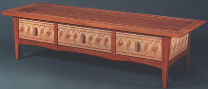 |
||||||||||||||||||||||||||||||||||||||||||||
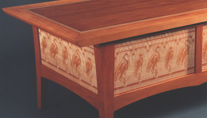 |
||||||||||||||||||||||||||||||||||||||||||||
Pearwood with Gesso, Silk lined drawers Low Chest of Drawers with Herons |
||||||||||||||||||||||||||||||||||||||||||||
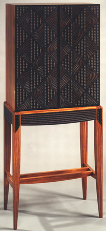 |
||||||||||||||||||||||||||||||||||||||||||||
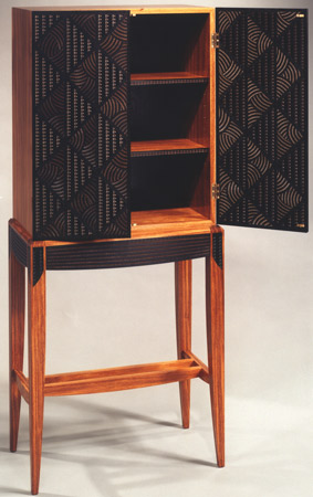 |
||||||||||||||||||||||||||||||||||||||||||||
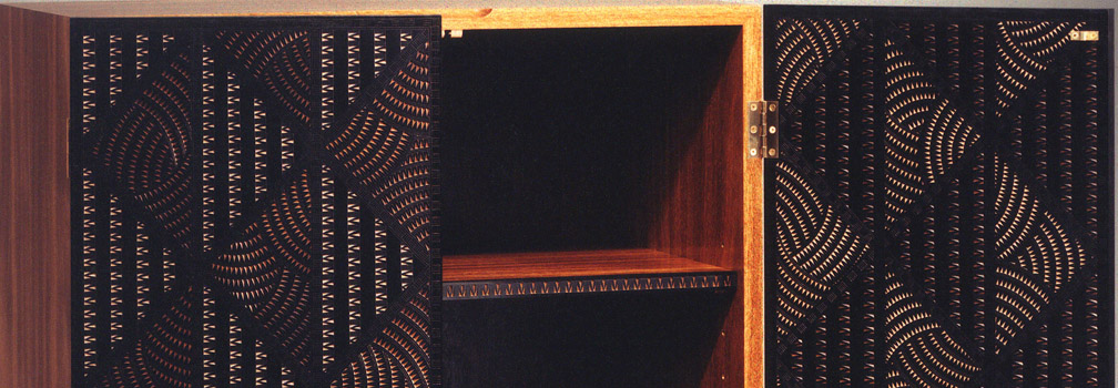 |
||||||||||||||||||||||||||||||||||||||||||||
Sucupira, dyed Pearwood, Maple, Imbuya, Ebony Cabinet on Stand + |
||||||||||||||||||||||||||||||||||||||||||||
|
 |
|||||||||||||||||||||||||||||||||||||||||||
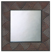 |
||||||||||||||||||||||||||||||||||||||||||||
Bubinga, Ebony, dyed Pearwood Square Mirror |
||||||||||||||||||||||||||||||||||||||||||||
Chakte Kok Long Mirror |
||||||||||||||||||||||||||||||||||||||||||||
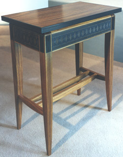 |
||||||||||||||||||||||||||||||||||||||||||||
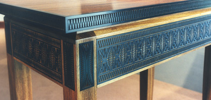 |
||||||||||||||||||||||||||||||||||||||||||||
Sucupira, Imbuya, Ebony, dyed Pearwood, Silk lined drawer Table with Drawer |
||||||||||||||||||||||||||||||||||||||||||||
| Early Winter Show - November, 1999 - January, 2000 |
Early Winter Show NOTES: Circumstances outside the studio can lead to innovative experimentation. In this case, an accident led Linda Sue Eastman to work with leather, whereas normally she worked in wood and metal. She began bringing leather into furniture forms in 1999 as seen in her Samurai Bench. Here, with the two chaises, she shows how tonality and pattern can dramatically change the personality of a form. Both chaises share scale and use a double arched base. In the first, the rust-brown suede leads into a boot tooled leather surround. Both materials follow the swell of the upholstery. This piece's rustic Spanish feel contrasts with the more urban style of the gray leather upholstered center and the black leather framing of the second piece. Eastman’s work is another example that furniture is not defined by its materials, unlike other craft mediums. Jenna Goldberg's Tall Cabinet follows the leads of Judy McKie and Kristina Madsen in using decorative carving to detail the facade. Its ample interior of shelves is a response to her growing up in a family of collectors. As is the case with Eastman, Dizzy Designs' pieces push the envelope of material use in furniture. Their sobriquet stood for the firm's partnership of three young Canadians -- one a ceramist, one a seamstress, and the third a form builder and business rep. The seamstress and ceramist also worked together as aerial trapeze artists which, no doubt, influenced the circus flavor of their furniture collaborations. Fran Taubman became well known amongst the gallery's clients for her Branch Lamp. The chandelier takes the same forged tendril work into candle holding finials. The clients for this chandelier researched further and came up with a closed, oil filled candle in the votive form. A handsome pair of club chairs by Timothy Philbrick added to the upholstered work in this show. The term "club chair" comes from a comfortable upholstered easy chair of scale used traditionally in men's clubs. This Philbrick version is actually scaled down from his first club chair. This junior club version has a more contemporary feel, and it was not impossible to move into conversational circumstances. That one was covered in fabric, and the other in leather, shows how important a single element can be as a key to its decorative inclusion. The corner desk by Hank Gilpin shows him at his best in pursuit of honest and recognizable furniture forms that retain an innovative freshness. Here he turns his attention to that under-utilized corner space, but there's also the voluptuous surprise of the drapery weighted and carved front. Note his use of double stretchers at the foot -- in this case, not a foot impediment. Wharton Esherick used the double stretcher on tables used for dining where the stretcher was always something to be negotiated. Another innovative decorative element is the raised buttons on the top surface near the edge of the piece that meets the wall. These have a limited rule function but also provide a visual boundary. Gilpin's contribution also included one of his family of benches, which used an "unusable" board for the top surface. These boards had such unruly undulations that they were only suitable for hand working. The side table by Joe Tracy in bubinga and wenge trim uses a simple intersection of curved and flat planes to produce its functional form. Coloring white oak by exposing it to ammonia fumes has a history in furniture. It mellows the harshness of the wood's naturally light color: at its best, it achieves a deep nutty brown. Rick Wrigley's extension table exhibited the best use of fumed oak that the gallery partners had seen. This table expresses a delicacy that belies its extension capabilities. This quality is enhanced by the slight apron-less oval top as well as the use of delicate marquetry panels on the facets of the legs. The use of quarter-sawn oak likewise keeps the table's nature calm and focuses on the vine pattern of the marquetry.
|
|||||||||||||||||||||||||||||||||||||||||||
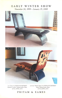 |
||||||||||||||||||||||||||||||||||||||||||||
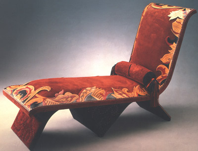 |
||||||||||||||||||||||||||||||||||||||||||||
Linda Sue Eastman - Suede, Tooling Leather, Brass Paisley Chaise |
||||||||||||||||||||||||||||||||||||||||||||
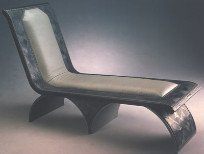 |
||||||||||||||||||||||||||||||||||||||||||||
Linda Sue Eastman - Upholstery Leather, Tooling Leather, Brass Chaise |
||||||||||||||||||||||||||||||||||||||||||||
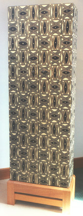 |
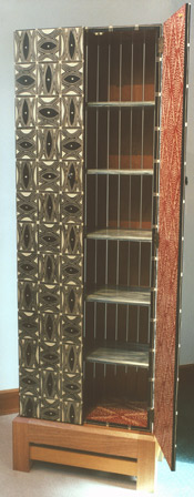 |
|||||||||||||||||||||||||||||||||||||||||||
Jenna Goldberg - Carved Basswood, Mahogany Tall Cabinet |
||||||||||||||||||||||||||||||||||||||||||||
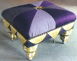 |
||||||||||||||||||||||||||||||||||||||||||||
Barbara Campbell, Nisha Crawley & Dan Ferguson - Ceramic, wood, raw Silk "The Queen" Footstool |
||||||||||||||||||||||||||||||||||||||||||||
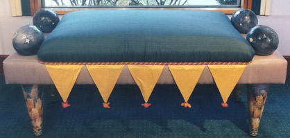 |
||||||||||||||||||||||||||||||||||||||||||||
Barbara Campbell, Nisha Crawley & Dan Ferguson - Ceramic, wood, raw Silk "Metropolis" Bench |
||||||||||||||||||||||||||||||||||||||||||||
 |
||||||||||||||||||||||||||||||||||||||||||||
Fran Taubman - Forged Steel, Candles in Glass Branch Chandelier |
||||||||||||||||||||||||||||||||||||||||||||
 |
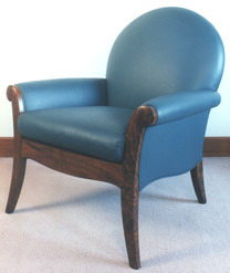 |
|||||||||||||||||||||||||||||||||||||||||||
Tim Philbrick - Pearwood, Larsen Fabric Club Chair |
Tim Philbrick - Claro Walnut, Leather Club Chair |
|||||||||||||||||||||||||||||||||||||||||||
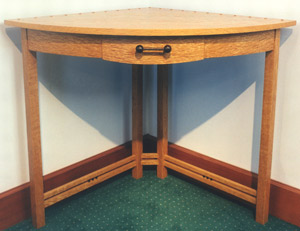 |
||||||||||||||||||||||||||||||||||||||||||||
Hank Gilpin - White Oak Corner Desk/Table |
||||||||||||||||||||||||||||||||||||||||||||
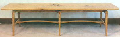 |
||||||||||||||||||||||||||||||||||||||||||||
Hank Gilpin - White Oak with Knots Bench |
||||||||||||||||||||||||||||||||||||||||||||
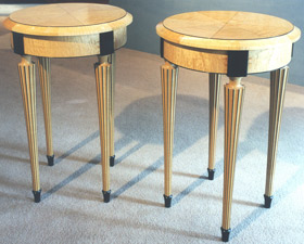 |
||||||||||||||||||||||||||||||||||||||||||||
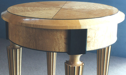 |
||||||||||||||||||||||||||||||||||||||||||||
Richard Newman - Curly Maple, Ebony Pair of Tables |
||||||||||||||||||||||||||||||||||||||||||||
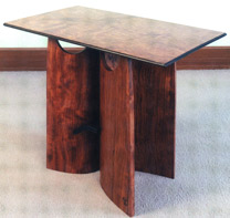 |
||||||||||||||||||||||||||||||||||||||||||||
Joe Tracy - Bubinga, Wenge Side Table |
||||||||||||||||||||||||||||||||||||||||||||
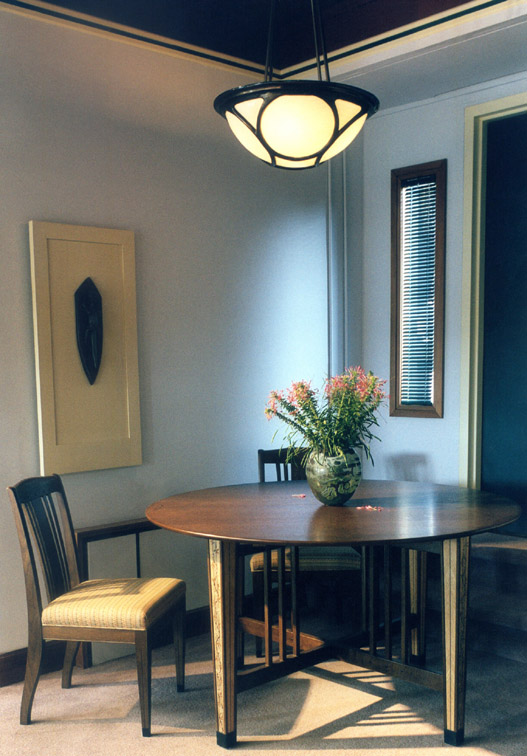 |
||||||||||||||||||||||||||||||||||||||||||||
Rick Wrigley - Quarter Sawn Fumed White Oak; Marquetry of White Oak, Maple, Pearwood, Ebony, East Indian Rosewood, Holly Extension Dining Table + |
||||||||||||||||||||||||||||||||||||||||||||
| 2 0 0 0 | ||||||||||||||||||||||||||||||||||||||||||||
| Early Spring Show - 2000 |
Early Spring Show NOTES: Linda Sue Eastman's announcement chest continues her experimentation with bringing leather -- and in this piece, fur -- into furniture forms. The wit of John Byers' hatbox chest is that it is just that: a stack of hatboxes. The round boxes themselves keep their diameter but the drawers become increasingly less deep with the ascending order. The piece compares to Tom Loeser's 1989 chest of drawers, which had the form of a stack of rectangular boxes and was his entry in the Museum of Fine Arts Boston 1989 exhibit New American Furniture. Tom Loeser was himself a student of Jere Osgood whose 1972 Chair O Drawers provides an even earlier departure from traditional form. Byers' hatbox cabinet also responds to this Osgood piece in his 1991 Oh Boy chest at Pritam & Eames. Duncan Gowdy's autumn coat rack exhibits his usual freshness and wit, and was one of the standout contributions to this show. Greg Smith's oval tables present a wonderful opportunity for use of narra, a hardwood not often seen in studio furniture. The tops are comfortably saddled into the legs with the stretchers below reversing the curve of the top. Smith's game table and stools showed off his superb craftsmanship. The carved details of the table's legs contributed a faux bamboo theme while the joinery included the quiet assumption of many Chinese details like the scarf joint evident in the stools. This table set substantiated his gift for contributing some of the most quietly beautiful work that the gallery had the good fortune to host. Noel and Janene Hilliard contributed their woven dome chandelier, which introduced a strong candidate in their distinctive lighting production series. For the gallery, they would normally add a distinctive color element in the working out of the glass tiles to distinguish these gallery pieces from their more numerously produced work. Rick Wrigley's mirror is highlighted by his distinctive marquetry artistry. The wisteria vine imagery has been used before in his earlier extension table. Here the mirror form has a distinct reference to the sill and crown of a window. In this show, it hung comfortably above a wide bubinga console table by Joe Tracy.
|
|||||||||||||||||||||||||||||||||||||||||||
 |
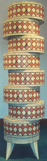 |
|||||||||||||||||||||||||||||||||||||||||||
Linda Sue Eastman - Hand-tooled Leather, Brazilian Cowhide, Suede, Brass & Pewter fittings, Bronzing Powders; dyed Birch Chest |
John Eric Byers - Mahogany, Milk Paint Hat Box Chest |
|||||||||||||||||||||||||||||||||||||||||||
 |
||||||||||||||||||||||||||||||||||||||||||||
Michael Cullen - Wenge, Milk Paint over Mahogany, Port Orford Cedar Red Chest |
||||||||||||||||||||||||||||||||||||||||||||
 |
|
|||||||||||||||||||||||||||||||||||||||||||
 |
||||||||||||||||||||||||||||||||||||||||||||
"The Jester" Footstool |
||||||||||||||||||||||||||||||||||||||||||||
"Spring Lamp" |
||||||||||||||||||||||||||||||||||||||||||||
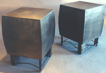 |
||||||||||||||||||||||||||||||||||||||||||||
Gary Magakis - Bronze, Steel, Copper Cube Tables |
||||||||||||||||||||||||||||||||||||||||||||
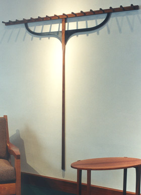 |
||||||||||||||||||||||||||||||||||||||||||||
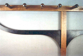 |
||||||||||||||||||||||||||||||||||||||||||||
Duncan Gowdy Autumn Coat Rack |
||||||||||||||||||||||||||||||||||||||||||||
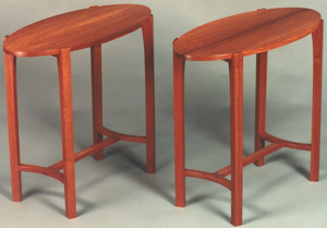 |
||||||||||||||||||||||||||||||||||||||||||||
Greg Smith - Narra Side Tables |
||||||||||||||||||||||||||||||||||||||||||||
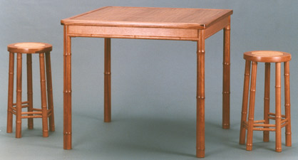 |
||||||||||||||||||||||||||||||||||||||||||||
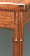 |
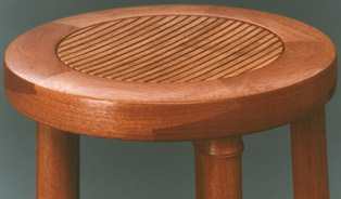 |
|||||||||||||||||||||||||||||||||||||||||||
Greg Smith - Game Table & Stools |
||||||||||||||||||||||||||||||||||||||||||||
 |
||||||||||||||||||||||||||||||||||||||||||||
Noel & Janene Hilliard - Handblown Glass Tile, Bronze Woven Dome Chandelier |
||||||||||||||||||||||||||||||||||||||||||||
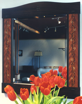 |
||||||||||||||||||||||||||||||||||||||||||||
Rick Wrigley - Marquetry Mirror |
||||||||||||||||||||||||||||||||||||||||||||
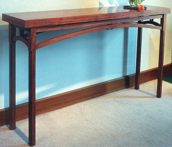 |
||||||||||||||||||||||||||||||||||||||||||||
Joe Tracy - Bubinga, Wenge Console Table |
||||||||||||||||||||||||||||||||||||||||||||
| 2000 | ||||||||||||||||||||||||||||||||||||||||||||
| 2000 & Ten - 2000 |
2000 & Ten NOTES: This show would yield some distinct contrasts in direction and affirm the personal energies that existed within the field. There was the solid aframosia bench by David Ebner with its swayed, slatted seat and comfortable pillowed wood arms; Linda Sue Eastman's bench with its accomplished decorative work in leather and its unusual puckered leather seat; Kristina Madsen's ample low table in wenge with apron pattern work in dyed pearwood and bubinga; and Andy Buck's Listener Chairs, eminently sit- able as occasional seats, but with such strong personalities that function seems like an addendum. Tom Hucker's tall lamps continued his work with experimental lighting, while Kim Kelzer's inviting game table for children showed her talent for freshly painted detail. Kristina Madsen has made a very usable and easily assimilated low table in which she uses her beautiful carving as a framing device to offset the functional wenge center. Here she has stayed with a more structered repeat pattern of conjoined bows, as opposed to her more free-form calligraphic approach. Bill Walker continued his investigation of his handsome and useful side table form with this dramatic use of limestone framed by wenge. The pillowed apron and bowed stretchers make quiet use of the curve without the slightest intention of sculpture. |
|||||||||||||||||||||||||||||||||||||||||||
 |
||||||||||||||||||||||||||||||||||||||||||||
Hank Gilpin - Yew Wood Bench |
||||||||||||||||||||||||||||||||||||||||||||
 |
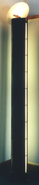 |
|||||||||||||||||||||||||||||||||||||||||||
Tom Hucker - Wenge, Water White Glass Pair of Tall Lamps |
||||||||||||||||||||||||||||||||||||||||||||
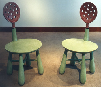 |
||||||||||||||||||||||||||||||||||||||||||||
Andy Buck - Mahogany, Milk Paint "Listener" Chairs |
||||||||||||||||||||||||||||||||||||||||||||
 |
||||||||||||||||||||||||||||||||||||||||||||
Michael Cullen - Carved Mahogany, Redwood Lace Burl, Milk Paint "Dreaming of a Land Beyond Elephant Mountain" |
||||||||||||||||||||||||||||||||||||||||||||
 |
||||||||||||||||||||||||||||||||||||||||||||
Linda Sue Eastman - Tooled Leather Smocked Leather Bench |
||||||||||||||||||||||||||||||||||||||||||||
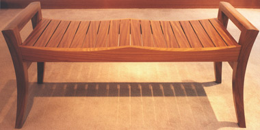 |
||||||||||||||||||||||||||||||||||||||||||||
David Ebner - Aframosia Bench |
||||||||||||||||||||||||||||||||||||||||||||
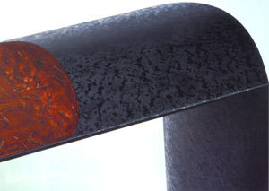 |
||||||||||||||||||||||||||||||||||||||||||||
Michael Hurwitz - Japanese Lacquer over wood Inkstone Desk |
||||||||||||||||||||||||||||||||||||||||||||
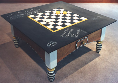 |
||||||||||||||||||||||||||||||||||||||||||||
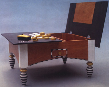 |
||||||||||||||||||||||||||||||||||||||||||||
Kim Kelzer - Mahogany, Milk Paint, Chalkboard Paint "Chance" Game Table |
||||||||||||||||||||||||||||||||||||||||||||
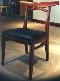 |
||||||||||||||||||||||||||||||||||||||||||||
Jere Osgood - Bubinga, Leather Wide Crestrail Side Chair |
||||||||||||||||||||||||||||||||||||||||||||
 |
||||||||||||||||||||||||||||||||||||||||||||
 |
||||||||||||||||||||||||||||||||||||||||||||
Kristina Madsen - Wenge, dyed Pearwood veneer over Imbuya Coffee Table + |
||||||||||||||||||||||||||||||||||||||||||||
 |
||||||||||||||||||||||||||||||||||||||||||||
Bill Walker - Wenge/Limestone Side Tables |
||||||||||||||||||||||||||||||||||||||||||||
 |
||||||||||||||||||||||||||||||||||||||||||||
Rick Wrigley - Cherry, Curly Cherry, Black Pearwood veneer, Ebony Hall Table |
||||||||||||||||||||||||||||||||||||||||||||
| James Schriber: Furniture - 2000 |
James Schriber: Furniture NOTES: The distinct directions within Schriber's work for this show have been present since the 1980s. Whether he is referencing traditional European sophistication, or milk painted takes on American folk or pop themes, the work is always at balance within itself. This breadth of expression makes Schriber one of the most commissionable makers in the field. The milk painted low chests and magazine tables were a delight to see with their cartoon Queen Anne legs. His bed kept the four-posted feature of his earlier successful Pencil Post bed but departed from the post-Shaker style to a more modern architectural idiom. The pierced shield concept of the bed works powerfully with the warm, even tones of the cherry. From the simplicity of the bed, Schriber takes us in a different direction with the complexity of the announcement piece, Double Chest with Stand. The play of the aggressive vertical lines running through the cabinet's front facade like slashes, remind one of earlier movements in painting, like Cubism. The feat of doing this in a formal ebony cabinet is daunting, although Wendell Castle did "set the table" for its feasibility. |
|||||||||||||||||||||||||||||||||||||||||||
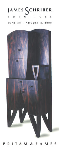 |
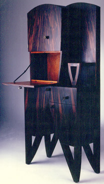 |
|||||||||||||||||||||||||||||||||||||||||||
Maccassar Ebony, Pommele Mahogany, cast bronze pulls Double Chest with Stand |
||||||||||||||||||||||||||||||||||||||||||||
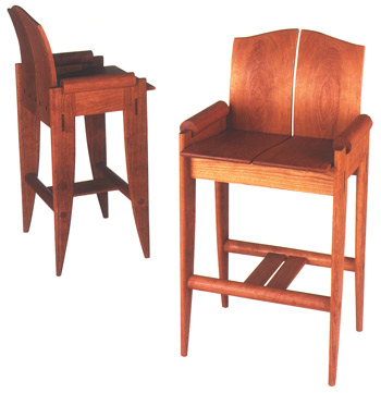 |
||||||||||||||||||||||||||||||||||||||||||||
Cherry Tall Chairs |
||||||||||||||||||||||||||||||||||||||||||||
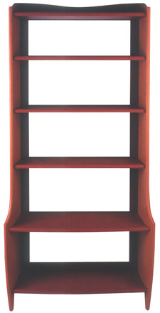 |
||||||||||||||||||||||||||||||||||||||||||||
Poplar, Milk Paint Etagere |
||||||||||||||||||||||||||||||||||||||||||||
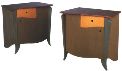 |
||||||||||||||||||||||||||||||||||||||||||||
Maple, Wormy Chestnut, Milk Paint Low Chests |
||||||||||||||||||||||||||||||||||||||||||||
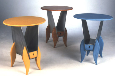 |
||||||||||||||||||||||||||||||||||||||||||||
Poplar/Ash/Cherry, Aluminum, Milk Paint Magazine Tables |
||||||||||||||||||||||||||||||||||||||||||||
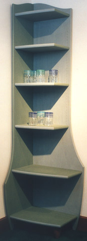 |
||||||||||||||||||||||||||||||||||||||||||||
Poplar, Milk Paint Corner Cabinets |
||||||||||||||||||||||||||||||||||||||||||||
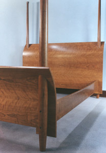 |
||||||||||||||||||||||||||||||||||||||||||||
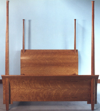 |
||||||||||||||||||||||||||||||||||||||||||||
Cherry Bed |
||||||||||||||||||||||||||||||||||||||||||||
The Furniture Art of Judy Kensley McKie - 2000 |
The Furniture Art of Judy Kensley McKie NOTES: This is Judy McKie's sixth one-person exhibit at Pritam & Eames, and the first in which her bronze work numerically dominates. There were six major pieces created for bronze casting. Two of them -- her largest bronze work to date, the Fish Bench (18"H x 76"W x 29"D), and the Sea Gull Chair -- were received even more enthusiastically than usual, evidencing perhaps that making room in interiors was becoming problematic, but the gardens were waiting. Both bronzes aptly convey the spirit of their subjects: the bird's form suggests alighting, while the heavy plenum of the fish form suggests submergence. The power in the other bronze work shows McKie's complete mastery of this material. The enigmatic intentions of the Baboon Bench and the power of its form draw your attention with the feeling that action is imminent. We saw that same compressed energy in the Sea Gull Chair and the Fish Bench. The six and one-half foot wide glass surface, which is supported by a pair of lynx, has an aerial effect. This is a large surface, and that the lynx bear it so easily gives them their magical presence. As guardians, they transform a working surface into one of empowerment. Her Tree Table pedestal is also somehow unencumbered by its heavy glass top. What is especially masterful about this form is that although the tendrils and branches must support a perfectly flat plane, they appear anything but flattened when looking down at the table. What impresses the viewer is the energy telescoping through the glass. Lastly, the gecko door handles are almost three feet in height and can stand solo with impact as wall sculpture. The simplicity of the Shell Chest's form is necessary to fully appreciate the motion of the carved facade. The pattern work leads one to think both of the layering segmentation in a shell, but also the succession of ripples caused by a stone tossed in a pond. The facade is a symmetrical pattern that is repeated in sets of four equalized drawers. The overall effect is like a shimmer of liquid transience. The slight, round shaped pulls appear in the center of the pattern work, much like the pearl in the oyster. The overall sensibility of the piece is elegant and feminine. Of the three wall hung cabinets, the Ribbon Cabinet hints at bio-medical slices of life, which is intensified by its deep red pigment. The tapestry chests, on the other hand, seem to say "no", the mysteries are aboriginal. You could not enter the exhibition space without feeling the presence of the Dove Bench, McKie's second and largest (35.5"H x 62"W x 27"D), piece created for marble. The outstretched wings serve as enveloping arms in this soulful piece. It is only the emergent carved claws that introduce a slight edge to this otherwise serene composition.
|
|||||||||||||||||||||||||||||||||||||||||||
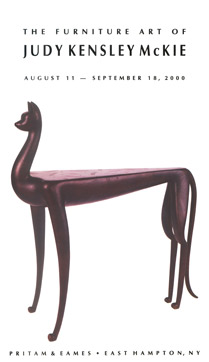 |
||||||||||||||||||||||||||||||||||||||||||||
Cast Bronze Lynx Table |
||||||||||||||||||||||||||||||||||||||||||||
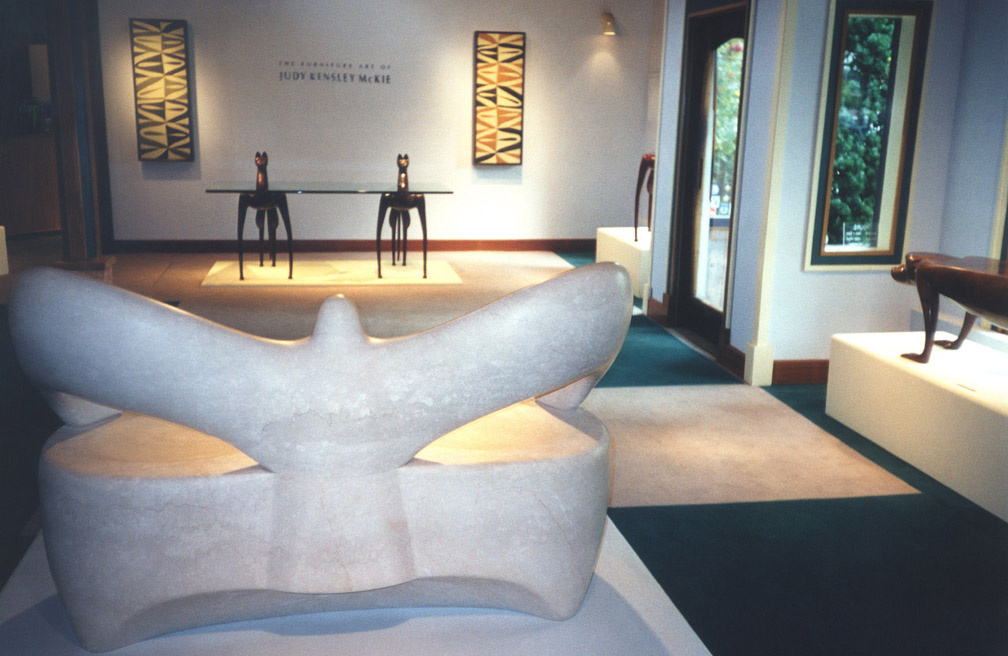 |
||||||||||||||||||||||||||||||||||||||||||||
+ |
||||||||||||||||||||||||||||||||||||||||||||
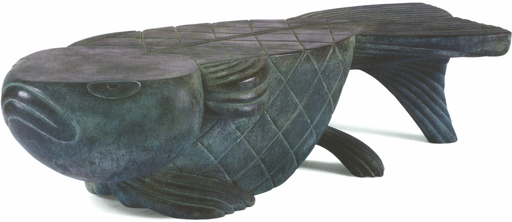 |
||||||||||||||||||||||||||||||||||||||||||||
Bronze Fish Bench + |
||||||||||||||||||||||||||||||||||||||||||||
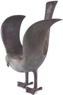 |
||||||||||||||||||||||||||||||||||||||||||||
Bronze Sea Gull Chair |
||||||||||||||||||||||||||||||||||||||||||||
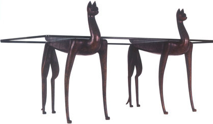 |
||||||||||||||||||||||||||||||||||||||||||||
Cast Bronze, Glass Lynx Desk
|
||||||||||||||||||||||||||||||||||||||||||||
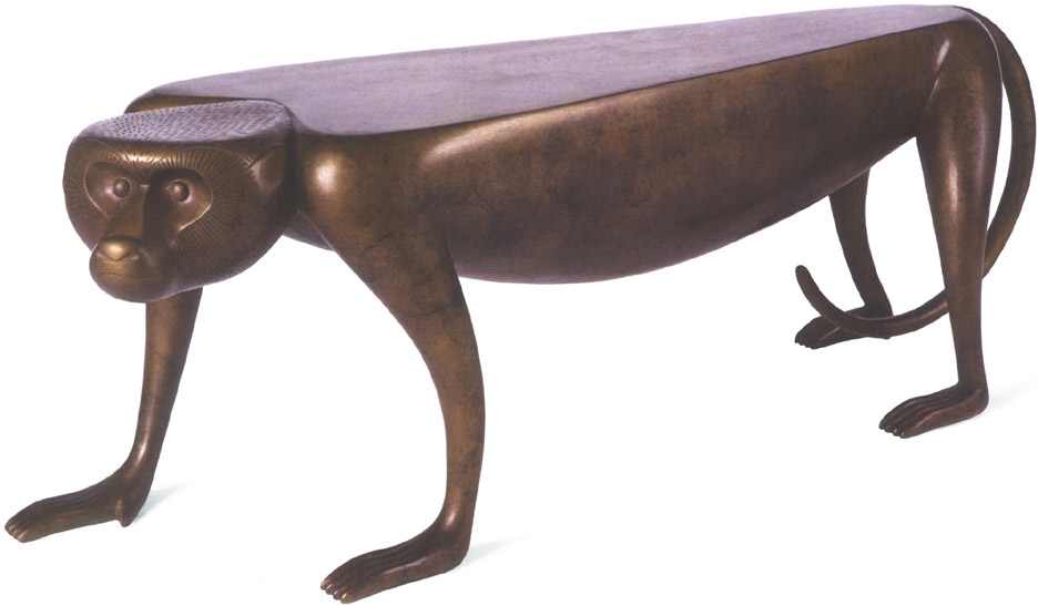 |
||||||||||||||||||||||||||||||||||||||||||||
Bronze Baboon Bench
+ |
||||||||||||||||||||||||||||||||||||||||||||
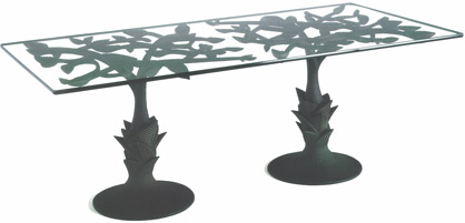 |
||||||||||||||||||||||||||||||||||||||||||||
Cast Bronze, Glass Tree Table |
||||||||||||||||||||||||||||||||||||||||||||
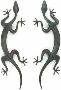 |
|
|||||||||||||||||||||||||||||||||||||||||||
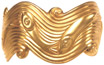 |
||||||||||||||||||||||||||||||||||||||||||||
Gold Fish Bracelet |
||||||||||||||||||||||||||||||||||||||||||||
Cast Bronze Gecko Handles |
||||||||||||||||||||||||||||||||||||||||||||
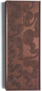 |
||||||||||||||||||||||||||||||||||||||||||||
Carved Mahogany Ribbon Cabinet |
||||||||||||||||||||||||||||||||||||||||||||
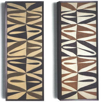 |
||||||||||||||||||||||||||||||||||||||||||||
Carved Mahogany, Milk Paint Tapestry Chests |
||||||||||||||||||||||||||||||||||||||||||||
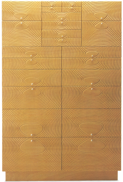 |
||||||||||||||||||||||||||||||||||||||||||||
Carved Obeche Shell Chest
+ |
||||||||||||||||||||||||||||||||||||||||||||
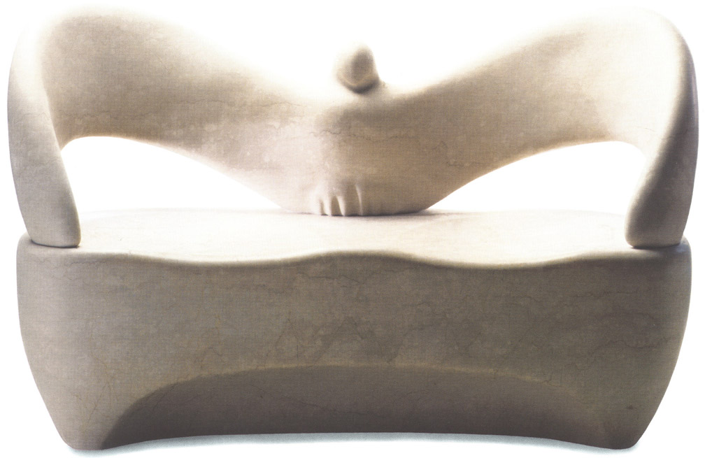 |
||||||||||||||||||||||||||||||||||||||||||||
Italian Botticino Classico Marble Dove Bench + |
||||||||||||||||||||||||||||||||||||||||||||
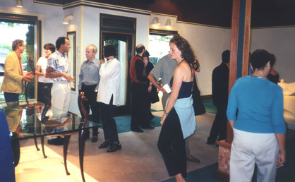 |
||||||||||||||||||||||||||||||||||||||||||||
| New Work - Early Winter 2000 |
New Work - Early Winter NOTES: The corner cabinets by Andy Buck suggest a way to bring life into an awkward, dark corner. They parody a vanity but cannot function as such; the image in the mirrored surface is too prismatic to be anything other than decorative light reflection. Again, where Buck trades on function, he offers humor. Also, wood is Buck's material, but paint is his final surface. It has been 15 years since the gallery last exhibited Tim Philbrick's design for a Grecian couch (see 1985). It's a classic from him and needs no updating. The economy of the contemporary upholstered industry is based on entirely upholstered forms; there's no visible wood except, perhaps, the feet, and the roughest kind of framework can be hidden. To use a beautifully crafted hardwood form to frame upholstery cannot have economy as its goal. The multiple challenges in bringing the sumptuousness of upholstery and its carefully chosen fabric together with a successful hardwood furniture form leaves these pieces for only the most proficient furniture minds to accomplish. In the image of the maple frame, one can imagine the couch with little difficulty: the upholstery completes the dots, but the form is already there. There is a human scale to all of Greg Smith's pieces. There is no elitist or ostentatious streak lurking in them. Their detailing comes form the very best craft, and this detailing awaits a patient connoisseurship for its notice. All of this can be seen in his étagère (he made a pair): the gentle tapering of the foot to crown stiles, the arching of the bottom rails, and the hand carved shelf supports with their tiny supporting arches. The choice of narra for this piece, as in many of his other works, seems perfect. Rick Wrigley's Book Pedestal is a good companion for those who like to read in bed. Its Arts and Crafts style is familiar from many of Wrigley's other pieces; as usual, there is his signature refined marquetry detail to distinguish the door. Anecdotally, the partners learned from Joe Tracy that bubinga and wenge grow side by side in the Equatorial forests of Africa. They are often times companions in Tracy's furniture as well, as evidenced in his low table. There is a sense of volume in this piece that is created by the joining of curved panels in the base. Often Tracy uses the solid volume of stone in his table bases. |
|||||||||||||||||||||||||||||||||||||||||||
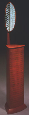 |
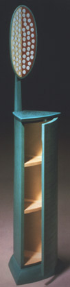 |
|||||||||||||||||||||||||||||||||||||||||||
Andy Buck - Poplar, Milk Paint, Mirror Reflection Cabinets |
||||||||||||||||||||||||||||||||||||||||||||
 |
 |
|||||||||||||||||||||||||||||||||||||||||||
David Ebner - Sassafras, Brass, Steel Fireplace Tools & Stand |
Fran Taubman - Forged Steel Fireplace Tools & Stand |
|||||||||||||||||||||||||||||||||||||||||||
 |
||||||||||||||||||||||||||||||||||||||||||||
Kristina Madsen - Bubinga, dyed Pearwood, Ebony Square Mirror |
||||||||||||||||||||||||||||||||||||||||||||
 |
||||||||||||||||||||||||||||||||||||||||||||
 |
||||||||||||||||||||||||||||||||||||||||||||
Tim Philbrick - Curly Maple, upholstery Grecian Couch |
||||||||||||||||||||||||||||||||||||||||||||
 |
 |
|||||||||||||||||||||||||||||||||||||||||||
Greg Smith - Narra Etagere |
Rick Wrigley - Bubinga, Black Pearwood, Ebony, Maple, Sterling Silver, Chrome-plated Brass Book Pedestal |
|||||||||||||||||||||||||||||||||||||||||||
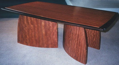 |
||||||||||||||||||||||||||||||||||||||||||||
Joe Tracy - Bubinga, Wenge Low Table |
||||||||||||||||||||||||||||||||||||||||||||
| 2 0 0 1 | ||||||||||||||||||||||||||||||||||||||||||||
Early Spring Show - 2001 |
Early Spring Show NOTES: The rosewood lingerie chest by Greg Smith needs to be highlighted here. Once again he accomplishes a beautiful piece with impeccable craft. The calligraphic pulls in forged iron demonstrate a second mastered skill by Smith. The stepped back effect as the piece ascends motivates the descending scale of the drawers. Three jewelry drawers behind the doors are half cabinet width. Julie Godfrey was trained by James Krenov at the College of the Redwoods, and apprenticed with Silas Kopf, where she learned her marquetry skills. The Jere Osgood easy chair in walnut and black leather is the latest version of this edition. The strength in the chair designs of William Walker, John Dunnigan,Timothy Philbrick and James Schriber work has been noted. The latter two makers were trained by Osgood. In an Osgood show, the desks and carcass pieces tend to be dominant, but this easy chair will arguably prove to be one of the classics from the studio furniture movement. Michael Cullen's small, exquisite Leaf Box gains its special quality in the way the lid's handle stands out from, but is perfectly integrated with, the theme of the carving. The complementarity of colors between handle and box enhances this effect.
|
|||||||||||||||||||||||||||||||||||||||||||
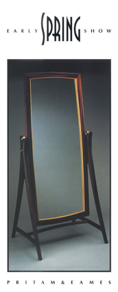 |
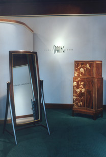 |
|||||||||||||||||||||||||||||||||||||||||||
Ted Blachly - East Indian Rosewood, Satinwood, Brass Mirror |
Ted Blachly - Mirror; Julie Godfrey - "Night Bloom" Cabinet |
|||||||||||||||||||||||||||||||||||||||||||
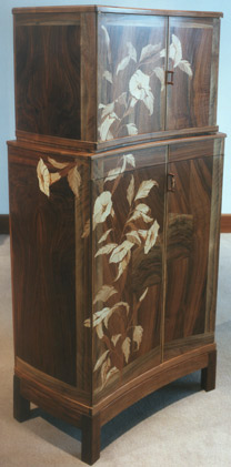 |
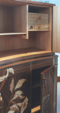 |
|||||||||||||||||||||||||||||||||||||||||||
Julie Godfrey - Walnut, Mencocino Cypress, Olive, Maple, assorted marquetry woods "Night Bloom" Cabinet |
||||||||||||||||||||||||||||||||||||||||||||
|
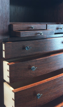 |
|||||||||||||||||||||||||||||||||||||||||||
Greg Smith - Honduras Rosewood, Maple, Iron pulls Jewelry & Lingerie Chest |
||||||||||||||||||||||||||||||||||||||||||||
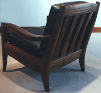 |
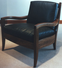 |
|||||||||||||||||||||||||||||||||||||||||||
Jere Osgood - Walnut, Leather Easy Chair |
||||||||||||||||||||||||||||||||||||||||||||
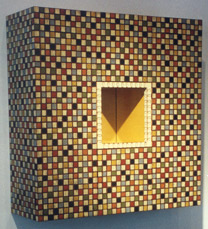 |
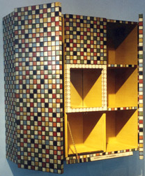 |
|||||||||||||||||||||||||||||||||||||||||||
John Eric Byers - Mahogany, Milk Paint, Mirror "Squares" Cabinet |
||||||||||||||||||||||||||||||||||||||||||||
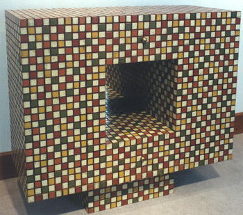 |
||||||||||||||||||||||||||||||||||||||||||||
John Eric Byers - Mahogany, Canary Wood, Milk Paint, hammered Brass, Mirror Cocktail Cabinet |
||||||||||||||||||||||||||||||||||||||||||||
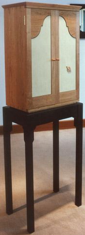 |
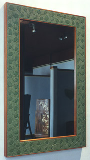 |
|||||||||||||||||||||||||||||||||||||||||||
Michael Cullen - Mahogany, Milk Paint Carved Mirror |
||||||||||||||||||||||||||||||||||||||||||||
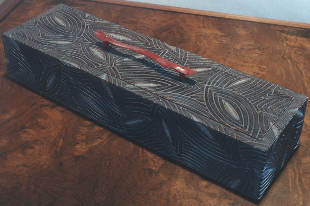 |
||||||||||||||||||||||||||||||||||||||||||||
Duncan Gowdy - Cherry, Maple, Poplar, Milk Paint "Cheshire Cabinet" |
Michael Cullen - Mahogany, Snakewood, Milk Paint, Deerskin lining Leaf Box + |
|||||||||||||||||||||||||||||||||||||||||||
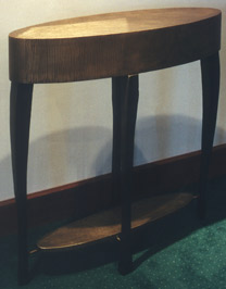 |
||||||||||||||||||||||||||||||||||||||||||||
Gary Magakis - Bronze, Steel Oval Table |
||||||||||||||||||||||||||||||||||||||||||||
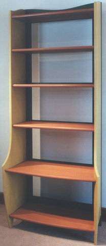 |
||||||||||||||||||||||||||||||||||||||||||||
James Schriber - Poplar, Milk Paint Etagere |
||||||||||||||||||||||||||||||||||||||||||||
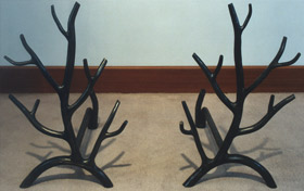 |
||||||||||||||||||||||||||||||||||||||||||||
Fran Taubman - Forged Steel Branch Andirons |
||||||||||||||||||||||||||||||||||||||||||||
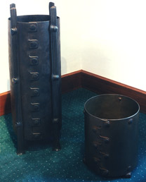 |
||||||||||||||||||||||||||||||||||||||||||||
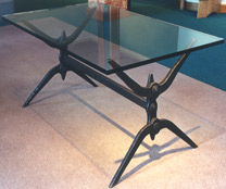 |
||||||||||||||||||||||||||||||||||||||||||||
David Zatz - Forged Steel, sand-blasted brown patina Iron Horse #3 |
||||||||||||||||||||||||||||||||||||||||||||
David Zatz - Forged Fire-Textured Steel Posted Umbrella Vessels |
||||||||||||||||||||||||||||||||||||||||||||
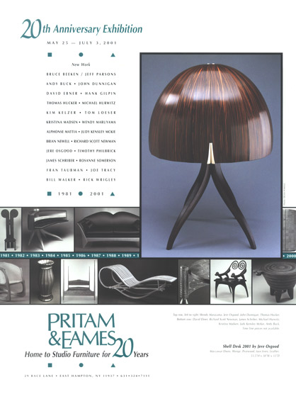 |
20th Anniversary Exhibition Bruce Beeken/Jeff Parsons, Andy Buck, John Dunnigan, David Ebner, Hank Gilpin, Thomas Hucker, Kim Kelzer, Tom Loeser, Kristina Madsen, Wendy Maruyama, Alphonse Mattia, Judy Kensley McKie, Brian Newell, Richard Scott Newman, Jere Osgood, Timothy Philbrick, James Schriber, Rosanne Somerson, Fran Taubman, Joe Tracy, Bill Walker, Rick Wrigley Binzen continued: "Early this summer, when Pritam & Eames mounted a 20th anniversary exhibition, the gallery was crowded with furniture by many of the most accomplished and active makers. Of the 26 included in the show, more than half were veterans of the inaugural exhibit. The greatest strength of this year's show was its breadth. With work by Judy Kensley McKie, Jere Osgood, Kristina Madsen, Alphonse Mattia, Hank Gilpin, Wendy Maruyama, David Ebner, Rosanne Somerson, Michael Hurwitz, James Schriber, and other distinguished designers, a furniture historian could easily have conducted a stirring seminar on the recent history of the craft (East Coast division, primarily) without recourse to anything but the pieces on display." NOTES: The time line in the exhibition poster takes a look back pictorially at some of the work that debuted at the gallery during its first 20 years. The pictures surrounding the time line show many of the pieces contributed to the 2001 show. Typically, some work for the show was not ready in time for photography, like Janene Hilliard's Ivory Reed Lamp; Tom Hucker's apple wood low table; Tom Loeser's Rocker for Four, and Fran Taubman's forged steel Vine Console. Kristina Madsen's time intensive chest of drawers was finished later that summer. Of the pieces represented on the poster, Jere Osgood's Shell Desk 2001 and Brian Newell's Spider Cabinet certainly dominate as far as accomplishment. The carcass of Osgood's desk sits like a finely domed helmet atop one of his classic pedestal bases. The only interruption to the sections of vertically flowing Macassar ebony is the bottom centered pulls of the two doors. They sensually mirror the parting of the pedestal legs. The interior design of four drawers and curving partitions has the serene architecture of a cathedral interior. The Spider Cabinet brought Brian Newell's work to the attention of a knowledgeable public, both clients and his peers. The design of the cabinet's compound curving brick-built carcass focuses on the center of the facade and its pierced carved grill. The free hand carving of the grill is a significant embellishment in this piece; this kind of carving has been a strong element historically for Newell (see his tall cabinet 1987). The Spider Cabinet's six long legs and sprung stretchers give the piece considerable tension. The Hilliards sent two lamps for the anniversary show; Janene's Ivory Reed Lamp was extremely well received, and stands close in accomplishment to Noel Hilliard's earlier (see 1997) Queen of the Nile lamp. The Ivory Reed Lamp sold twice in the opening week after Janene agreed to repeat the lamp. Noel Hilliard's Tapaintana Lamp was also well received. These Hilliards lamps are considerable craft objects; the individual bronze fabrication as well as the construction time for the lamps makes them craft objects of the highest order. Kristina Madsen's chest of drawers, present at the opening with several drawer fronts not yet carved, would prove how completely considered her pattern design is. Only when the carving was completed later in the summer, would the chest's full power be released. The small chest from Judy McKie represents one of her non-sculptural works with its emphasis on two-dimensional pattern. The pattern itself strikes you as large for the chest, and its two dimensionality seems only technical as the grid itself offers the focus of different shapes on different views, some pushing out from the plane, others imploding. The wild and primitive nature of the grid gives this piece almost a fun house, or circus, feel. The use of color helps to illustrate the dynamics of the shapes but is kept to muted, almost faded tones, as if this chest were found in an exciting exploration of the attic. John Dunnigan's Bon Heure du Jour desk references earlier work of his with its tiered or stepped legs. This is strictly an elegant piece, without the use of exaggerated elements that mark his work of the late 1980's. His accompanying chair is in keeping with this piece, representing the essence of his best chair designs. The format of the Cheerio Cabinet is one that Wendy Maruyama will develop for an on-going series of wall hung cabinets that will serve as a template for later work like Turning Japanese (2001), Men in Kimonos (2005), and her most recent series, Executive Order 9066 (2009). Fran Taubman's Vine Console would later appear in Architectural Digest. Tom Loeser's witty bench, Rocker for Four, was in fact a rocking bench and would accomodate four bodies by virtue of iridescently colored, gouged carved seating places. Tom Hucker's table blended the country charm of the material, apple wood, with his sophisticated sense of form, in this case, a triangle with curved sides and fin-like supports. The bench contributed by Richard Newman descends in style and attitude from his Child's Stool (1992). It combines the canted legs of a rural milking stool with the beautifully executed twisted fluting of his finest pieces. The bench takes his thinking from a divertissement to a highly functional piece of furniture. Others contributing pieces to this show were Bruce Beeken/Jeff Parsons, Andy Buck, David Ebner, Hank Gilpin, Kim Kelzer, Alphonse Mattia, Timothy Philbrick, James Schriber, Rosanne Somerson, Joe Tracy, Bill Walker and Rick Wrigley.
|
|||||||||||||||||||||||||||||||||||||||||||
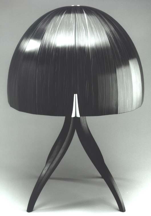 |
||||||||||||||||||||||||||||||||||||||||||||
+ |
||||||||||||||||||||||||||||||||||||||||||||
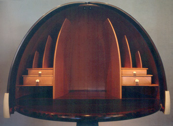 |
||||||||||||||||||||||||||||||||||||||||||||
Jere Osgood- Interior of Shell Desk 2001 |
||||||||||||||||||||||||||||||||||||||||||||
 |
||||||||||||||||||||||||||||||||||||||||||||
Jere Osgood & Brian Newell take a break from helping to set up the show. |
||||||||||||||||||||||||||||||||||||||||||||
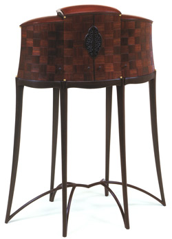 |
||||||||||||||||||||||||||||||||||||||||||||
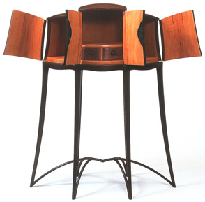 |
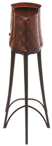 |
|||||||||||||||||||||||||||||||||||||||||||
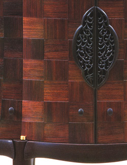 |
||||||||||||||||||||||||||||||||||||||||||||
Brian Newell - East Indian Rosewood, Wenge, African Ebony, Pearwood, Brazilian Rosewood " Spider Cabinet " |
||||||||||||||||||||||||||||||||||||||||||||
 |
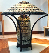 |
|||||||||||||||||||||||||||||||||||||||||||
Janene Hilliard - Handblown Glass, Bronze Ivory Reed Lamp |
Noel Hilliard - Handblown Glass, Bronze Tapaintana Lamp |
|||||||||||||||||||||||||||||||||||||||||||
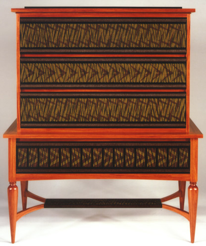 |
||||||||||||||||||||||||||||||||||||||||||||
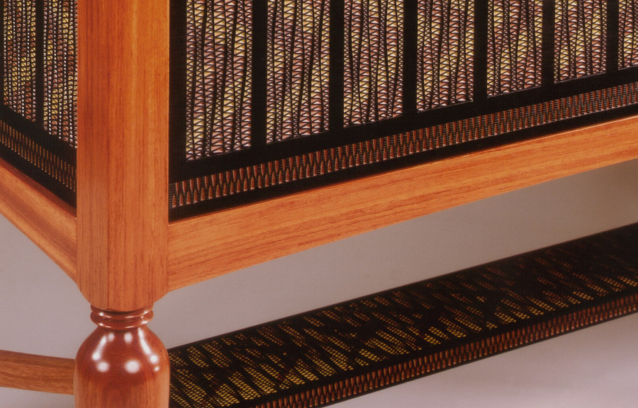 |
||||||||||||||||||||||||||||||||||||||||||||
Kristina Madsen - Bubinga, Pau Amarello, dyed Pearwood, Ebony Chest of Drawers |
||||||||||||||||||||||||||||||||||||||||||||
Judy Kensley McKie - Basswood, Milk Paint Chest |
||||||||||||||||||||||||||||||||||||||||||||
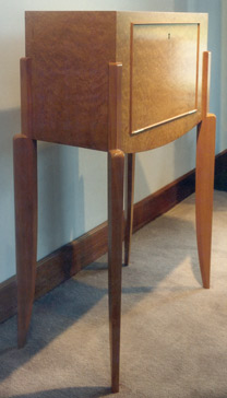 |
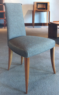 |
|||||||||||||||||||||||||||||||||||||||||||
John Dunnigan - Pearwood, Madrone Burl "Bonheur du Jour" |
John Dunnigan - Pearwood, jacquard fabric designed by Dunnigan |
|||||||||||||||||||||||||||||||||||||||||||
 |
||||||||||||||||||||||||||||||||||||||||||||
 |
||||||||||||||||||||||||||||||||||||||||||||
Wendy Maruyama - Bloodwood, polychrome, mixed media, glass, mirror, gold leaf "Cheerio Cabinet" |
||||||||||||||||||||||||||||||||||||||||||||
 |
||||||||||||||||||||||||||||||||||||||||||||
Thomas Hucker - Applewood Acoustic Table |
||||||||||||||||||||||||||||||||||||||||||||
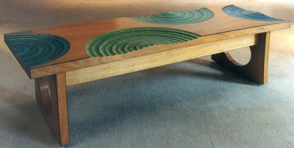 |
||||||||||||||||||||||||||||||||||||||||||||
Tom Loeser - Mahogany, Milk Paint "Rocker for Four" |
||||||||||||||||||||||||||||||||||||||||||||
 |
||||||||||||||||||||||||||||||||||||||||||||
Fran Taubman - Forged Steel, Bronze, Glass Vine Mirror and Vine Console |
||||||||||||||||||||||||||||||||||||||||||||
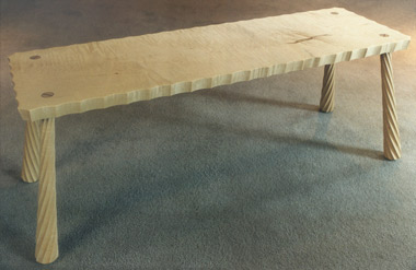 |
||||||||||||||||||||||||||||||||||||||||||||
Richard Scott Newman - Curly Maple, Ebony Fluted Bench |
||||||||||||||||||||||||||||||||||||||||||||
 |
|
|||||||||||||||||||||||||||||||||||||||||||
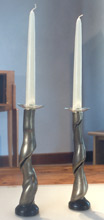 |
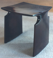 |
|||||||||||||||||||||||||||||||||||||||||||
David Ebner - Cast Bronze Candle Holders |
David Ebner - Cast Bronze Renwick Stool |
|||||||||||||||||||||||||||||||||||||||||||
David Ebner - Cast Bronze Scallion Coat Rack |
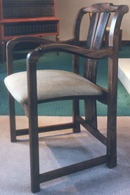 |
|||||||||||||||||||||||||||||||||||||||||||
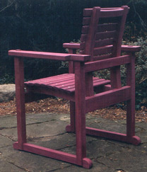 |
||||||||||||||||||||||||||||||||||||||||||||
Hank Gilpin - Purpleheart Chair |
Hank Gilpin - Walnut Chair |
|||||||||||||||||||||||||||||||||||||||||||
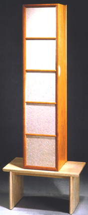 |
||||||||||||||||||||||||||||||||||||||||||||
Rosanne Somerson - Sandblasted Limestone, Yellowheart Hornbeam, Figured English Sycamore Cabinet on Stand |
||||||||||||||||||||||||||||||||||||||||||||
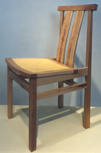 |
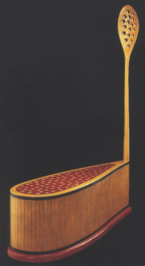 |
|||||||||||||||||||||||||||||||||||||||||||
Bruce Beeken & Jeff Parsons - Heart Maple & Cane Chair |
Andy Buck - Poplar, Milk Paint, graphite "Lemonhead Bench/Table" |
|||||||||||||||||||||||||||||||||||||||||||
 |
||||||||||||||||||||||||||||||||||||||||||||
Kristina Madsen, Margaret Conklin, James Schriber, Bebe Pritam Johnson, Jere Osgood, Tom Hucker, Nancy Grover, Joel Koblentz |
||||||||||||||||||||||||||||||||||||||||||||
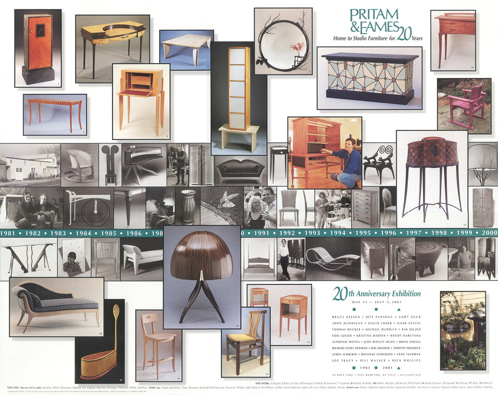 |
||||||||||||||||||||||||||||||||||||||||||||
+ At the end of this second decade, the demand for featured and one-person shows is noticeably less. Although the gallery had accepted these shows as an important feature of its promotional role, the partners remained regardful of the ability of most makers to fulfill these demands. The daunting effort required to produce a body of work capable of being viewed as groundbreaking placed heavy responsibility on the maker, but also on the gallery as an enabler. For the makers, there is no security or pot of gold at the end of the rainbow, and the marketplace will retain its characteristically less than predictable nature. By the end of the decade, it is clear that the featured or one-person show will be viable for only a few. The poster announcement for the 20th anniversary show in 2001 forecasts, by and large, the next decade for the gallery. That is, the furniture makers who contributed to the 20th anniversary exhibit will continue to showcase their work at Pritam & Eames. Some fields seem conducive to longevity, and there must be a truthful aspect to this found in the furniture shop, despite its obvious hazards. Looking to the third decade requires that we imagine artist-gallery relationships that will endure for 30 years. Scenes from the 90s |
||||||||||||||||||||||||||||||||||||||||||||
|
||||||||||||||||||||||||||||||||||||||||||||
Photographers include: Jonathan Binzen, David Caras, Warren Eames Johnson, Edward Judice, John Kane, Scott McCue, Morgan McGivern, Nash Studio, Dean Powell, Eleni Prieston, Jon Reed, David Stansbury. |
||||||||||||||||||||||||||||||||||||||||||||
Use of Content from this Web Site Access to and use of text, artwork, photographs and other files on this Web site are subject to the following terms and conditions: All Content is Protected by Copyright Laws Images, text, software, documentation, electronic text and image files, audio and video clips, and other materials are protected by copyright laws and may be covered by other restrictions as well. Pritam & Eames retains all rights, including copyright, in data, image, text, and any other information contained in these files. Copyrights and other proprietary rights in the material on this Web site may also subsist in individuals and entities other than, and in addition to, Pritam & Eames. Pritam & Eames expressly prohibits the copying of any protected materials on this Web site, except for the purposes of fair use as defined in the copyright laws, and as described below. Fair Use is Permitted Fair use of copyrighted material includes the use of protected materials for noncommercial educational purposes, such as teaching, scholarship, research, criticism, commentary, and news reporting. Unless otherwise noted, users who wish to download or print text and image files from Pritam & Eames’ Web site for such uses are welcome to do so without Pritam & Eames’ express permission. Users must cite the author and source of this material as they would material from any printed work; the citation should include the URL "http://www.PritamEames.com". By downloading, printing, or otherwise using text and image files from this Web site, users agree that they will limit their use of such files to fair use, and will not violate Pritam & Eames’ or any other party's proprietary rights. Commercial Use is Restricted Unauthorized publication or exploitation of Pritam & Eames’ files is specifically prohibited. Anyone wishing to use any of these files or images for commercial use, publication, or any purpose other than fair use as defined by law, must request and receive prior permission. All requests to reproduce works from Pritam & Eames’ collection within North America ( Canada, U.S., Mexico) should be addressed directly to Pritam & Eames, at 29 Race Lane, East Hampton, New York 11937. Telephone (631) 324-7111; fax (631) 324-4942, connect@pritameames.com, www.PritamEames.com. |
||||||||||||||||||||||||||||||||||||||||||||
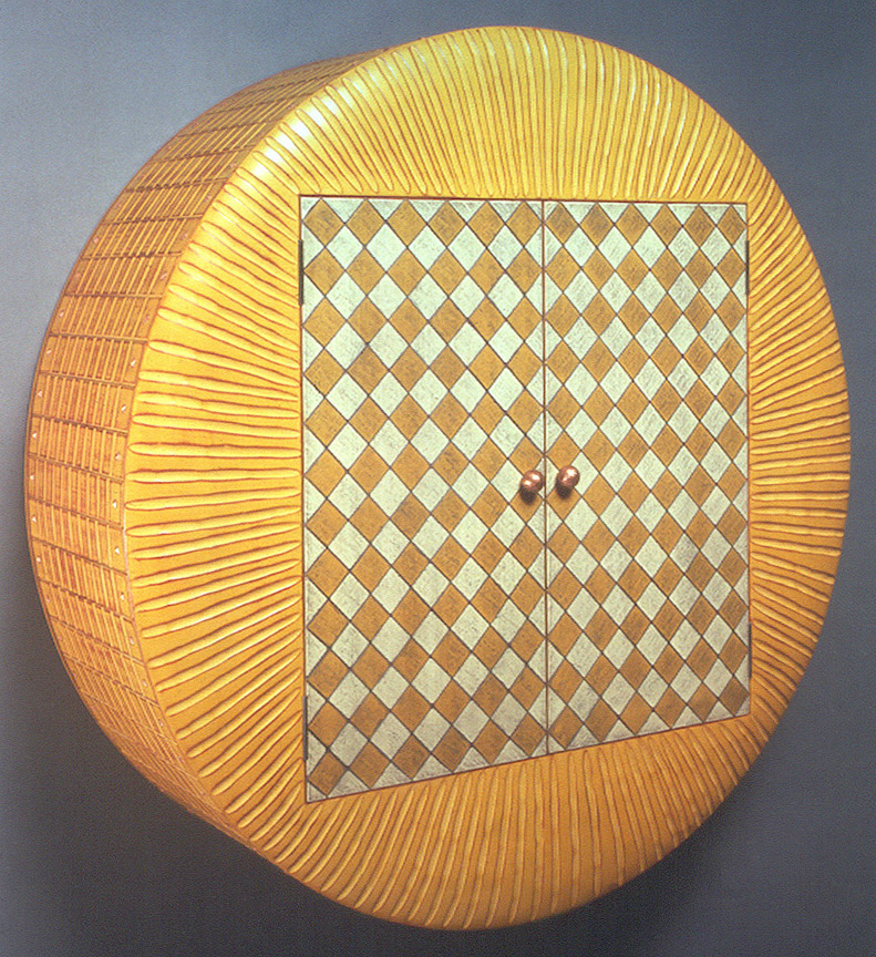
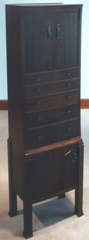
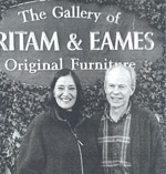
![]()
East Hampton, New York 11937
631-324-7111
connect@pritameames.com
www.PritamEames.com
![]()
Design by Diana Zadarla